5 Charts That Will Define Markets in 2026

Key Takeaways
- Market breadth and risk appetite offer early clues as the bull market enters a mature phase
- Key intermarket ratios reveal where leadership may emerge—or fade—heading into the new year
- From U.S. equities to Europe, price action is signaling what macro trends matter most
It's time to ring the bell on the NYSE and drop the ball in Times Square.
2025 is out, and the new trading year gets going on Friday. While we’ll have to wait on December economic data, price action is always at the ready. On net, global equities appear primed to take on the sometimes-sketchy midterm election year. The S&P 500 turned in a 15%-plus gain (nearly 20% for the broader U.S. stock market on a total return basis), while ex-U.S. stocks notched their best year since 2009 (up ~32%, dividends included).
But now that's ancient history, and we want to know what’s on tap for 2026. Let’s dive into the five charts that matter most as this bull market matures.
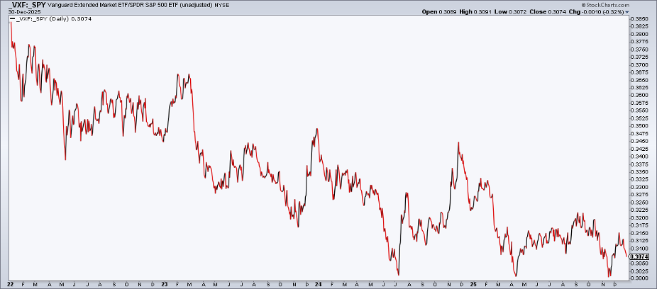
1. VXF/SPY: The U.S. Extended Market versus the S&P 500
Previous tops and subsequent near-bear markets have taught us that breadth matters. Recall that the U.S. market deteriorated, size-wise, leading into the February 2020 peak and in advance of the 2022 bear market. How does breadth fare right now?
Well, according to the ratio chart of the Vanguard Extended Market ETF (VXF), which holds all domestic companies not in the S&P 500, and the S&P 500 ETF (SPY), we see that it has made lower highs for years. Key support is at the 0.3 ratio level — a break of that spot would be a negative. Technical traders know that the trend of a larger degree matters most, so this is not exactly a cork-popping chart right off the bat.
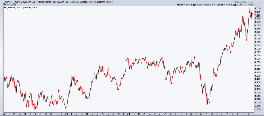
2. SPHB/SPLB: S&P 500 High Beta versus S&P 500 Low Volatility
The third straight year of double-digit S&P 500 gains was aided by a surge in high-beta stocks from “Liberation Day” through much of December. While VXF/SPY is lukewarm at best, within the S&P 500, it has been risk-on since Q2. This one is crucial to the broadening trade. “High beta” is 40% tech, but the largest holdings are not stalwarts like NVIDIA (NVDA) or Apple (AAPL).
SPHB is a modified equal-weighted product, so it won’t be swayed by just a handful of names. Once again, breadth matters for this ratio chart. As it stands, up and to the right is the trend — an arrow in the bulls’ quiver.
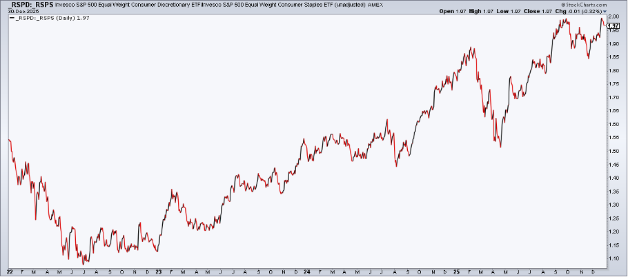
3. RSPD/RSPS: S&P 500 Equal Weight Consumer Discretionary versus S&P 500 Equal Weight Consumer Staples
Next up on my list of critical 2026 charts is a consumer view. Chalk this one up for the bulls, with equally-weighted Discretionary having sharply outperformed equally-weighted Staples since June 2022 (notably, four months before the S&P 500 bottomed that year, underscoring it as a leading indicator).
Market analysts should always use the equal-weight versions of the consumer ETFs due to Tesla’s (TSLA) and Amazon’s (AMZN) massive stakes in the cap-weighted discretionary sector index and related ETFs. Tesla is more about AI and robotics, while Amazon Web Services arguably matters more to that firm’s fundamental health.
Large-cap Staples, on the other hand, have battled weakness among lower-end consumers, along with lingering tariff fears. Could some of those headwinds abate in 2026? Perhaps, and we’ll likely see it first in price action. As always, wait for technical signals… don’t guess.
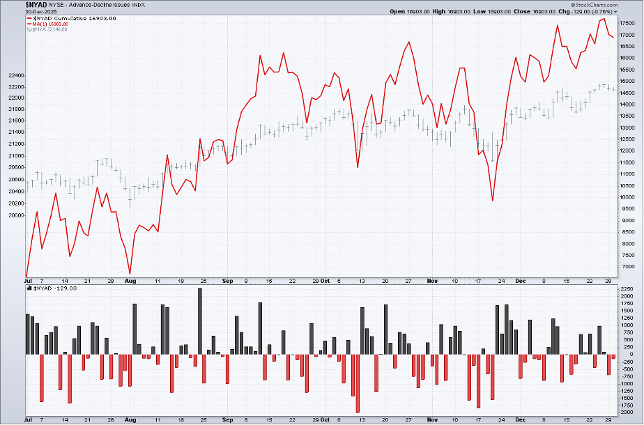
4. NYSE Cumulative Advance-Decline Line
Perhaps the ultimate breadth gauge is the NYSE cumulative advance-decline (A/D) line. It is an indicator based on net advances, which is the number of advancing stocks minus the number of declining stocks. The “A/D line” is a cumulative measure of net advances, rising when it is positive and falling when it is negative. Confirmation is key.
When the NYSE cumulative A/D line notches new highs with either the NYSE Common Stock Only Index or the S&P 500 also printing records, that’s Goldilocks for technical analysts. And guess what? The cumulative A/D line reached a zenith just ahead of New Year’s.
If you’re keeping track, that’s three bullish and one (mildly) bearish intramarket charts so far. But what about the fifth and final? For that, we must head overseas.
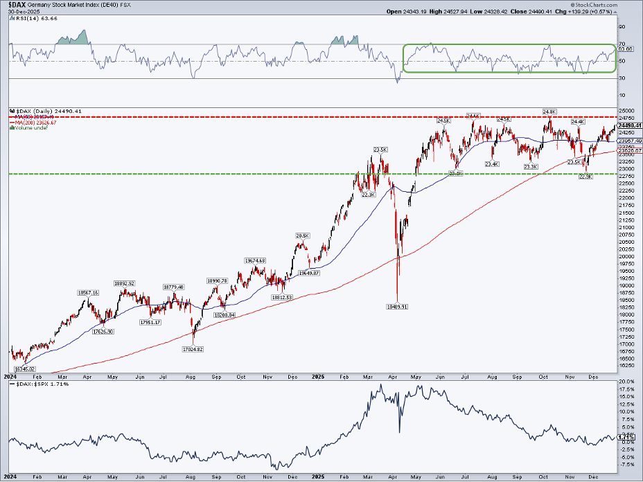
5. German DAX Index
European markets stormed out of the gates in 2025… relative to the U.S. stock market. Germany, specifically, posted among its strongest alpha stretches in history from November 2024 through the middle of this past March. Since the second quarter, however, the largest stock market in Europe has lagged domestic equities. Q4 has been a sideways chop, with no clear winner between Germany and the U.S.
I’d like to see Germany, which is heavy in cyclical sectors like Industrials and Financials, get its mojo back. First things first, the DAX must take out the all-time high at 24,800. A rally through there would trigger an upside measured move target to near 26,800 based on the height of the ongoing trading range. I like what I see in its RSI momentum oscillator, as it ranges between 35 and 70. Also notice in the view below that the DAX:SPX relative chart could be basing out here, then potentially inflecting higher in 2026.
Another round of international leadership would be a welcome development for globally diversified investors.
The Bottom Line
I’m watching these five technical charts for clues on macroeconomic developments. That should be how you approach it, too: price is always first to know. When allocating your portfolio, these intermarket and intramarket views often reveal more than merely eyeing the S&P 500.
Disclaimer: This blog is for educational purposes only and should not be construed as financial advice. The ideas and strategies should never be used without first assessing your own personal and financial situation, or without consulting a financial professional.


