It’s All Systems Go for Commodities

It's rare for the economy, stocks, currencies, and commodities to simultaneously point toward rising commodity prices, but we're experiencing such alignment now.
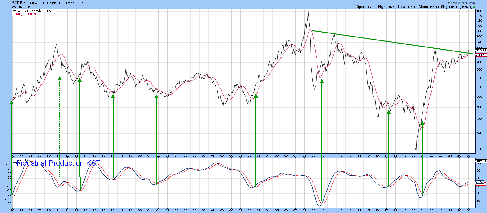
Chart 1 shows that the CRB Index ($CRB) is beginning to breach the neckline of a massive inverse head-and-shoulders formation. The following charts indicate that it probably has the power to punch through.
Commodity prices are, of course, greatly influenced by the economy, which acts as a proxy for the demand side of the equation. The chart's lower panel displays the long-term Know Sure Thing (KST) for U.S. industrial production, a coincident economic indicator. The arrows highlight sub-zero momentum buy signals, which have historically preceded significant upward movements in the index. A noteworthy exception happened in 1981, when a weak signal was followed by an unusual "double dip" recession.
Currently, the KST is positive at a relatively modest level. This indicates substantial room for further upside movement before this indicator becomes overstretched.
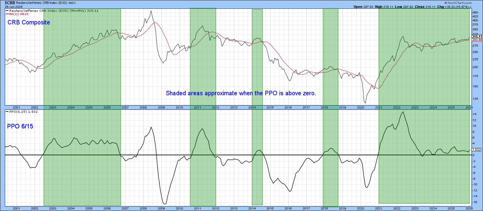
The Percentage Price Oscillator (PPO), utilizing 6- and 15-month parameters, ranks among my preferred long-term indicators. Its appeal lies in its ability to signal turns relatively close to final turning points while minimizing false signals. The indicator generates buy signals when the shorter-term exponential moving average (EMA) crosses above the longer-term one, which appears as a zero-line crossover on the chart. The positive periods are represented by the green-shaded areas. The indicator currently displays a bullish stance and should provide support for the index's preliminary breakout.
Commodity-Sensitive Currencies Are Bullish
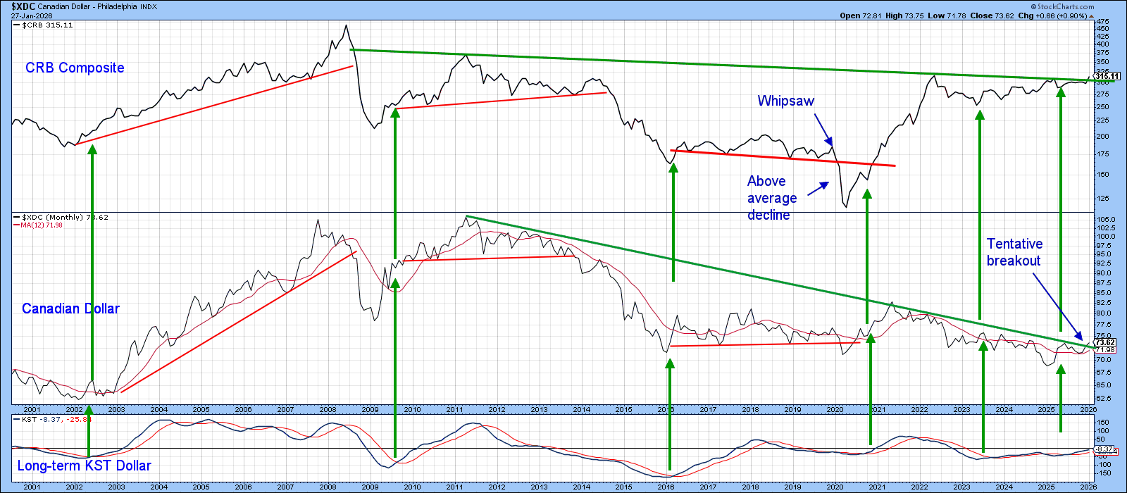
Historical data demonstrates that most long-term commodity rallies and pullbacks correlate with movements in the Canadian dollar, a relationship clearly evident in Chart 3. While some divergences exist, such as in 2020 when the CRB hit a significant new low while the currency did not, the subsequent CRB rally proved both stronger and more prolonged than the dollar's recovery. From a timing perspective, currency momentum provides a more robust and actionable correlation. The arrows in Chart 3 identify KST buy signals for the Canadian dollar, each of which preceded some form of CRB rally.
Although the 2023 signal was followed by currency weakness, the CRB still managed a modest upward trend. The latest signal, triggered last year, remains active. Additionally noteworthy is the dollar's current attempt to break above its long-term down trendline, coinciding with the CRB's effort to cross its potential neckline.
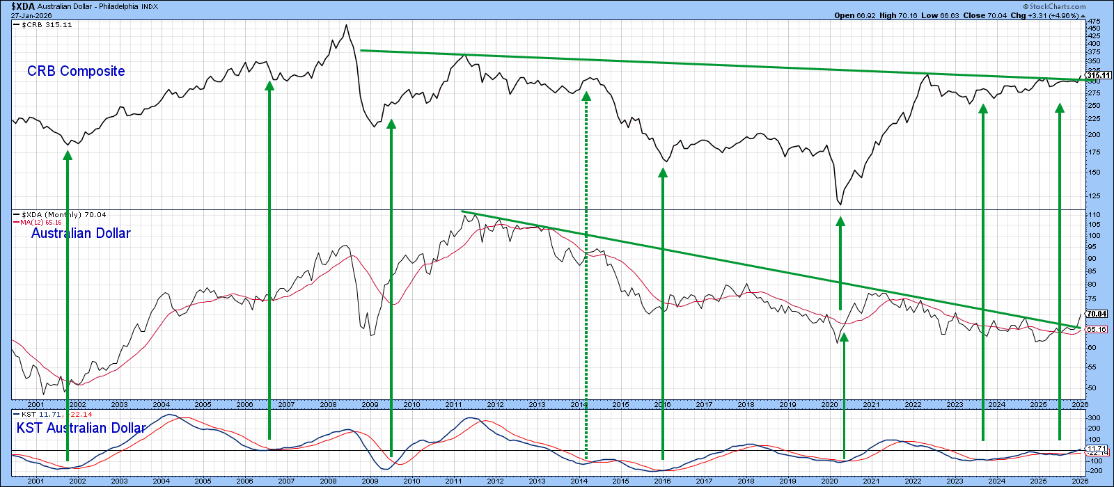
A similar relationship exists between the CRB and the Australian dollar. In this instance, though, the Aussie currency has already broken decisively above its secular down trendline.
The Stock Market Gets a Vote
To gauge the stock market's perspective on commodity prospects, we need to examine certain cross-sector relationships more closely.
Chart 5, for instance, contrasts my Inflation with my Deflation-Sensitive Index. The inflation series comprises several industry groups responsive to commodity prices, which typically outperform during the cycle's latter stages. Conversely, the deflation series includes defensive and interest-sensitive sectors that tend to excel during the cycle's early phase. For additional details on this concept, please click on this link.
What Chart 5 clearly shows is that fluctuations in the Inflation/Deflation relationship align reasonably well with CRB movements, thereby reflecting the stock market's ongoing assessment of inflationary versus deflationary outcomes. Currently, the ratio is rising sharply and has convincingly broken through a decade-long resistance trendline. It is unequivocally, signaling expectations of higher commodity prices ahead.
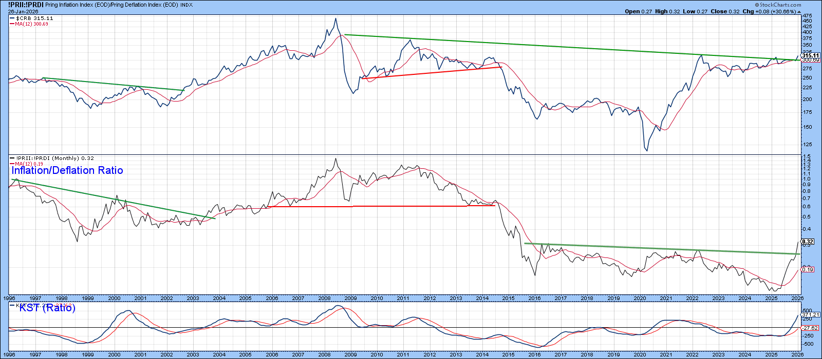
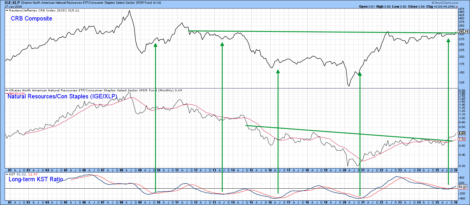
Chart 6 presents another stock market relationship based on the same principle, comparing the iShares North American Natural Resources to the Consumer Staples Select Sector SPDR ETF (IGE/XLP). The concept of contrasting an inflation-sensitive sector with a deflation-sensitive one mirrors the Inflation/Deflation series. However, IGE is more heavily weighted toward energy, while the ID ratio places greater emphasis on gold shares.
Since oil has been relatively subdued compared to gold, the IGE/XLP ratio has shown less strength recently. Nonetheless, it has generated a KST buy signal and broken decisively above the neckline of a multi-year inverse head-and-shoulders pattern.
The Bottom Line
An alignment across indicators that's this consistent is unusual. While this convergence doesn't guarantee rising commodity prices, betting against it could prove detrimental to your financial well-being.
Good luck and good charting,
Martin J. Pring
The views expressed in this article are those of the author and do not necessarily reflect the position or opinion of Pring Turner Capital Group of Walnut Creek or its affiliates.


