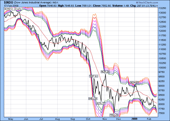
Bollinger Band "Topo Map" ($INDU)

Click here for a live version of this chart.
Based on the statistical concept of Standard Deviations, Bollinger Bands graphically illustrate how "far away" prices are from their "average" value. Traditionally, 2.0 standard deviations are used to determine where the upper and lower bands should appear. In the chart above, I've layered 6 different Bollinger Bands on top of each other going from 2.0 deviations to 3.0 deviations forming two "bands of Bands." The "deeper" prices go into either band, the more likely things will "snap back" towards the dashed average line. That's good news since the Dow plunged deep into the lower band today.


