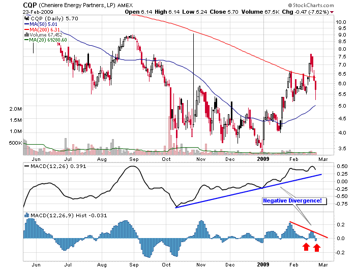
Up + Down = Down (CQP)

Click here for a live version of this chart.
The MACD Histogram shows the change in momentum of the MACD Line. The MACD Line - in turn - shows the change of momentum in the underlying stock. In the case of CQP, the MACD Line has been moving up pretty steadily since early October (blue trendline). Recently however the MACD Histogram has started moving lower and is now diverging significantly from the MACD Line. This signals trouble for the stock - something that may already be appearing on the chart.


