Never mind QE, the Yield Curve Reflects a Dovish Fed
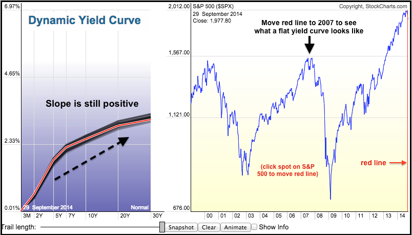
The end of QE may be on the table, but the yield curve shows that the Fed remains dovish overall. The image below comes from the Dynamic Yield Curve. Notice that short-term yields are the lowest and the yields rise as the maturities extend. This is a "normal" or positively sloped yield curve and it means the Fed is accommodative right now. The trouble starts when short-term yields rise sharply and the yield curve flattens. Click the image below for a live chart and move the vertical red line to 2007 and 2000 to see what a flat yield curve looks like.
Click this image for a live chart.


