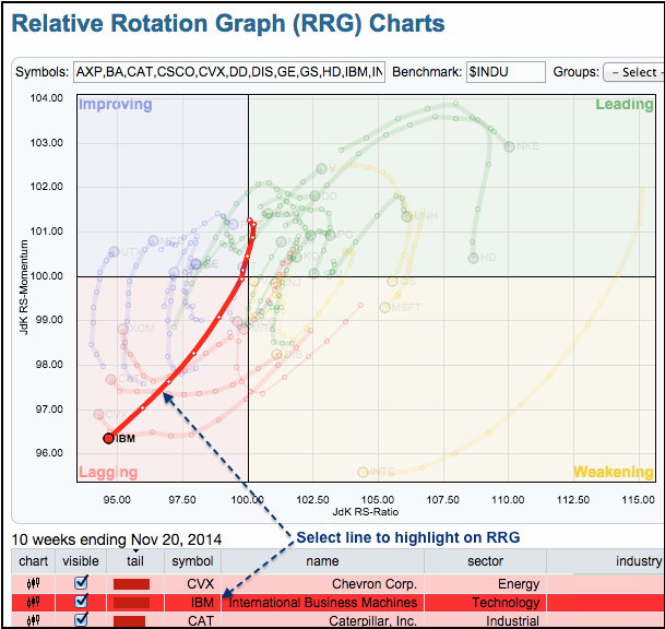
Big Blue Stays Red on the Relative Rotation Graph
The S&P 500 is up over 7% the last five weeks, but IBM is down and flirting with new lows. The chart below shows the Relative Rotation Graph (RRG) with all thirty Dow stocks. With the Dow Industrials as the benchmark, we are seeing the relative performance rotations for all 30 stocks in this key average. The highlighted red line represents relative performance for IBM and it is pointing northeast, which is negative. Also notice that Chevron and Caterpillar are underperforming the senior average.
Click this image for a live chart.


