3 Types of Breakouts To Upgrade Your Portfolio

Key Takeaways
- Use this scan to identify stocks and ETFs that are making new three-month closing highs.
- Learn to identify the three types of charts that come up in the three-month closing highs scan results.
- Monitor the upward trends in the charts from your scan results.
If there’s one thing I’ve learned over the years about idea generation, it’s that consistency matters. Top investors are able to improve their returns by always looking for stocks and ETFs that will upgrade their portfolios. And no matter the current macro conditions, some chart somewhere is probably breaking out!
I run a weekly scan for stocks making new three-month closing highs. To recreate the magic of this easy scan, simply copy this line into the StockCharts Advanced Scan Workbench:
and [Weekly Close > Last Week's MAX(13,Close)]
This will give you stocks and ETFs where this week’s close is higher than the last 13 weekly closes. I ran the search earlier this week and realized that the results usually end up in three general buckets. I thought I’d describe each of these buckets, share a stock or two that came up this week with that particular pattern, and talk about some best practices for identifying good entry and exit points using the charts.
Early Breakouts: Names Showing New Strength
The first bucket, which I call “Early Breakout” charts, consists of stocks and ETFs that are just emerging from established basing patterns. The chart of Liberty Media (LLYVK) provides a classic example of a stock that has just recently achieved a new three-month high.
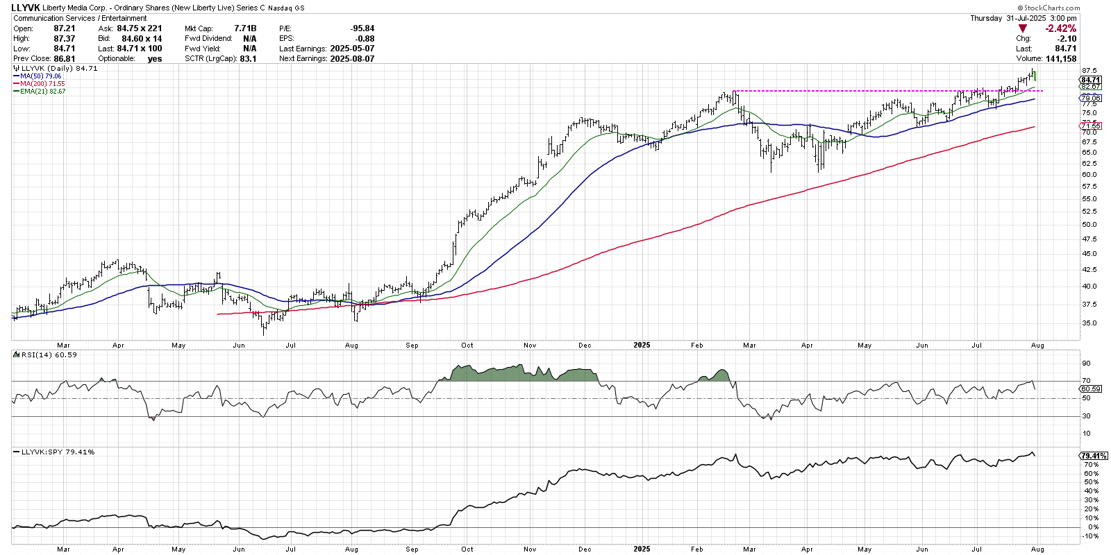
Liberty reached the $80 level in February 2025, then dropped to create a classic double-bottom pattern with lows in March and April. By mid-June, the stock had retraced all the way back to the February high, but then spent almost four weeks bumping up against that resistance point.
LLYVK finally broke to a new high in July, driven by an increase in buying power and confirming a new uptrend phase. Charts like this remain bullish as long as they remain above upward-sloping moving averages. I like to use the 21-day exponential moving average as an initial support level, and the 50-day moving average as a good measure of downside risk, as shown a number of times in recent months.
Testing Resistance: Stocks That Have More to Prove
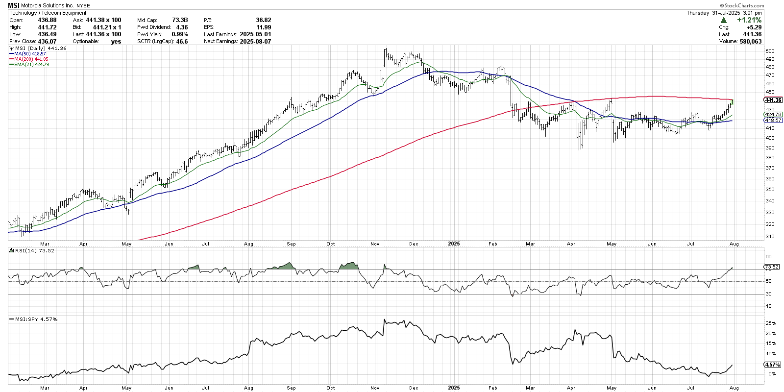
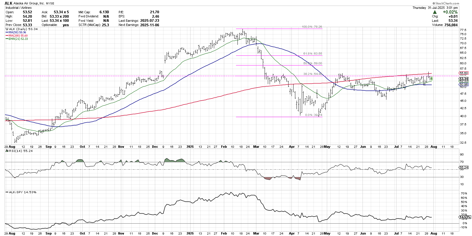
This second bucket includes stocks that have indeed made a new three-month high, but they still remain below a significant resistance level. I’m a fan of being patient with charts like this, and, instead of being more aggressive today, I’d rather lay out a clear game plan so I can better define my risk and reward.
Motorola Solutions (MSI) popped up on the scan last week, when it finally pushed above resistance just below $430. But a quick review of the chart shows a much more significant resistance level around $440. The 200-day moving average is right around that price point, which also lines up with previous highs in April. Until MSI can push above this confluence of resistance, I’m happy waiting it out.
Seattle-based airline Alaska Air Group, Inc. (ALK) has a similar structure to Motorola, having achieved a new three-month high but still remaining below the 200-day moving average. Previous swing highs from June and May, as well as a 38.2% Fibonacci retracement of the Q1 selloff, all coalesce around the $55 price level. Only a move above this confluence of resistance would convince me of a new primary uptrend for ALK.
Established Uptrend: Charts Pounding Out Primary Uptrends
The last type of chart that will come up in the scan results looks like Caterpillar, Inc. (CAT), with a clear pattern of higher highs and higher lows. For these “established uptrend” names, this new three-month high is just the latest sign of strength from this consistent winner.
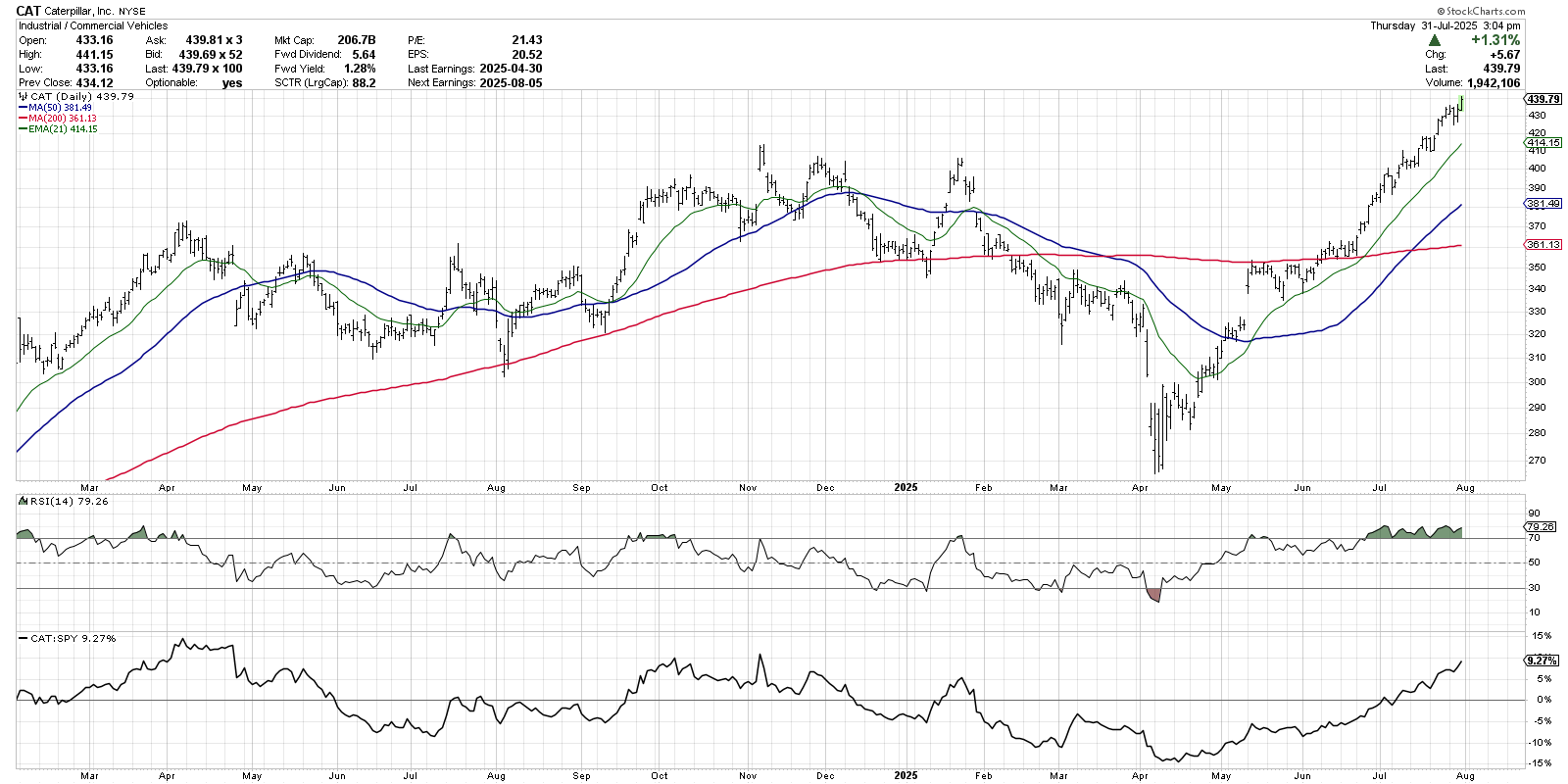
CAT first started appearing on my weekly scan back in June, when a new three-month high also resulted in a push above the 200-day moving average. From that point on, I’ve noticed Caterpillar in the results fairly consistently, as new highs have led to further new highs.
These are the “long and strong” charts, where it pays to be a trend-follower. In this case, I’m keeping a watchful eye on that upward-sloping 21-day exponential moving average, shown in green. As long as CAT remains above this short-term trend-following mechanism, then the primary uptrend is in good shape.
For more insights on how to use this breakout scan, check out my latest weekly show on the StockCharts TV YouTube channel!
RR#6,
Dave
P.S. Ready to upgrade your investment process? Check out my free behavioral investing course!
David Keller, CMT
President and Chief Strategist
Sierra Alpha Research LLC
marketmisbehavior.com
https://www.youtube.com/c/MarketMisbehavior
Disclaimer: This blog is for educational purposes only and should not be construed as financial advice. The ideas and strategies should never be used without first assessing your own personal and financial situation, or without consulting a financial professional.
The author does not have a position in mentioned securities at the time of publication. Any opinions expressed herein are solely those of the author and do not in any way represent the views or opinions of any other person or entity.


