Using Relative Rotation Graphs to Visualize Sector Rotation
When it comes to managing sector rotation, timing and perspective are everything.
Working as a sell-side analyst on the trading floor of an investment bank, relative strength was the only metric that counted. Professional fund managers do not have the freedom to allocate large percentages of their portfolio to cash; they generally need to remain fully invested at all times. Their job was, and is, to beat the S&P 500. This is the game where, if the market goes down 10% but your fund only goes down 5%, you are beating the market by 5%.
With that in mind, the most important thing to know is which sectors/stocks are going down LESS than the S&P 500 or up MORE than the S&P 500. Thus, a view on when to rotate and where to rotate into is what really mattered.
This is exactly how Relative Rotation Graphs (RRGs) came to life. Helping me, and eventually my clients, to bring more structure and clarity to that process.
Quick Refresher
Relative Rotation Graphs show you the relative trends for a group of securities, sectors, stocks, etc., relative to a common benchmark and each other. Each security is plotted as a point on a chart, moving over time through four distinct quadrants:
- Leading: Securities in the upper right-hand quadrant are in a relative UPtrend which is being pushed higher by strong relative momentum.
- Weakening: When a leading security experiences a loss of momentum, or Rate of Change, it drops into the lower right-hand quadrant. The relative UPtrend is still intact, but it is losing strength.
- Lagging: When that loss of momentum continues, eventually the relative trend will roll over and become a relative DOWNtrend. Then the security moves into the lower left-hand quadrant. These securities are in relative downtrends, which are being pushed further down by negative momentum.
- Improving: When a lagging security experiences a pickup of momentum, it will push the security into the upper left-hand quadrant. These securities are still in a relative DOWNtrend, but they are picking up relative momentum, which can eventually push them into leading once the DOWNtrend becomes an UPtrend.
By connecting the observations, you will be able to see the characteristic "tail" for the security as it travels through time.
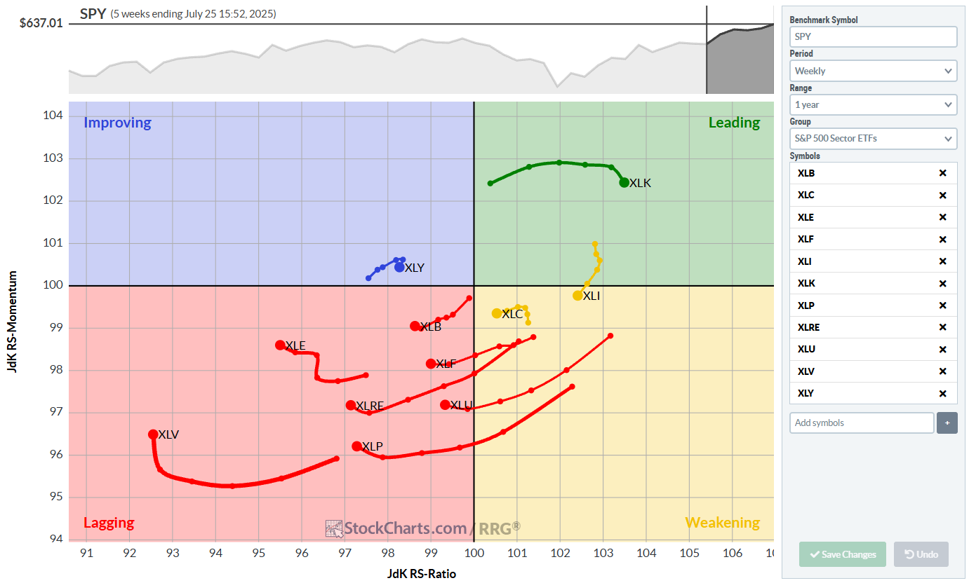
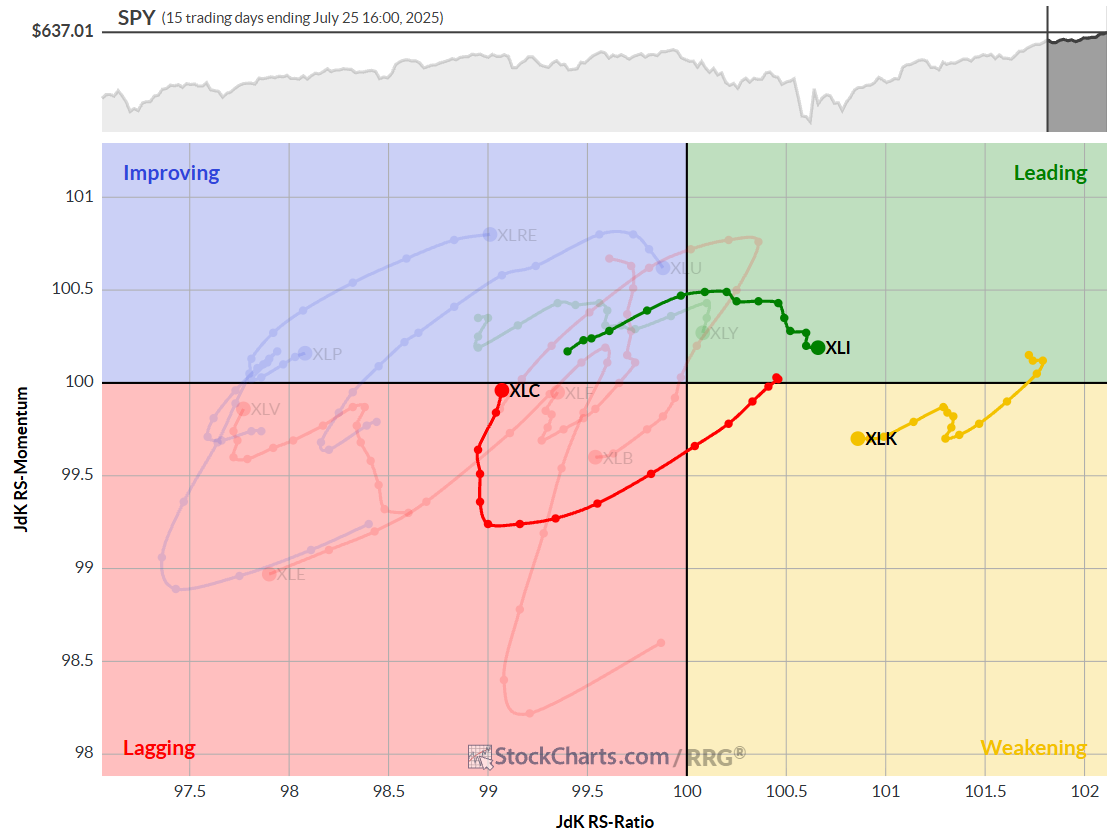
Probably the most-watched RRG is the one showing the 11 S&P sectors (ETFs) against SPY as the benchmark.
Why Sector Rotation Needs Structure
Sector rotation is a continuous process. Leadership changes all the time, and what’s hot this quarter might cool down the next. Some of that’s macro – think interest rates, inflation, or the business cycle – but some of it just comes down to investor sentiment and rotation flows.
A good sector rotation strategy involves anticipating shifts early and acting accordingly. (You can read more on Sector Rotation in combination with the Business Cycle in this article.) RRGs are a helpful tool for this type of analysis, as they provide a structured way to visualize where sectors are heading, not just where they’ve been.
RRGs in Practice
1. Pick a Universe and Benchmark
Most people compare the 11 SPDR sector ETFs — XLY, XLK, XLF, etc. — against the S&P 500 (SPY). That will give a good view of market leadership in US stocks.
2. Watch the Quadrants, But Focus on Rotation
It’s easy to fixate on where a sector sits right now, but the trajectory matters just as much. A sector moving from Improving into Leading with a strong RRG-heading, between 0-90 degrees? That’s usually a good sign.
RRG-Heading: A measurement of the heading/direction of the last segment of the tail by using degrees. To find it, center a virtual compass on the previous node and measure the degrees of the tail.
On the other hand, sectors transitioning from Leading to Weakening on a negative RRG-Heading, 180-270 degrees, are not in good shape.
I pay close attention to the length and curvature of the tails, as they help signal acceleration or deceleration in the relative move.
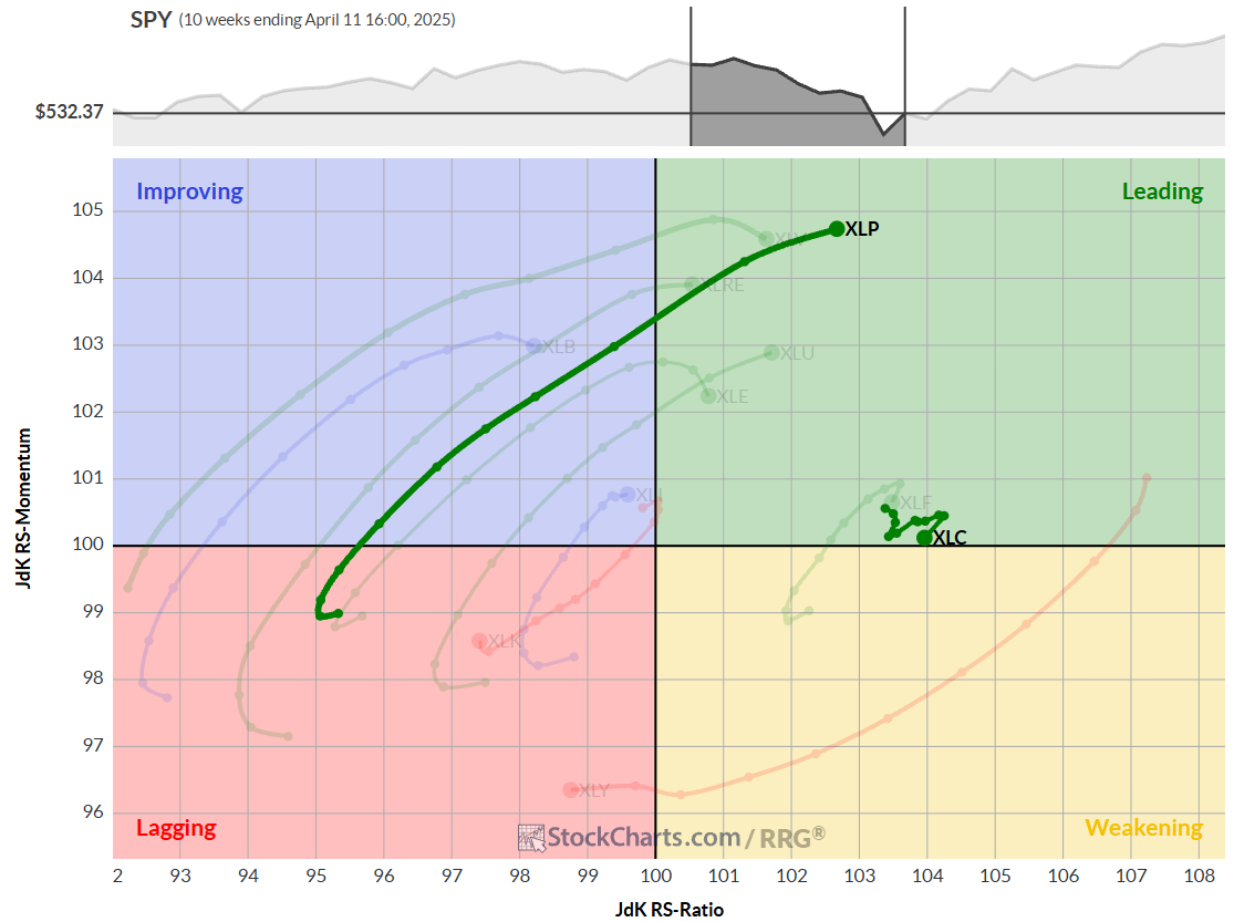
The RRG above is set to show tails of 10 weeks. Note the difference in length for XLP and XLC.
XLP is accelerating positively and powering into the leading quadrant, while XLC is almost static at a very short tail, indicating a stable relative uptrend.
3. Use Multiple Time Frames
For broader positioning, I rely on weekly RRGs. However, it is also important to monitor the daily RRG for more granular insights, just as you would use daily price charts alongside weekly ones.
Sometimes, a sector will appear to be weakening on a daily basis, while still leading on a weekly basis. That might just be a pause in the trend and not (yet) a full reversal. Combining time frames helps you avoid getting faked out by noise, while still catching early shifts.
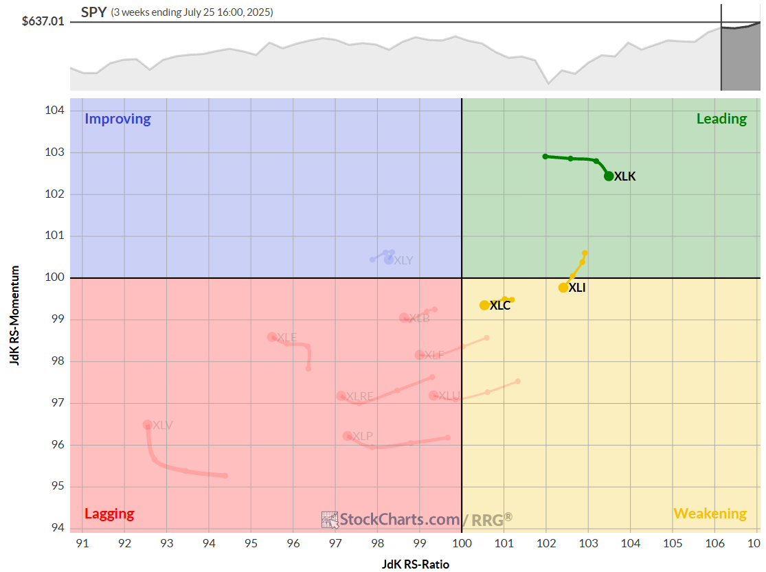
The top chart shows the weekly RRG with a 3-week tail. The bottom chart shows a daily RRG covering the same period on a daily RRG using a 15-period tail.
4. Overlay With Macro View
Sectors/stocks don’t live in a vacuum; macroeconomic events heavily influence market rotation. RRGs can be very helpful in identifying rotations among different asset classes and signaling more risk-on or risk-off driven stock markets.
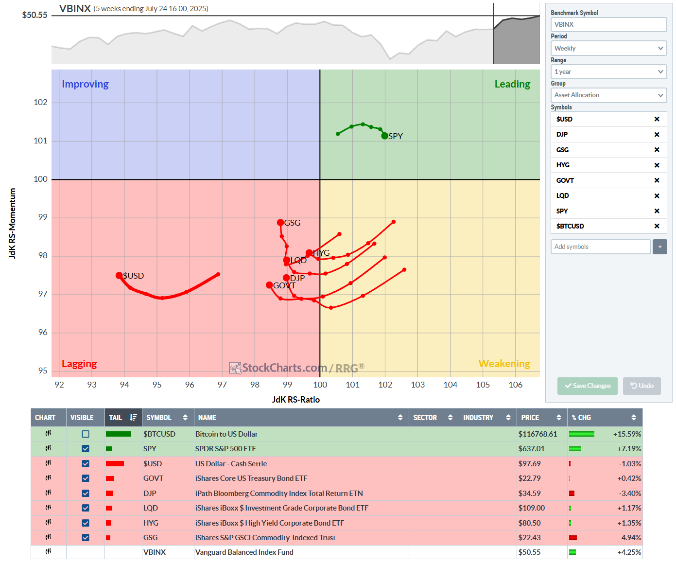
The RRG above shows the rotations for various asset classes against VBINX. This is a Vanguard balanced index fund (60% stocks, 40% bonds).
This will help investors to keep an eye on the bigger picture.
Summary
RRGs help to bring more clarity to relative performance analysis. In the context of sector rotation, they’re incredibly useful for staying ahead of shifts in leadership and avoiding the laggards.
If you’re managing a portfolio or want a more innovative way to time sector exposure, RRGs may become one of your best friends, providing a framework to make those calls with confidence. RRGs will help you listen to the markets and show you the BIG picture in ONE picture.
#StayAlert and have a great week. --Julius


