Why Daily vs. Weekly RRGs Matter in Portfolio Construction
Key Takeaways
- Weekly RRGs provide insight into longer-term rotations.
- Daily RRGs help active traders with a more detailed view.
- The interpretation of daily vs. weekly RRGs is similar to the interpretation of daily vs. weekly candlesticks.
One of the most frequently asked questions by investors exploring Relative Rotation Graphs (RRGs) is:
“Should I be using the daily or the weekly version?”
At first glance, the difference might seem like just a matter of chart resolution. But in practice, the choice between daily vs. weekly RRGs can significantly influence how you interpret market rotation—and how you manage your portfolio in response. This article breaks down the core distinctions and offers practical guidance on how to use both timeframes effectively in your portfolio strategy.
What Changes with the Timeframe?
Relative Rotation Graphs visualize trends in relative strength and the momentum of a group of securities, like sectors or industry groups, against a common benchmark, such as the S&P 500. What many users don’t immediately realize is that the time frame of the RRG, daily or weekly, has a significant impact on the rotational behavior of the chart.
- A weekly RRG is based on end-of-week data and displays rotations from week to week. It gives you a broader, smoother view of medium- to long-term relative trends.
- A daily RRG uses closing prices from each trading day and is thus more sensitive to recent developments and shorter-term rotations.
Think Candlestick Charts: A Useful Analogy
To understand the difference in practice, think of the relationship between daily and weekly candlestick charts.
- A weekly candlestick chart compresses five trading days into one weekly candle and is thus less susceptible to noise, showing the broader trend, which makes it great for longer-term investors.
- A daily candlestick chart provides more detail and shows more granular fluctuations, which are needed for more active traders.
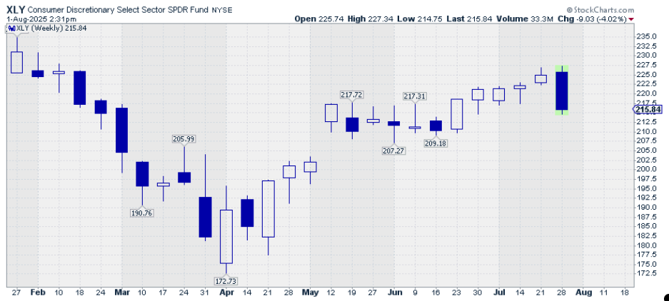
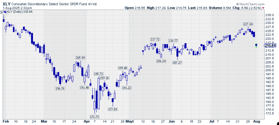
The first candlestick chart shows the weekly price action for XLY over six months. The second candlestick chart shows the same price action over the same period, but now using daily candles.
It’s the same idea with RRGs:
- The weekly RRG gives you the “big picture” rotation and helps identify major shifts in leadership across sectors or asset classes.
- The daily RRG captures the short-term dynamics that can signal emerging opportunities—or serve as early warnings.
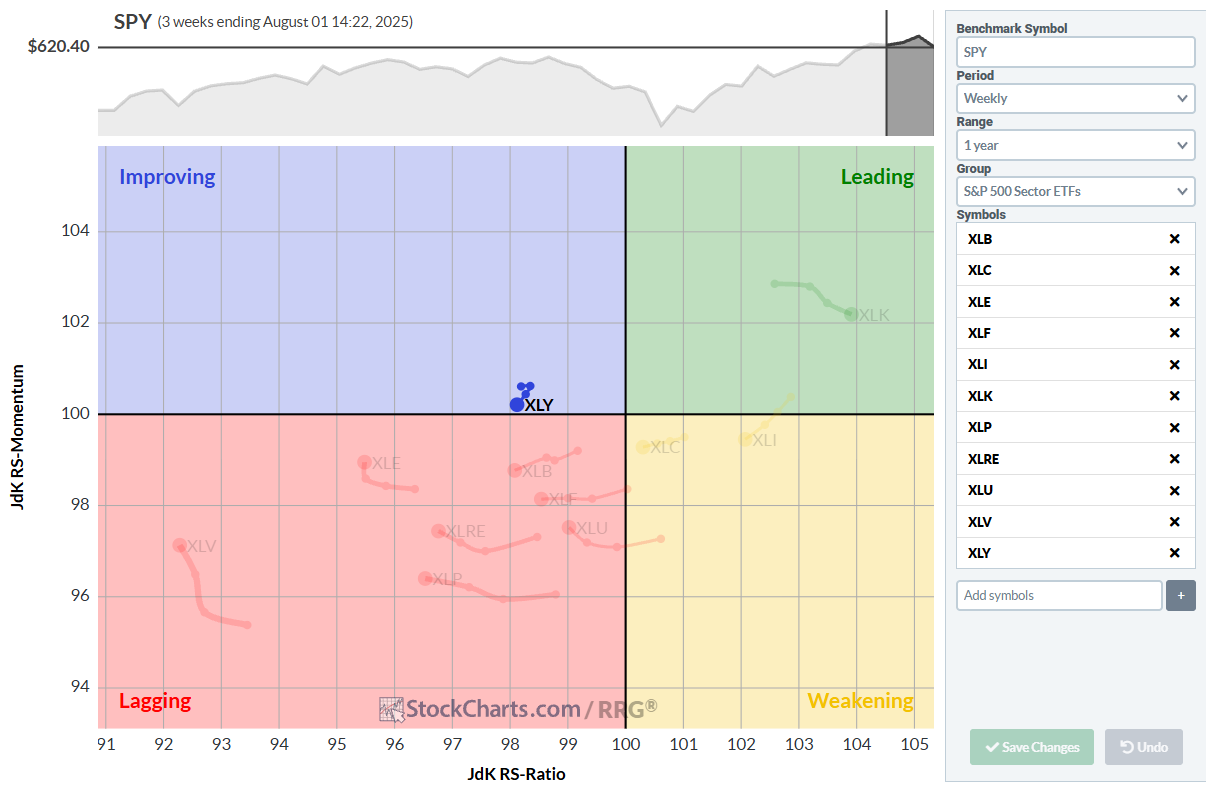
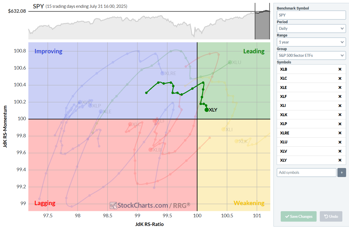
The first RRG shows the weekly rotation over three weeks, highlighting the tail of XLY. The second RRG shows the daily rotation over the same period, so 15 days. Again, highlighting the tail on XLY for comparison.
Just as a long-term investor wouldn't use a 5-minute chart to decide on a multi-month position, you shouldn’t rely on a daily RRG alone to drive long-term portfolio decisions.
Speed and Smoothing
A key visual difference between daily and weekly RRGs is the speed of rotation through the quadrants.
- On weekly RRGs, securities typically move through quadrants more gradually. It may take several weeks for a full rotation to occur.
- On daily RRGs, those same securities may shift from one quadrant to another much more rapidly, sometimes within just a few days.
This reflects real-world price dynamics. Daily RRGs are more reactive to short-term volatility, while weekly RRGs offer trend clarity.
Which One Should You Use?
The answer depends on your investment strategy and time horizon.
| Objective | Preferred Time Frame | Why? |
|---|---|---|
| Long-term investing | Weekly RRG | Filters out short-term noise |
| Tactical rebalancing | Daily RRG | Reacts quickly to rotation signals |
| Intermediate portfolio reviews | Both | Weekly sets the trend; daily refines entries |
Combining Daily and Weekly for Better Decision-Making
Many professional investors find that using both timeframes in tandem yields the best results:
- Start with the weekly RRG to identify the broader, strategic trends. Which sectors are emerging leaders? Which are falling out of favor?
- Then, zoom in to the daily RRG to fine-tune entries or exits. Are short-term momentum patterns supporting the weekly view?
This combination allows you to align your portfolio with durable trends while remaining agile enough to manage risk and take advantage of timely opportunities.
A Practical Use Case: Sector Rotation
Imagine you're running a sector rotation model, aiming to overweight the strongest sectors based on relative performance.
- The weekly RRG helps identify which sectors are moving from lagging to improving, or going right to leading.
- The daily RRG provides more granularity, revealing acceleration or loss of momentum that may not be visible on the weekly chart.
This approach helps investors gain more confidence in the direction of the relative move that is underway. This is useful for active portfolio managers or tactical asset allocators.
Summary
Relative Rotation Graphs are a powerful way to visualize how securities rotate through phases of relative strength and momentum. But the timeframe you choose fundamentally affects what you see and what decisions you make.
- Use weekly RRGs to guide long-term positioning.
- Use daily RRGs to monitor short-term developments and fine-tune execution.
- Use both to strike a balance between strategy and timing.
Just like switching between daily and weekly candlestick charts helps confirm trend strength, using both daily and weekly RRGs helps you to get a handle on relative trends.
Relative Rotation Graphs provide situational awareness in every timeframe.
#StayAlert and have a great weekend. --Julius


