Bitcoin is at a 2026 Crossroad
Bitcoin experienced an unprecedented bull market between 2014 and 2025, but has recently suffered some sharp losses. The big question, of course, is whether 2025 was the top or whether prices will continue to advance in 2026.
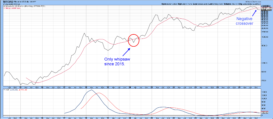
Chart 1 shows that Bitcoin has experienced three up waves since 2014. The termination of the first two was signaled by a negative 12-month MA crossover, while the third remained intact until the end of November, when it, too, succumbed to a decisive downside crossover of the MA. The 12-month span tests well over numerous markets and decades of history, but it’s certainly not perfect. In that respect, the chart shows that there has only been one whipsaw during the last 11 years, and it took place in 2020. Moreover, this signal was also supported by the long-term KST, which had already begun to reverse to the downside. A final takeaway is that the price traced out a series of higher highs in 2018, 2021, and 2025, yet the KST traced out a series of lower ones, reflecting a consistent dissipation of upside momentum.
This weakening technical condition is more apparent in Chart 2, which compares the price to a 78-week (18-month) ROC. An 18-month time span is used because it is roughly half of the 41-month (Kitchin) business cycle. There are also numerous examples of markets or commodities whose 18-month ROC peaked above a “bubble” qualifying level of 190%. Those thirty bubble peak prices were not surpassed for, on average, 15 years. I bring this up because Silver, the previous record holder, peaked at around 500% in 1980. That pales in comparison to the 2018 peak in the 78-week ROC at 2,400, or even the 2021 high of 750%. In the case of these Bitcoin readings, it only took a few years to regain those losses, far less than the 13-year average.
This demonstrates that Bitcoin came out of the gate with unprecedented momentum. Now things are different, as the latest 2025 high peak peaked at around 135%, following numerous negative divergences. In themselves, divergences merely point out a weakening underlying technical structure. However, when they are confirmed by price action, it means the price is now responsive to the deteriorating technicals. That’s where the red trendline dating from 2015 comes in, as it represents must-hold support. If it is violated, the divergences will be confirmed.
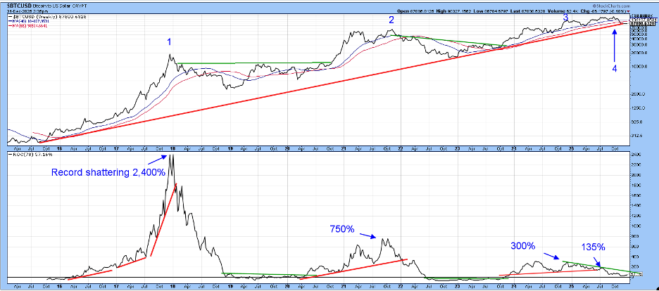
Chart 3 displays the same period with bar charts and a PPO with the 6 and 15-month parameters. The pink shading tells us that, when the PPO is below its EMA, Bitcoin is vulnerable. Unfortunately, this indicator is in a negative mode at present, therefore adding to the bearish case. However, we need to return to the question of confirmation, because the price is right at the up trendline and support indicated by the extended green breakout trendline.
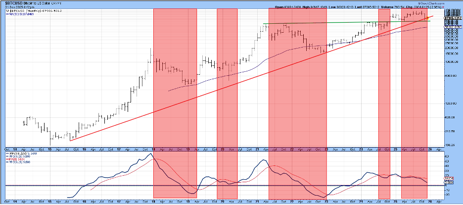
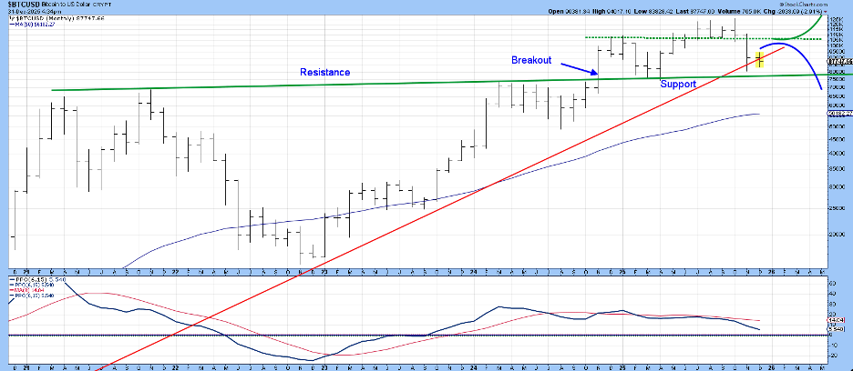
Chart 4 shows this situation in greater detail, where the significance of trendline support at just under $80,000 is more discernible. Working on the assumption that the price will not immediately extend its decline below the extended green line, I see two credible alternative road maps. The first is that the price follows the blue line by forming the right shoulder of a 2024-2025 head-and-shoulders top. Note there is substantial resistance at the dashed green line around $105,000. An alternative would follow the green one to new highs.
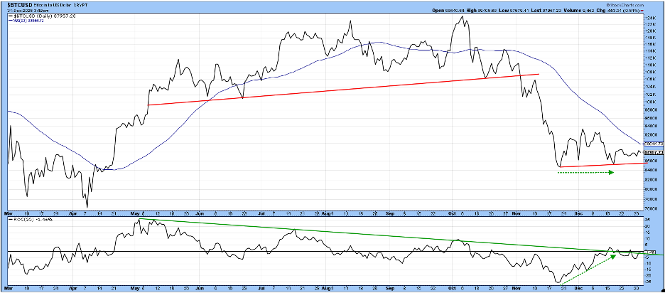
I am not ruling out an immediate decline, but Chart 5 offers a couple of reasons why that may not occur. First, the dashed green arrows indicate the November and December bottoms for the price developed at roughly the same level, while the 25-day ROC was much higher, indicating a dissipation of downside momentum. Indeed, we can take it one step further by observing that the ROC appears to be leading the price higher. That’s because the price is well below its early December peak, but the ROC is higher. Finally, it would not take much in the form of upside action to result in a violation of that 2025 ROC down trendline. Certainly, sentiment is in the right place to enable a rally. According to Copilot, the fear and greed Index for Alternative.me is at the “extreme fear” level, whereas a similar measure for Coin Base Fear is at the “fear” level.
The Bottom Line
Bear signals have already been given by the long-term KST, the 6/15 PPO, and the negative 12-month MA crossover. If decisive violations of the red trendline in Chart 2 and the extended green one in Charts 3 and 4 materialize, the primary bear case for Bitcoin will be proven beyond a reasonable doubt. In the meantime, we are at the crossroad!
Good luck and good charting,
Martin J. Pring
The views expressed in this article are those of the author and do not necessarily reflect the position or opinion of Pring Turner Capital Group of Walnut Creek or its affiliates.


