Change of Character: Why the S&P 500’s Uptrend May Be Breaking Down

I don’t remember when exactly I added a basic trend channel to my daily chart of the S&P 500, but it has turned into perhaps the most helpful visual representation of the consistent uptrend phase since the end of June.
As we’ve discussed recently on our daily market recap show, trend channels help us define the pace of the uptrend. When you apply a trend channel on a log scale chart, the consistent slope of the trendline basically translates to a persistent percentage change over that period of time. That can be very helpful for confirming that an uptrend remains in good shape. But as we’re finding this week, it can also provide a clear signal that a “change of character” is emerging on the chart.
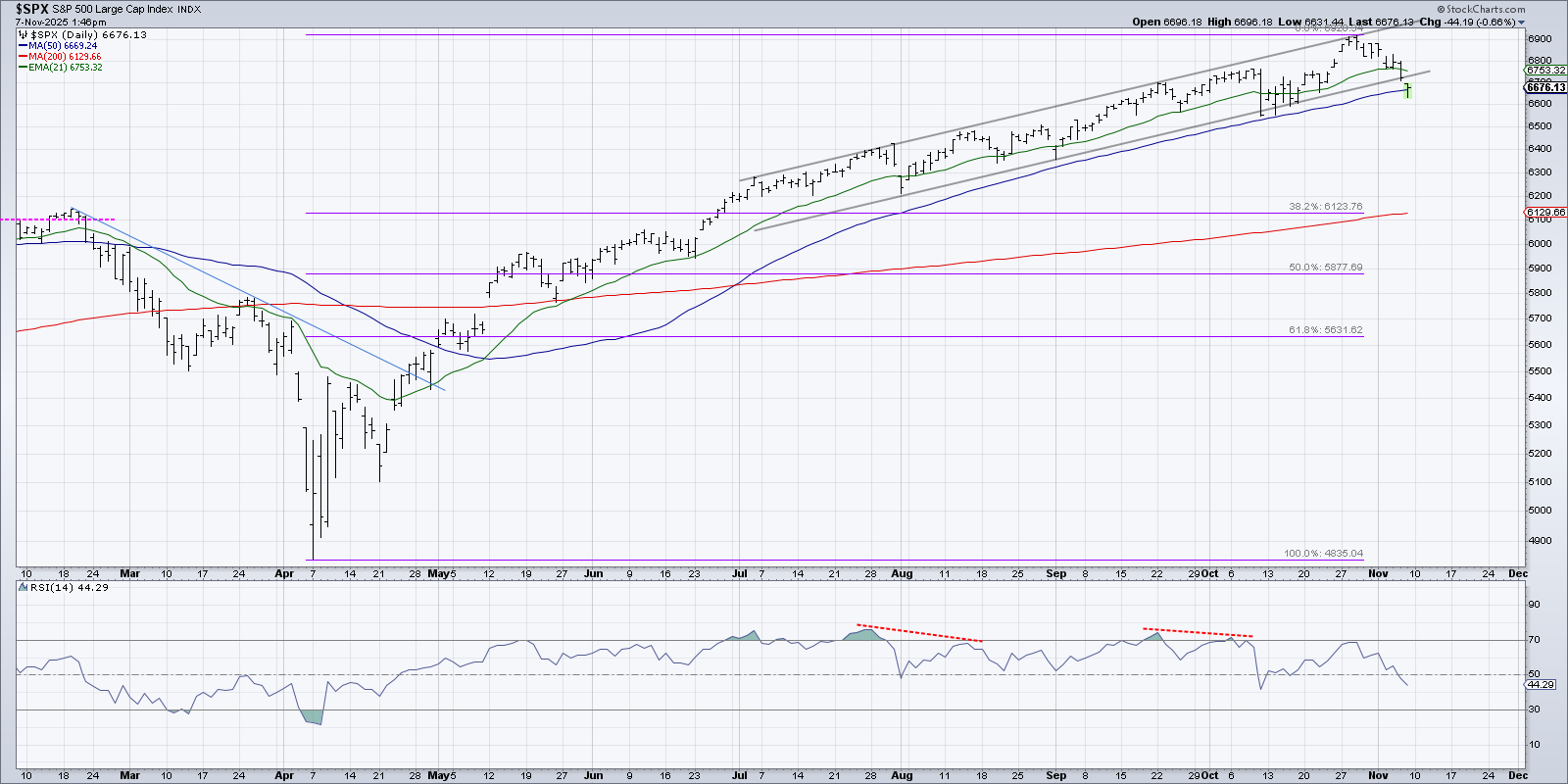
On the daily S&P 500 chart, we can see that after the initial impulse move higher after the April low, the pace of the advance slowed a bit in May and June. Starting in July, the uptrend settled into a steady advance that is best defined with two parallel trendlines tracking the swing highs and swing lows.
The key with drawing trendlines is to draw an initial line based on the first two major price points, and then see if the initial trend lines up with later turns. In this case, we can see that the peaks and valleys in recent months lined up quite well with those trendlines.
This week, the S&P 500 broke below its 21-day exponential moving average, which I often use as an initial trailing stop for charts in strong uptrend phases. Thursday saw the SPX finally break below the lower trend channel line, followed on Friday with a test of the 50-day moving average. Unless the 50-day moving average holds here, our Market Trend Model would most likely turn bearish as it did after the February 2025 market peak, and we would consider the market in a primary distribution phase.
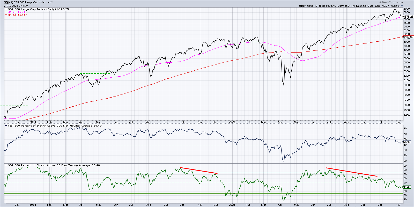
Breadth conditions have been deteriorating steadily since the beginning of that uptrend channel in early July. In the bottom panel, we’re looking at the percent of stocks above their 50-day moving average. This indicator registered a reading of 80% at the end of June, and now sits just below 40%. The percent of stocks above their 200-day moving average is barely holding on to about the crucial 50% level.
While anemic breadth conditions do not exude optimism for continued upside for the S&P 500, in the end, it’s all about price. If the right stocks are still going up, then there is always hope! So if we start to see real weakness in the leadership names from the bullish phase, namely technology stocks, then we could be in for a painful period.
Unfortunately, this week featured real weakness in technology, with stocks like NVIDIA (NVDA), Broadcom (AVGO), and Oracle (ORCL) all down over 9% for the week through Friday afternoon. As a trend-follower, I would say that the long-term trends in these AI-related plays are all still quite strong. But even if you’re bullish on the long-term prospects for AI, that does not mean you need to participate in a potentially painful drawdown!
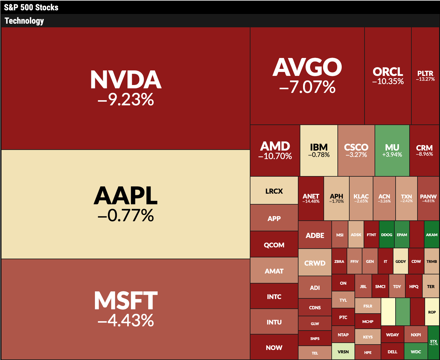
I use the MarketCarpet feature on StockCharts every day, not just to track what’s working and what’s not on a particular trading day, but also to assess longer-term performance trends and themes. This fantastic visualization tool made it quite easy to recognize big pullback days for growth sectors this week, and also to identify which sectors were actually showing strength despite the weakness in big tech.
So how can we track a potential leadership rotation from growth names to other sectors? I created this chart to show the relative performance of the VanEck Semiconductor ETF (SMH) versus the S&P 500 ETF (SPY).
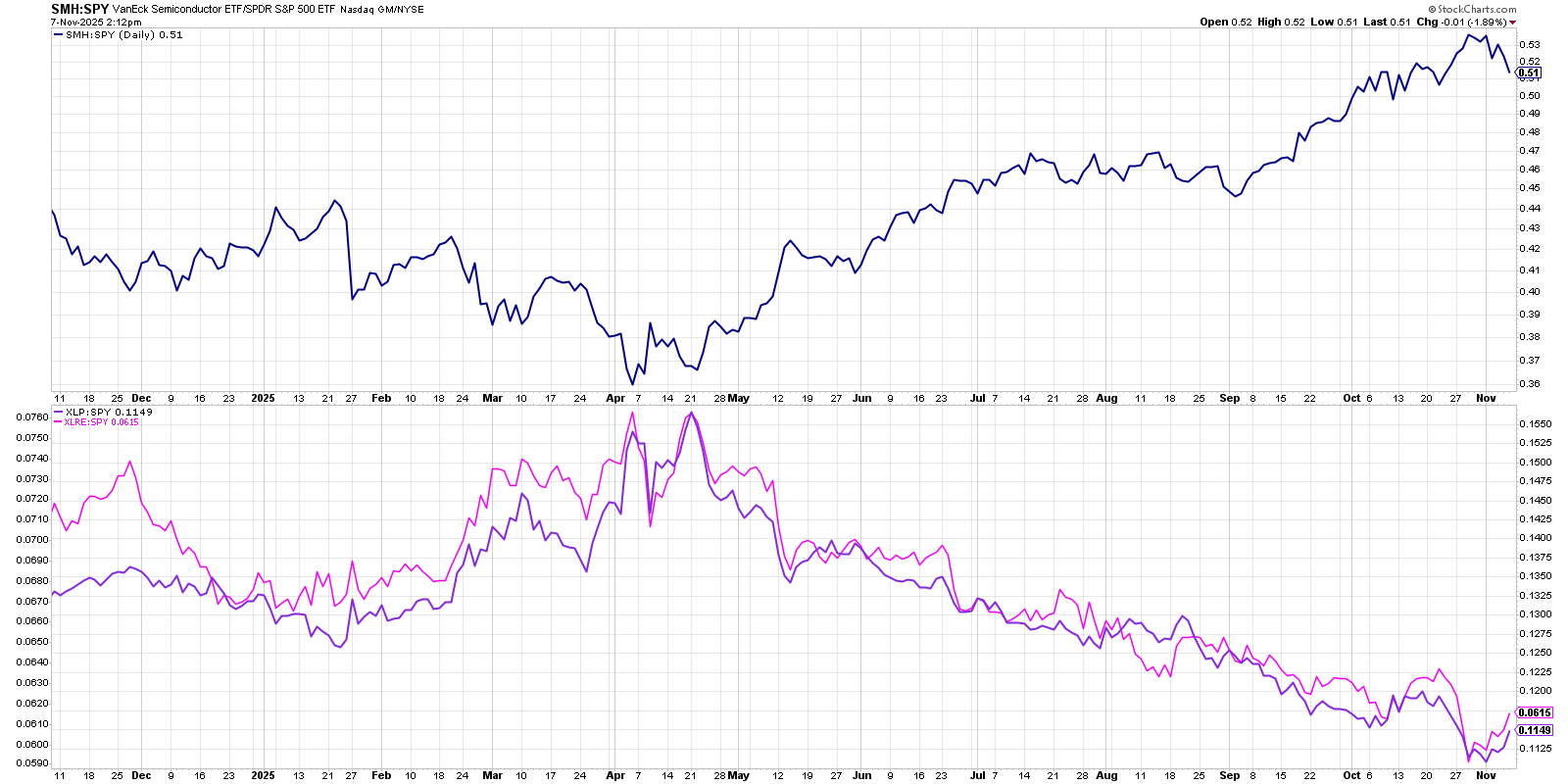
In the bottom panel, I’m tracking the relative performance of the Consumer Staples sector (XLP) and the Real Estate sector (XLRE) versus the S&P 500. If the market takes a bearish turn in November, then we should see these “alligator jaws” closing up very quickly. That would mean that the previous leadership, semiconductors, were starting to underperform the benchmark. An improvement in those two bottom ratios would show that investors are rotating to more defensive positions in lower volatility sectors.
Need help tracking these potential changes in the coming weeks? Check our daily market recap show, CHART THIS with Dave Keller, every trading day after the close!
RR#6,
Dave
P.S. Ready to upgrade your investment process? Check out my free behavioral investing course!
David Keller, CMT
President and Chief Strategist
Sierra Alpha Research
marketmisbehavior.com
Disclaimer: This blog is for educational purposes only and should not be construed as financial advice. The ideas and strategies should never be used without first assessing your own personal and financial situation, or without consulting a financial professional.
The author does not have a position in mentioned securities at the time of publication. Any opinions expressed herein are solely those of the author and do not in any way represent the views or opinions of any other person or entity.


