Comparing Growth vs. Value on RRGs Across Time
When considering sector rotation, factor investing often arises in the conversation. Growth and Value are two of the most widely used investment styles, and their relative performance tends to move in cycles that can last months or even years. For investors seeking to gain a deeper understanding of how these two styles behave in varying market environments, Relative Rotation Graphs (RRGs) provide a powerful means of visualizing the dynamics between Growth and Value over time.
Growth vs. Value in Context
At the most basic level, Growth stocks are those companies expected to expand earnings at an above-average pace. Technology and consumer discretionary names often dominate Growth baskets. Value stocks, on the other hand, are priced more conservatively relative to fundamentals like earnings or book value. Financials, energy, and industrials frequently make up a significant portion of Value indices.
These two styles don’t just represent different ways of selecting stocks—they also represent different attitudes toward risk and return. Growth tends to thrive when investors are optimistic, liquidity is plentiful, and interest rates are low. Value generally performs better when markets are less forgiving and investors prefer stability and cash flow. The tug-of-war between the two is a fascinating story, and RRGs give us the perfect tool to follow it.
Using RRGs to Track Growth vs. Value
Relative Rotation Graphs enable us to plot the relative strength of Growth versus Value against a benchmark, such as the S&P 500. Good examples of Growth and Value indices or ETFs are:
- $DJUSGR and $DJUSVA ($DJUS benchmark)
- SPYG and SPYV (SPY benchmark)
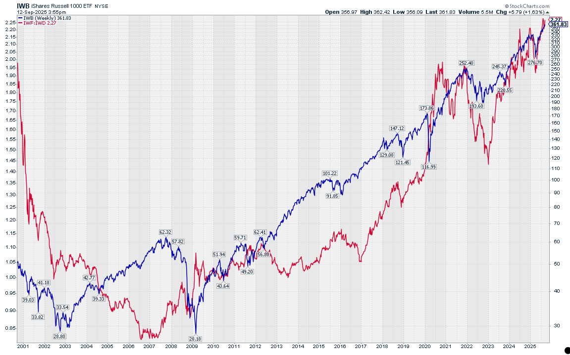
- IWD and IWF (IWB benchmark)
By plotting these combinations on an RRG, we can directly observe how the market is positioning itself between these two investment styles.
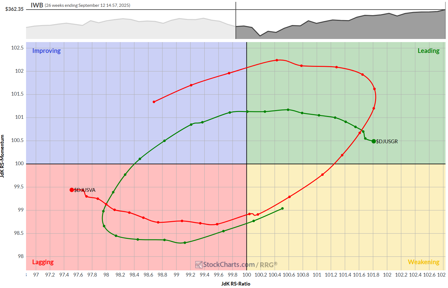
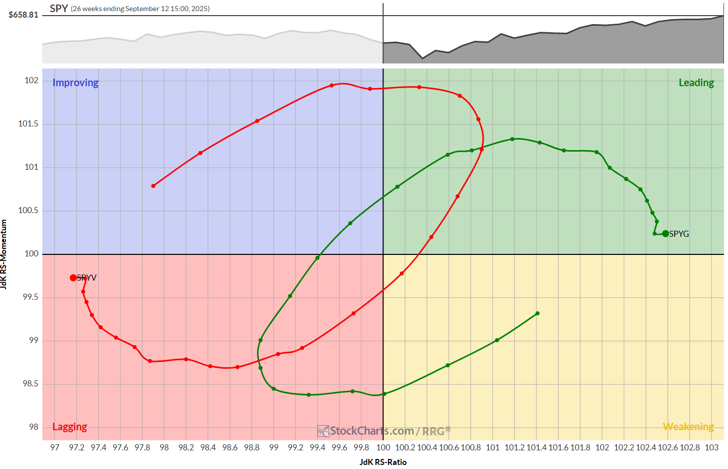
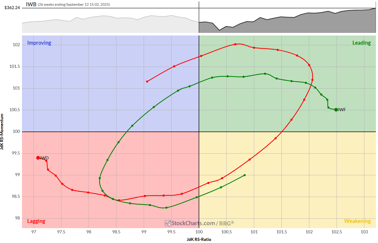
As you can see, they all look alike – not surprisingly, of course. You can pick any set of symbols, but my advice would be to remain within the same index "family" to maintain consistency.
This RRG setup typically shows Growth and Value on opposite sides of the plot, with one leading and the other lagging. This makes sense: when Growth is gaining relative strength versus the S&P 500, Value usually lags, and vice versa. Watching the rotation of these two tails helps us identify turning points in style leadership.
Short-Term vs. Long-Term Views
One of the great advantages of RRGs is the ability to change the timeframe. By switching between daily and weekly rotations, we can distinguish between short-term swings and longer-term trends.
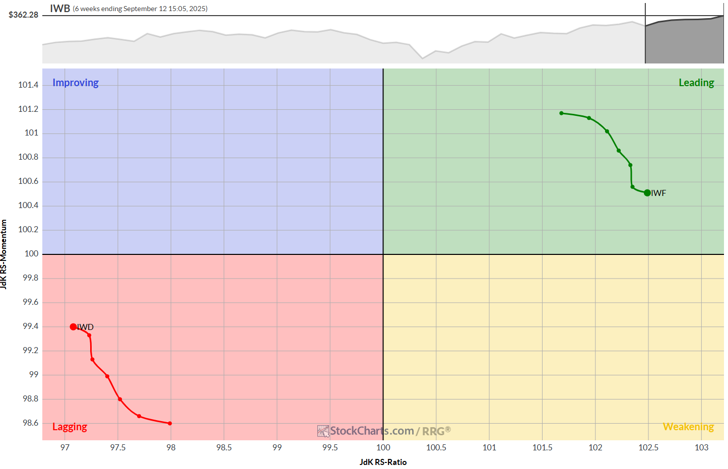
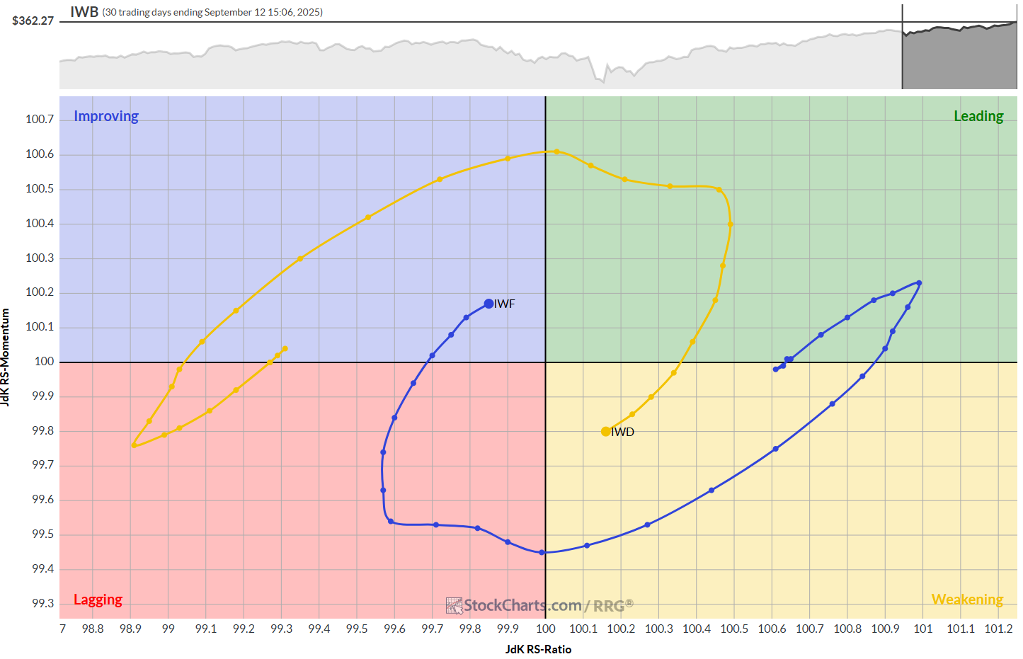
The top RRG chart shows IWF vs. IWD on the weekly time frame over a 6-week period. The bottom RRG shows the same combination on a daily timeframe over the past 30 days. This means both graphs/tails cover the same amount of time.
The granularity of the daily RRG allows you to see how the loss of relative momentum inside the leading quadrant for IWF on the weekly RRG converts into a big rotation through weakening and lagging on the daily timeframe. This kind of information can be invaluable for traders who need to balance tactical timing with strategic positioning.
Cyclical Leadership
History shows that Growth and Value leadership tends to shift in multi-year waves. During the 2010s, ultra-low interest rates and massive innovation in technology pushed Growth to dominate. Since the pandemic, though, Value has staged comebacks, especially during inflationary periods and rate-hike cycles.
RRGs allow us to observe these transitions not just as static performance differences but as dynamic rotations. A move of Growth from Weakening back into Leading often signals the start of a new up-leg in the Growth cycle. Conversely, when Value emerges from Improving into Leading, it’s usually a sign that market leadership is broadening and defensive sectors are regaining strength.
Practical Applications
So how do investors use this information?
- Portfolio Positioning: A growth-oriented investor can monitor RRG rotations to decide when to scale back exposure and shift toward more Value-oriented holdings, or vice versa.
- Sector Allocation: Because Growth and Value ETFs are composites of different sectors, the RRG gives you a top-down read on sector rotation. If Growth is rotating into Lagging, it often coincides with weakness in Technology or Consumer Discretionary.
- Risk Management: RRGs help frame risk appetite in the market. When Growth leads, investors are usually taking on more risk. When Value rotates to the Leading quadrant, risk appetite is waning, and capital preservation is back in focus.
Wrapping Up
Comparing Growth vs. Value on RRGs offers a simple yet powerful way to visualize one of the most important dynamics in equity investing. Instead of just looking at performance charts or ratios, RRGs show us the rotational character of these styles. They help us anticipate turning points, align time horizons, and better understand what the market is really telling us about risk appetite.
In an environment where leadership can shift quickly, having a tool that visualizes these rotations across timeframes is invaluable. Whether you’re managing a diversified portfolio or just curious about the market’s internal rhythms, Growth vs. Value on RRGs is a story worth following closely.
#StayAlert and have a great weekend. -Julius


