Confidence Ratios are Breaking Out in One Direction
Sometimes we get a warning from subtle changes in the relationship between sectors, or between a specific sector and a different asset class. It’s no different than a divergence between an advance/decline line failing to confirm a new high in a stock index.
Chart 1, for instance, shows that the NYSE A/D and Common stock A/D Lines failed to keep up with the S&P Composite at the turn of the year. The result was a nasty decline into the spring.
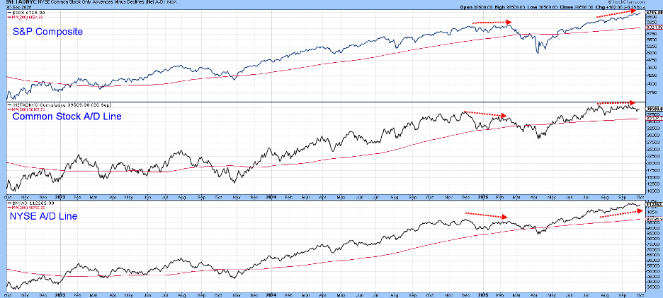
At present, the NYSE A/D Line is more or less in gear with the index, but the Common Stock version has been moving sideways for a couple of months in the face of a rising $SPX. That’s a worry, but not the kind of serious discrepancy we saw earlier in the year. The good news is that most of the confidence relationships I follow are acting well. Some look poised to trigger an important buy signal, whilst others have already done so.
Global Confidence is Breaking Out
The center window of Chart 2 compares the Dow Jones World Stock Index to a ratio between international junk bonds and treasuries (_HYXU/_BWX). When this relationship is rising, it means global confidence is rising because investors prefer to purchase risky junk bonds with a high current return, rather than the lower-yielding and much safer treasuries contained in the BWX portfolio.
The green-shaded areas tell us when the long-term KST in the bottom window is above its 26-week Exponential Moving Average (EMA). Generally speaking, that’s bullish for the DJ World Index. The white areas indicate that if there is going to be trouble for global equities, it's likely to come when the KST is below its EMA. This indicator has been negative since the turn of the year, but now looks ready to trigger a buy signal. That seems likely since the ratio has just cleared its 2018–2025 resistance trendline. In any event, both the ratio and the $DJW are in gear on the upside.

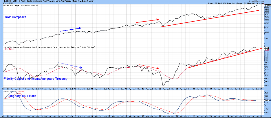
Chart 3 contains a similar type of relationship, but for the US. In this instance, the center window features the ratio between the Fidelity Capital and Income and Vanguard Treasury funds. A rising indicator is again indicative of improving confidence and its positive spillover effect on equity prices. That’s because the Fidelity fund contains a substantial portion of risky, high-yielding bonds in its portfolio, whereas the Vanguard fund is devoted to more conservative treasuries.
The red arrows show that a negative divergence developed before the early 2020 decline. The blue ones also identify a divergence, but also show that not all divergences “work.” Right now, both series are in gear. That does not guarantee a decline-free future, but I’d much rather have an in-gear situation than not. Note also that the long-term KST is poised to trigger a buy signal.
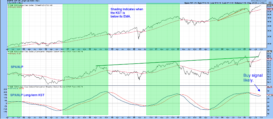
Another useful confidence relationship compares the performance of the S&P itself to a defensive market sector, Consumer Staples. The result is a rising ratio that signals a preference for the “speculative” S&P over the higher-yielding, more defensive Consumer Staples. Once again, the green shadings reflect a bullish KST. At the moment, it is poised to trigger a buy signal, which seems likely to happen as the ratio itself has only recently broken above a seven-year resistance trendline.
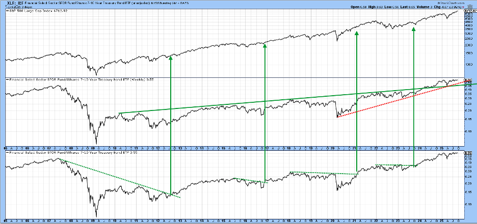
The ratio featured in Chart 5 is that between Financials and 7-10 year bonds (_XLF/_IEF). Over the passage of time, it usually moves in the same direction as the S&P Composite. Occasionally, though, it’s possible to construct a (dashed) resistance trendline. The arrows show that when the lines are surpassed, the $SPX usually celebrates with a rally. Last year, the ratio, signaling a boost in confidence, broke above the 2010–2024 solid resistance line in the center window. If this turns out to be invalid, we would get ample warning from the rupture of the red dashed 2020–2025 support trendline.
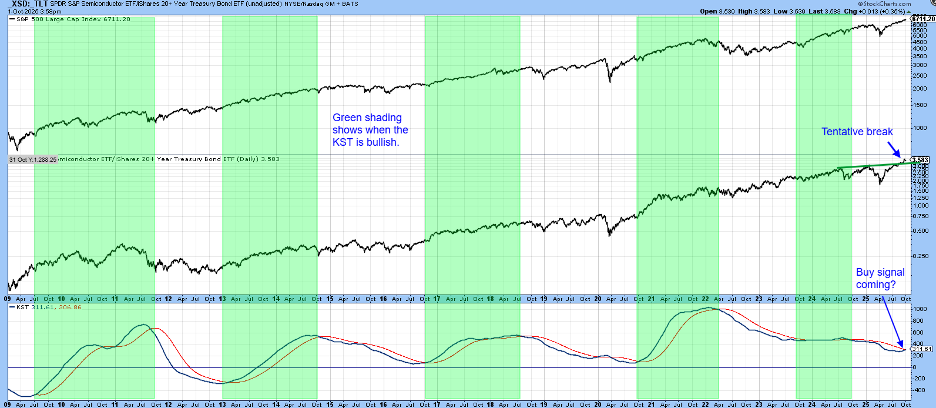
Finally, Chart 6 shows that the Semiconductor/Bond ratio (_SMH/_TLT) has broken above its 2024–2025 resistance trendline, which could well be enough to trigger a more decisive KST buy signal. The green shadings again indicate bullish KSTs are usually positive for the S&P as well.
Good luck and good charting,
Martin J. Pring
The views expressed in this article are those of the author and do not necessarily reflect the position or opinion of Pring Turner Capital Group of Walnut Creek or its affiliates.


