The Dollar Yo-Yo: What a Weak USD and Currency Wars Mean for Investors
Key Takeaways
- President Trump suggested he was comfortable with a falling greenback.
- The remarks sparked “debasement trade” chatter, all while the S&P 500 and global stock markets hit record highs.
- Dusting off the early-mid-2000s playbook reveals that alpha opportunities can be many when the USD sinks.
Now more than ever, it’s easy to get swept up in a macro narrative. Calls for the dollar’s dramatic demise, predictions of political turmoil, and equity valuation chickens finally coming home to roost steer investors in the wrong direction.
Price action is almost always the better guide. It’s objective, timely, and free from sensationalism.
To be clear, it’s not a Pollyanna view. Corrections and bear markets can and will happen, and they’re often caused by the factors that dominate today’s headlines. But sitting on the sidelines in cash waiting for a collapse is simply no way to invest for the long haul.
Follow the Dollar, Not the Narrative
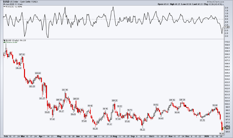
This past Tuesday’s all-time highs in both the S&P 500 and the global ex-US market occurred alongside the U.S. Dollar Index’s (USD) worst slide since mid-April 2025, shortly after so-called “Liberation Day.” The greenback’s giveback echoed that tariff-induced selloff, too.
On Tuesday afternoon, President Trump told reporters that he thought the dollar was doing “great” and was comfortable with its current level. Reading between the lines, the administration wouldn’t mind a weak currency over the next three years.
A weak dollar, of course, boosts exports (which narrows the deficit) and effectively devalues the nation’s now $38.7 trillion debt burden. More immediately for investors, a softer domestic currency works to lift earnings for multinational corporations that translate overseas revenue and profits.
The downside is that prices on Main Street could turn even more unaffordable due to higher import costs and other inflationary pressures that commonly come with a sinking USD. Tourism might also stay within our borders, as ex-US purchasing power dwindles with a falling buck.
Sector Leadership: Same Playbook, New Cycle
For traders, dusting off your mid-2000s playbook might be the right approach. Back then, we didn’t call it the “debasement trade,” but price action was not a whole lot different. Using StockCharts’ S&P 500 Sector ETF PerfCharts, with the S&P 500 ETF (SPY) as the baseline, we see that the Energy (XLE) and Materials (XLB) sectors were strongest from late 2001 through the USD’s March 2008 low of 70.70 (right when Bear Stearns was acquired by JPMorgan Chase (JPM)).
Also note that only Financials (XLF) lagged the S&P 500 over the selected timeframe (hence, a sagging dollar meant a broad rally).
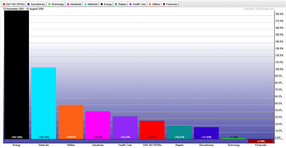
Market history note: The Communications and Real Estate S&P 500 sectors did not exist 20-plus years ago, so they were removed from the above PerfChart.
So far this year, XLE and XLB are best, both up more than 8% after the dollar’s recent drubbing. Resource-rich areas are catching investors’ attention, namely glimmering gold and silver’s sterling rally. Oil, however, remains stuck near $60 (though I detailed a potential breakout that still appears underway).
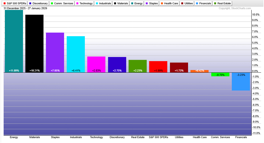
The lone sector laggard from late 2001 to the middle of 2008? Financials (XLF). Worst of the 11 funds in 2026? Financials. The big banks have come under pressure from apparent midterm election-year policies, such as the proposed 10% cap on credit card interest rates. And reactions to Q4 earnings were downright dreadful.
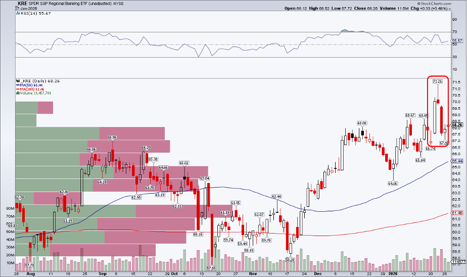
A Bearish Signal From Regional Banks
What’s more, the now highly-likely government shutdown set to commence at the turn of the month would effectively close the IPO window and limit other capital markets activities — big profit centers for Wall Street firms. As for smaller regional banks, I remain concerned about a near-term bearish candlestick feature on the SPDR S&P Regional Banking ETF (KRE). A shooting star reversal pattern played out at the end of last week.
Global Leadership Broadens
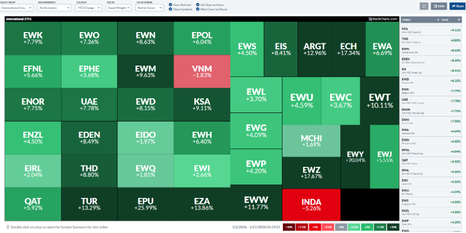
Naturally, foreign stocks have caught a major bid as the dollar has retreated. Among the 41 ETFs we track on the StockCharts International Country ETFs MarketCarpet, just two are in the red YTD: India (INDA) and Vietnam (VNM). The median non-U.S. country ETF sports a 7% total return through just 17 trading days in 2026.
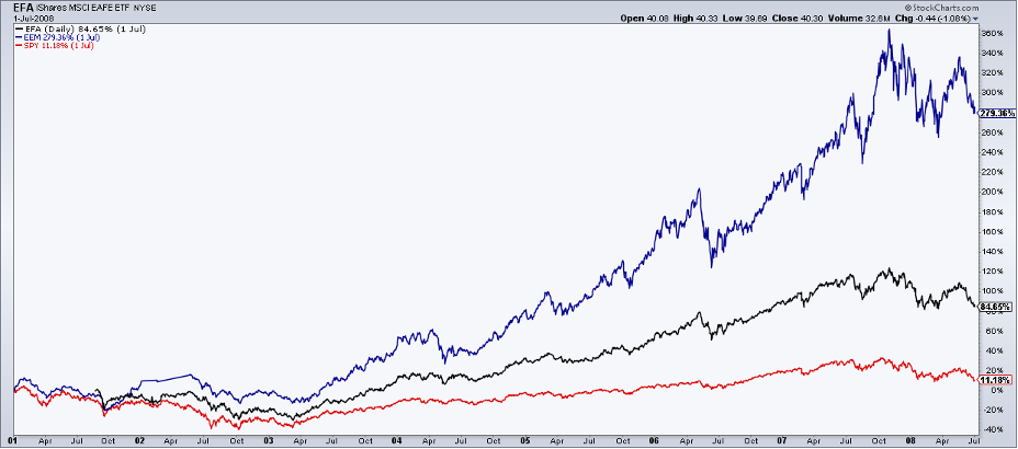
Back to the early-mid-2000s playbook, spreading risk geographically was one of the easiest and most reliable ways to generate alpha. From 2001 through the first half of 2008, the iShares MSCI EAFE ETF (EFA) returned 85% compared to SPY’s paltry 11% gain (dividends included). The iShares MSCI Emerging Markets ETF (EEM) soared 279%.
The same tune this go-round: EFA +6.3%, EEM +5.7%, SPY +2.4% (YTD through Wednesday’s premarket).
So is it a “sell America” trade? It’s hard to make that case. More like “buy everything.” Sure, crypto and foreign bonds are in the bears’ grip, but global equities are at records (with the best ex-U.S. breadth this cycle), Treasuries are hanging in there, and commodities appear poised to test their 2022 highs, all amid handwringing over the dollar.
I like to say that the only thing worse than a weak dollar is a strong dollar, and history shows that spreading your bets often works well when other currencies curry favor.
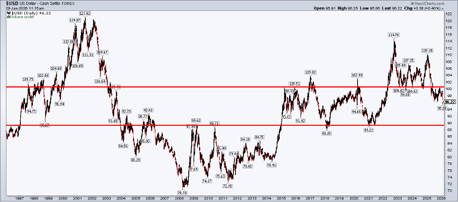
Keep in mind that the dollar could go much lower. It would be absolutely normal for the USD to test the 90 level, a spot tagged several times in the last 30 years.
The Bottom Line
The “debasement trade” and “sell America” narratives stir emotions among those relying heavily on news headlines and geopolitical macro takes. But historical performance trends and current price action point to wealth-generating opportunities. Trade the market hand we are dealt.
Disclaimer: This blog is for educational purposes only and should not be construed as financial advice. The ideas and strategies should never be used without first assessing your own personal and financial situation, or without consulting a financial professional.


