Fed Chair Says, “It’s Cloudy”; These Benchmarks Could Blow the Clouds Away
Disagreements at the Fed are unusual, but we certainly got one last week, with one governor looking for a 50 basis point cut and another not wanting to lower rates at all. This indecisiveness is not limited to the Fed, but also extends to the markets. Before we take a look at recent price action, though, it’s best to step back and look at things in perspective.
Chart 1 features the 10-Year US Treasury Yield ($TNX) since the mid-1960s. The thick arrows identify the three secular or very long-term trends that have taken place since then.
There are three pieces of evidence suggesting the secular trend reversed in 2020.
- The violation of the dashed secular down trendline.
- The record overbought reading in the 52-week Rate of Change (ROC) coming off that low.
- The positive crossover of the 96-month MA, shown in Chart 2.
It’s important to understand that the direction of the secular trend determines the characteristics of the primary ones that fall under it. If I am right, and the secular trend reversed in 2020, it means (pro trend) primary bull markets for yields will generally experience greater magnitude and duration than (contra trend) primary bear markets. This characteristic is portrayed by the pro trend dashed green arrows before 1981 and the pro trend bearish red ones between 1981 and 2025.
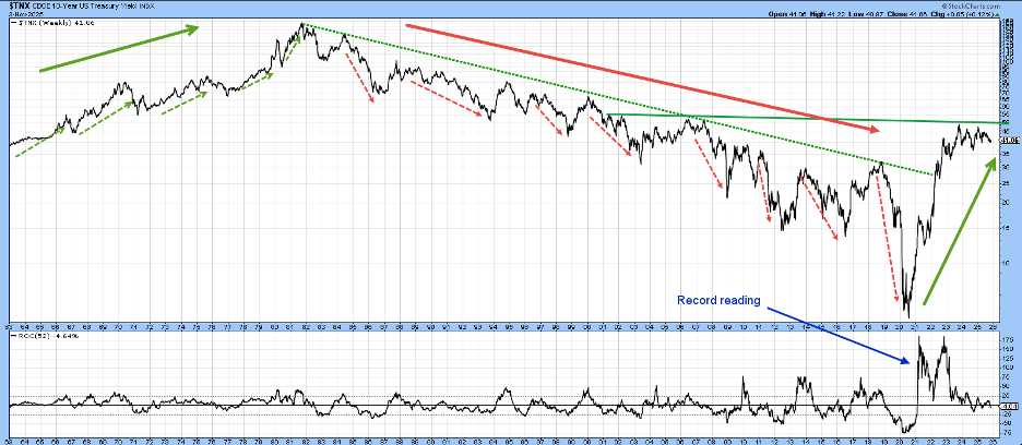
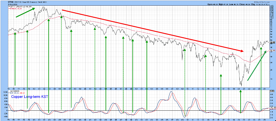
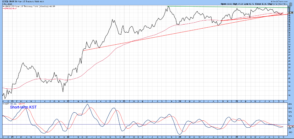
Chart 2 reflects a similar period for the 30-Year US Treasury Yield Index ($TYX). It also features a 96-month (eight-year) exponential moving average (EMA), crossovers of which have accurately identified secular trend reversals for other series back to the middle of the 19th century.
The chart also displays a long-term Know Sure Thing (KST) of the copper price. Copper is helpful because it is widely used in many industries and is a proxy for industrial commodity prices in general. The solid green arrows isolate KST buy signals, which have helped call primary trend rallies for the yield. The dashed arrows remind us that no indicator is perfect by highlighting failed signals. The KST went positive in 2024 and began to flatten out earlier this year, thereby hinting at a sell signal. However, it has recently begun to accelerate again, which suggests higher rates.
The 2-Year US Treasury Yield ($UST2Y)
The 2-year yield is worth monitoring because it often leads the Federal Funds rate. The 2-year yield is featured in Chart 3, along with a Percentage Price Oscillator (PPO) incorporating the 6- and 15-month parameters. The green shading tells us when the oscillator is above zero. Such periods have captured most of the yield rallies. The unshaded ones have captured most of the declines. Now the yield is trading under its 12-month MA and the oscillator is below zero. That places it in a negative mode, but it is also apparent that it would not take much in the form of upside activity for either component to go bullish.
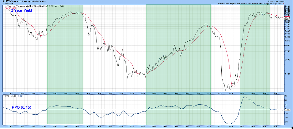
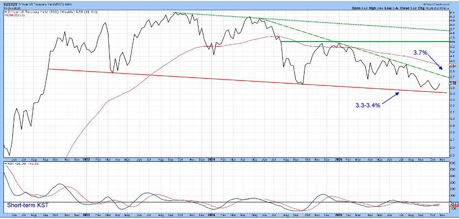
Chart 4 focuses on price action starting in 2022, where a potential top appears to be forming. A drop below the red support trendline at around 3.3% would complete the top and signal lower money market yields. On the other hand, a Friday close north of 3.7% would violate the dashed down trendline and indicate a test of the upper two green trendlines. That seems likely as the short-term KST is in a good position to support a rally since it has only recently gone bullish.
The 30-Year Yield
Chart 5 features a similar arrangement for the 30-year yield. In this instance, though, the PPO is bullish. Another key difference with the 2-year series is that the lower boundary of the 2022–2025 trading range is identified by a rising trendline, whereas the equivalent line for the 2-year series is declining. This underscores the point that market forces are in disagreement with the Fed, which is trying to lower rates.
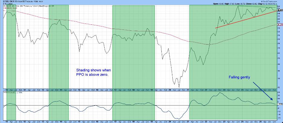
Chart 6 features more recent price action. It is apparent that the yield has reached a crucial level, right at its red support line and 65-week EMA. The short-term KST has just started to turn up, which suggests a bounce from current levels and a test of the green resistance line.
Final Thoughts
There is a clear disagreement between the heavily Fed-influenced short end of the curve and market-dominated longer-dated maturities. Both are rangebound, with the former slanting to the downside and the latter in an upward direction. Even though the secular trend argues for an upside resolution, we need to let Mr. Market decide.
Good luck and good charting,
Martin J. Pring
The views expressed in this article are those of the author and do not necessarily reflect the position or opinion of Pring Turner Capital Group of Walnut Creek or its affiliates.


