How to Use the Market Summary Page to Spot Global Breakouts
After four straight down days in the S&P 500 ($SPX), Friday’s bounce was a welcome relief. And hey … there’s still a chance Santa Claus makes it to Wall St.
The S&P 500 closed at 6,858.47. If we’re going to get a Santa Claus rally, we’ll want to see it close above 6909.79.
🧑🎄Waiting on the “January Trifecta.”
Even if Santa doesn’t show up, two other well-known seasonal patterns are still on the table — the First Five Days (FFD) and the January Barometer. But seasonal tendencies are useful guides. The market doesn’t follow a script.
So, whether the January Trifecta plays out or not, you still need to monitor the price action, stay flexible, and trade what you see, not what you hope.
What the Market Summary is Showing
A quick look at the Market Summary page suggests the market is holding its ground. All the major U.S. indexes are trading above their 200-day Simple Moving Average (SMA).
Here’s where things get interesting.
If you view the Global Snapshot tab and sort by the 200-day SMA column, you’ll notice that the U.S. is near the bottom of the list. Meanwhile, Latin America and Asia (excluding Japan) are holding the top spots. And when you shift to the Country Funds tab, and sort by the same 200-day SMA column, South Korea and Peru rise to the top.
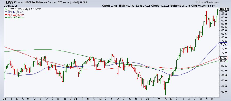
Click on South Korea, and you’ll pull up the iShares MSCI South Korea Capped ETF (EWY) chart, which is trading at an all-time high (see below). On the unadjusted weekly chart of EWY, you can see the ETF has been climbing aggressively since mid-2025.
This is a great reminder of the classic advice: “Don’t put all your eggs in one basket.”
Quick question: How diversified is your portfolio? It might be worth taking a few minutes this weekend to review your holdings and make sure your exposure isn’t too concentrated.
Take a tour through the Country Funds charts available in the Market Summary page.
Here’s an easy way to do it:
- Click the Charts button (far right of the Equities panel)
- Select Country Funds.
- Scroll through the ChartList.
- When one grabs your attention, click and dive in.
If you have set up your StyleButtons, this becomes even faster. Just click through your short- and long-term view to quickly spot trends, key levels, and potential opportunities.
Save Time with StyleButtons + ChartStyles
If you haven’t set them up yet, StyleButtons and ChartStyles can be a huge time saver, especially when you’re flipping through several charts.
Learn how to set them up. You will also find this video helpful.
Next Week: Back to “Normal” (Sort of)
Markets should return to a more typical rhythm next week. We’re getting a solid lineup of economic data, including the ISM Manufacturing PMI, 30-Year Mortgage Rates, ISM Services PMI, JOLTS Report, and the December Non-Farm Payrolls.
So if you’re planning to hit the ground running, now’s a good time to get your charts in order.
Before You Jump In… One More Quick Tool Upgrade
If you haven’t seen it yet, check out this video on our new SharpCharts Drawer.
Now you can view your charts and tools without endlessly scrolling through the full tool list. This makes your charting experience smoother, faster, and more efficient.
So rest up this weekend, and be ready for the market to get back to business next week.
We wish you a wonderful 2026.


