Is the Market’s Pullback a Warning Sign? Here’s What the Charts Reveal
Key Takeaways
- The S&P 500, Nasdaq, and Dow are testing their 21-day EMAs
- Rising yields and a stronger dollar could pressure stocks
- Friday's PCE inflation report will likely set the tone for stocks, bonds, and precious metals
After last week’s 25-basis-point rate cut, investors are now digesting the latest comments from the Federal Reserve. Fed Chair Jerome Powell recently mentioned that stock prices are “overvalued” and that any future rate cuts would be approached with extra caution. Other Fed speakers offered mixed opinions in their statements, which only added to the market’s uncertainty.
And if that wasn't enough, there’s also the possibility of a government shutdown. If this happens, we could see delays in economic data releases, which could stir up stock market volatility.
The S&P 500 Pullback
The daily chart of the S&P 500 ($SPX) below shows that on Thursday, the index dipped down to its 21-day Exponential Moving Average (EMA) before bouncing back.
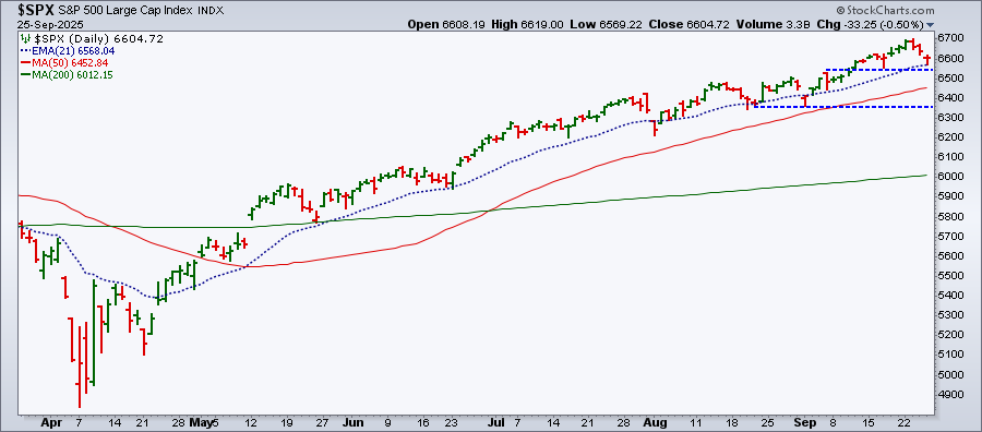
The 21-day EMA is worth keeping an eye on. If the S&P 500 breaks below it, I would watch the previous low (upper blue dashed line). If the selling continues, the 50-day Simple Moving Average (SMA) would be the next level to watch.
The Nasdaq Composite ($COMPQ) and Dow Industrials ($INDU) are moving in a similar pattern. All three of the major indexes have been down for three consecutive days but, so far, the magnitude of the selloff hasn’t been severe. The indexes are still above their 21-day EMAs, an indication that this may be the much-needed pullback the market needs.
What About Yields?
The 10-Year US Treasury Yield Index ($TNX) is beginning to climb again. The 10-year yield has moved above its 21-day EMA, although it has some ways to go before this can become an uptrend.
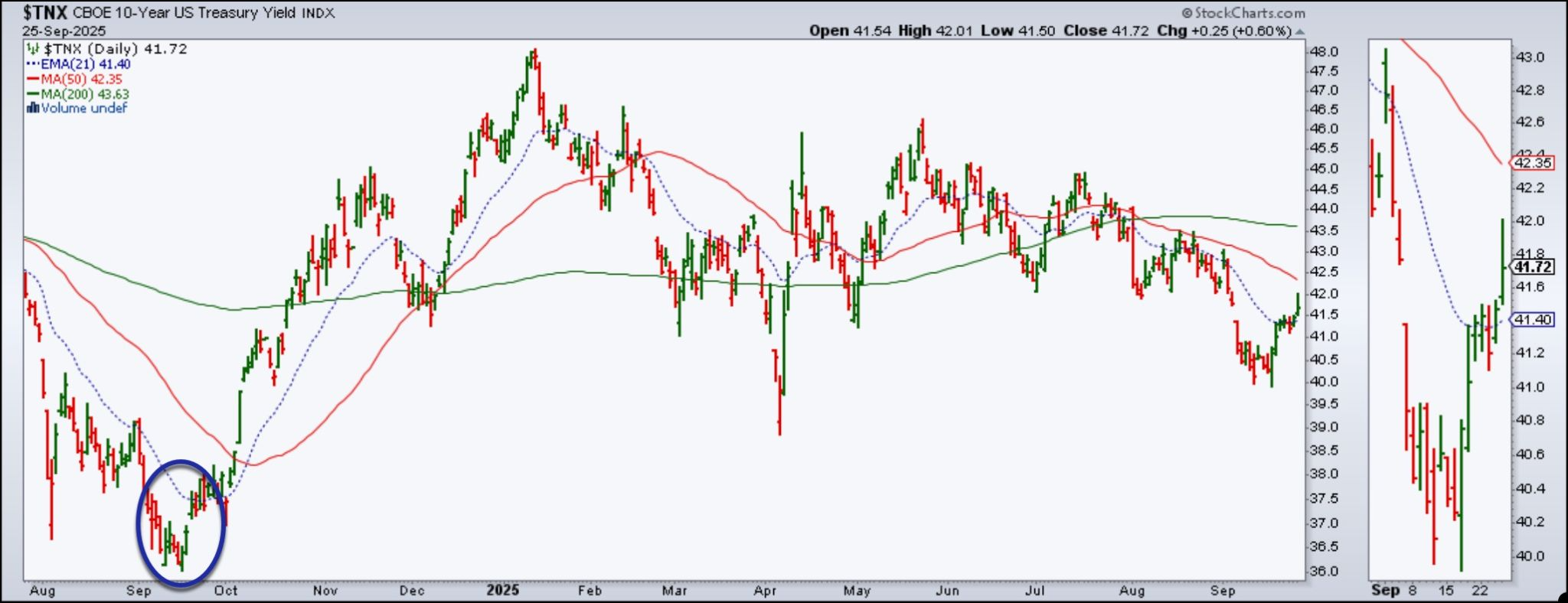
After the September 18, 2024 50 basis point rate cut, the 10-year yield moved significantly higher, climbing from 3.64% to around 4.80% by January 13, 2025 (blue oval). During that period, the Fed cut rates two more times (25 basis point cuts in November and December).
This upward move in yields is unusual, and it looks like we’re seeing a little of that again (see zoom thumbnail on right). However, given the Fed has made it clear they’ll be cautious going forward, let’s hope the 10-year yield doesn't go much higher than 4.50%. In a high-inflation environment, high yields would put pressure on stocks.
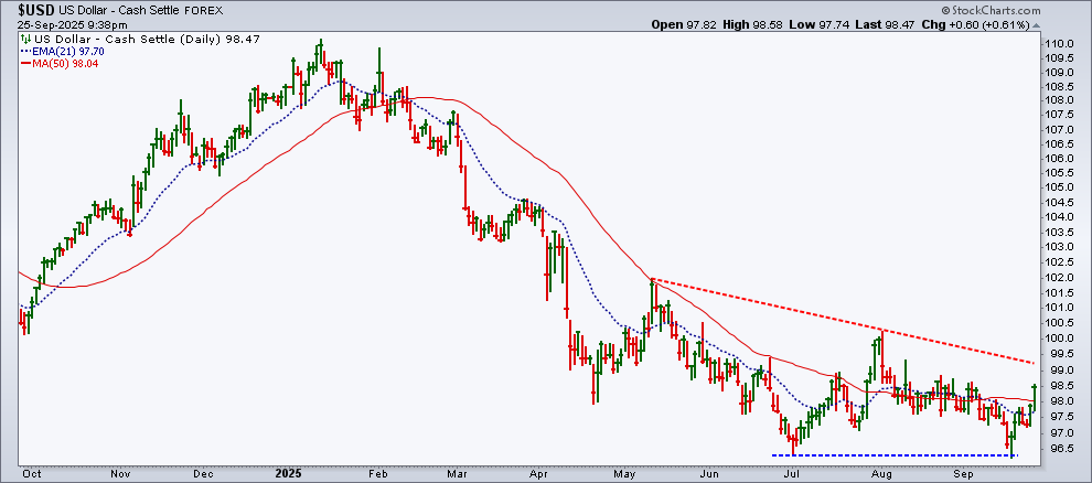
The Dollar’s Rebound
The US dollar hit a low when the Fed announced its rate cut last week; since then, it has rallied. On Thursday, the dollar crossed above its 50-day SMA. The next resistance level would be just above 99 (red dashed trendline). Will the dollar struggle to break above that trendline, or will it break above it? That's something to watch for.
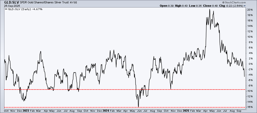
Gold and Silver
Precious metals have also been on a tear. Gold took a bit of a breather on Thursday while silver kept pushing higher. When we look at the PerfChart of gold versus silver over three years, silver is starting to shine a little brighter. There is industrial demand for silver, which could be one reason behind silver’s rise relative to gold.
Why Friday’s PCE Matters
So, with stocks pulling back, yields rising, the dollar rallying, and gold pausing, Friday’s PCE becomes very important. Will inflation come in line with expectations, or will it be higher than expected? If it’s the latter, stock market dynamics could change very quickly.

Disclaimer: This blog is for educational purposes only and should not be construed as financial advice. The ideas and strategies should never be used without first assessing your own personal and financial situation, or without consulting a financial professional.


