Is the US Market Losing its Edge Relative to Global Equities?

Since the financial crisis, the US stock market, in the form of the S&P Composite, has been on a tear against the rest of the world. That said, price action since 2024 has started to indicate that this powerful trend may be in the process of running out of steam.
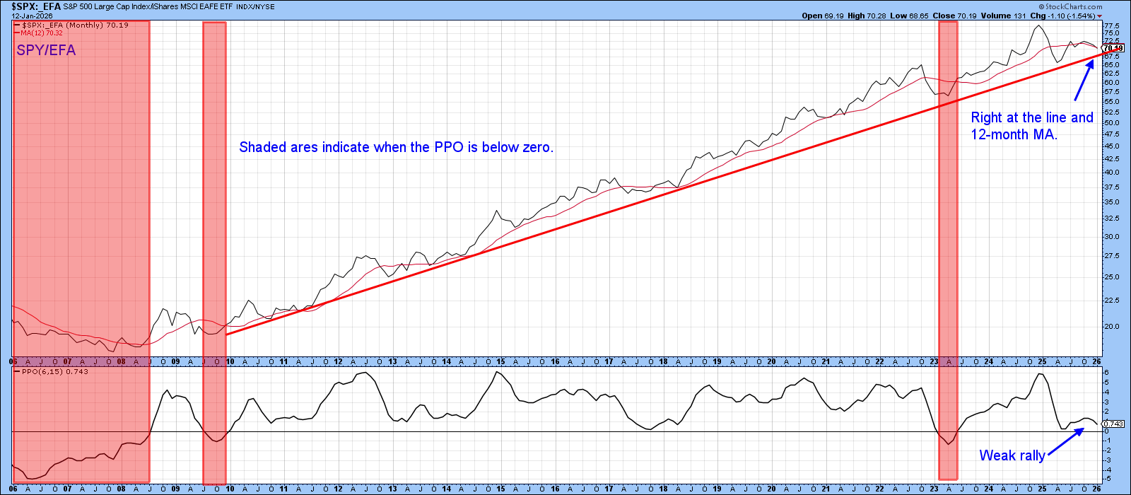
S&P 500 vs. EFA
Some evidence in this direction comes from Chart 1, which features the ratio between the S&P 500 and the iShares Europe Australia Far East ETF (EFA). The shaded areas identify periods when the PPO is below zero. The red trendline approximating the secular or very long-term uptrend favoring the U.S. is currently intact. For its part, the PPO is also positive but is not far from a negative equilibrium crossover. If the trendline is violated genuinely, one of two possible scenarios would likely follow: a multi-year extension to the post-2024 trading range or an actual reversal.
S&P 500 vs. ACWI
Chart 2, which compares the S&P 500 to the iShares MSCI World ETF (ACWI), is starting to show some cracks, as it has broken decisively below its secular up trend line. Furthermore, the PPO has tentatively crossed below its equilibrium line. It does not qualify as official bearish evidence yet, since the break is extremely marginal; being a monthly chart, an official plot requires a month-end close. Nonetheless, the range-bound price action since 2024 looks suspiciously like a head-and-shoulders top.
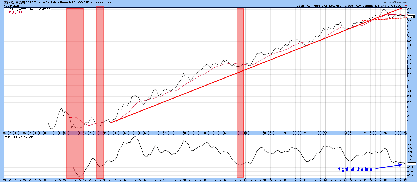
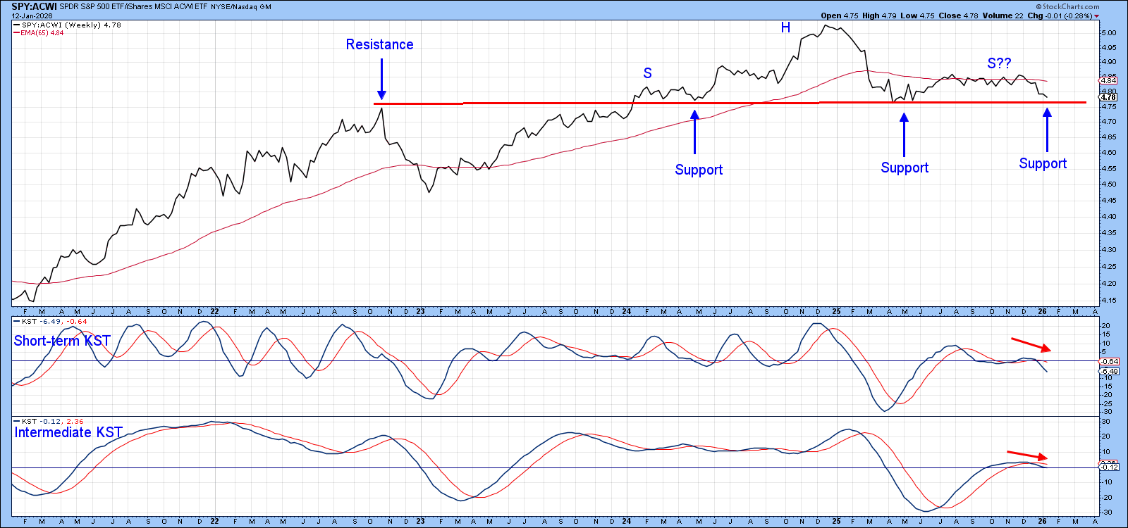
Chart 3, which comprises weekly data, shows recent action in greater detail. It also presents us with a textbook example of how a resistance level, once surpassed, reverses its role to one of support. In this case, the resistance was provided by the late 2022 rally high and support by the neckline of that potential head and shoulders top. I emphasize the word potential because that’s what it is, at least until the pattern is completed with a decisive downside penetration neckline. Also worth noting is that both KSTs are in a declining mode, which strongly suggests any test of the neckline is likely to be unsuccessful.
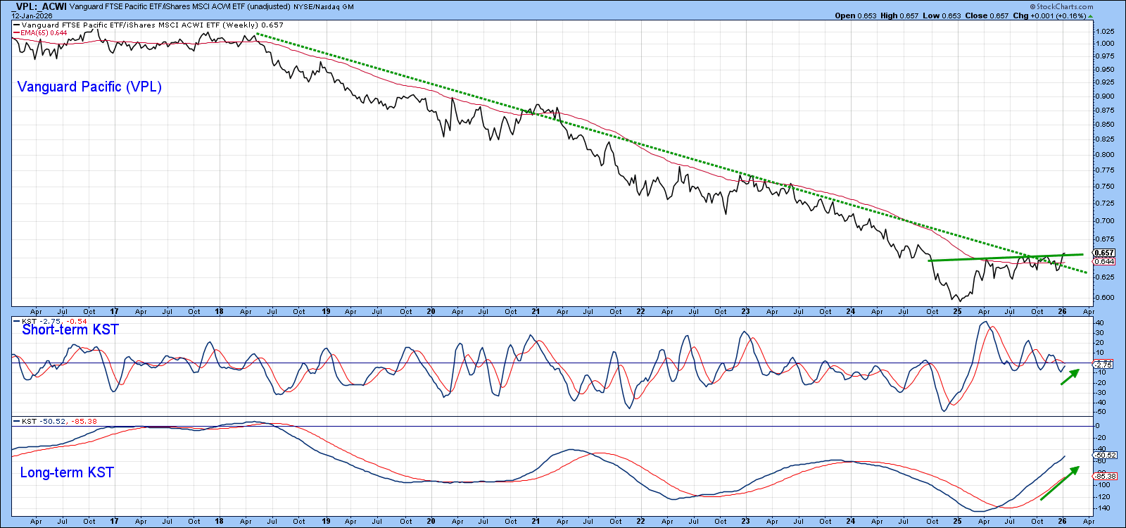
VPL vs ACWI
If the U.S. loses its superior relative performance, it is reasonable to ask where we might look for new leadership. In that respect, Chart 4 shows part of the secular decline in the relative action between the Vanguard FTSE Pacific (VPL) and the iShares MSCI World (ACWI). The ratio has clearly broken above the dashed post-2018 down trendline and is also above its 65-week EMA. However, I don’t place a great deal of weight on this crossover due to the numerous false ones that took place in 2025. Nonetheless, it looks to be in the process of breaking above its 2024–2025 trading range, an action that is being supported by two rising KSTs.
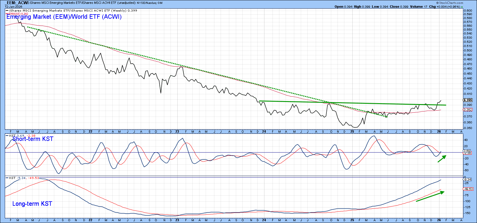
EEM vs. ACWI
Chart 5 displays another possible leadership candidate, the iShares Emerging Markets ETF (EEM). Its RS line has also cleared a dashed multi-year down trendline. Moreover, it has broken out from a base and experienced a short-term KST buy signal in the last couple of weeks. Finally, the ratio has crossed decisively above its 65-week EMA. That’s also bullish because none of the recent crossovers have proved to be spurious.
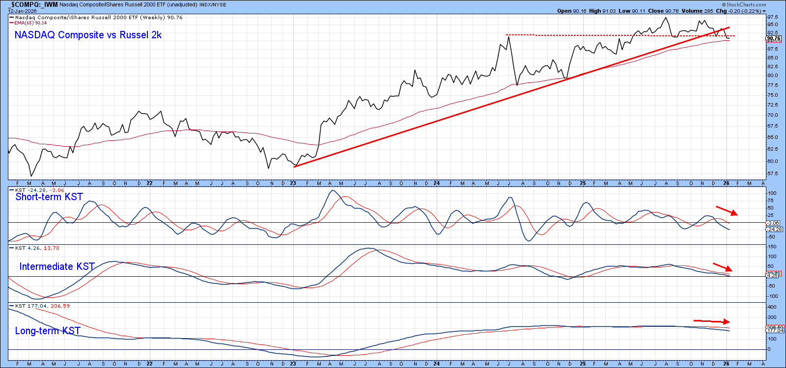
One More Thing
Relative outperformance by the U.S. in the last decade has been driven by tech stocks, as epitomized by the NASDAQ Composite. In some small way, Chart 6 suggests that NASDAQ leadership may be about to give way to Small Caps. That’s because the ratio between the NASDAQ and the IWM has recently violated its 3-year up trendline. Even though all three momentum indicators are in decline, that’s not sufficient evidence to call a turn. However, a decisive drop under the 65-week EMA and dashed trendline would.
The Bottom Line
US equities in the form of the S&P Composite have done a stellar job outperforming the world since the opening decade of this century. This important relationship has been rangebound in the last couple of years and appears to have reached a crossroad. Price action in the next few weeks is likely to determine whether that uptrend will extend.
Good luck and good charting,
Martin J. Pring
The views expressed in this article are those of the author and do not necessarily reflect the position or opinion of Pring Turner Capital Group of Walnut Creek or its affiliates.


