Is This Rally Real? What Needs to Improve for a Bullish Case

With the S&P 500 pounding out an impressive countertrend rally this week, I find myself focusing on the evidence I would need to see to validate a potential bullish scenario in April. I’ve settled on three specific data points, including a clear rotation into offense over defense, a dramatic improvement in market breadth conditions, and upside breakouts in key growth stocks.
Let’s review each of these concepts one by one, reflecting on what the charts told us in a risk-off month of March and what we would need to see to turn more bullish in April.
Are investors favoring “things you want” over “things you need?”
My favorite chart to track institutional sentiment within the equity space is based on the ratio of Consumer Discretionary to Consumer Staples. As Consumer Discretionary stocks are way more sensitive to consumer sentiment shifts and economic conditions, while Consumer Staples are more immune to changes in consumer behavior, this has often provided an excellent signal of a change in investor outlooks.
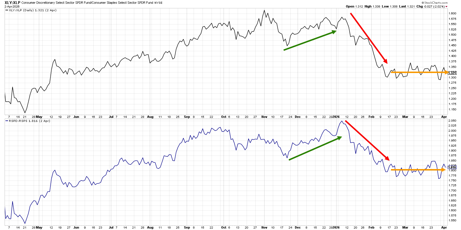
The equal-weighted ratio in the bottom panel shows that investors were clearly leaning into more defensive positions in the first six weeks of 2026. Since mid-February, however, the ratio has been decidedly sideways. This balance between offense and defense implies that investors are fairly neutrally-positioned, waiting for more evidence to make any aggressive changes.
If and when this ratio breaks out to the upside, that could signal a real “change of character” for stocks, indicating that institutions are betting on a market recovery into Q2. On the other hand, if the ratio breaks lower from here, that would provide a serious red flag for the markets, as it would suggest that investors are leaning more into defensive positions.
Are market breadth indicators signaling a broad advance?
We’ve been tracking a steady deterioration in short-term market breadth indicators for some time, with only 30% of S&P 500 stocks remaining above their 50-day moving averages this week. Even more concerningly, long-term breadth indicators have also shifted to more bearish ranges.
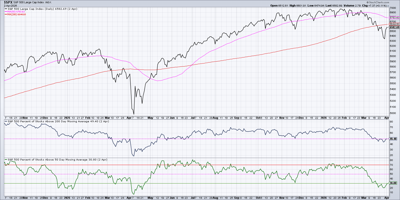
The first panel below the S&P 500 chart shows the percent of S&P 500 members that are above their 200-day moving averages. For the last three weeks, that number has been mostly just below the 50% level, showing a fairly even balance between stocks holding this key level of long-term support and those already breaking down.
For any sort of bullish thesis from here, I would need to see a break above that 50% level, showing that a decent number of stocks have been able to recover their 200-day moving average. Just like the S&P 500 is testing its own 200-day moving average from below into next week, the question is whether a broader group of stocks will overcome this crucial long-term trend barometer.
Are key growth stocks finally breaking out of sideways patterns?
For the S&P 500 and Nasdaq to mount a meaningful recovery in April, key growth stocks would need to resolve their current consolidation patterns to the upside. Let’s review two charts that stand out among many in this space: Seagate Technology Holdings (STX) and Alphabet (GOOGL).
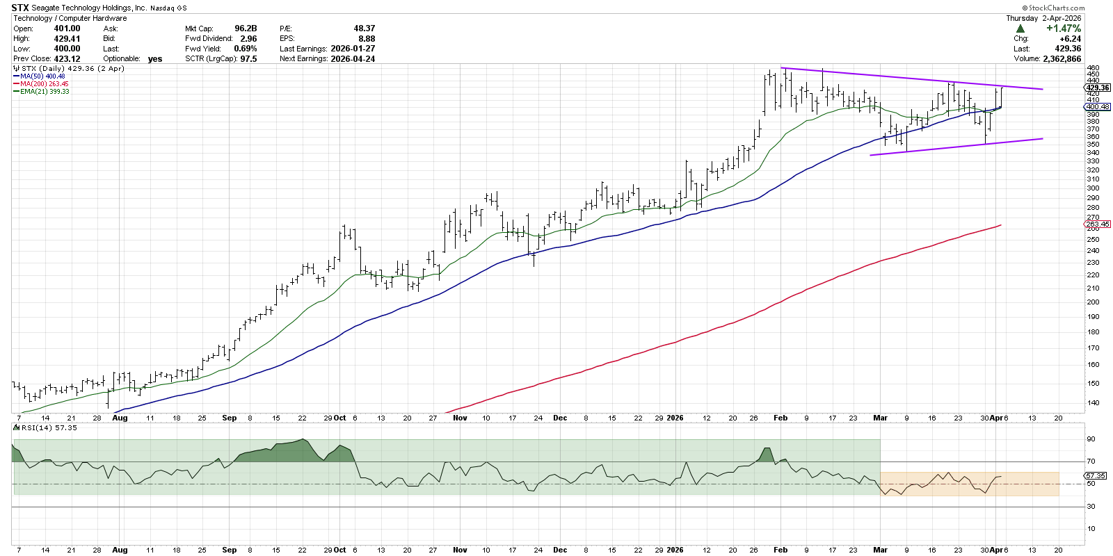
Seagate has been featuring a symmetrical triangle or “coil” pattern over the last two months, formed by a pattern of lower highs and higher lows. A bounce higher this week pushed STX to the upper end of this consolidation pattern. An upside breakout next week, ideally supported by stronger momentum readings, could confirm a bullish resolution and imply further highs for this computer storage name.
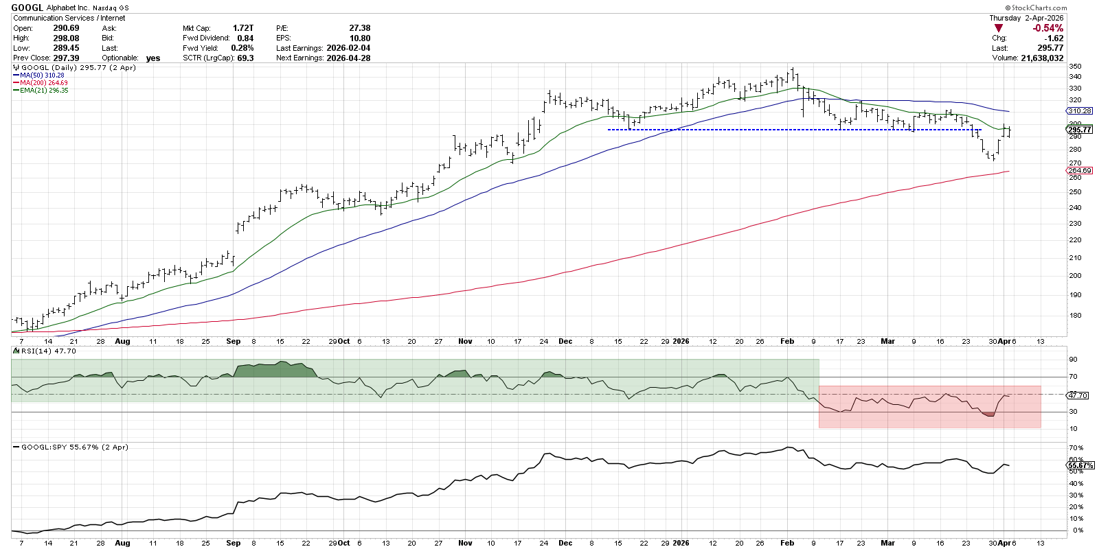
Alphabet remains in “technical analysis limbo” as it sits between a downward-sloping 50-day moving average and an upward-trending 200-day moving average. If GOOGL can follow through on this week’s strength, propelling back above the 50-day moving average, it would suggest that the late March drop below support is no longer valid.
In this case, the price momentum is an important factor. Note how the RSI has been consistently below 50 since early February. Until and unless we see an RSI move above 60 on an upswing, I’d be inclined to see this as a bearish chart.
Even though the major equity averages experienced a strong bounce higher this week, several key charts shown today represent bearish-to-neutral readings that would need to improve. Bullish markets are driven by strong leadership and, if these charts can improve in the coming weeks, then perhaps the sky’s the limit for the S&P 500.
Want to follow these charts together as we navigate a volatile April? Check out our daily livestream every trading day after the close!
RR#6,
Dave
P.S. Ready to upgrade your investment process? Check out my free behavioral investing course!
David Keller, CMT
President and Chief Strategist
Sierra Alpha Research LLC
marketmisbehavior.com
https://www.youtube.com/c/MarketMisbehavior
Disclaimer: This blog is for educational purposes only and should not be construed as financial advice. The ideas and strategies should never be used without first assessing your own personal and financial situation, or without consulting a financial professional.
The author does not have a position in mentioned securities at the time of publication. Any opinions expressed herein are solely those of the author and do not in any way represent the views or opinions of any other person or entity.