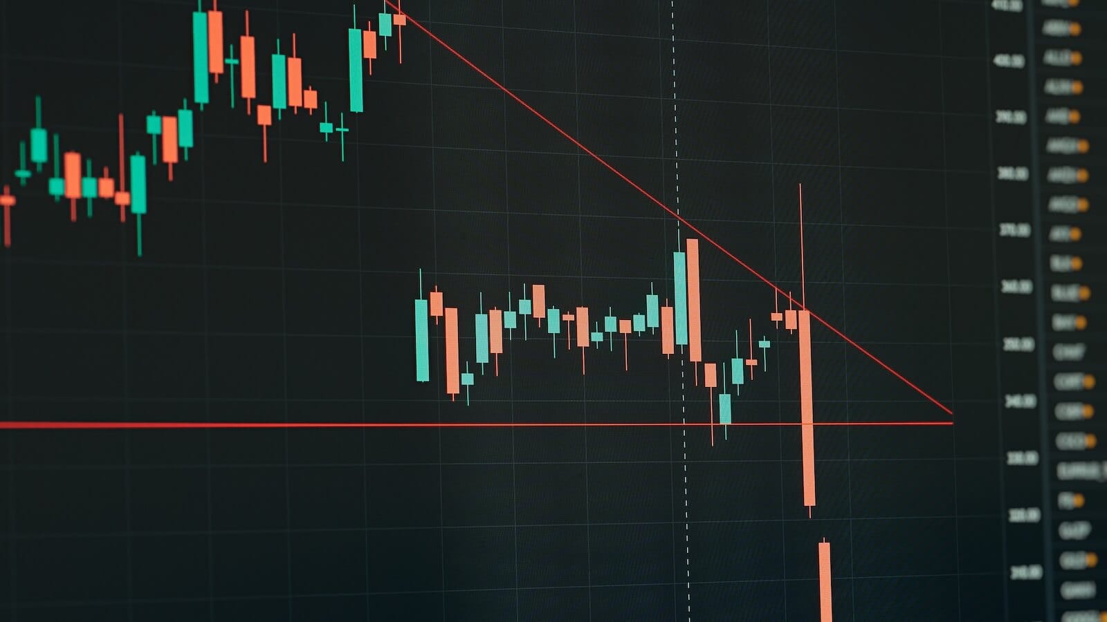
MARKET SELLS OFF ON BIG VOLUME -- DOW AND NASDAQ 100 BREAK 50-DAY LINES -- VIX TURNS UP WHILE S&P GIVES SELL SIGNALS
DOW DIAMONDS BREAK 50-DAY LINE AND DECEMBER LOW ... Thanks mainly to a huge plunge in Citigroup and General Electric, the Dow Industrials had a terrible chart day. Chart 1 shows the Dow Diamonds (DIA) shattering its 50-day moving average and falling to the lowest level in more than two months undercutting its December low in the process. And it did so on the heaviest volume in more than three months. Anyway you look at it, that's bad technical action. Other stock indexes had a bad day as well. Chart 2 shows the Nasdaq 100 Shares (QQQQ) closing beneath the 50-day line. Downside volume was the heaviest in six months. That's a bearish combination. The daily stochastic and MACD lines are also on short-term sell signals. The fact that the Nasdaq 100 was the biggest loser of the day (-2.8%) shows that most of the selling came from the technology sector. Within technology, semiconductors fell -3.9% while Internet stocks lost -3.4%. Airlines were the biggest non-technology losers (-3.9%) owing to crude oil climbing $1.52 to close over $68. Oil service stocks gained 1.7% to lead the energy complex. It's not a good sign for the market when the strongest group is energy and the weakest is technology. Technology selling helped make South Korea (EWY) and Japan (EWJ) two of the day's biggest global losers.

Chart 1

Chart 2
VIX TURNS UP -- S&P TURNS DOWN... A week ago Thursday I wrote a message entitled: "Low Volatility (VIX) Index May Increase Market Risk in 2006 -- S&P 500 Pulls Back From Overbought Condition" (January 12, 2006). The next two charts are updates of the ones shown at that time. I was concerned that a rising VIX from the lowest level in a decade could start to put downside pressure on an overbought market. So far that has been the case. Chart 3 shows the VIX breaking through its December highs to register an intermediate upside breakout. It's no coincidence that the jump in the VIX accompanied heavy stock selling. Chart 4 shows the short-term damage done to the S&P 500 SPDRs. Although the SPY closed right on its 50-day average, the daily MACD lines turned negative after failing to confirm the recent price move to new highs. Heavy downside volume is also negative. The last time the SPY saw such heavy trading was around its October lows. Heavy selling after a price decline often signals a bottom. Heavy selling after a price rise usually signals a top. This looks more like a top than a bottom. The blue arrow on the RSI line shows the "negative divergence" that I wrote about on January 12. After expressing concern about that divergence, I suggested that "this looks like a good time for short-term traders (or those looking for an excuse to take some January profit) to do so". Today's downside action suggests that it's time to do some more selling.

Chart 3

Chart 4


