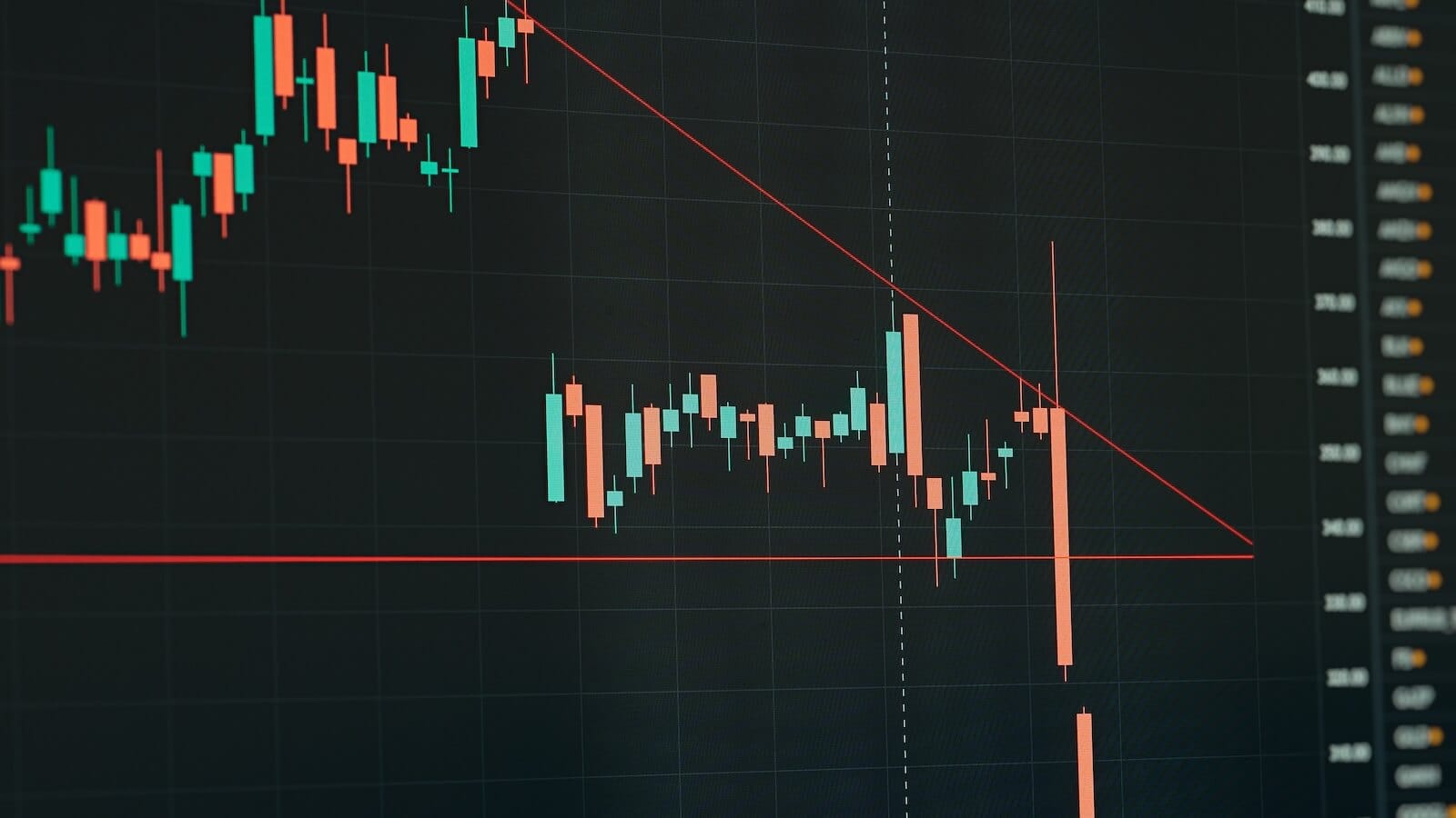
COPPER FALLS TO EIGHT-MONTH LOW ON SLOWING ECONOMY -- COMMODITIES ARE UNDER PRESSURE -- WATCH THE 50 -DAY MOVING AVERAGE FOR BUY AND SELL SIGNALS
FALLING COPPER HINTS AT ECONOMIC WEAKNESS... Copper prices are usually viewed as a measure of economic strength. That's because it's used in things like autos and housing. It may not be a coincidence then to read that copper prices have fallen to the lowest level in eight months on the same day that third quarter GDP came in at a lower-than-expected 2%, which is the slowest pace of economic growth in a year. Not surprisingly, bond prices are rising today while stocks are experiencing some profit-taking. Some of the hardest hit stocks are in the commodity arena. Energy and precious metal stocks are down today. The heaviest selling, however, is coming from copper-related stocks. That's weighing on the basic materials group.

Chart 1
FREEPORT MCMORAN COPPER & GOLD FALLS 6% ... The biggest metal loser is Freeport McMoran Copper & Gold which is falling 6% today. The daily bars in Chart 2 show the stock falling below its 50-day average and threatening its 200-day line. A close below its November low would be another bearish sign. FCX is the biggest percentage loser in the Materials SPDR (XLB) and is also exerting downward pressure on the Gold & Silver (XAU) Index (which includes FCX). Chart 3 shows the Market Vectors Gold Miners ETF (GDX) in the process of testing its 50- and 200-day moving average lines. The Reuters/Jefferies CRB Index is trading lower today with 11 of 19 commodities in the red. Right behind copper (which is the biggest percentage loser) are nickel, crude oil, silver, aluminum, heating oil, and gold.

Chart 2

Chart 3
COMMODITY TRACKING INDEX STILL IN UPTREND ... One of our readers asked why the DB Commodities Tracking Index (DBC) was "getting slaughtered". Actually, it isn't. The daily bars in Chart 4 show the DBC trading off its December high, but still above its moving average lines. A close below this week's intra-day low at 24.19, however, would justify some selling.

Chart 4
WATCH MOVING AVERAGE LINES ... One of the simplest ways to look for buy and sell signals is with moving averages. They're not perfect, and they give occasional bad signals. But their value in spotting trend changes far outweighs their short-comings. I prefer to use arithmetic averages, although many analysts prefer exponential averages (which are more sensitive). If nothing else, moving averages act as good filters on market trends. They tell us what to be in and what to avoid. The two main averages that I use are the 50- and 200-day. The 200-day is more useful for longer-term trend changes, while the 50-day is better for intermediate trend changes. [The 20-day average is useful for short-term traders]. I'm using the Dow Transports in Chart 5 to demonstrate how they work. The Dow Transports have fallen to the lowest level in three months. They're one of the market's weakest group again today. The index closed below its 50-day average seven trading days ago, which was a signal to do some selling (or avoid buying). Today, it's trading below its 200-day line for the second consecutive day. A simple rule of thumb is to avoid anything that's trading below its two moving average lines. [I generally like to see at least two consecutive closes below the 50-day line and a Friday close below the 200-day line to confirm a breakdown].

Chart 5
MOVING AVERAGE BREAKS ... Shown below are three group indexes that are slipping below their 50-day averages. That means that all three are ripe for some profit-taking. Chart 6 shows the Biotechnology Index (BTK) trading below the 50-day line for three days. Its relative strength line is slipping as well. Chart 7 shows the S&P Retail Index (RLX) in danger of breaking its 50-day line. Its relative strength ratio has been slippping for the last two months. Chart 8 shows the Semiconductor (SOX) Index trading below its 50-day line, but just above its 200-day average. A close below both moving average line would put a big "avoid" on that group. Over the summer, the BTK and the RLX exceeded their 50-day lines which gave initial buy signals (blue circles). [The buy signal is stronger after the 50-day line has started to rise]. Even stronger buy signals were given when the BTK and the RLX crossed over their 200-day lines (red circles). The recent move above its 200-day line by the SOX Index is now in jeopardy.

Chart 6

Chart 7

Chart 8
NASDAQ AND S&P 600 ARE TESTING 50-DAY LINES... Unfortunately, I haven't been able to find any new upside breakouts in the moving average lines. That suggests that most other groups are already in well-established uptrends. I showed earlier in the week, however, that the Nasdaq Composite and S&P 600 Small Cap indexes were testing their 50-day lines. If a market pullback is going to occur, it will most likely start with one (or both) of those two indexes breaking their 50-day averages. As I said at the start of this message, moving averages aren't perfect. But they're a simple way to spot trend changes and to help time buy and sell decisions. There are a lot of other things to consider as well. But the 50-day line is one of the best places to start.

Chart 9

Chart 10


