SHORT-TERM MARKET TREND MAY BE STABILIZING -- BUT LONG-TERM TREND MAY BE WEAKENING -- WHY ECONOMISTS SHOULDN'T BE ASKED ABOUT THE STOCK MARKET
GLOBAL STOCKS ARE TESTING 200-DAY AVERAGES... With the all recent market turmoil, it's important not to lose sight of the big picture. We all know by now that the stock market has suffered a sharp downturn over the last month on record volume. And we all know where the main problem is located -- housing and subprime mortgages which have caused a liquidity crisis that threatens to stall the U.S. economy. Global markets fell sharply at week's end as the U.S. problems spread to foreign stocks. That has unleashed a debate about whether this is just another short-term correction (and buying opportunity) or something more serious. The jury is still out on that. The stock market has bent, but hasn't broken. Friday's late buying suggested some hint of short-term stability. So did the weekly bounce in some of the weakest groups, including small caps and financials. That was enough to keep the S&P 500 from closing beneath its 200-day moving average (Chart 1). Chart 2 shows, however, that Friday's global selloff pushed the EAFE iShares into a test of their 200-day line as well. That's obviously an important test of a long-term support line and the continuance of the four-year global bull market. While everyone is focused on short-term swings, more important information about the market's ultimate direction may be gotten from studying its long-term trend. Which brings us back to the big picture.

Chart 1

Chart 2
S&P 500 COULD BE PEAKING... The big question we have to keep asking ourselves is whether the current market correction is just another pullback in an ongoing uptrend, or something more serious. There are a lot of hints that it's the latter. Like record downside volume, the unusually large number of big board stocks hitting 52-week lows, and the highest volatility in four years. But the charts themselves also hint that the major bull market could be in some danger. Take Chart 3 for example. It shows the S&P 500 having reached a seven-year high of 1555 just a month ago. That number is within two points of its 2000 peak at 1553. That puts the S&P up against a formidable resistance barrier and raises the possiblity of a huge "double top" in the making. To reinforce that negative possibility, one of the things that would need to happen would be a violation of the 20-month moving average (blue line), which has contained every pullback in the last four years. At the moment, that long-term support line sits at 1375 which is about 12% from the recent highs. It also coincides roughly with the March reaction low. That's one of the reasons that I've called for an S&P 500 correction of 10-12% and a likely retest of that March low. The daily bars in Chart 4 show the coincidence of those two support levels (The 20-month average is converted to 400 days). I still believe that there's a strong chance of those levels being tested between now and October (even if the market stabilizes or bounces from current levels). Even that wouldn't end the four-year bull market, but would put it in more danger of ending.

Chart 3

Chart 4
RIPPLES, WAVES, AND TIDES... The oldest of technical theories (Dow Theory) compares market trends to ripples, waves, and the tide -- in ascending order of importance. The ripples represent short-term market moves. Waves represent intermediate-term moves. The tide, however, determines the market's major trend. As long as the tide is moving in, each wave and ripple will move a bit closer to shore. When the tide starts to recede, however, each ripple will end a little further out from the shore. It's the direction of the tide that determines the impact of the waves and ripples. Daily charts show us the ripples (short-term trend). Weeklies show us the waves (intermediate trend). Monthlies show us the direction of the tide (the market's major trend). Chart 5 is an updated version of the chart I showed on July 28. I'm showing it again because it carries an important message.

Chart 5
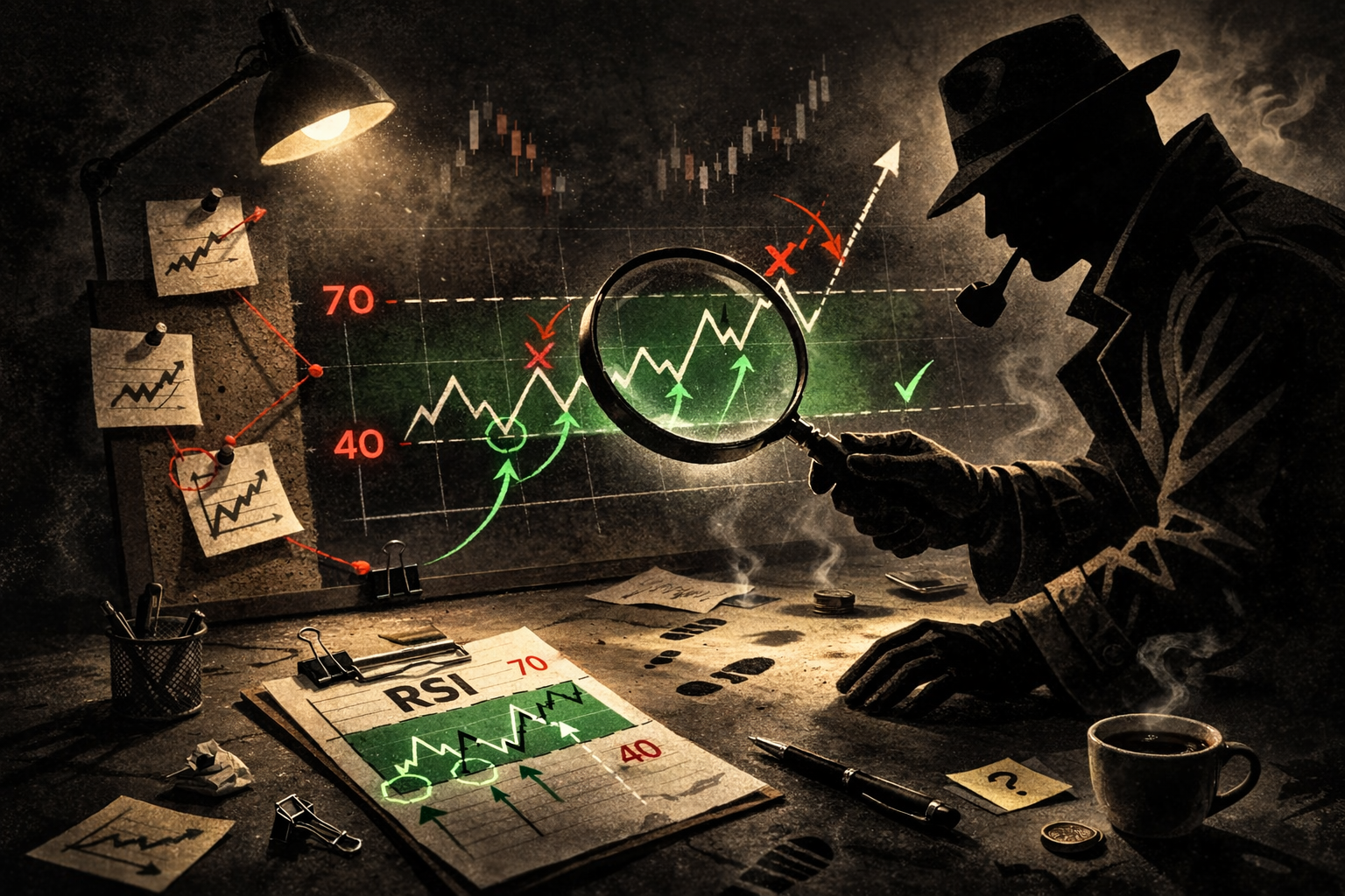
RSI SUGGESTS MARKET TIDE MAY BE EBBING... Chart 5 overlays the 14-month RSI line on the S&P bars. And it also carries a warning. Let's explain first exactly what that line is used for. The RSI line is an oscillator that measures market extremes. It's most often applied to daily and weekly charts to determine overbought and oversold conditions. A reading below 30 signals an oversold market. Readings over 70 mean the market is overbought. While daily and weekly RSI lines measure short- and intermediate- term market trends respectively, the monthly RSI measure the long-term trend (or the market's tide). That makes it the most important one. Chart 5 shows the RSI dipping below 30 in the second half of 2002 just as the last bear market was ending (green arrow). It continued to rise over the next four years as the bull market continued. The RSI line, however, moved into overbought territory (over 70) in the second half of 2006 which was the first overbought reading in six years. At the very least, that warned that the bull market had reached a mature stage and was at an upper extreme. That in itself is only a warning. Markets can stay overbought for long periods of time -- as it did from mid-1995 to mid-1998. A more dangerous point is reached when the monthly RSI line falls back below 70 -- as it has just done (red arrow) and as last happened at the end of 1999. That suggests to me that the market's tide (major trend), which has been moving in (or up) for more than four years, may be starting to recede. The waves and ripples will continue to produce short-term (and maybe even intermediate-term) bounces. Instead of higher highs and higher lows, however, a receding tide suggests that any market rallies from here may follow a pattern of lower peaks and lower troughs.
WHY ECONOMISTS SHOULDN'T BE ASKED ABOUT THE STOCK MARKET... One of the things you've surely noticed during the recent market drop is how often economists have been interviewed in the financial media. And, not surprisingly, they all say pretty much the same thing. They don't think the stock market downturn is that serious because the economy remains strong. And therein lies a major market fallacy. That we can predict the stock market by studying the economy. The reason that's a fallacy is that the stock market is a "leading indicator" of the economy. It's been estimated that the stock market peaks anywhere from six to nine months before the economy does. You may recall that the stock market peaked in the spring of 2000. You may also recall how economists flooded the airwaves for the rest of that year reassuring us that the economy was strong. The Fed finally started to ease the following January. Exactly a year after the Nasdaq peaked (March 2001), the start of a recession was declared. I'm not suggesting that the current situation is that serious. But the scenario is similar. And so is the tune that the media keeps playing. The stock market and the economy are certainly linked, but they're not the same thing. I'd rather see more stock market analysts from outside of Wall Street interviewed about the stock market (including a few more technical analysts) and a lot fewer economists.
WHY I DON'T APPEAR ON TV... In the interests of fairness and full disclosure, I was invited to appear on CNBC twice over the last week. I declined both invitations. My main reason for declining is the fact that they only offer invitations after the market has fallen sharply (and usually on short notice). Technical analysts are viewed as the last resort only to be used when things look especially bad and they've run out of fundamental excuses. They don't seem to feel that they need us any other time. A second reason is that my main responsibility is to Stockchart subscribers (that's you). I feel no obligation to offer views or market opinions to CNBC or anyone else's viewers. Besides, I'm not as good looking as I used to be.


