SO FAR, MARKET BOUNCE IS ONLY SHORT-TERM IN NATURE -- BUT EVEN AN INTERMEDIATE BOUNCE WOULD STILL BE ONLY A BEAR MARKET RALLY -- AN ALTERNATE INTERPRETATION OF RECENT ACTION SUGGESTS STILL ONE MORE DOWNLEG
BEAR MARKET RALLIES... A couple of weeks ago I suggested that the market had completed a five-wave decline which would suggest the likelihood for an intermediate rally. On Tuesday, I explained that an "intermediate" rally can last anywhere from three weeks to three months and can retrace 38% to 50% of the prior downtrend. On Thursday, in response to a question, I explained that the market would remain in a bear trend as long as prices remained below the falling 200-day moving average (and the 50-day average remained below the 200-day). I ended the first paragraph in Thursdays' Market Message by stating "that suggests that any bounces would have to be considered bear market rallies" (see Chart 1). A few readers complained that those messages contradicted one another. In other words, the first one was bullish and the second one bearish. Not so. Both were bearish.

Chart 1
MARKET BOUNCE STILL SHORT-TERM IN SCOPE ... Tuesday's message explained that the intermediate trend represents a "correction" to the primary trend. The moving average lines tell us that the primary (major) trend is still down. Tuesday's last paragraph writes that "In Elliott Wave work, that usually suggests the possibility of another downleg after an intermediate rebound". That's hardly a bullish statement. So far, the market bounce hasn't qualified as "intermediate" in scope. First, the rally hasn't lasted more than two weeks. Secondly, the S&P 500 ended the week below its 50-day moving average (Chart 2). Even if we do get an an intermediate bounce, it will still qualify as a bear market rally.

Chart 2
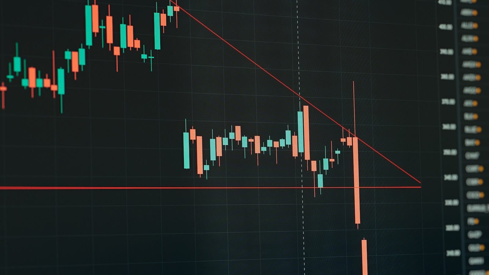
AN ALTERNATE INTERPRETATION... One of our readers suggested an alternate Elliott Wave interpretation which suggests that the S&P 500 SPDRs have been tracing out a "descending triangle" since the middle of January. You may recall that I took the view that the March decline may have concluded the fifth wave down (by forming a double bottom). A triangle would make sense at this point since fourth wave consolidations are very often triangular in shape. So that's a very credible alternate interpretation that also resolves another problem. Earlier in the year, I suggested that the S&P 500 would probably reach its summer 2006 low before completing this phase of the bear market. If the "descending triangle" view is correct, that may still happen (see Chart 4).

Chart 3

Chart 4
BOND/STOCK RATIO IS STILL IN UPTREND... I also suggested recently that any decent stock market bounce would probably correspond to profiit-taking in bonds. So far, both of those reactions have been relatively minor (stocks have bounced and bonds have dipped a bit). One way to tell when those two trends are changing is to track a bond/stock ratio. Chart 5 plots a ratio dividing the price of the 10-Year T-Note by the S&P 500. The ratio has trended higher since October. That's because bond prices have risen as stocks have dropped. At the moment, the ratio trend is still up. That uptrend will remain in place as long as the bond/stock ratio stays over its 50-day average (blue line).

Chart 5
GOLD DID CLOSE OVER $1,000... One reader asked for the symbol showing gold bullion rising above $1,000. The symbol is $Gold and the price bars in Chart 6 show bullion having traded over $1,000 earler this month. A second questioned how gold could close higher and its corresponding Exchange Traded Fund (GLD) could close lower. The answer has to do with their closing time. Gold stops trading around 2:30 New York time. The Gold ETF trades until 4:00. That's why their closing prices may differ on occasion. Chart 6 shows, however, that they have a close correlation to each other. The price bars represent bullion while the solid gold line shows GLD. They usually don't get too far out of line.

Chart 6
NATURAL GAS STILL OUTPACING CRUDE ... On Thursday, I suggested that gold still had more correcting to do. I suspect oil does as well. Chart 7 shows the United States Oil Fund (USO) testing its early March peak. Meanwhile, its daily RSI and MACD lines are weakening. That suggests that oil (along with most other commodities) may pull back further. Chart 8, however, shows the United States Natural Gas Fund (UNG) still trending higher. I recently wrote that natural gas has been acting better than oil since the start of the year. The natural gas/crude ratio below Chart 8 show that's still the case. That also explains why natural gas stocks are now leaders in the energy sector.

Chart 7

Chart 8


