DOW FALLS SHARPLY -- FINANCIALS LEAD SECTORS LOWER -- BONDS SURGE ON PPI AND CPI NEWS -- GOLD HITS RESISTANCE -- STEEP YIELD CURVE NOT HELPING -- RISK AVERSION RULES
ANOTHER WEDNESDAY WHACK ... Today's Market Message was written by Arthur Hill. John Murphy will return tomorrow. - Editor
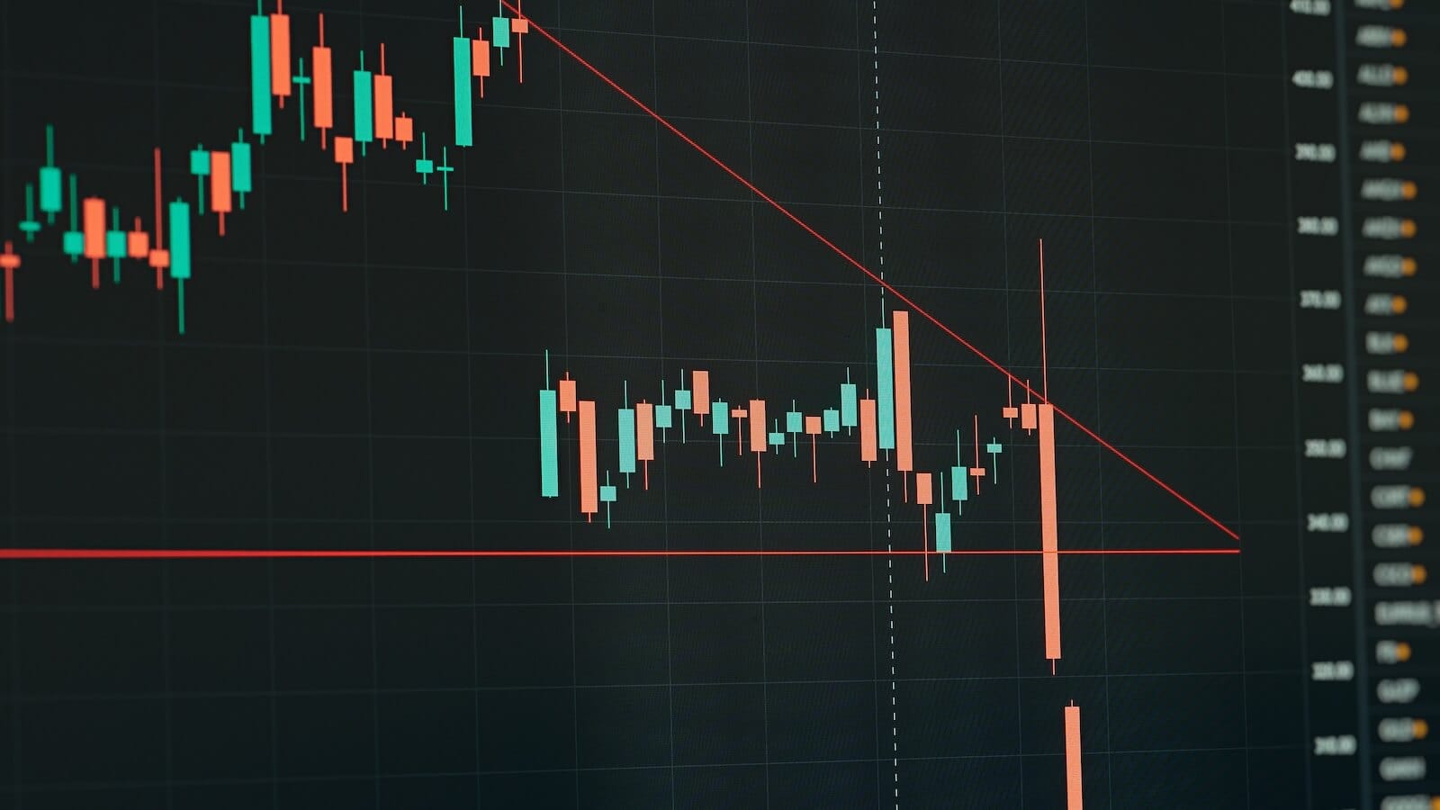
The Dow Industrials declined for the tenth Wednesday in a row on 19 November. This is becoming a habit with five of the last six Wednesdays sporting declines greater than 4%. Last week I showed the Dow breaking triangle support. Chart 1 shows a sharp recovery rally the very next day, but this turned out to be a one-day, flash-in-the-pan rally. Despite a big surge above 8800, last Thursday's rally only lasted three hours. The Dow then declined three of the last four days and closed below 8000 today. With today's decline, broken triangle support becomes resistance around 8500. This triangle breakout remains in play as long as the Dow is below 8500. For downside projections, the height of the triangle is subtracted from the triangle break. With the triangle over 1500 points high, this projects a move to at least 7000.

Chart 1
FINANCIALS LEAD BROAD DECLINE... Wednesday was another bloodbath for stocks with no prisoners taken. All major indices were down 5% or more with the Russell 2000 leading the way lower. Six of the nine sectors were down over 5%, four of the nine were down over 6% and one was down over 10%. There is simply no place to hide in this bear market-no prizes for guessing the weakest sector. Once again, it was the Financials SPDR (XLF) with a loss of 10.47%. XLF broke triangle support last Wednesday, rebounded a bit on Thursday and then moved sharply lower the last four days. Financials got the market into this bear mess and the bear market is not going to end until this key sector finds a bid (support). Chart 3 shows the Broker Dealer iShares (IAI) breaking support at 18 and moving to new 52-week lows this week. Chart 4 shows the Regional Bank HOLDRS (RKH) breaking triangle support and dropping over 30% in November.

Chart 2

Chart 3

Chart 4
BONDS SURGE ON PPI AND CPI REPORTS... On Wednesday, the Labor Department reported that the producer price index (PPI) plunged 2.8%, which was its biggest surge ever. Today, the Labor Department reported that the consumer price index (CPI) declined 1%, which was its biggest drop since 1947 (61 years). These declines can be attributed to the sharp decline in energy prices (oil) over the last few months. However, energy was not the only contributor as there were price declines in a number of consumer and business goods. It may be premature to talk about deflation, but these declines in PPI and CPI will squash any talk about inflation. Bonds, which loathe inflation, were delighted with the news. The iShares 20+ Year Bond ETF (TLT) surged over 2% with a big move towards its Sep-Oct highs. Chart 5 shows TLT breaking resistance with a big move in August and broken resistance turning into support the last two months. The decline from September to early November looks like a massive pennant. Today's trend line breakout and move above the late October high reverses the pennant's fall and signals a continuation of the bigger uptrend.

Chart 5
GOLD TURNS BACK AT RESISTANCE... Gold is traditionally considered an inflation hedge. With inflation getting kicked in the teeth over the last two days, gold is struggling at resistance. Chart 6 shows an overall downtrend for bullion. The streetTRACKS Gold ETF (GLD) formed a lower high in late September and a lower low in late October. This is the basic definition of a downtrend. The ETF remains below the 200-day moving average and the 200-day moving average is falling. After a sharp decline in October, GLD moved into a trading range over the last few weeks. The combination of sharp decline and consolidation looks similar to what we are seeing in the S&P 500 and Dow. These stock indices show signs of continuing lower, but GLD is holding above its October-November lows. Despite some support, I would not call gold strong at this stage. The next signal is dependent on the consolidation break. An upside breakout would be bullish, while a downside break would be bearish.

Chart 6
THE YIELD CURVE IS A BIT DIFFERENT THIS TIME... The Dynamic Yield Curve provides an excellent means to compare the relationship between stocks and the yield curve over time. A normal yield curve occurs when short-term rates are lower than long-term rates. In normal times, rates rise as time increases. In contrast, an inverted yield curve occurs when short-term rates are higher than long-term rates. A normal yield curve implies loose monetary policy from the Fed, which is expansionary. An inverted yield curve implies tight monetary policy, which deters economic expansion. Chart 7 shows the current yield curve on the left with the S&P 500 on the right. The yield curve has been positive and steep the entire year. While this implies loose monetary policy, Wall Street is not taking the bait and continues to fall.

Chart 7

Chart 8
Chart 8 shows a yield curve snapshot from May 2002, which was during the last bear market. As in November 2008, the yield curve was normal and steep, which implies loose monetary policy. Despite the similarities, there is a big difference between now and May 2002. We have been pointing out the low 13-week TBill Yield ($IRX) for a few weeks now. The current yield curve shows the 13-week TBill Yield ($IRX) near zero, the 2-Year Yield near 1.15% and the 5-Year Yield near 2.22%. Looking back at May 2002, the 13-week TBill Yield was around 1.7%, the 2-Year Yield was near 3% and the 5-Year Yield was near 4%. Even though the curves are the same shape, yields were higher overall in May 2002. The main culprit now is the 13-week TBill Yield. While the other short-term rates fell further in 2002 and 2003, the 13-week TBill Yield never dipped below .7%. In other words, the level of risk aversion was less during the prior bear market than it is now. Put another way, the level of risk aversion is higher now as money hunkers down in short-term T-Bills.
LONG-TERM RATES HAVE ROOM TO FALL... Chart 9 shows some key interest rates over the last seven and a half years. The 13-week TBill Yield ($IRX) moved below its 2003 lows over the last three months. The 1-Year, 2-Year and 5-Year yields are trading near their 2003 lows. The 10-Year Yield remains above its 2003 lows, which indicates there is further room to fall. Remember, bonds rise when yields fall so bonds could have further upside. Also notice that 1-5 year rates dropped sharply over the last five months (orange area). Money moved into short-term treasuries across the board and this coincided with a sharp decline in the stock market. As John Murphy noted, this move into short-term treasuries shows a serious risk aversion that is bearish for stocks. A rise in short-term rates would reflect a decline in short-term treasury prices and this would show confidence returning to the credit markets. A return of confidence could facilitate a stock market rally. There is no sign of this yet.

Chart 9


