Failure of Equities to Decline on Unexpected Bad News from Iraq is Bullish
- Equities remain overstretched.
- Japanese ETF just below key resistance.
- Bonds look vulnerable as short-term rates break to the upside.
- Dollar Index triggers a sell signal.
- Gold is cloe to confirming a primary bull market.
- Commodities acting consistently with a primary bull market.
(Click here for the narrated video version of this article)
US Equities
If there was one word I could use to describe this market that word would be “overstretched”. On the other hand, developments in Iraq have given equities every opportunity to decline, instead they have gone up. Whenever unexpected bad news develops market participants normally factor it into the price structure by selling. The fact that that has not happened suggests to me that the technical structure has the ability to support higher prices, despite current overbought readings. Remember, the NYSE A/D and cumulative upside downside volume lines have confirmed the latest SPY high.
The overstretched nature of global equities can be seen in Chart 1, where my Global Diffusion indicator is now slightly above its overbought zone. The arrows show that most times when it re-crosses this overstretched level a decline or sideways correction develops. The dashed arrow flags just one recent false negative. As long as this indicator can remain above its overbought line the market is free to move higher, but once it starts its next downward descent we need to watch out below.
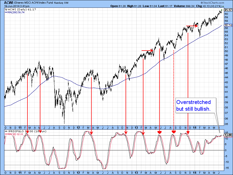
Chart 1
Chart 2 compares the S&P to its daily KST. Again we see an overbought market, but what is overstretched sometimes has a habit of becoming more overstretched. That’s why I have been stressing the $192 area, now $192.50, on the SPY, because that is where the two converging trendlines are currently intersecting. As long as they remain intact it’s difficult to take a bearish short-term stance on this market.
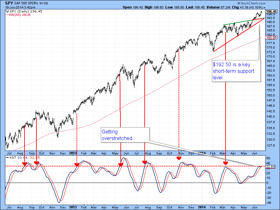
Chart 2
Chart 3 again shows two things. First, a long-term negative divergence between the price and the number of NYSE stocks above their 200-day MA’s. Second, the fact that the number is nevertheless still a high one, which underscores the idea that even if prices move higher, upside potential is limited.
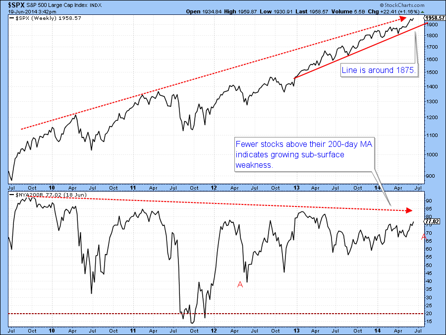
Chart 3
Sometime ago I wrote an article pointing out the vulnerability of the Japanese market should it break down from its recent trading range. Chart 4 shows that the Japanese ETF, the EWJ, did not, and is now challenging the upper end of that same range. It’s a really conflicting picture as to whether it can break to the upside, since the short-term KST is bullish but overextended. On the other hand, the long-term series, which monitors primary trends, is bearish. To cap it all off the intermediate series looks as though it’s just about to go bullish and if so, would tip the technical balance to the positive side. If the EWJ can experience a daily close that can hold above $12.50 I would go with the breakout, but the overbought short-term KST says be very careful because it could be a false one.
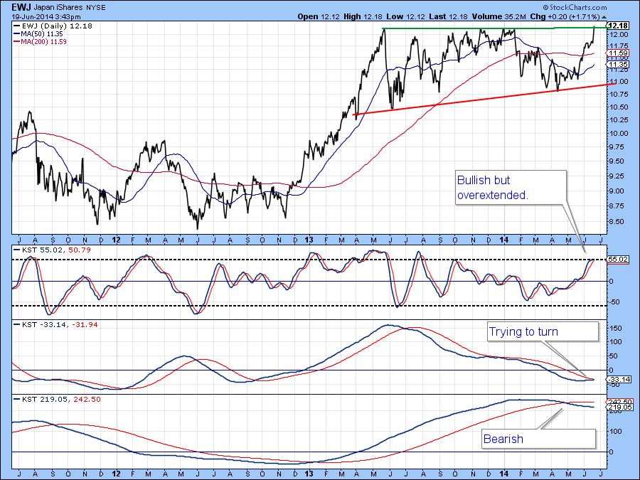
Chart 4
US Credit Markets
Previous market roundups pointed out that the Barclays 20-year Trust, TLT, had experienced a false breakout above the green trendline. Since the Bond Net New High indicator, in Chart 5 had peaked from a relatively high level prices appeared vulnerable. I also said that notwithstanding a small bounce we should subsequently expect to see a violation of the red up trendline. Well, we have seen the violation and the bounce, and now I am expecting prices to break below the $110 level just below the small red trendlinel. This view is not only being supported by the Net New High indicator but by the price action of shorter term maturities, where yields are rising and prices falling.
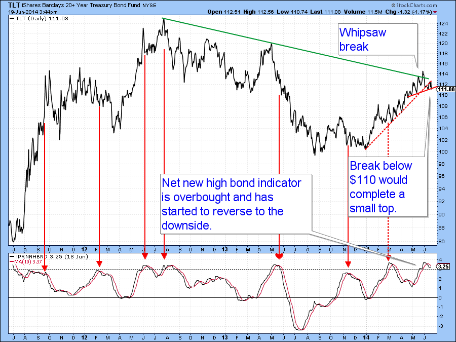
Chart 5
Chart 6 shows that the 2-year yield has just completed a major base. Note that the breakout is being supported by a rising short-term KST. More important, is the fact that the dominant intermediate series was moving sideways. This week though, it started to re-accelerate to the upside. If short-term rates, as expected, continue to rally this should spill down the yield curve to longer-term bonds such as those represented by the TLT.
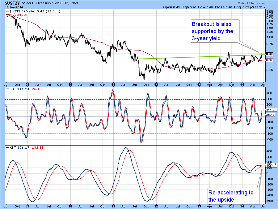
Chart 6
US Dollar Index
The US Dollar Index has remained in a major trading range for quite some time, but right now the stochastic in Chart 7 has clearly rolled over to the downside as has the short-term KST (not shown). That suggests that the Index itself is headed to the lower end of the trading range around 79.
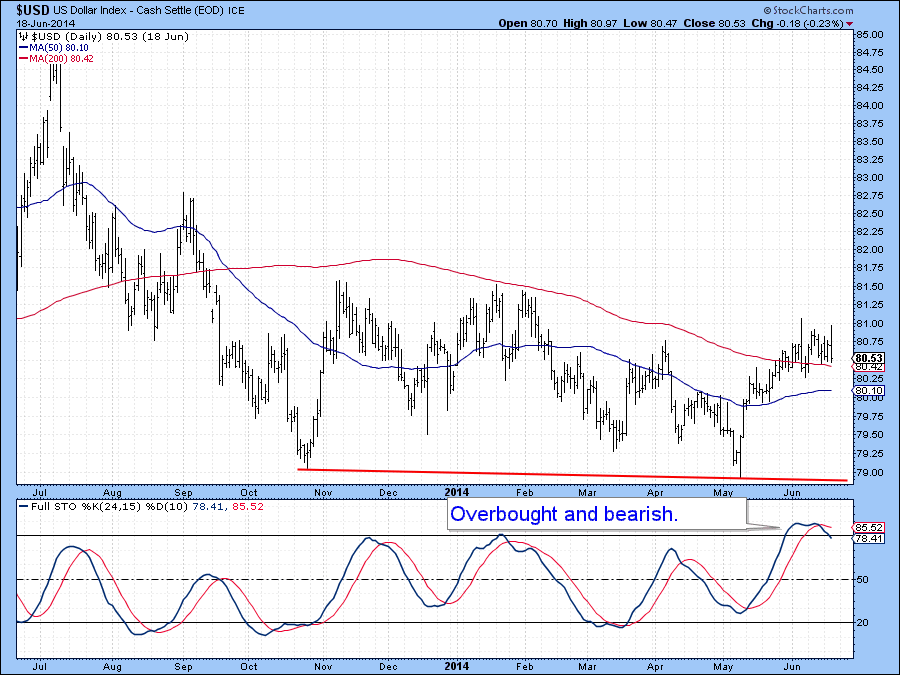
Chart 7
Precious Metals
A few weeks ago the price of the Gold Trust, the GLD, violated a key red up trendline, as did the KST. That line for the price was support, but then became equally as important as a resistance zone, which the price surpassed on Thursday. With the KST now in a bullish mode the odds of a break above the dashed green down trendline at $131, have been greatly enhanced.
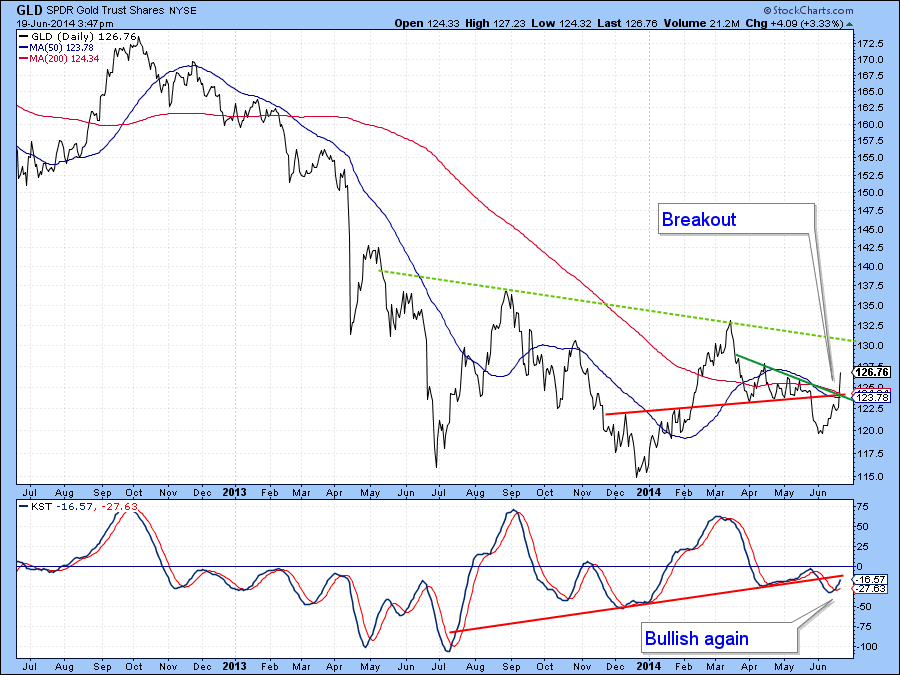
Chart 8
If it can succeed then the indicator in the bottom of Chart 9 will likely go bullish by reversing its descent. This series is my Dollar Diffusion, which you can read about here. I normally use it in conjunction with the US Dollar Index. However, it’s plotted inversely here because the dollar and gold usually move in opposite directions. Currently, the indicator is declining, which is bearish for gold. However, given the possibility of a dollar reversal to the downside, this indicator at zero, is in a position where it could easily reverse.
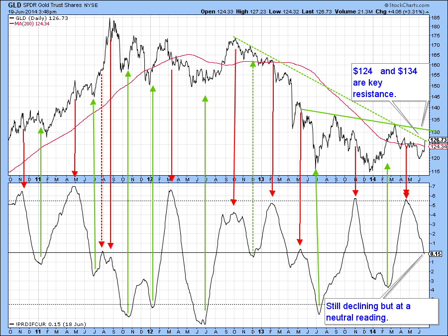
Chart 9
Finally, the Gold Miners ETF, the GDX, has broken above a small down trendline, its 200-day MA and experienced a positive KST signal. Now we will see if it can rally above the key green trendline at $26.60. If so, that will be very bullish for both the shares and the metal. Note that the gold share bullish percentage is also below an important trendline. That’s another thing to keep an eye out for. Moving in its favor is the fact that the bullish percentage has been registering a series of rising lows since July of last year. This compares to the price itself which made its low in January.
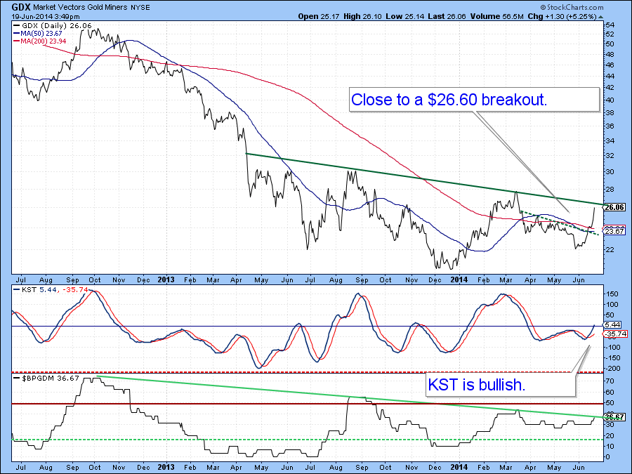
Chart 10
Commodities
Last time I concluded that if commodity prices were still in a bull market, which was my belief, then the reversal of my two net new high commodity indicators (read about them here) should trigger a rally. The confirmation point was a break above this green down trendline, which, as you can see, actually took place. So far so good; if there is going to be any trouble on the downside one thing I do not want to see is the DJP slipping below this line as that would create a head and shoulders top.
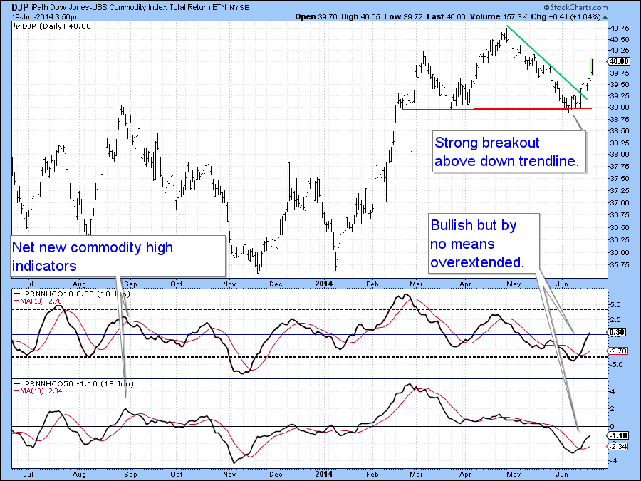
Chart 11
One reason why this is unlikely, lies in the fact that the ratio between the Goldman Sachs Natural Resource ETF and the Spider Consumer Staple ( the IGE/versus the XLP) has broken to the upside. As you can see this series usually moves in tandem with the DBC Commodity ETF, which has also broken out. One thing that would really enhance the inflationary case would be a breakout by the Inflation/deflation Ratio(read about it here). It has just rallied from support. Now let’s see if it can move above its resistance trendline, to do so, just click on the chart to follow its progress in the next few days.
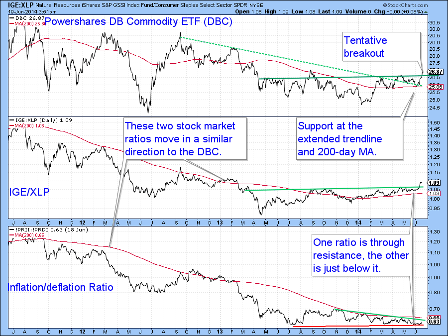
Chart 12
Good luck and good charting!
Martin Pring


