New Highs in the Dow Don't Translate Elsewhere
- Less than 50% of NASDAQ stocks are above their 200-day MA’s.
- Bond market confidence ratio on the verge of a major breakdown.
- US Dollar Index could be about to break to the upside.
US Equities
The Dow touched an all-time high this week but that gives a false impression of what is really going on, as many sectors continued the corrective process I have been talking about for the last couple of weeks or so.
During most of the recent years rally, new highs in the Dow were quickly confirmed or even led by the NYSE A/D line. However, this week the breadth indicator tentatively violated its February/July up trendline. Any further weakness will result in a decisive break. Note that it also failed to confirm the Dow high this week. Such discrepancies can always be cleared up, of course, but as it stands right now, the breadth price setup is negative. The level I am watching at this point is just below 17,000 on the Dow, say 16,900, since that is where the February up trend line is currently residing. If it gets taken out in a meaningful way, look for a much wider correction to follow.
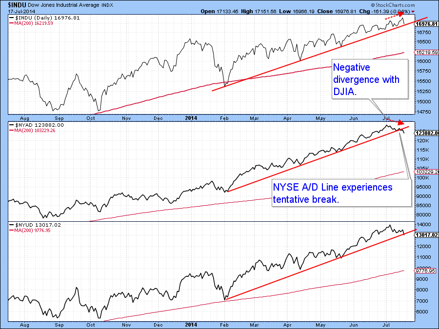
Chart 1
That view is not based on the line itself, which is not all that significant, but from a plethora of negative divergences that are starting to appear. For example, Chart 2 shows that the number of NYSE stocks exceeding their 200-day MA’s looks like it has peaked from a level that was lower than previous tops that have developed since 2011. There is nothing to stop another peak from developing with an even lower number of issues above their 200-day MA’s. However, the more that happens, the greater the rot under the surface and the more serious the consequences when the market finally breaks. Also note that this indicator is very close to trendline AB. If AB is taken out, that would indicate that more stocks would fall below their 200-day MA’s. The point being that even if the Dow 30, for instance, was to register a new high, it would be under the context of a far more selective market.
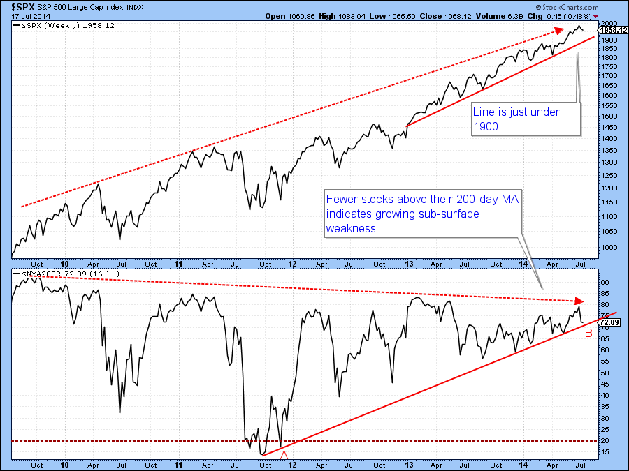
Chart 2
When we look at the same measure for the NASDAQ, things are far more serious, as you can see from Chart 3. As of Thursday, around 45% of all the NASDQ issues were above their 200-day MA’s, yet the Index was close to its bull market high.
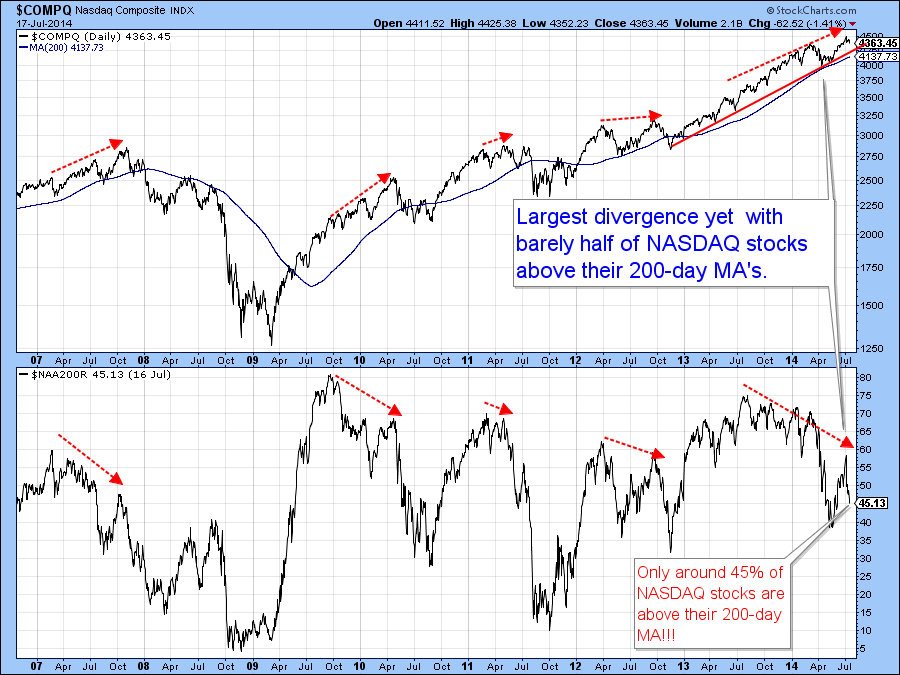
Chart 3
That means that very few stocks are participating in the rally and an even lower number registering new highs. Chart 4 confirms that growing selectivity. There are currently slightly more stocks at new 52-week lows than highs, even though the NASDAQ is very close to its bull market high.
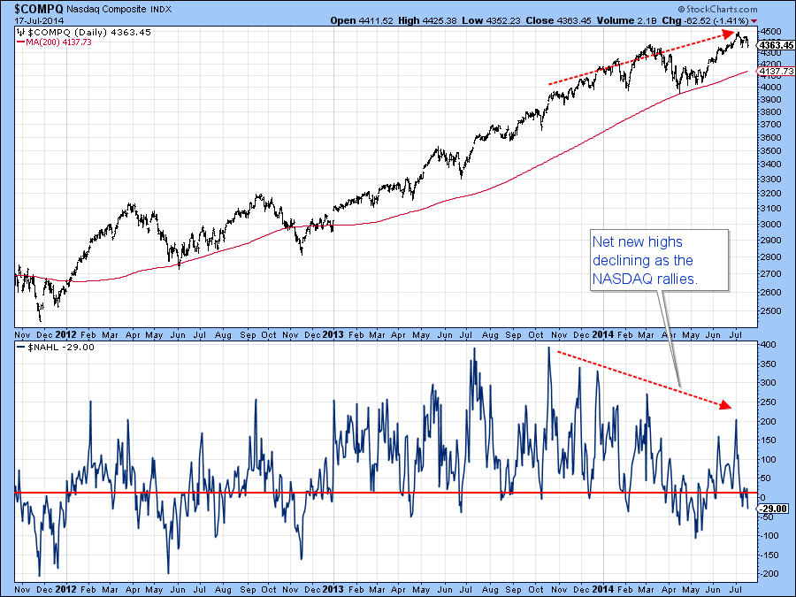
hart 4
Chart 5 tells us that the low cap stocks, in the form of the IWM, are in terrible technical shape. To start with, their recent high was unconfirmed by the RS line in the center panel. Even worse is the fact that the RS line has already started to register a new low for the move. When relative action is that weak, it is usually a tipoff that the price itself will follow suit. There is not a reliable track record for the IWM leading the S&P, so I am not going to use this poor action as high probability odds that the S&P itself will drop. However, I do think the weakness is sufficient to set up a big red flag of caution on the overall market.
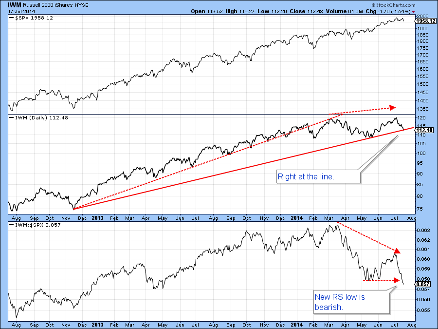
Chart 5
Finally, Chart 6 features the ratio between the iBoxx Corporate High Yield Bond Fund (HYG) and the Barclays 20-year Trust, the TLT. When it is rising, it indicates confidence in the bond market because it means that the riskier issues in the HYG are outperforming the higher quality US Treasuries. Most of the time, the ratio moves in tandem with the S&P. However, when the ratio declines and the equity market goes on to make new highs, this tells us to be prepared for equity weakness as bond investors are growing more uneasy. A couple of previous negative divergences have been flagged on the chart. A major discrepancy is currently evolving as the S&P continues to register new highs in the face of a declining ratio. That series has now reached a very critical point in the form of the neckline of a potential head and shoulders top. The bearish KST argues for a downside break, so we will have to see. However, this serious discrepancy is another warning that while stocks may move on to new high territory, the termites continue their work. Have no fear, eventually the beam will break…it always does.
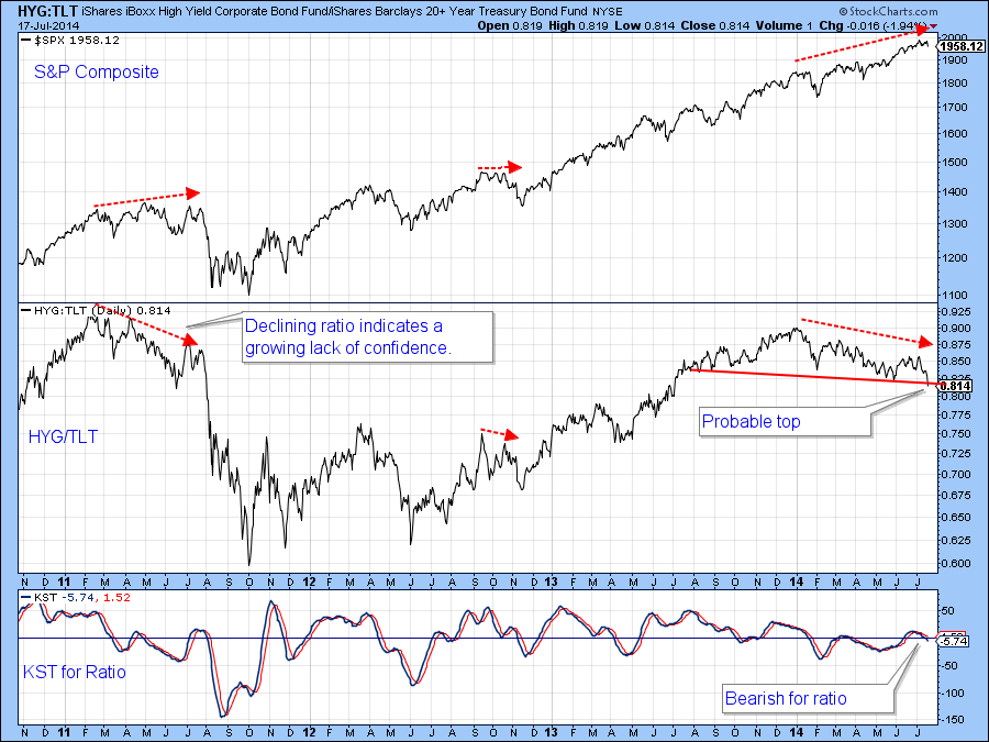
Chart 6
US Credit Markets
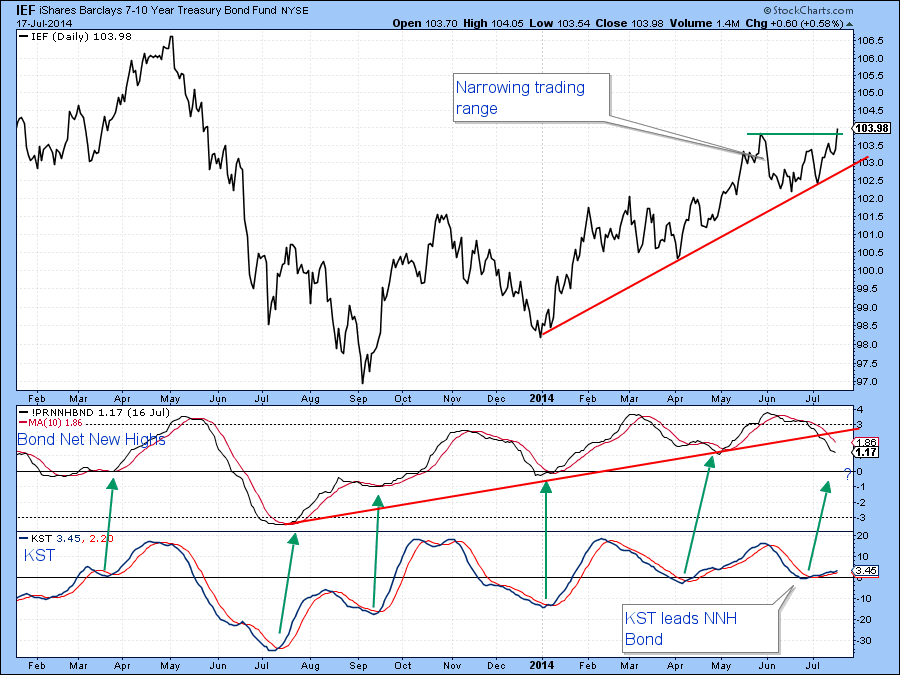
I have been expecting the 2014 bond rally to end, but the signal I was looking at was a daily close below $110 for the Barclays 20-year Trust, the TLT. That signal was never triggered and now it seems likely that the rally will continue. If equities do decline and the inverse relationship between equities and bonds extends, then the IEF, as featured in Chart 7, will probably break to the upside. At first glance, things look bearish because the net new bond high indicator in the center panel is bearish and still moderately overbought. It has also violated an up trendline. On the other hand, the KST, which leads the new high series, is rallying and that means that if the IEF can manage to close above the green trendline and complete the potential ascending triangle, say at $104.15, further gains will lie ahead.
US Dollar Index
The Euro is very close to a downside breakout below 135 and that is a big deal because this currency has a high weighting in the US dollar index and that series is very close to an upside breakout.
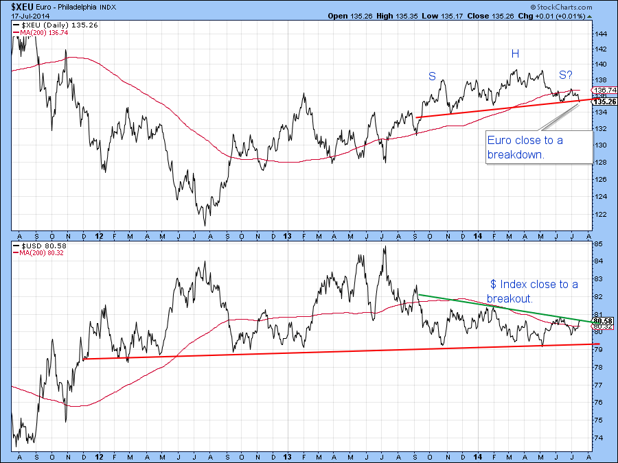
Short-term momentum indicators, such as the KST and the 20/10/10 stochastic, suggest that the dollar will break to the upside as we can see from Chart 9.
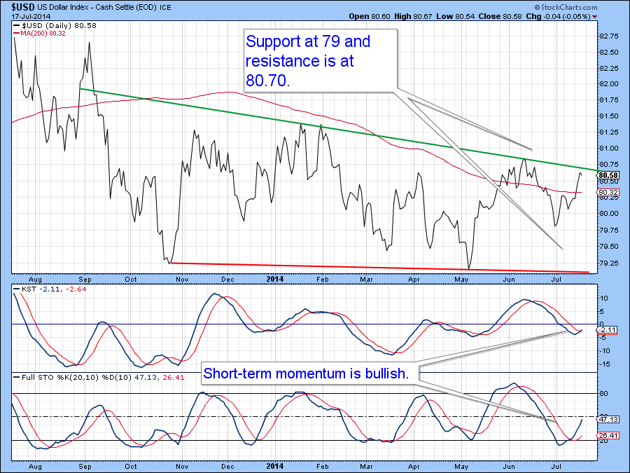
Chart 9
Precious Metals
The Gold Trust ETF, GLD, has experienced a KST sell signal from a moderately overbought position suggesting further re-accumulation within the trading range of the last few months or so. However, the KST experienced a similar hesitation in August of last year. This was resolved by the 9-day RSI breaking back above the 50-level again, as flagged by the green arrow. On Thursday, the RSI accomplished the same task as the price itself bounced off important support at the red trendline. I am not going to say we will see a rally of equal magnitude this time, but we cannot rule such a possibility out either. It is worth remembering that gold in dollars, euro and yen closed last month above their 12-month MA’s; a primary bull market characteristic. That is important because young bull markets often shrug off what would otherwise be overstretched short-term momentum. Watch that green trendline at $129 for a possible upside break.

Chart 10
Commodities
The Dow Jones UBS Commodity ETN, the DJP, recently completed and broke down from a head and shoulders top. Now, the 10-day net new high indicator has reached an extreme oversold level and the price has fallen to support in the form of the red horizontal trendline. It has not yet reversed, of course, but Thursday’s action does suggest some stabilization and the potential for a rally.
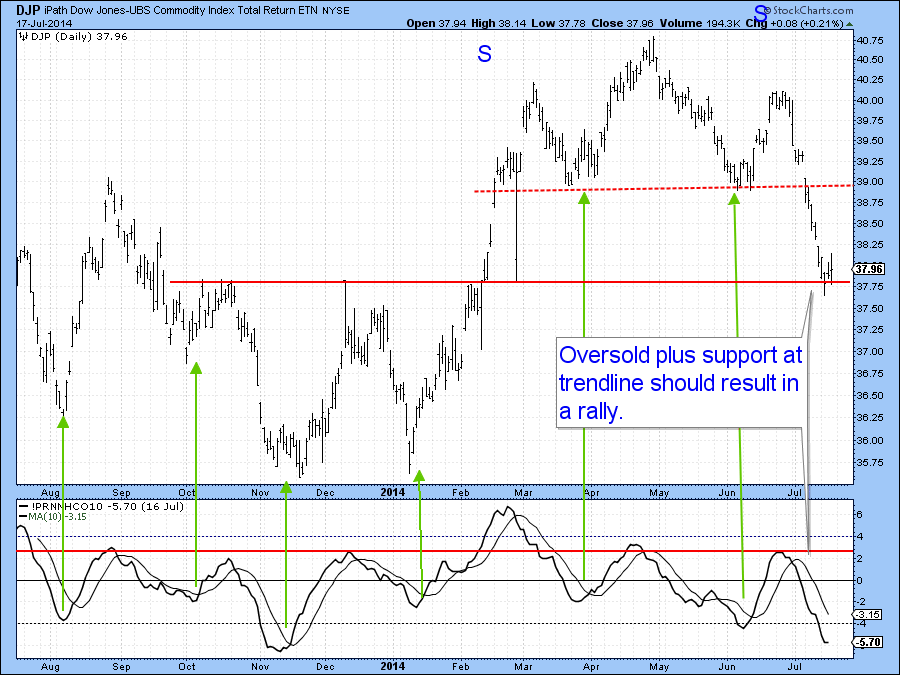
Chart 11
Good luck and good charting
Martin Pring


