Five Year Yield Experiences Major Upside Breakout
- - Brokers experience new bull market closing high.
- - NYSE stocks above their 200-day MA’s continue to shrink.
- - Canadian dollar experiences false break to the downside.
- - Commodities break to the downside. Could it be a whipsaw?
US Equities
Tuesday’s strong equity action could well be a signal that other market averages are about to join the Dow by setting a new high. After all, the early leading Brokers ETF ( IAI ), registered a new closing high on Tuesday. Brokers have a strong tendency to lead the S&P. That’s because the S&P discounts the economy and the IAI discounts the market.
Generally brokers make more money during bull than bear markets. Consequently, when investors in brokerage stocks fear that a bull market is coming to a close they anticipate this by selling their brokerage stocks. The new brokerage high seen in Chart 1 is therefore a favorable factor and shows that these investors have confidence in the market’s ability to move higher.
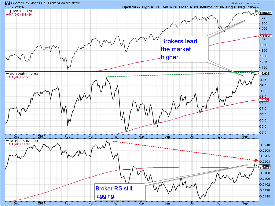
Chart 1
One problem though, lies in the fact that the daily KST for all the major averages is moderately overbought and bearish. The KST for the S&P 500 ($SPX) is featured in Chart 2. This does not preclude a rally but it does create a headwind unless the indicator can gradually work off this overstretched condition via through ranging action as opposed to an actual decline.
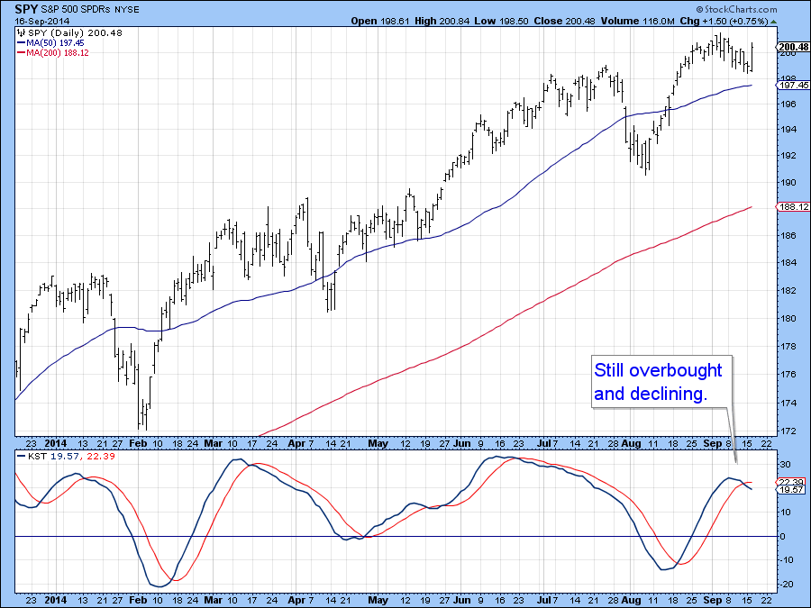
Chart 2
The NASDAQ Composite ($COMPQ) has recently been very strong, but Chart 3 shows that each time it has registered a new bull market high fewer and fewer issues have accompanied it. The NASDAQ High Low ($NAHL) tells us that the advance has been powered by a few heavy hitters and is not broadly based, and that makes it vulnerable.
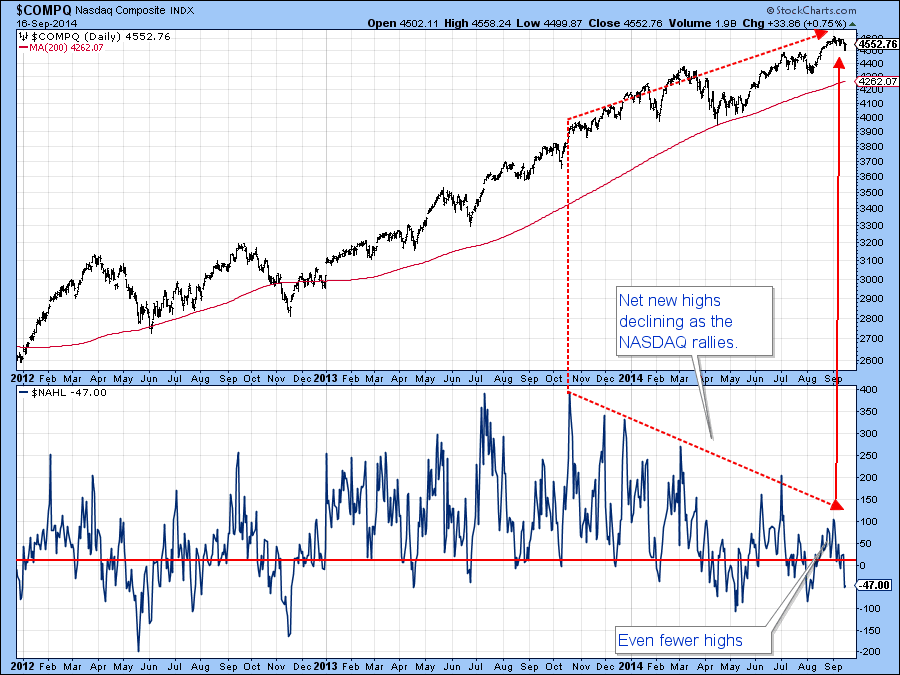
Chart 3
Another problem, arises from the fact that the Percentage of NYSE stocks above their 200-day MA ($NYA200R) on Chart 4 continues to get weaker as the market advances. There is no reason why further new highs will be seen with even fewer stocks above their average, but that would make the advance even more selective than it currently is. Alternatively, these divergences may be cleared up with a strong rally. However, as it stands today the divergences are still in force and the longer they continue the worse the decline is likely to be when it finally does unfold. I am particularly interested in the red dotted support trend line on the second plot area for if it is violated with a drop, say below 55, that would indicate that the number of issues north of their MA’s had begun to shrink even more. Such action would not preclude the market from moving higher but it would certainly confirm that conditions had become more selective.
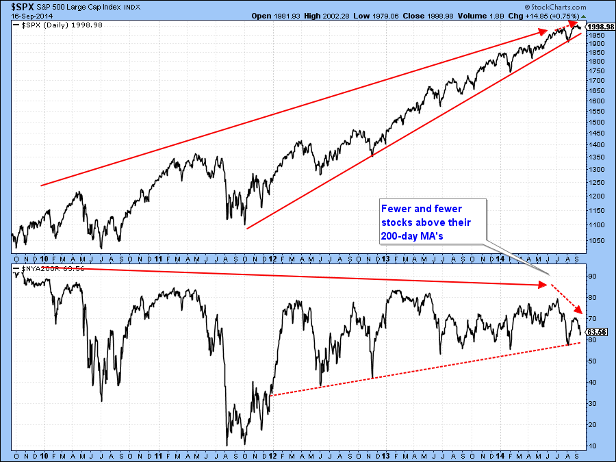
Chart 4
The confirmation I am looking for in that regard is a break in the 2012-2014 up trendline in the World Stock ETF (ACWI) in Chart 5. The red trendline has been touched or approached on six occasions and represents a very formidable level of support. It is currently around $59.30. A daily close that holds below $57.80 would not only decisively penetrate the line but would also take out the July low.
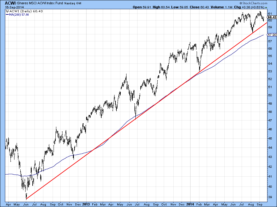
Chart 5
US Credit Markets
The price of the 10-year note ($UST), shown in Chart 6, looked last week as if it had experienced a false upside breakout. This week it has confirmed that scenario by violating the red up trendline. The short-term KST has gone bearish and marginally penetrated its 2014 up trendline. All of this suggests that the position of the long-term KST, which is marginally positive could be threatened.
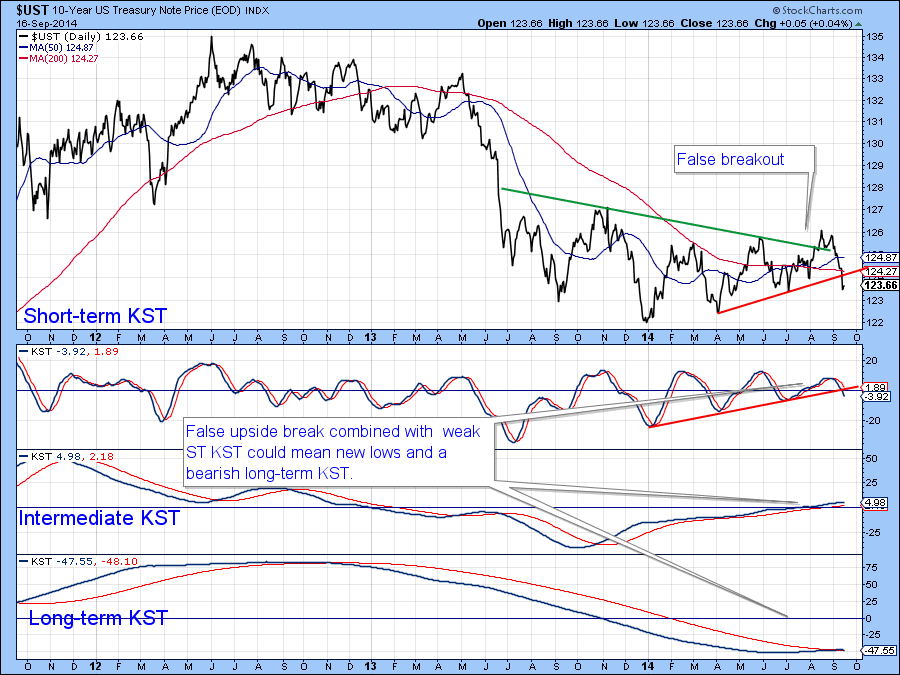
Chart 6
The same message of higher yields is being presented on chart 7 by the 5-Year Yield ($FVX), which has just tentatively broken to the upside. This has taken the form of both a long-term trendline violation and the completion of a 1-year right angled triangle.
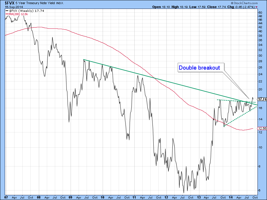
Chart 7
Dollar Index
Notwithstanding the fact that the Dollar Index ($USD) shown on Chart 8 is in a primary bull market it still looks to me as though some counter-cyclical action is called for. Chart 8 compares the Index to the Bandwidth Indicator. This series measures volatility and triggers its strongest signals whenever it reverses direction from a high level. After a sharp decline this means a move to the upside but after a rally one to the downside. I have highlighted downside signals with the red arrows since that is what we see today. The ADX in the bottom panel measures directional movement. Reversals from high readings indicate the previous strong trend is likely to change. In the current situation the previous trend was a rising one, so the change in trend could either be sideways or an actual reversal. Either way, since the ADX is at a very high level, and has tentatively started to reverse to the downside so the indication is that prices are unlikely to move higher for a while. Bear in mind though, that the long-term indicators are signaling a primary bull market, and that’s the direction on which we should really focus our attention.
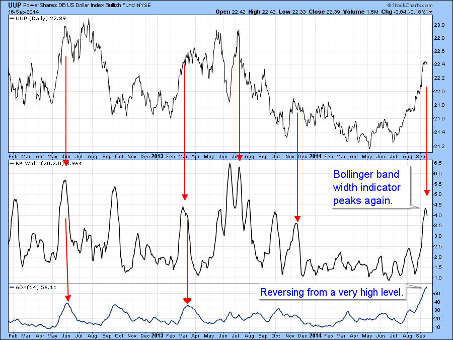
Chart 8
The Canadian Dollar ($CDW) broke down from a head and shoulders pattern some time ago but this week experienced a bullish two bar reversal. Tuesday’s action took the price back above neckline and if it can hold in that position above the line that will mean that the downside break will turn out to be a false one, and would imply a spirited rally. However, on the long-term charts, 94c represents really strong resistance, which once overcome would confirm a primary trend reversal.
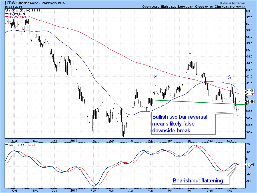
Chart 9
Precious Metals
I have been saying for a couple of weeks that the gold asset complex is at a critical point. I still believe that it is, even with the bearish drip, drip, drip of the last couple of weeks. Take a look at the Gold Share ETF( GDX) in Chart 10. It’s just above the key (red) support trendline. However, the cumulative line constructed from daily new high/low gold share data is still slightly above its MA. Moreover, the raw high/low numbers in the bottom panel, have been moving sideways as the price has been correcting. None of this turns the overall picture into a bullish one ,which can only happen with a break above the green line at $27.50. However, it does tell us that under the surface the technical situation is more constructive than price action alone would have us believe.
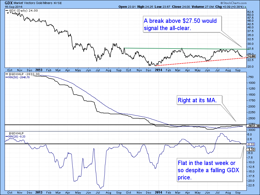
Chart 11
The Gold ETF (GLD) on Chart 11 is still in its trading range but does not look as strong as the shares. First, the price has started to trace out a series of declining peaks and troughs as flagged by the arrows. In addition, the short-term KST remains in a bearish mode. On the other hand, Ned Davis Research reports that their gold sentiment indicator is at a very bullish (from a contrarian aspect) 7%. We noted similar data from Mark Hulbert last week. Price, of course, trumps everything, so until we get a positive signal in that direction with a break above the green dashed trendline at $125 on the GLD, a cautious stance is appropriate.
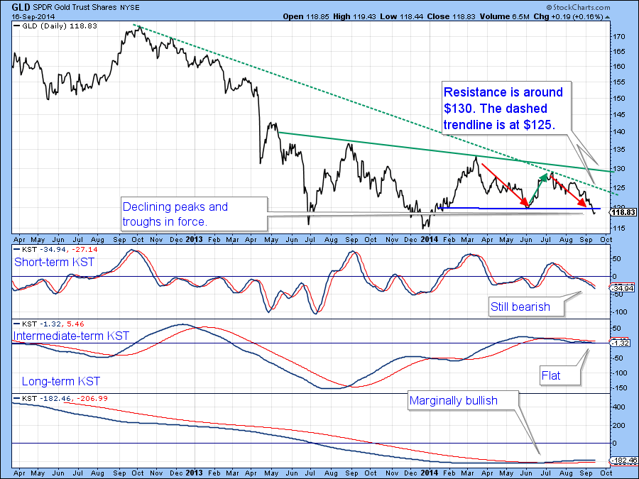
Chart 11
Commodities
Late last week the Dow Jones UBS Commodity ETN (DJP) broke below support as flagged by the horizontal line on Chart 12. This week though, it has managed to move back to the line, which now becomes resistance. The KST is oversold and in a declining mode, so I am treating the trend as a bearish one unless the price, which is way overextended on the downside, experiences a break that can hold above the line at $35.75. Were that were to happen in the next couple of sessions or so, it would indicate that the downside break was a whipsaw. Whipsaws are often followed by above average moves in the opposite direction to the whipsaw.
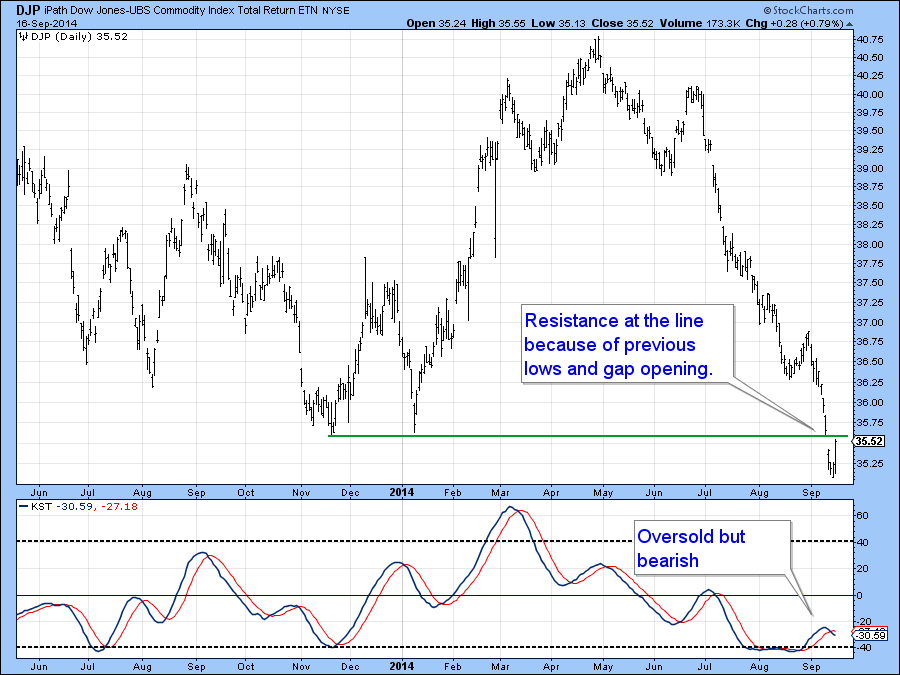
Chart 12
Good luck and good charting!
Martin Pring
The views expressed in this article are those of the author and do not necessarily reflect the position or opinion of Pring Turner Capital Group or its affiliates.


