Global Equities and Some US Averages are Just Above Critical Support
- Small cap stocks on the verge of a major breakdown.
- Gold shares violate important up trend line.
- Dollar Index due for a correction within a primary bull market.
Click here for the video version.
For the last few weeks I have been pointing out the gradually deteriorating technical position but emphasizing that trend trumps everything and that these discrepancies need to be confirmed by some kind of a trend reversal. We could use the analogy of termites eating at a beam, the more they eat the closer you come to a break in the beam. However, nothing bad happens until the beam actually responds to the growing weakness and finally gives way.
Bearing that in mind I have noticed that several indicators have fallen to key support areas. Take the S&P Small Cap ETF ( IJR). The IJR, along with its Advance / Decline line ($SMLADP) have tentatively violated the neckline of a 1-year head and shoulders top. Both series are also below their respective 200-day MA’s and the KST is bearish and slightly below zero. This suggests that further weakness is to follow.
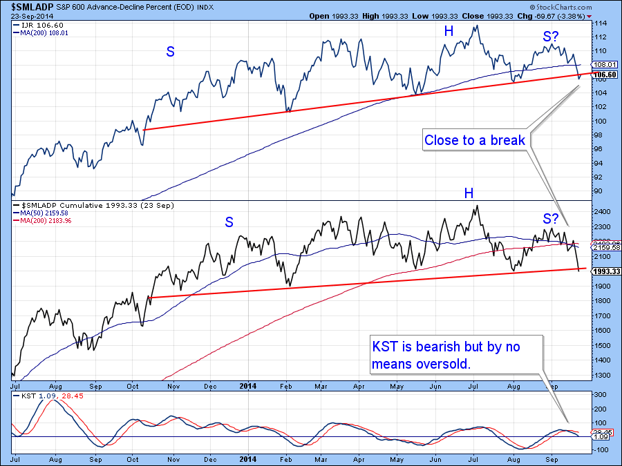
Chart 1
I have been stalking the NYSE Percentage Of Stocks Above Their 200-day MA ($NYA200R) since it has been quite soft recently. This series has now broken to a new low, even in spite of new S&P 500 ($SPX) highs. More to the point, it has violated a key support trendline and this suggests that the number of stocks above their 200-day MA’s will continue to decrease. The message, even if the S&P makes a new high, is that it’s going to be very difficult to find issues that will rally along side it.
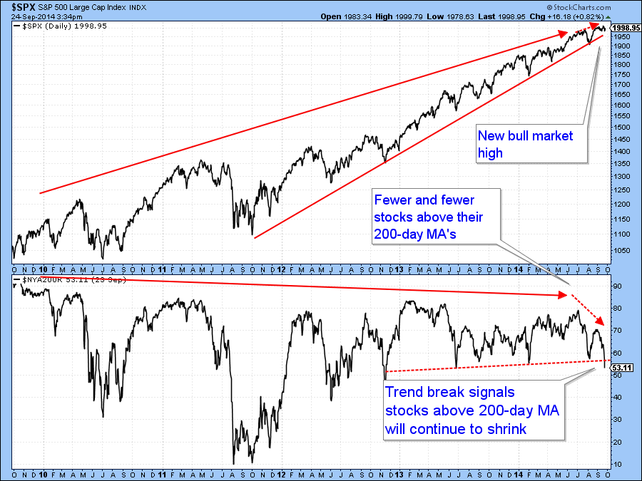
Chart 2
The NYSE Composite ($NYA) includes all the stocks on the New York Stock Exchange (NYSE). When we look at the $NYA, which is a much broader average than the S&P 500 ($SPX), we see that it is also delicately balanced, right at its bull market trendline. If we use the 2009 low to construct a trendline for the Special K it was violated a long time ago. However, I have constructed a more conservative one that joins more of the lows. This series has also been violated and now stands at its MA.
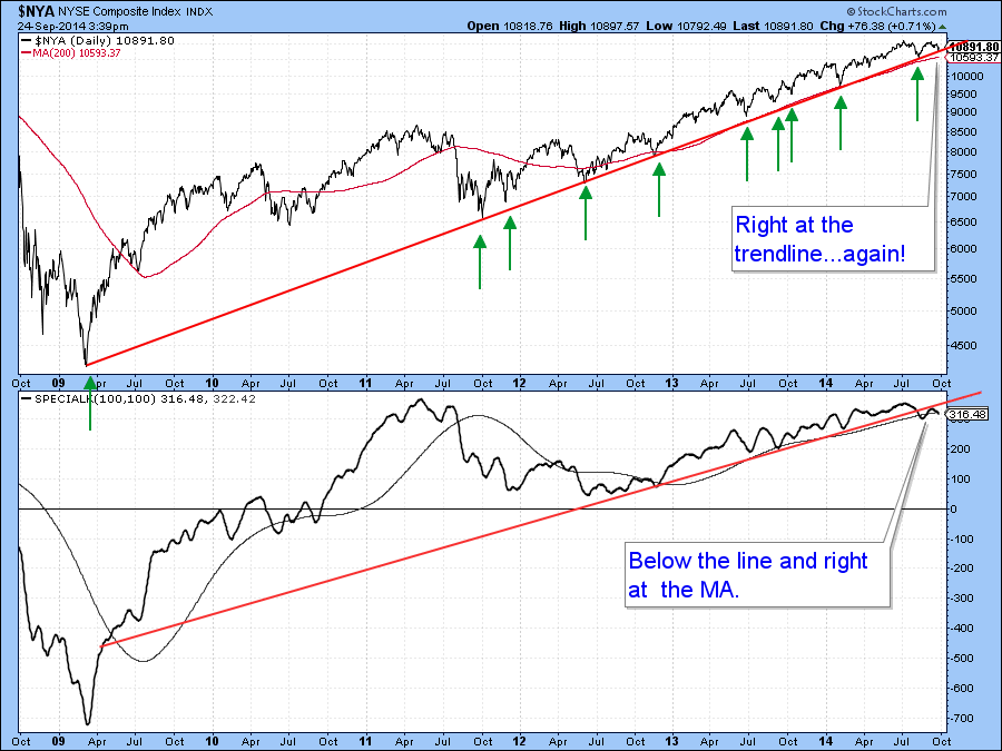
Chart 3
Last week, we slipped in this chart showing the bull trend for the MSCI World Stock ETF(ACWI) since mid-2012. Now the ACWI has fallen back to it, but has not gone through. Since the line has been touched or approached on six occasions and it is quite a long one its penetration would have some significance. However, I think a better point is $58 since that’s where the previous short-term low and 200-day MA are currently residing.

Chart 4
Things don’t look that hot for global equities as the MSCI World ETF (ACWI) has been acting weaker than the S&P. We are now starting to see some weakness in global breadth. Throughout the bull market my Global Advance/Decline Line (!PRGLAD), comprising the daily cumulative plurality of a basket of country ETF’s advancing or declining, has been in gear with the MSCI World ETF (ACWI). However, in recent weeks this series has first of all violated this strong up trendline. More concerning though, is the fact that it has now broken down from this top. Note that the price itself has not yet done so.
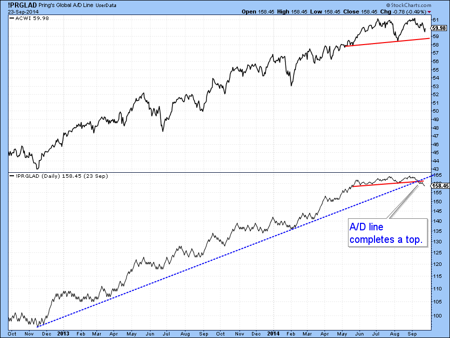
Chart 5
Also, my Global Diffusion Indicator (!PRDIFGLO) monitors a basket of country ETF’s that are above their 50-day MA’s. This series recently rallied but was unable to get much above zero even though the ACWI reached a new bull market high. If the bull market trendline is violated this will confirm the divergence. Quite often when a momentum indicator reverses from just above the equilibrium level as the price is at a new high a very sharp shakeout can follow. Just look at this example in the summer of 2011.
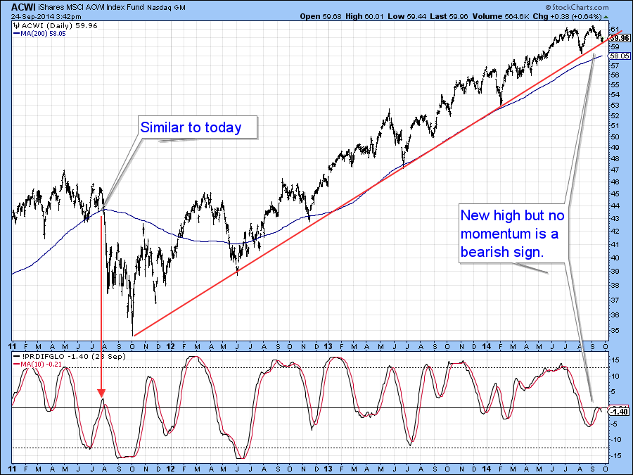
Chart 6
I think there is a pretty good chance that the market will break. However, next week experiences a the strong end-of-the-month seasonal, so a small rally or consolidation may develop. Our final S&P 500 stock market ETF (SPY) chart hints at this because the McClellan Oscillator for the NYSE ($NYMO) is quite oversold. This could give us a breather but the technical deterioration that’s already taken place won’t postpone weakness forever.
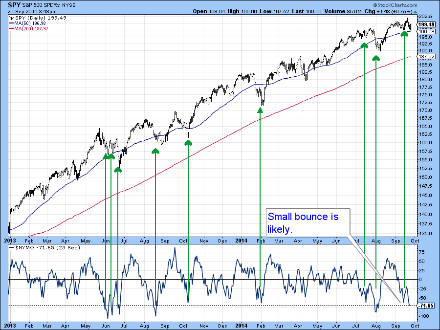
Chart 7
US Credit Markets
The 10-year Treasury note ($UST) recently experienced a false breakout above the green trendline. This was then confirmed with a drop below the red 200-day MA and a trendline joining the April and July lows. Now it’s possible to construct a more meaningful line using last week’s low. If that gives way, which is what is suggested by the declining KST and dashed momentum trendline violation, then new lows will likely be seen for this maturity.
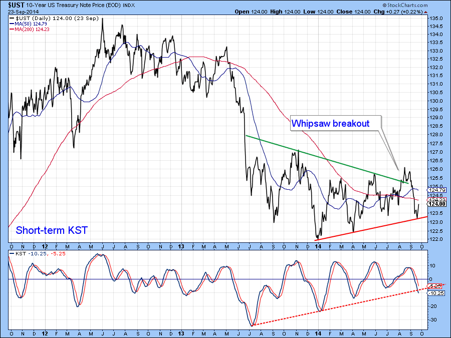
Chart 8
US Dollar Index
The Dollar Diffusion Indicator (!PRDIFCUR), which monitors a basket of cross currency rates in a positive trend, is very overextended and still rising. I have been saying for a couple of weeks that the US Dollar Index ($USD) is due for a correction. The failure of one to develop is actually a characteristic of a new and young bull market. For that reason I continue to focus on the main trend, which is positive.
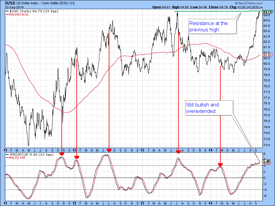
Chart 9
By way of a reminder look at the recent breakout in the $USD. It was tentative at the start of the month, but is now a pretty decisive one. Lots more upside potential here, regardless of any short-term correction.
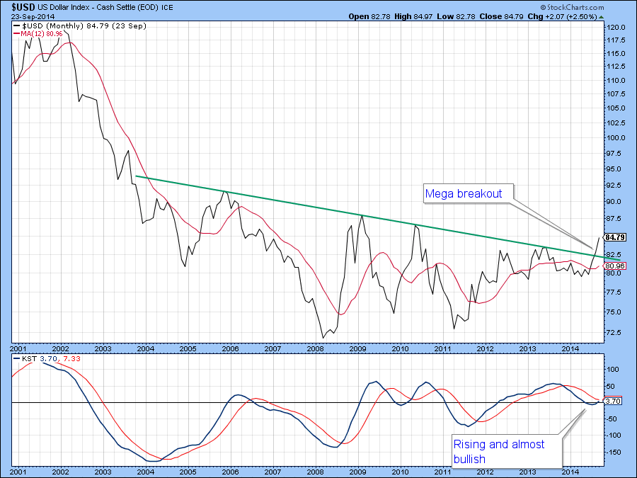
Chart 10
Precious Metals
The Gold Miners Index ETF (GDX) has not broken out above the key $27.50 level that would have signaled a new bull market. Instead it has slipped rather decisively below the red up trendline. Support still lies at last December’s low at $20. However, the negative crossover of its moving average by the cumulative setting on the Gold Miners Net New High Line ($GDXHLP) and a drop below zero by the raw data on solid line setting ($GDXHLP) in the bottom panel do not offer any encouragement that can back up what are, from a contrary viewpoint, very bullish sentiment numbers. Best to remain cautious until some green shoots break through.
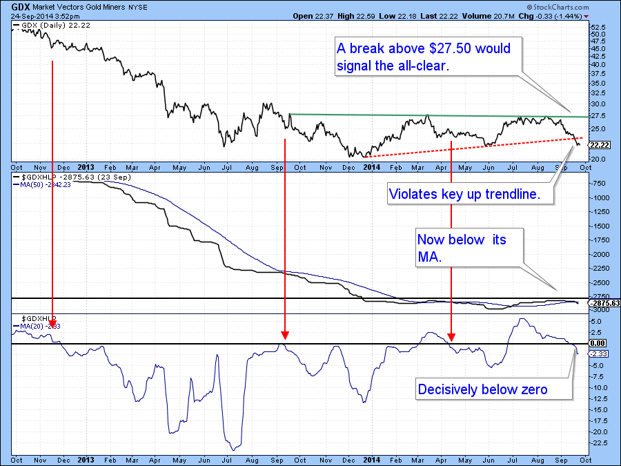
Chart 11
Commodities
Last week I pointed out that the Dow Jones UBS Commodity ETN (DJP) had broken below key support. I also stated that if it could quickly take advantage of a deeply oversold condition and rally back above resistance it might be possible for a good rally to develop. As you can see from the chart that did not happen and time is running out. The Pring Net New High Commodity Indicator (!PRNNHC050) is deeply oversold and could trigger a nice rally, but it’s usually better to trade on the evidence rather than hope, and so far there is little evidence apart from an oversold condition and constructive sentiment. We need to see some positive price action and so far that has not taken place.
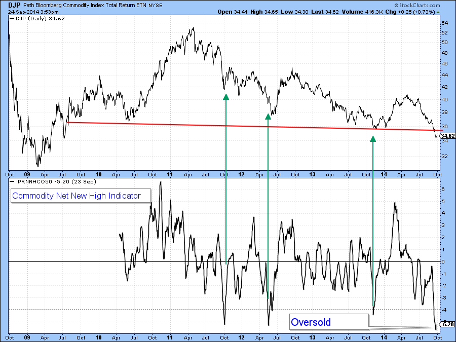
Chart 13
Good luck and good charting,
Martin Pring
The views expressed in this article are those of the author and do not necessarily reflect the position or opinion of Pring Turner Capital Group or its affiliates.


