Interest Rates are Starting to Rally Across the Board
- Equity market short-term momentum starting to roll over but not yet bearish.
- Dollar Index fails to respond to overbought short-term condition, which is a sign of a primary bull market.
- Gold experiencing very constructive sentiment but needs to confirm this with a break in the GLD above $130.
(Click here for a video version of this article.)
US Equities
Last week I pointed out that short-term momentum was positive and that we should look for higher prices. However, we should also be mindful of the possibility that the new high in the World Stock ETF, the ACWI, could be a whipsaw. The point of confirmation I was looking for in this respect was a drop below the then pre breakout minor low at $60.50 i.e. at the red trendline. That has now happened and the KST has started to roll over. Sometimes when this indicator peaks, as it did in May the market can regain composure and move on to new highs. In the case of the false upside breakout then, the price did not violate the previous support as flagged by the dashed red line. This week it did, thereby suggesting that the KST peaking action is genuine. Nothing is perfect in this world and the price rallied back today, Wednesday, to a position right at this former support level. This has been a cruel market for those looking for corrections, so the situation may well resolve itself on the upside, I think we will find out in the next few sessions.
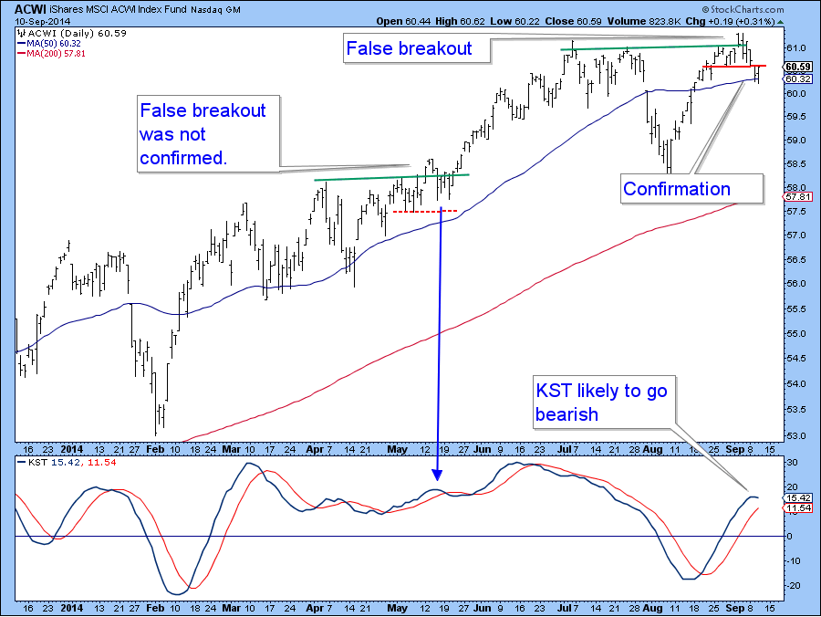
Chart 1
Some other discrepancies have also been emerging. One comes from the relationship between the S&P and the more broadly based NYSE Composite. All through the 2012-2014 rally you can see from the vertical lines that the NYSE confirmed every new high established by the S&P. The latest high though, has not been confirmed and that’s a worry. It’s always possible that this negative divergence will soon be cleared up. However, if the S&P breaks below its up trendline at 1940 and the NYSE does the same with a break below 10,750 that would sufficient to confirm this divergence.
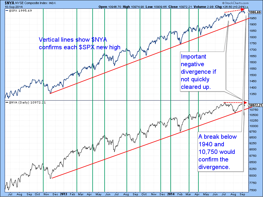
Chart 2
A good way to look at the market from the point of view of assessing whether an advance is broadly based is to compare say, the S&P with the number of NYSE components that are above their 200-day MA’s. We see this in Chart 4, where the number of stocks above their respective averages has been shrinking since the beginning of 2013. The latest new high in the S&P was accompanied by substantially fewer issues. We do not know if we have seen the top for the current move as the percent above series could always turn around and move higher. In this case a violation of the red trendline around the 55 level would be confirmation enough. You can update this series with the symbol $NYA200R or simply by clicking on this chart.
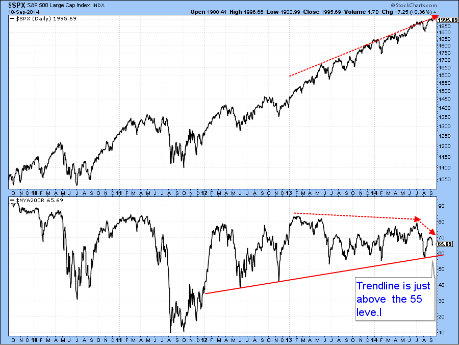
Chart 3
Finally, I showed you a chart featuring the Value Line Arithmetic a few weeks ago. Note that the this series has decisively violated a secondary up trendline going back to early 2013. The Special K, or SPK, action especially fascinates me because I am getting clear-cut signals that this weak sector of the market has experienced a major momentum reversal. That, of course could be an omen for other sectors. Typically, but certainly not always, the SPK peaks more or less simultaneously with the price series it is monitoring. I use several techniques to help me with this reversal identification process. The most common is to observe trendline violations where the line is of at least 9-months duration---check. Also, both series recently rallied back to their extended lines, which acted, as they should, as resistance levels. Second I like to see a reversal in the rising peak trough progression.-check there as well. Third, the SPK needs to cross below its SMA, which is a 100-day MA smoothed by another 100-days-check number three. Finally, if the SPK completes a top formation it further adds to the probability that it has reversed-check here with a completed upward sloping head and shoulders. Bottom line, there are a number of factors that suggest the SPK has peaked for the cycle. This is an area of the market that we need to watch fairly closely for if it defies the odds and begins to move higher it will indicate that the technical position of the market in general is solid. On the other hand, if it weakens some more, the odds would favor other sectors following suit.
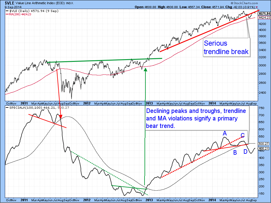
Chart 4
US Credit Markets
Last time we looked at the 5-year yield and I concluded that it was likely to challenge overhead resistance in the form of the green trendline at 1.8%. The KST was bullish then and remains at a subdued level, so a break above 1.8% looks likely.
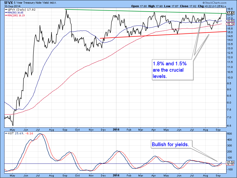
Chart 5
The 10-year note recently experienced a break above this green trendline but was unable to hold above it. Since the short-term KST in the second panel has started to go bearish it looks to me as if that upside break will turn out to be a whipsaw. That would be confirmed if the price experiences a daily close below 124 since that will rupture the trendline and the 200-day MA.
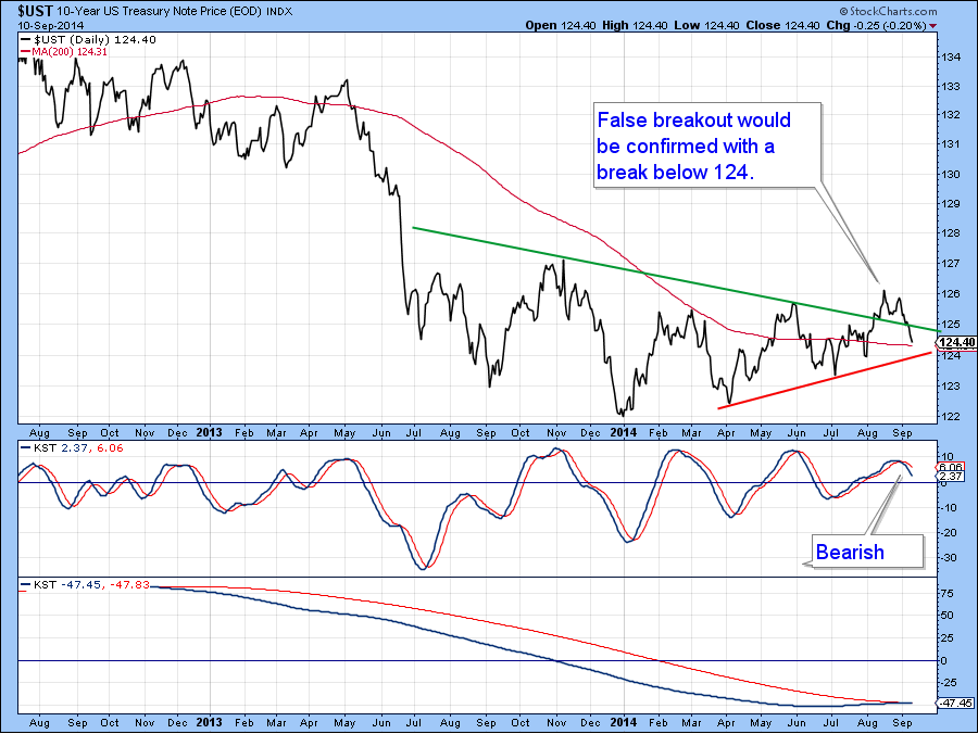
Chart 6
The global credit market prices don’t look that healthy on an intermediate basis as my World Bond Index has ruptured its 1-year up trendline. Both KSTs are bearish and this may well have an influence on the long-term series, which is not shown but which is rising gently at around the equilibrium position.
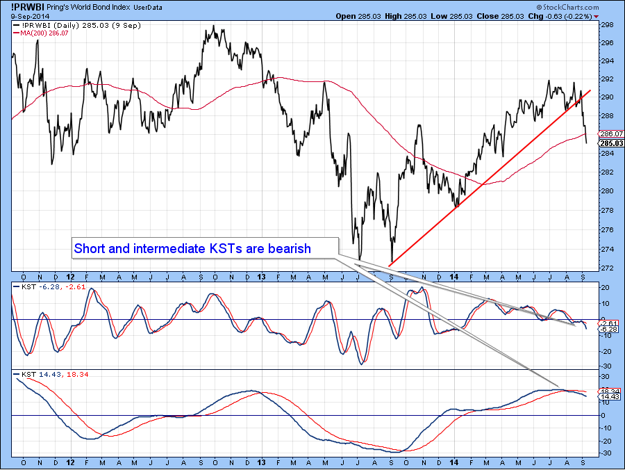
Chart 7
The Dollar Index
The US Dollar Index tentatively broke out from a multi-year base at the end of last month and has built on that strength in the last two weeks. Last time I pointed out this overbought condition and suggested that a correction could take place but that we should focus on the main trend since counter-cyclical corrections are notoriously difficult to call. The very fact that the Index has failed to respond to this over extended condition then, is a further sign that the Index is in a solid bull market.
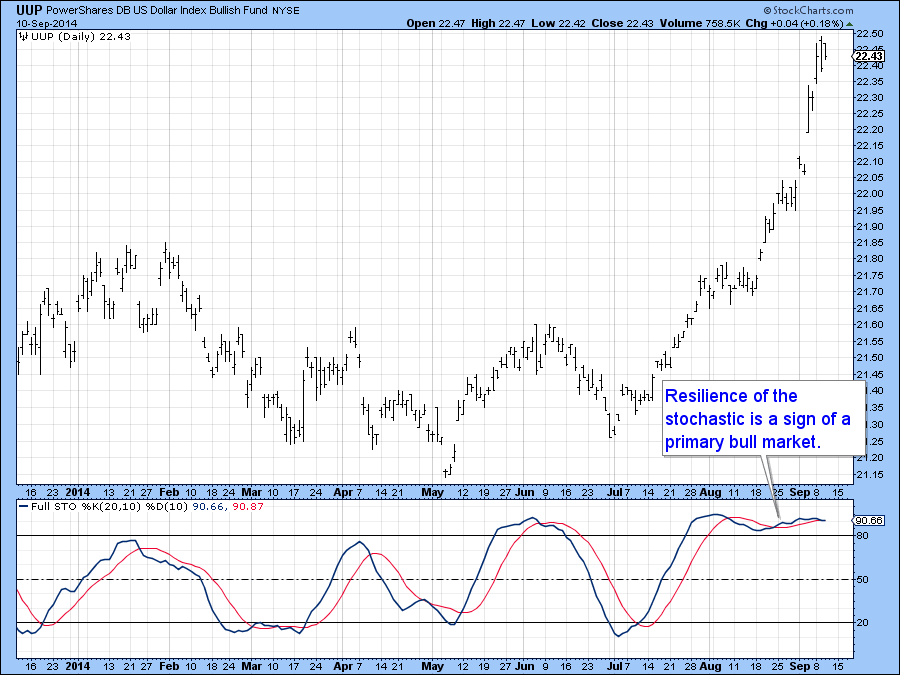
Chart 8
Precious Metals
Gold has held up reasonably well given the powerful head wind of an extremely strong US dollar. The inversely plotted dollar diffusion in the lower panel of Chart closely reflects price swings in the yellow metal and is now extremely oversold. Mark Hulbert, in a recent Marketwatch column, also reports that his sentiment indicator for gold has fallen to a very positive net 40% short position for gold allocations amongst newsletter writers. That’s a 14-month low. All of this suggests some kind of a bounce, sufficient perhaps to break the all-important $130 level on the GLD, could soon begin to take place..
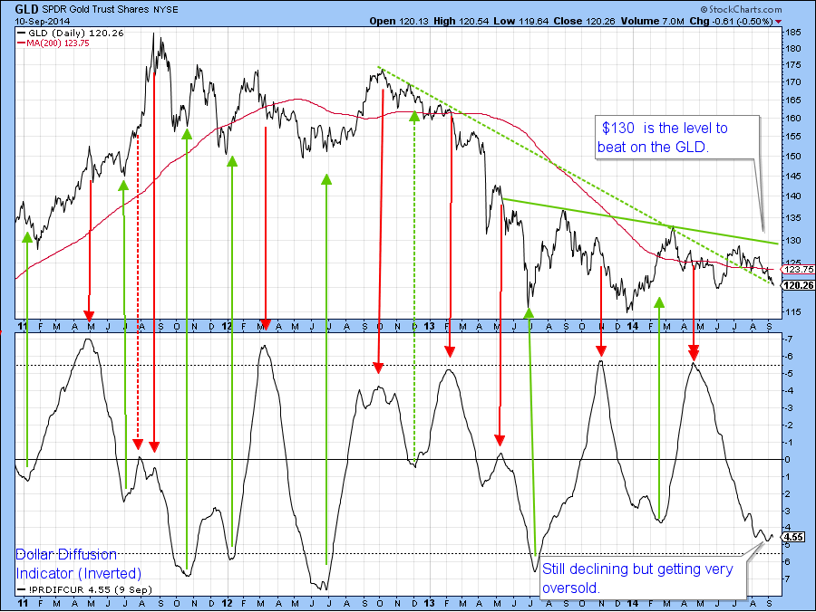
Chart 9
Gold shares also remain in their recent trading range. However, their KST continues to edge lower. In recent weeks I had pointed to a nice breakout in the percentage of gold stocks in a positive trend. However, that series has slipped a bit, and is now just above its extended breakout trendline. It all comes down to price and here the two levels are $23 on the downside as that would violate the red trendline or $27.50 on the upside, as that would complete the base and place the shares in a very strong technical position to rally.
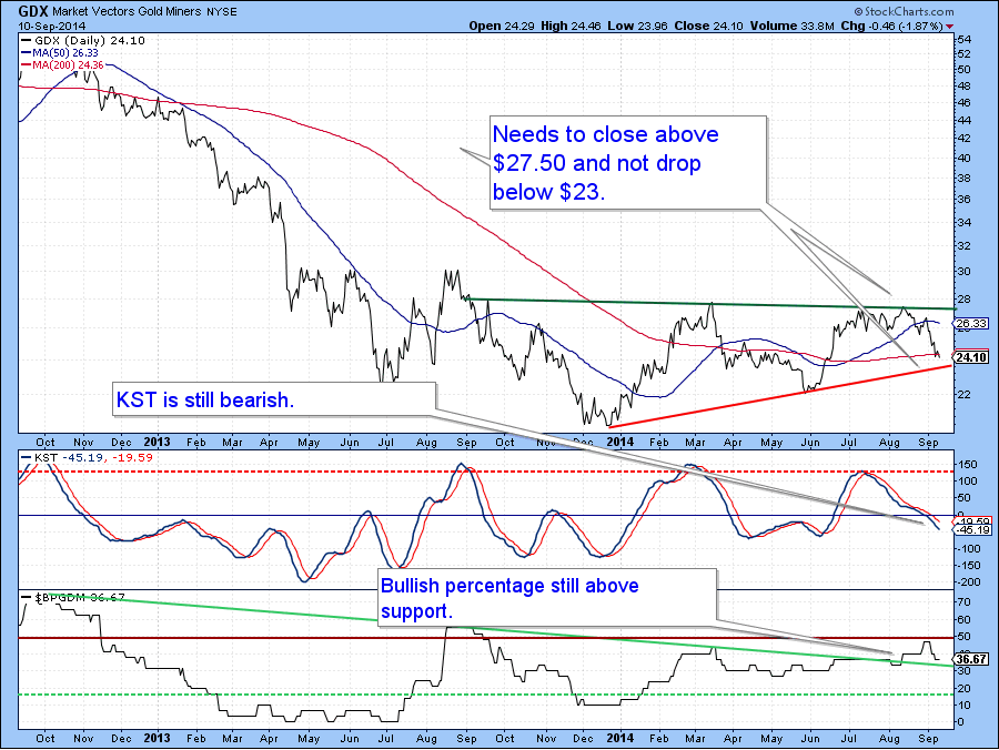
Chart 10
Commodities
Last week I pointed out that the Dow Jones UBS Commodity ETN was experiencing a positive divergence with the number of commodities registering net new highs over a 10-day period. That discrepancy continues today, even though the indicator has started to fall like a stone. The KST has also set up a positive divergence. All divergences need to be confirmed by prices responding to them in a positive way. In this situation I was looking for a break above the previous minor high and the trendline with a closing price above $37. That never happened of course and the price is now at make or break support in the form of its bear market low as flagged by the horizontal red trendline.
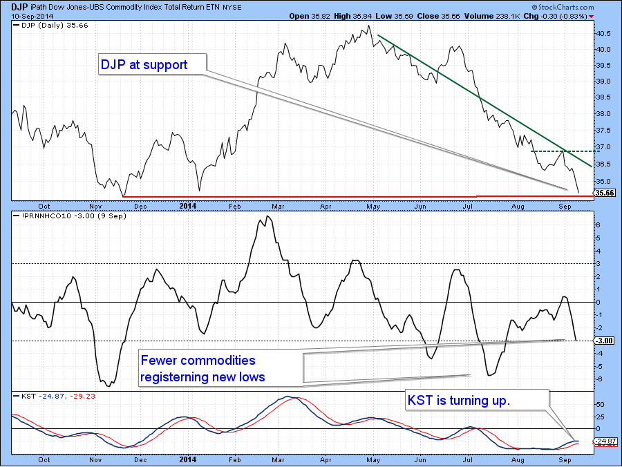
Chart 11
Good luck and good charting!
Martin Pring
The views expressed in this article are those of the author and do not necessarily reflect the position or opinion of Pring Turner Capital Group or its affiliates.


