Silver Breaks to the Downside in a Big Way
- Negative divergences in the equity market continue to build.
- The rest of the world (EFA) completes a head and shoulders top.
- Credit spreads continue to deteriorate.
- Some commodity indexes break down in a major way, others hold fast.
US Equities
In our last issue my basic conclusion on equities was up now down later. The up now part was based on the fact that the McClellan Oscillator (NYMO) for the NYSE had dropped to a level that was consistent with a short-term rally. Moreover, this was occurring at a time when the strong seasonal end of the month was about to kick in. That’s the last two trading days of the existing month and the first three trading days of the new month.
Chart 1 shows that the McClellan has started to bounce from its oversold condition. With three days left in the bullish monthly seasonal the near-term bounce case is still alive and well.
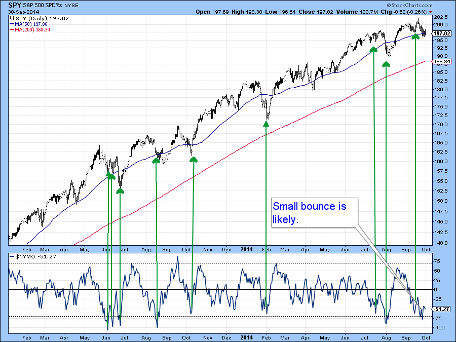
Chart 1
The down later part was justified by numerous negative divergences and an overextended long-term technical position. These factors are, in my view, far more potentially significant. Take a look at the MSCI World Stock ETF, (ACWI), in Chart 2. Last week it was right on its 2012-2014 up trendline. Now it has decisively violated it. Compared to an oversold condition in a short-term indicator like the McClellan, this is a far more important trend since it goes back basically 2-years. The line has also been touched or approached on five occasions, so its violation represents a major penetration of support. Note also how the Global Advance Decline (A/D) Line (!PRGLAD), constructed from the cumulative daily plurality of a basket of country ETF’s rising or falling, has now more decisively completed an important top than it had last week.
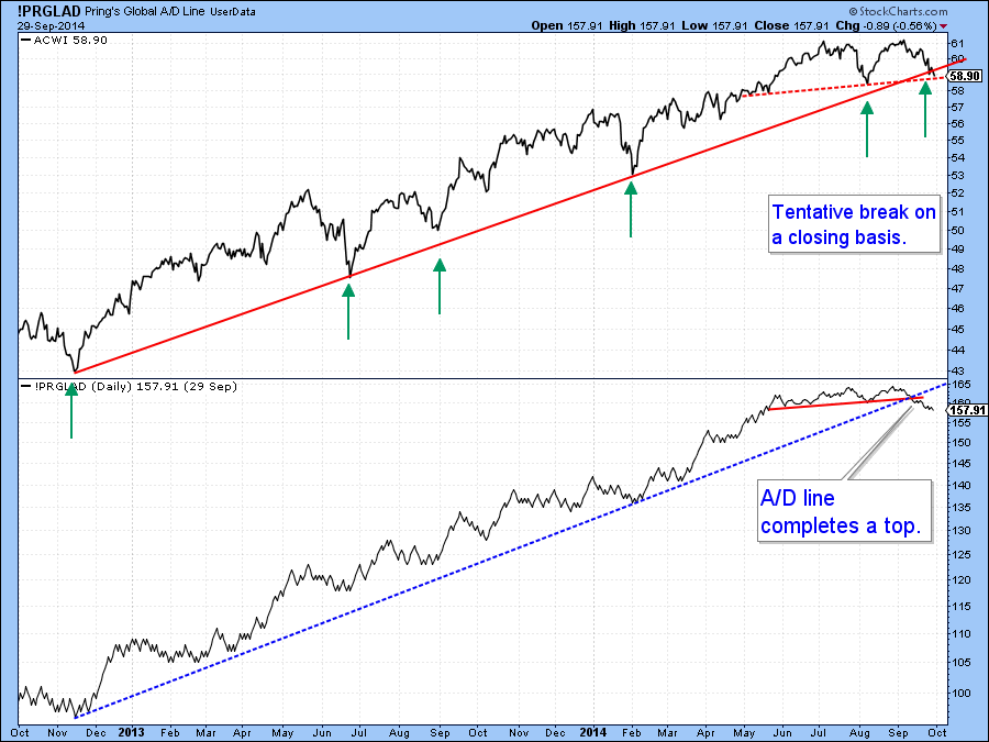
Chart 2
Finally, the Global net new high indicator ($PRNNHGL) has reversed to the downside. This tells us that while the ACWI may have been flirting with new bull market highs recently most countries were not. Broadly based advances are good. Narrowly based ones, such as this, are not. This series reversed direction from a position that was barely above zero, not unlike the January 2014 sell signal, and that was followed by a sharp decline.
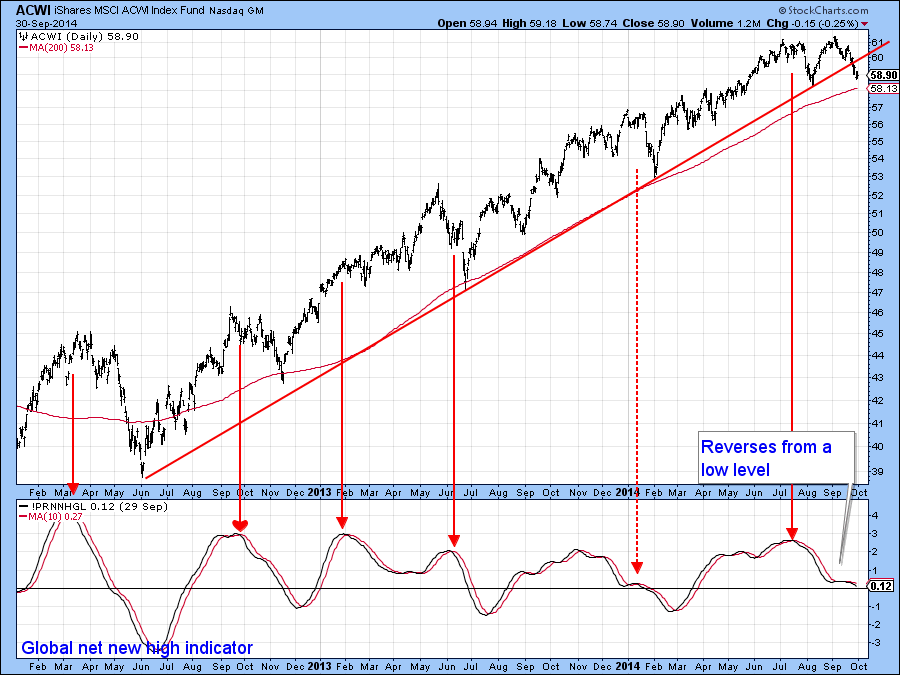
Chart 3
The ACWI has been held up quite well thanks to a robust US market. However, when we look at the rest of the world as represented by the MSCI Europe Australia and Far East ETF, ( EFA), a more negative picture emerges. That’s because this series has just completed a head and shoulders top. Interestingly, the downside objective calls for a drop to the $61 area, which happens to be in the vicinity of the February low.
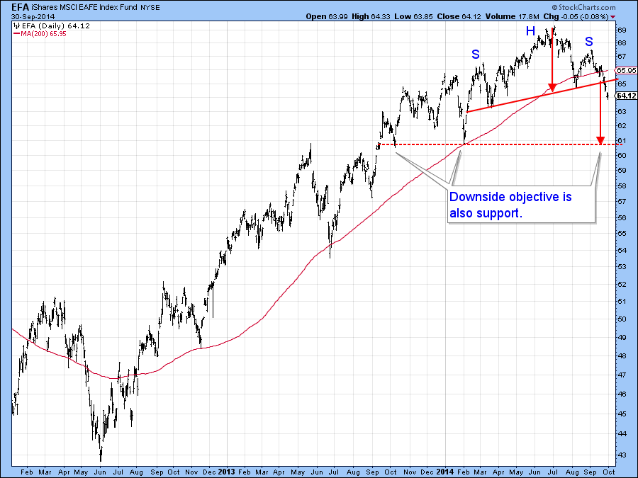
Chart 4
Our final stock market chart features a key one credit market spread, that between the iShares High Yield Bond Fund (HYG) and the Barclays 20-year Trust (TLT). A rising ratio indicates bond investors are growing in confidence as they show a growing preference for high yield over high quality. Most of the time this relationship moves in tandem with stock prices. It’s when these two asset classes disagree that a message is given. Hence a positive one at the 2009 bottom and a negative one more recently as the ratio has been falling. Unfortunately this relationship does not give clear-cut buy and sell signals. That means that we need to rely on signals from the equity market itself to indicate that it is responding to improving or deteriorating sentiment in the credit markets. In the current situation I would say a break in the 2012-14 up trendline in the SPY would confirm the deteriorating trend in this key credit market spread.
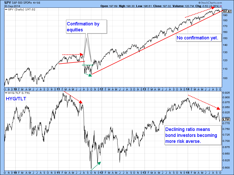
Chart 5
Credit Markets
The US 10-year note ($UST) recently experienced a false breakout to the upside but has not yet given us official confirmation of that with a break below the red up trendline in Chart 6. The KST is still bearish but looks as though it has started to stabilize as a possible precursor to an upside reversal.
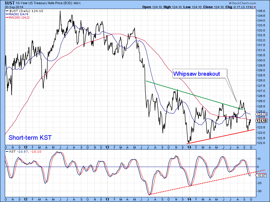
Chart 6
Prices with longer-term maturities have already experienced such a reversal, as you can see from the KST action of the Barclays 20-year Trust, (TLT). The price may be in the process of tracing out a head and shoulders top but the momentum buy signal greatly reduces the odds that this will happen.
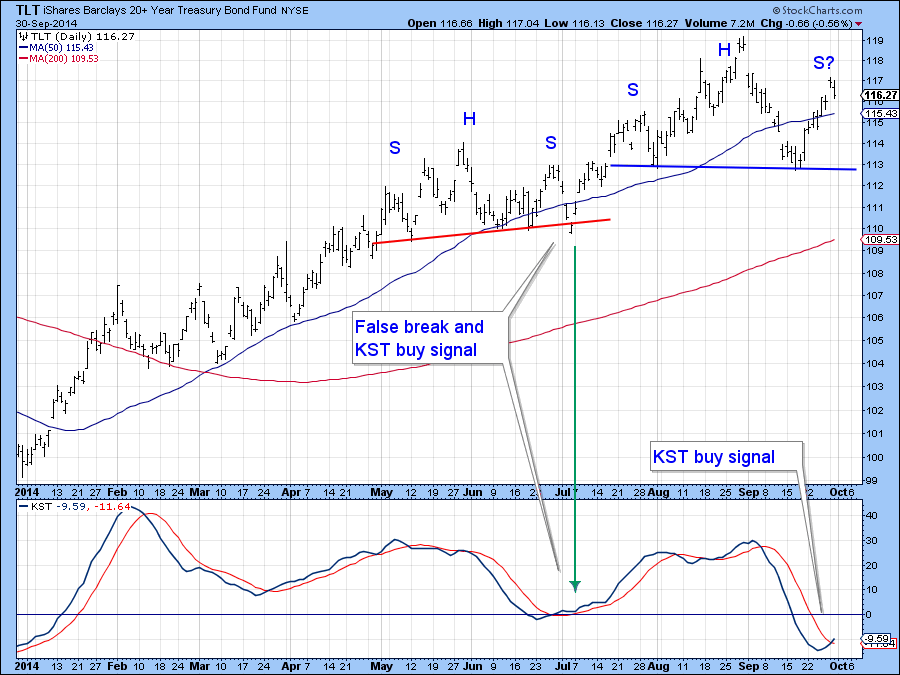
Chart 7
US Dollar Index ($USD)
There is nothing worthwhile to add to my comments of recent weeks in that the Index is in a confirmed strong young and vibrant bull market, where overbought conditions have little effect. In this respect Chart 8, shows that despite the recent explosive rally our dollar diffusion indicator remains in an uptrend.
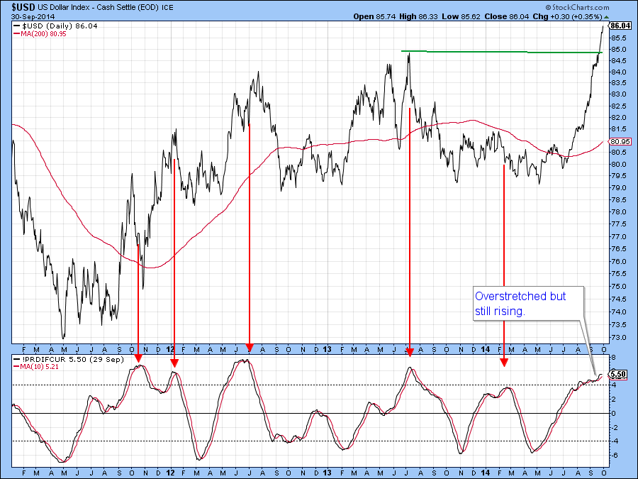
Chart 8
A bi-product of that strong condition makes itself felt on the other side of course. In this respect I mentioned two weeks ago that the Canadian dollar had moved back above the neckline of a bearish head and shoulders pattern and that it was probably out of the woods. Action in the last two weeks shows that my interpretation was incorrect as the dollar has not only moved back below the neckline again but to new lows for the move as a whole. This type of action again underscores the strength of its southern neighbor. What do they say about getting in front of a freight train?
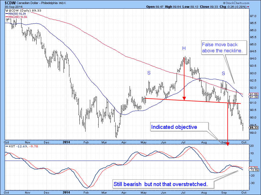
Chart 9
Precious Metals
The SILVER tracking ETF (SLV) has penetrated major support and may well be leading the way lower for other precious metals. At the moment both the short-and intermediate KSTs are bearish and this is likely to put more downside pressure on the metal, notwithstanding any reflex rallies that might develop. The long-term series is flat but still above its MA. However, the recent drop below support by the price itself is likely to place downward pressure on it.
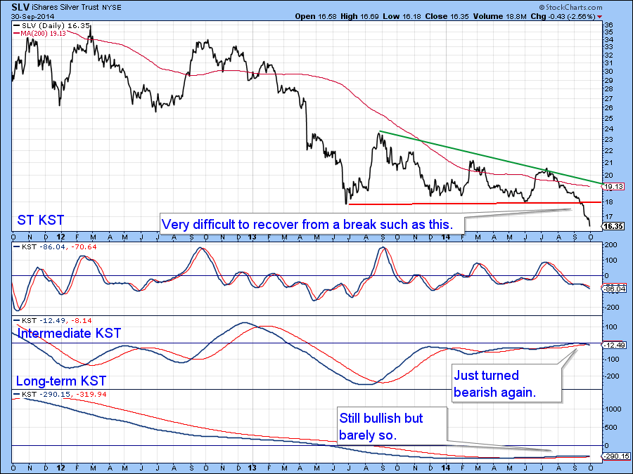
Chart 10
Chart 11 shows the Silver ($SILVER) price since its 1980 peak. Recent price action indicates a breakdown from a bearish right angled triangle. The downside objective calls for an eventual move back to support in the area of the 1987 and 2004 tops around $7.50.
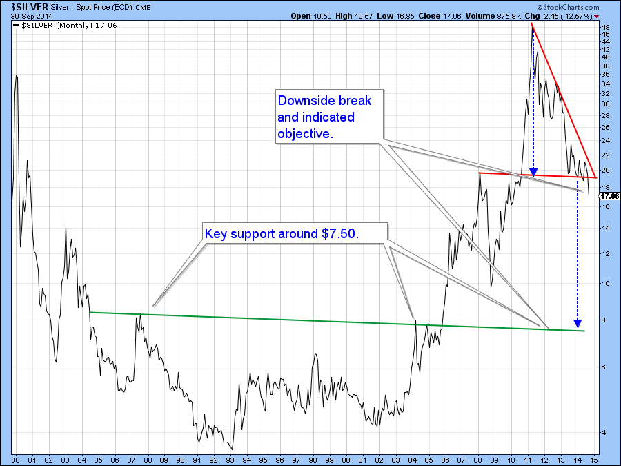
Chart 11
Commodities
Some commodities have broken down in a serious way in the last few weeks, while other series are right at key support. Chart 12 for instance, shows that the PowerShares DB Commodity ETN (DBC) has just completed a triangle top and its long-term KST has also gone marginally bearish by tentatively crossing below its 9-month MA. Occasionally commodities do experience whipsaws as we see from the 2009-10 experience. In the current situation we are assuming the September’s decisive downside break is for real. Things would change though, if the DBC experiences a month-end- close above the upper green line of the triangle, say at $27.
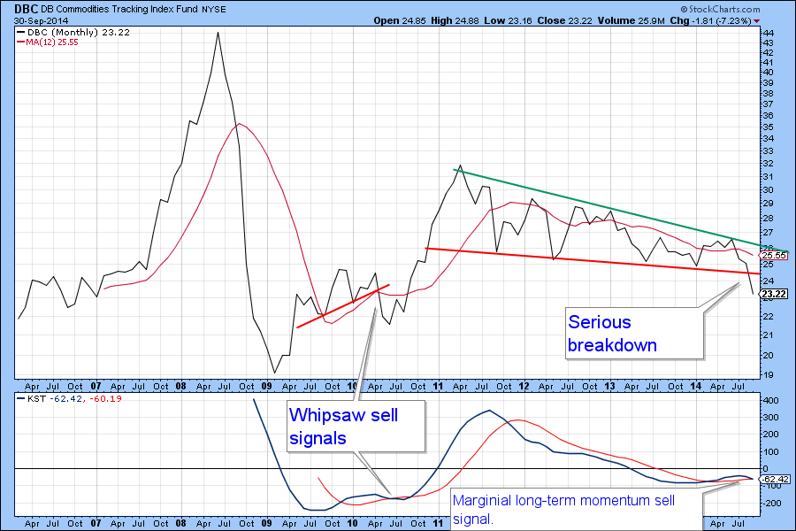
Chart 12
Another series we are watching closely is the Pring Inflation Index (!PRII), which is constructed from several inflation sensitive S&P industry groups. It tracks commodity prices fairly closely as you can see with the Commodity Research Bureau Composite Index ($CRB) comparison in Chart 13. However, this series and the $CRB have not broken down in the same way that the DBC has. Indeed, the stochastic for the Inflation Index in the lower panel is actually in a rising trend. In view of these mixed messages we cannot, at this stage say that commodity prices are headed significantly lower. However, if the CRB Composite and the Inflation Index experience similar breakdowns to the DBC the balance of evidence will have tipped in a pretty decisive way for a serious bearish outcome.
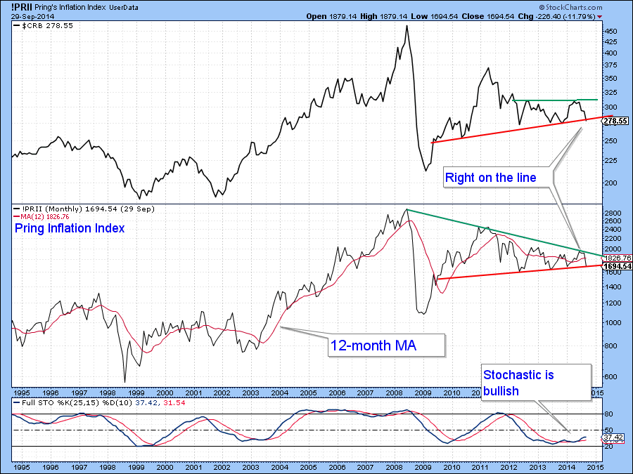
Chart 13
Good luck and good charting,
Martin Pring
The views expressed in this article are those of the author and do not necessarily reflect the position or opinion of Pring Turner Capital Group or its affiliates.


