Shanghai Reverses Four -year Bear Market in Relative Action
- Global equities experience long term technical damage.
- But short-term indicators are close to signaling a tradable rally.
- Bond market still looks strong.
- Gold experiences marginal upside breakout against stocks.
US Equities
Last week I described how some serious long-term technical damage had been done to global equities but that a short-term oversold condition may have been able to undo some of that damage had it resulted in a reflex rally.
Specifically I was looking at the bull market trendline for the MSCI Word Stock ETF, the ACWI. As you can see from Chart 1 the price has moved further away from the extended line which means that it would now take a much stronger effort to enable the price to move back above it.
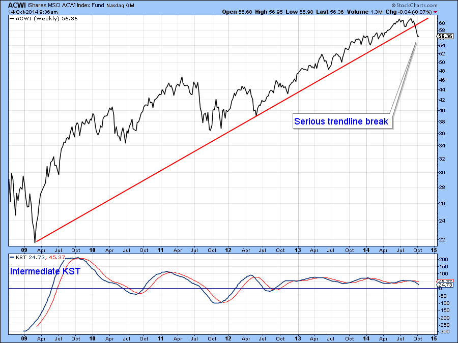
Chart 1
Bearing in mind the plethora of divergences and weak global breadth (see my Global A/D Line in Chart 2) it seems likely that the market is forming some type of top, whether it’s the start of a 10-20% shakeout move, similar in characteristics that we saw in 2010 and 2011 or the opening salvos of a bear market is open to question. If it were to be a bear market I would expect to see leading US economic indicators in an established down trend, but that is certainly not the case at this point. It’s true that the global economy looks weaker but history shows us that unless the US joins the rest of the world in recession territory declines are much more contained, hence the shakeout possibility. Either way, notwithstanding a near-term reflexive rally risks is at the higher end of the spectrum.
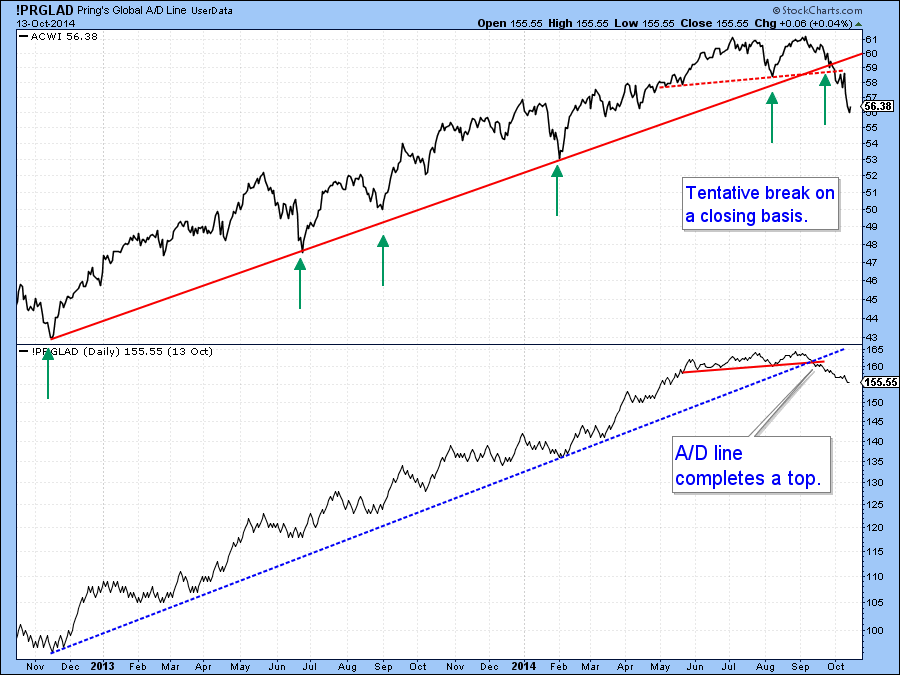
Chart 2
There is no doubt that the strong uptrend since 2009 has been ruptured but markets rarely reverse on a dime. That’s because forming a top is almost invariably a process not a specific event. That process involves the formation of a trading range or distribution pattern and the current oversold condition hints that a retracement rally of some kind is close at hand, at least in terms of time. I base this conclusion on the current position of three reliable indicators.
First, my Global breadth oscillator,(!PRGLADO) shown in Chart 3 has fallen to the kind of level from which a reversal has typically resulted in a good advance. The October 2008 reversal was not the best of signals as prices gyrated around the lows for a while, but remember that this was one of the most vicious bear markets in history and you are looking at its climax. I would expect the market to be much more responsive this time around when the indicator reverses If you want to follow the progress of the !PRGLADO just click on the chart.
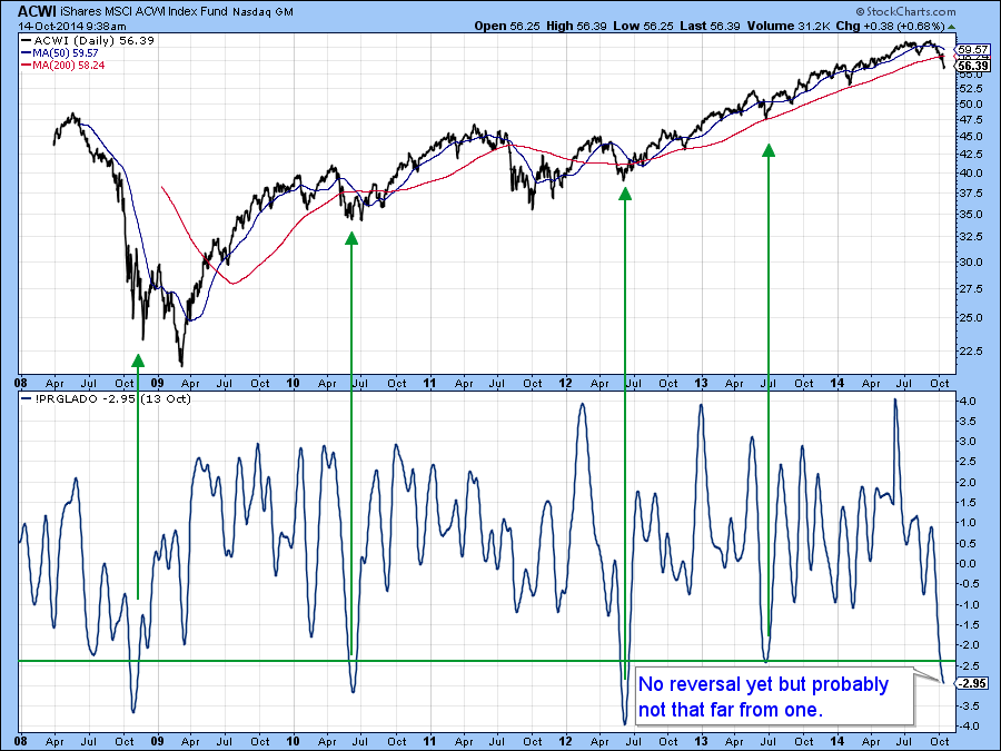
Chart 3
The second indicator I am looking for to signal a rally is my Bottom Fisher (!PRBFISH). It’s featured in Chart 4. It doesn’t call tops very well but has had a great record of identifying bottoms, which it does by reversing to the upside from below the green “fishing line”. Right now it is still falling and is slightly above the line. I would wait for it to reverse before concluding that a rally is underway. Again just click the chart for an update.
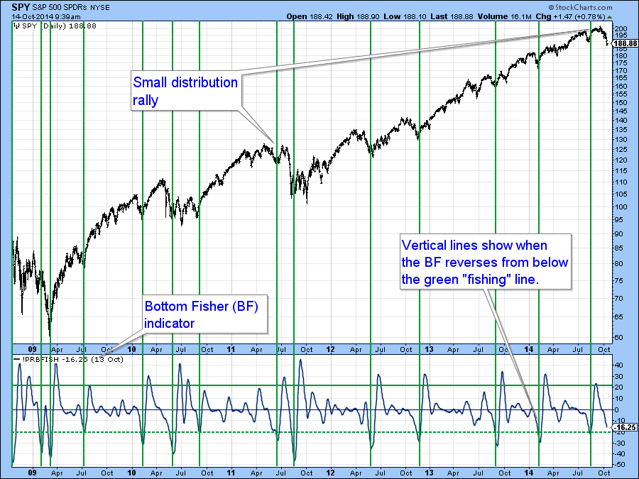
Chart 4
Finally the PVO, which monitors volume fluctuations, is on the edge of major selling climax territory. In order to go bullish it is necessary for the indicator to reverse from a position at or above the +20% level. Note that in most cases the signals are followed by a tradable rally rather than the start of a sustainable trend.
Please note that all three indicators are close to a signal but until they reverse their status remains a bearish one.
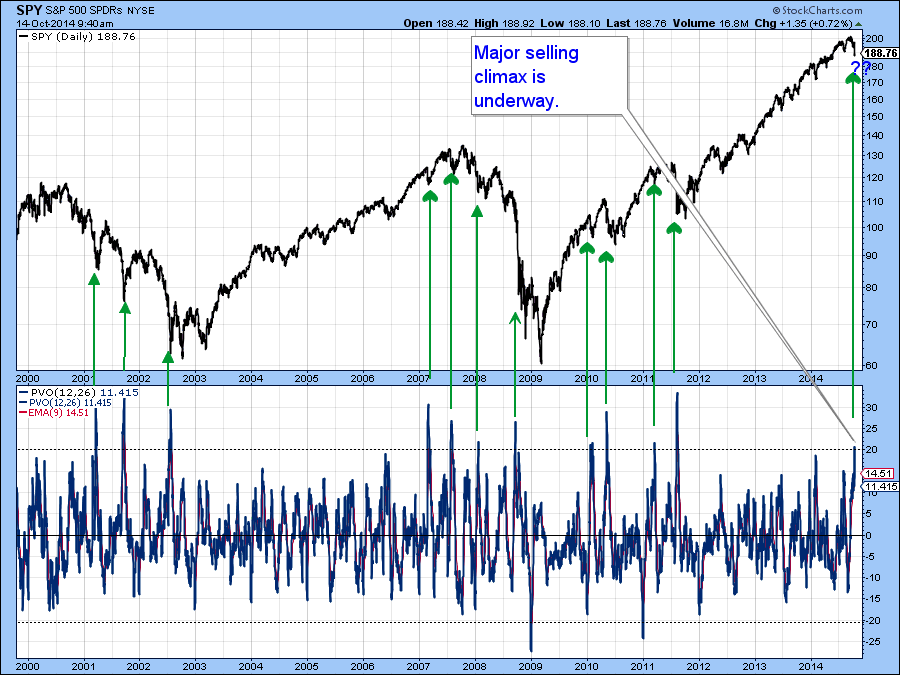
Chart 5
While Rome has been burning, the Shanghai Composite ($SSEC) has been quietly improving in a relative way. The Index itself violated a major down trendline some time ago, but now has confirmed this with a break above a 5-year trendline in relative action vis a vis the S&P. Both long-term momentum series (KSTs) are positive, which also supports the idea of higher prices.
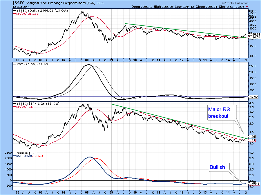
Chart 6
Even China ($SSEC) though, is vulnerable to some corrective action. In this respect we can see that the short-term KST is overstretched on Chart 7. If weakness in the rest of the world drags the Chinese market down this would probably offer a great buying opportunity.
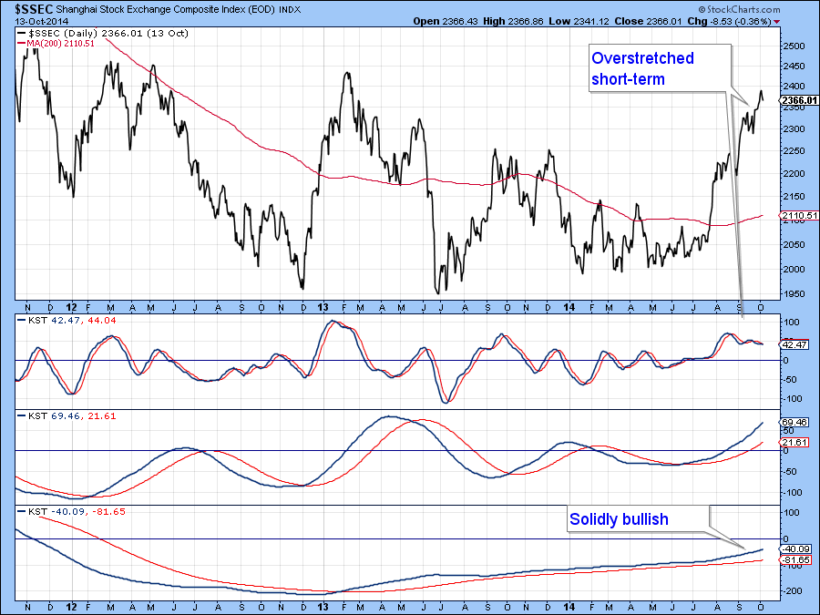
Chart 7
Stocks versus Bonds
I have been following the progress of the ratio between stocks and bonds as it recently completed a top. That breakdown has now become more decisive and all three momentum series are in a declining trend favoring bonds. This action tells us nothing about the absolute price action, only that bonds are likely to out- perform for a while. However, it’s important to note that most of the time a declining ratio as shown on Chart 8 is associated with a softening in equity prices.
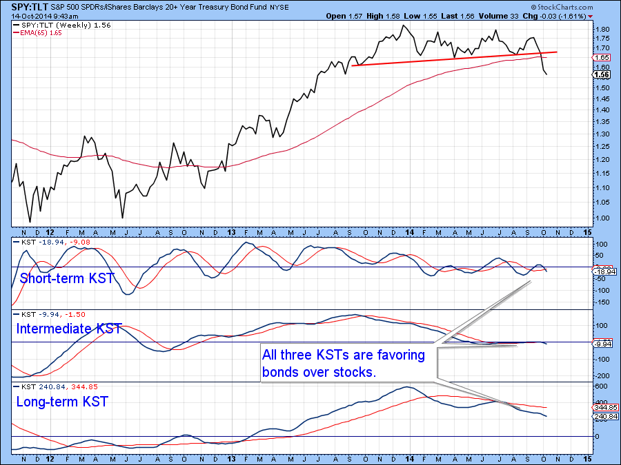
Chart 8
US Credit Markets
Last week I pointed out that it looked as if the five year yield ($FVX) had experienced a false breakout to the upside but that we needed some confirmation with a break below the red trendline in Chart 9. That confirmation has now taken place. Since the short-term KST is still bearish but not overextended the indication is that yields are headed lower.
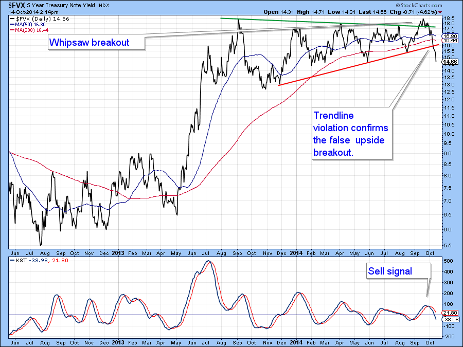
Chart 9
The price of the 10-year Treasury ($UST) has also broken out in a favorable direction as the 2013-14 base has now been completed. Since all three KSTs are in a positive mode it seems that prices are headed significantly higher and yields lower.
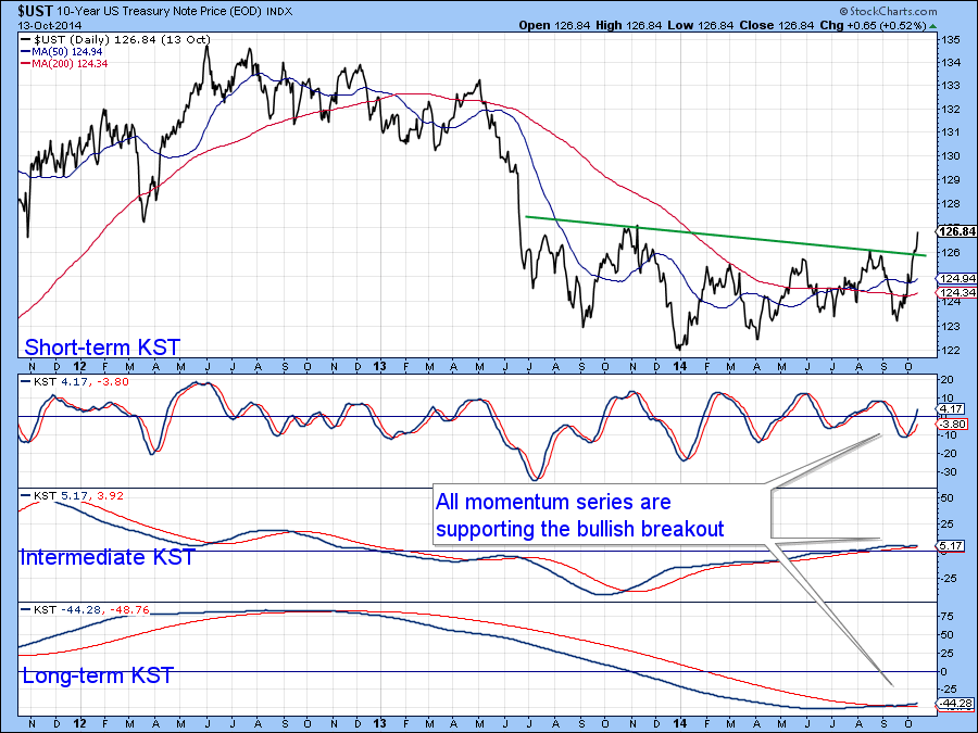
Chart 10
US Dollar Index
Once again there is little to add to the dollar picture as the Index has experienced a major upside breakout and is likely to be subject to profit taking as it works off its overbought condition. Make no mistake though, this is a strong bull market in its early stages and that is the direction on which we should focus because short-term overbought conditions do not necessarily result in extended corrections in such situations.
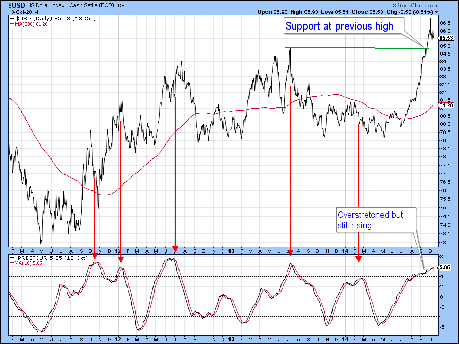
Chart 11
Precious Metals
The Gold Trust (GLD) held where it needed to last week on Chart 12, at its bear market low. What is interesting is that, during these troubled times, gold has managed to experience a marginal breakout in the gold/stock ratio. Note that the long-term KST of this relationship is already positive. Most of the time a rising ratio is negative for stocks, so if a more decisive breakout does take place it will represent another long-term bearish factor.
Gold itself is also experiencing a positive KST but really needs to move above that $130 level which would, in my view, signal a primary bull market.
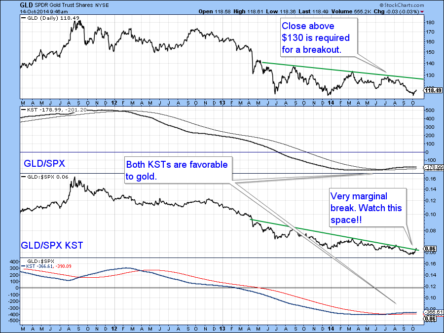
Chart 12
Commodities
Any way you look at it commodities have taken a beating recently. However, Chart 13 shows that far fewer commodities are registering net new lows over a 10-day time span than was the case in mid-September. That’s a bullish sign that needs to be confirmed with a break above the two green trendlines. Such action would likely signal a tradable rally.
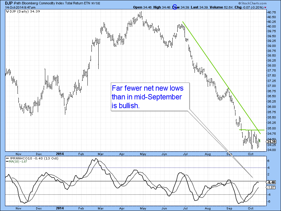
Chart 13
Good luck and good charting,
Martin Pring
The views expressed in this article are those of the author and do not necessarily reflect the position or opinion of Pring Turner Capital Group or its affiliates.


