Stocks Break Down Against Bonds In A Major Way
- Oversold short term condition could trigger a bounce... but remember this is October!
- Five year yield experiences false upside breakout. That signals lower yields
- Gold bounces from a must hold support level.
(Click here for the Video Version of this article.)
US Equities
In the last week some serious long-term technical damage has been dealt to the equity markets but a short-term oversold position compounds the problem. That’s because it is possible that a good short-term advance could quickly undo some of that damage. First let’s look at the damage, then what’s needed to repair it.
Chart 1 shows that the MSCI World Stock ETF (ACWI) has decisively violated its up trendline dating back to 2009. Trendlines get their significance from their length and the number of times they have acted as a support area by turning back declines. This one is very important because it is over 5-years in length and has acted as support on many occasions.
The chart also compares the ACWI with the Special K, which you can read about here. The important point to grasp is that it more often than not experiences a primary trend peak or trough simultaneously with the price series it is monitoring. Note that I said “more often than not”, for there are exceptions as you can see from the mid-2012 green arrow. Since the indicator peaks with the price on most occasions it’s recent action indicates a high probability that some kind of major top has been seen. Whether it will turn out to be a bull market peak or the start of a shakeout move such as we saw in 2010 or 2011 is open to question. Unfortunately there are no known methods for consistently forecasting the magnitude and duration of price moves. You may be asking the question- What evidence do we have that the Special K has peaked? Well, first it has severely violated its bull market trendline. That line is a very significant one, not only due to its length, but to the fact that it has been touched or approached on numerous occasions. It therefore marks a very significant dynamic support zone. In addition the indicator has crossed below its MA and completed a small head and shoulders top, just like it did in 2011.
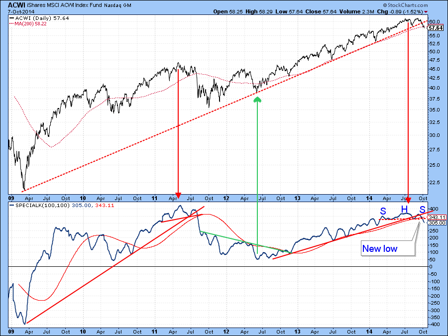
Chart 1
Chart 2 features the NYSE Composite ($NYA) , a market average that includes all listed NYSE stocks based on capitalization. This series has violated its 9-month MA and is ever-so-slightly below the 12-month MA and bull market trendline. Now for a big caveat. This is an end of the month plot, so this week’s data does not really count, as we have the rest of the month to experience before the actual closing price will be revealed. I featured it because it shows that a weak October could easily tip many long-term indicators into a primary bear mode.
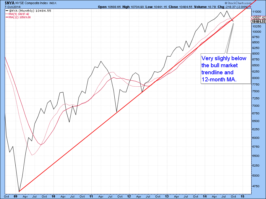
Chart 2
Now for the more positive aspects. Chart 3 tells us that the MACD for the NYSE Composite ($NYA) is very oversold and due for a reversal. The arrows indicate that such action has been a great precursor of a good rally in recent years.
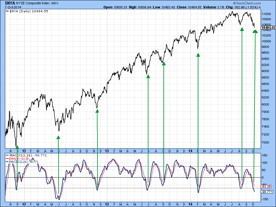
Chart 3
Second, early October saw a small selling climax as indicated by the Price Volume Oscillator (PVO) in Chart 4. Again, reversals in this series have offered timely signals of rallies in the last year or so. If a rally does develop then the slight break in the NYSE will turn out to be a whipsaw leaving the market in a position to perhaps register a new high.
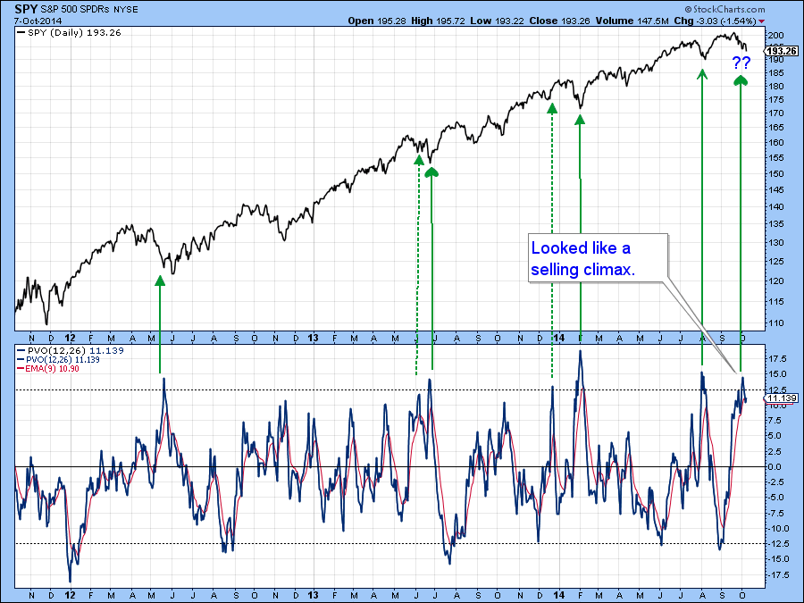
Chart 4
However, the overall technical position is more problematic as the potential breakdown in small cap stocks I cited a few weeks ago has now materialized as you can see from Chart 5. Note that the Small Cap Advance /Decline Percentage Line ($SMLADP) is also bearish. Things may be overdone for the time being though, because the KST for the iShares Small Cap ETF (IJR) shown in the top plotting area is moderately oversold.
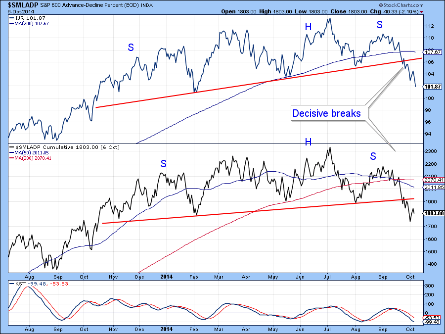
Chart 5
Also, Chart 6 shows that the ratio between stocks and bonds (SPY:TLT) has now completed a top on the weekly charts. Add to that the fact that the stochastic has just gone bearish from a very low level and you have the ingredients for some really sub-par performance in the stock/bond relationship.
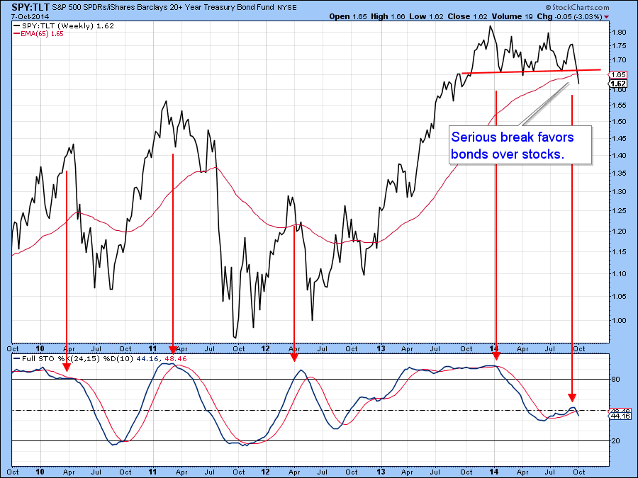
Chart 6
Markets move on confidence or lack thereof and that seems to be slowly deteriorating. In this respect Chart 7 compares the performance between high yield and government bonds i.e. that between the HYG and the TLT. (HYG:TLT) This relationship continues to drop, indicating that bond investors are progressively favoring low yielding government bonds to high yielding corporate ones. They have clearly stopped moving out on the risk curve, not what the Fed asked them to do! Those sort of attitudes don’t usually reverse with no effect on equities. Instead, they usually deteriorate to the point where equity investors can no longer afford to ignore them and equity participants themselves start to lose confidence.
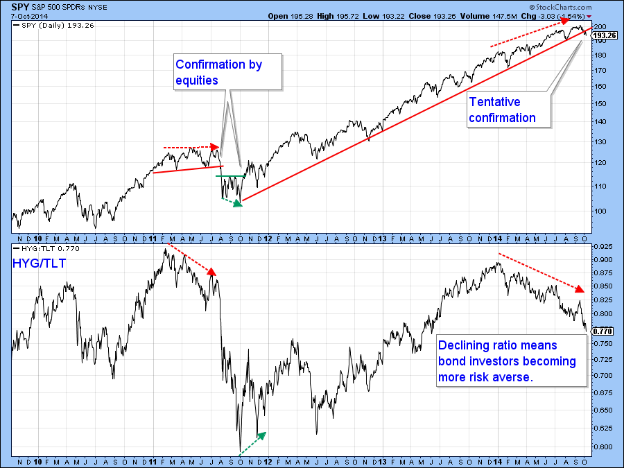
Chart 7
Finally, Chart 8 shows that the MSCI Europe, Australia Far East ETF (EFA), may be in the process of completing a bearish broadening wedge. These patterns develop, after a strong advance, when the price action forms an ever widening trading range as flagged by two diverging trendlines. The violation of the lower line is the sell signal and it’s often followed by an above average decline. In this case this potential top would be completed with a decisive break that can hold below $60.50. The lower panel shows that “the rest of the world” as represented by (the EFA:SPY Ratio ) has been seriously under-performing the USA S&P 500 ETF (SPY) for some time. If you were looking for a potential downside leader this would probably be it!
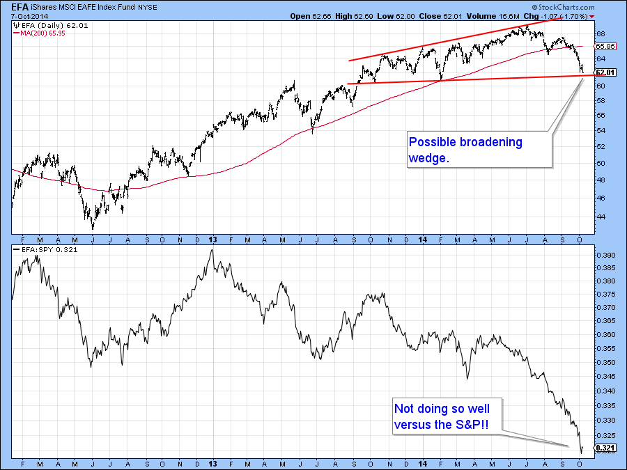
Chart 8
US Credit Markets
Moving on to the credit markets, Chart 9 shows that the Treasury Five Year Yield($FVX) recently broke out from a base. At the time I used that action to project higher interest rates. However, markets are really people in action and people can and do change their minds. That’s what has happened in this case as the breakout has clearly failed. It’s another whipsaw move. If the yield can quickly regain its composure and rally back above its recent high that would reinstate the breakout. However, as it stands right now the breakout is invalid. If possible I like to see false moves confirmed by additional price action. In this case that would require a break below the red up trendline, which is currently around 1.6%. That seems probable because the KST in the bottom window has just gone bearish.
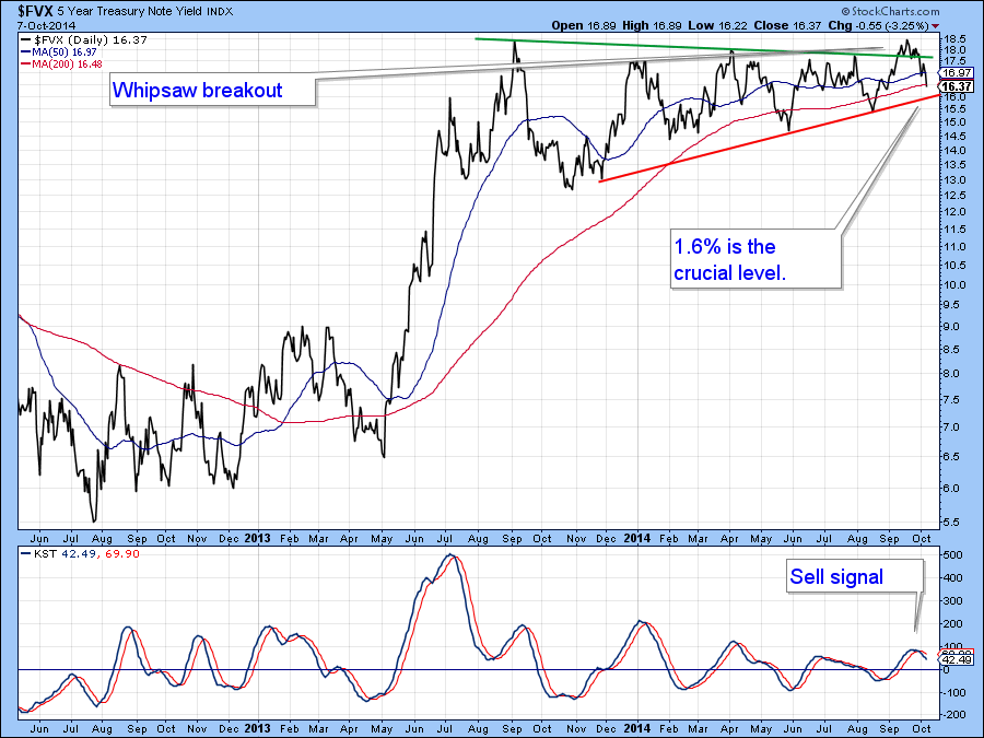
Chart 9
US Dollar Index
Chart 10 compares the US Dollar Index ($USD) to its MACD. On Tuesday it crossed very marginally below its signal line. Greg very presciently pointed out that the Index may have experienced a blow-off move in his weekend epistle. Tuesday’s action in this momentum series has increased the odds of such a possibility. But please remember, Counter-cyclical corrections are notably difficult to play however tempting they may look.
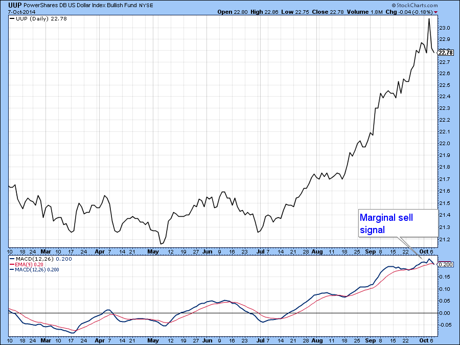
Chart 10
Precious Metals
The Gold Trust ETF, the GLD, held exactly where it needed to, at the red support trendline joining the two previous lows. Since the KST is marginally bullish and the Dollar Index ETF (UUP) shown in Chart 10, against which gold usually moves inversely, may have begun a correction, now is as good a time for expecting some kind of a rally. If one does develop it could well be the start of a new bull market. However, until the price of the yellow metal breaks out of its recent trading range the balance of technical evidence will continue to point in a primary bearish direction.
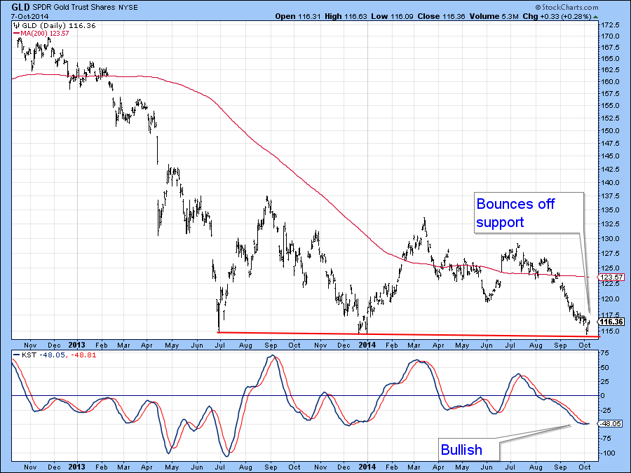
Chart 11
Good luck and good charting,
Martin Pring
The views expressed in this article are those of the author and do not necessarily reflect the position or opinion of Pring Turner Capital Group or its affiliates.


