Tuesday's NASDAQ High Was Accompanied By A Paltry 50 Net New Highs
- Value Line Arithmetic is just below important resistance.
- 10-year bond price reacts to its recent breakout point.
- The GLD fails at resistance.
US Equities
The Value Line Arithmetic($VLE) monitors the price of the average stock. It has been one of the weakest areas of the market as demonstrated by a declining relative strength line in the lower panel in Chart 1. If it is able to rally above the green horizontal resistance trendline and the declining RS trendline, that would suggest that serious new highs will be seen and a likely turnaround in the fortunes of this market sector.
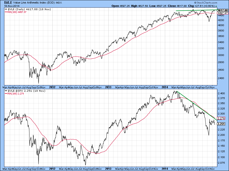
Chart 1
However, the $VLE price and Special K (SPK) momentum indicator, in Chart 2, have both violated key up trendlines. Moreover, the Special K has fallen below its MA and traced out a series of declining peaks and troughs as flagged by the letters A, B C and D. That suggests that this indicator, which usually tops and bottoms out with the price it is monitoring is in a bear market. One exception to the simultaneous bottoming process was, of course, October 2011, at which time the SPK lagged. That sort of thing though, is an exception rather than the rule. Right now the SPK is at resistance in the form of a small down trendline. Since the line is relatively short and has only been touched twice it does not have a lot of significance. However, its upside violation would hold out the possibility of an upside reversal, albeit at a much more subdued pace than was previously the case.
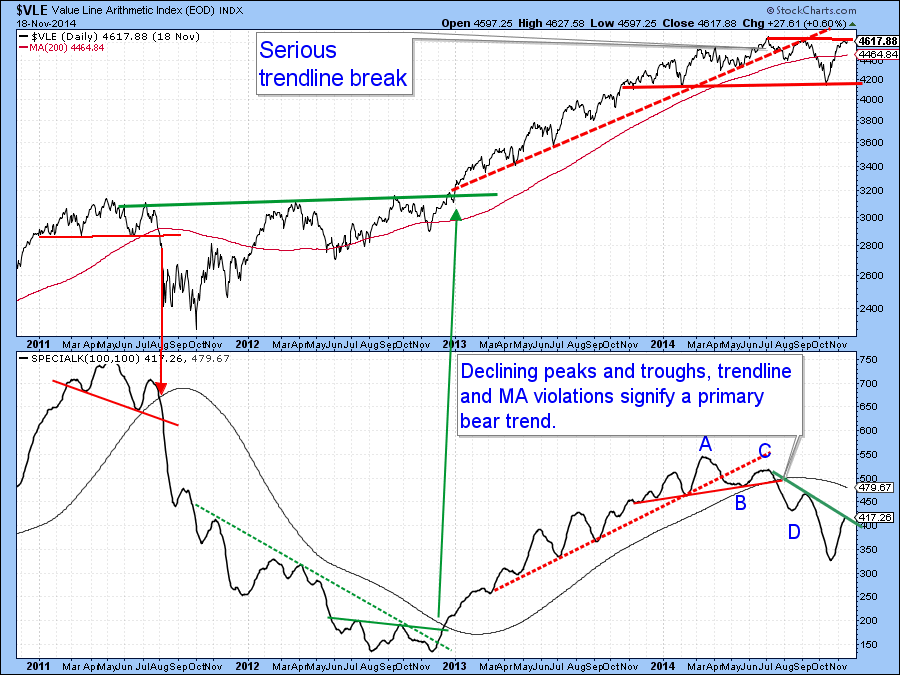
Chart 2
The green vertical lines in Chart 3 show that between late 2012 and September of this year every new high by the S&P 500 ($SPX) was confirmed by the NYSE Composite ($NYA). That relationship changed in September as the NYSE refused to register a new high. It has continued this new pattern in into November. That’s not necessarily a signal to sell, as it is quite possible that these two series could extend their stand-off as time goes by. However, it does warn us of sub-surface problems in the market, that if not cleared up could eventually be followed by trouble.
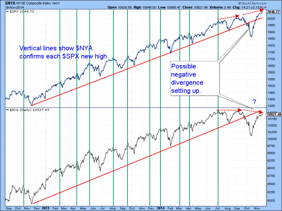
Chart 3
Most investors look at the S&P 500 registering higher highs and take comfort from that. However, if indicators measuring participation, such as Advance/Decline - (Abbreviated as A/D) - Lines, percentage of stocks above their 200-day MA’s or those registering new highs are lagging, it’s that much more difficult to make money in equities. Some indicators are pointing up such a situation right now. For example, Chart 4 shows that the NYSE A/D Line (!ADRATNYC) comprising just common stocks has traced out a similar negative divergence with the S&P as has the NYSE Composite.
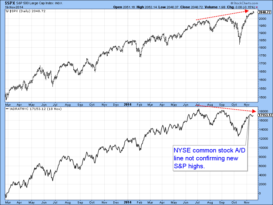
Chart 4
Moreover, the percentage of NYSE stocks above their 200-day MA’s ($NYA200R) has recently rallied quite sharply, but only back to the green resistance line at 58. Indeed, it has now started to roll over and may well be peaking out. If that proves to be the case it would tell us that selecting positively performing stocks is going to get a lot more difficult. The rolling over action of the indicator could be reversed in the event that the rally extends. However, there are some indicators that suggest otherwise.
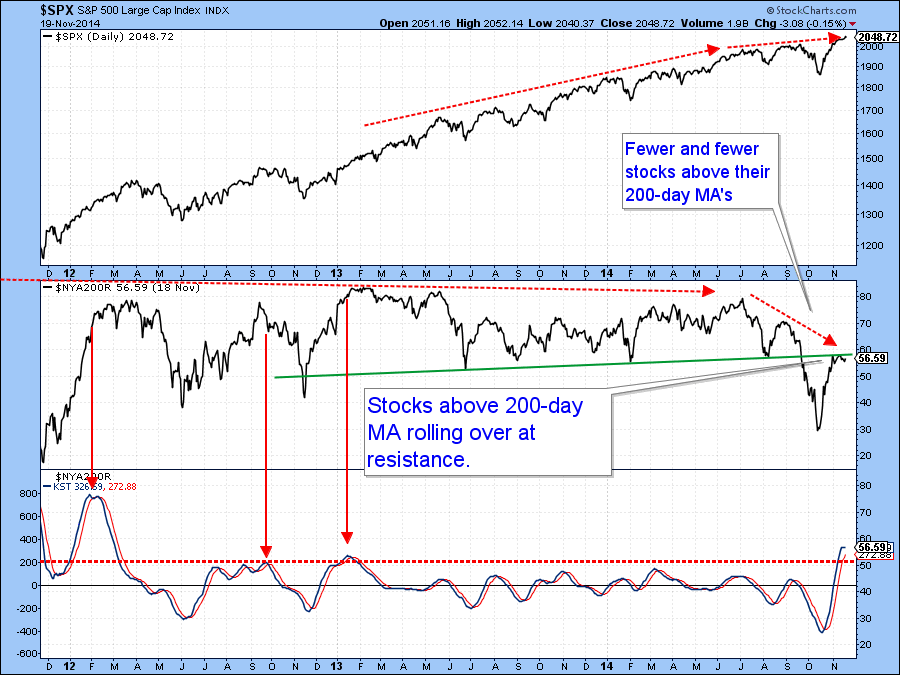
Chart 5
Chart 6 hints at this because the S&P 500 stocks above their 20-day EMA (!GT20SPX) looks as though it may be in the process of peaking. The indicator does not have a perfect record as the three dashed arrows show. Also, it would not tell us the nature of any ensuing correction. However, if it does top out this will suggest that the indicator in the previous chart will decline from current levels, thereby making it more difficult to identify positively acting stocks.
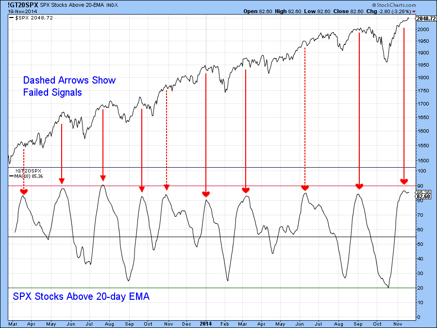
Chart 6
Finally, the NASDAQ Composite ($COMPQ) recently touched a new post 2000 recovery high. However, Chart 7 indicates that its RS line($COMPQ:$SPX) , in the lower panel, did not confirm the latest high in the Index itself for the second time since February. It’s always possible of course, that this discrepancy can be cleared up, but again, other indicators suggest otherwise.
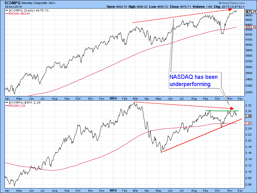
Chart 7
First, Chart 8 features the McClellan Volume Oscillator for the NASDAQ (!VMCOSINAS) , or more specifically its 10- and 20-EMA’s. The red arrows show that whenever the 10-day time span crosses below its 20-day counterpart the Index is vulnerable. As of Wednesday night a signal had not yet been triggered. However, the declining action from an overextended reading suggests that it soon might.
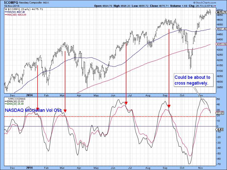
Chart 8
Secondly, Chart 9 shows that while the NASDAQ Composite ($COMPQ) was recently flirting with new high ground only 55% of listed securities were in bullish trends($BPCOMPQ) , not really a very positive sign.
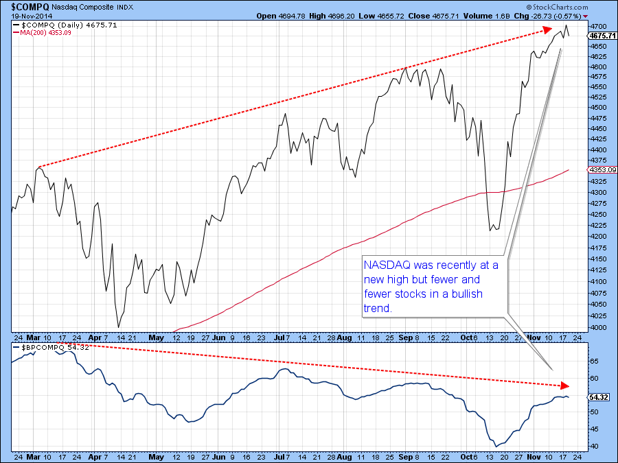
Chart 9
Finally on the NASDAQ, Chart 10 shows that the Composite ($COMPQ) reached a new intraday high on Tuesday yet the net new high number ($NAHL) was a paltry 50 securities. The two red arrows show that this number peaked at the beginning of the month and has been shrinking ever since.
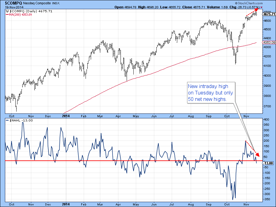
Chart 10
US Credit Markets
The price of the 10-year bond ($UST) has now fallen back to its breakout level. The short-term KST is still negative, but is in a position to support a rally should the price experience some form of a bounce. Since the intermediate and long-term KSTs are both positive it’s possible that another up leg to the bull market may soon get underway.
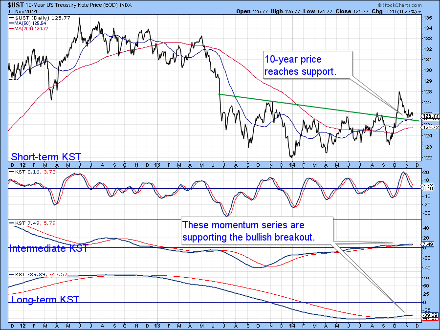
Chart 11
US Dollar Index.
The KST for the US Dollar Index ($USD) has started to hesitate but nevertheless remains in a bullish mode. A break below the horizontal trendline at $23.20 would probably invoke a corrective move down to the dashed up trendline. However, it’s important to remember that the currency is in a primary bull market and typically surprises develop in the direction of the main trend.
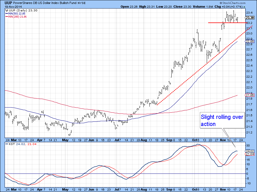
Chart 12
Precious Metals
The short-term KST for the Gold tracking ETF (GLD) is trying to go bullish. However, the price has run into resistance at the blue trendline joining previous lows. If it can push through that would undoubtedly result in the short-term momentum joining its long-term counterpart in a bullish mode. The real test would then come at the intersection of the two dashed lines at $120. Until then a relatively cautious stance is justified.
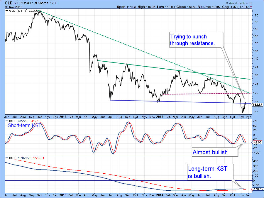
Chart 13
Commodities
I have not commented on commodities for a while because there has not been a lot going on. Now there is the possibility of a small base being formed by both the Commodity price (DJP) and the net new high indicator.(!PRNNHCO10) I would look upon a daily close above $34.50 as a valid break. However, it’s important to remember that by all long-term trend measurements commodities are in a primary bear market. That means that while short-term rallies may be signaled they are likely to lead to disappointment.
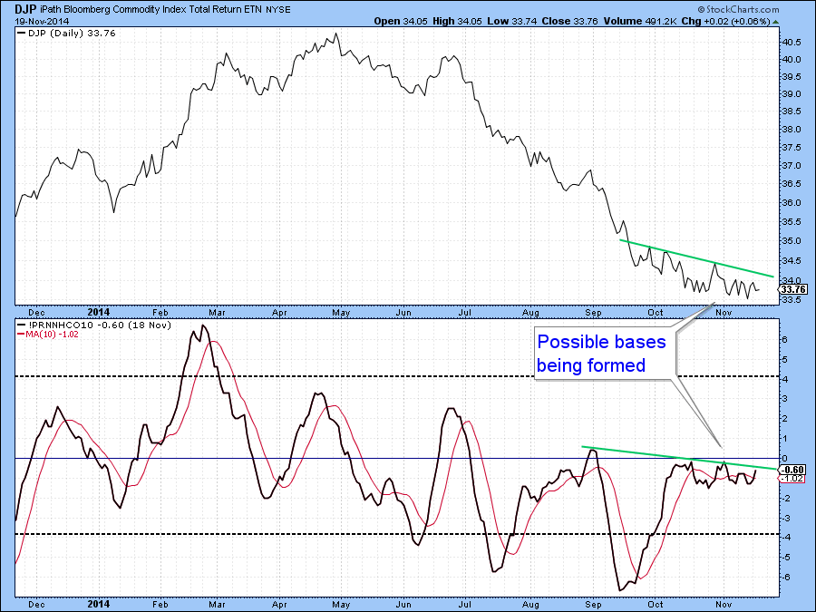
Chart 14
Good luck and good charting,
Martin Pring
The views expressed in this article are those of the author and do not necessarily reflect the position or opinion of Pring Turner Capital Group or its affiliates.


