Equities still Look Vulnerable Notwithstanding a Possible Reflexive Bounce
- Dichotomy in the credit markets is extending.
- Dim Sum bonds at a critical juncture.
- Gold asset markets weakening again.
US Equities
Statistics tell us that December is the most bullish month of the year for equities. Interestingly, the November-January period offers the best performing consecutive months of the year (S&P 500 ($SPX) average gain of 4.3% since 1950). Failure to do well in this part of the year is often a sign of trouble. One of my heroes, the late Edson Gould observed that “If the market does not rally, as it should during bullish seasonal periods, it is a sign that other forces are stronger and that when the seasonal period ends those forces will really have their say”.
To quote Chapter 24 of Technical Analysis Explained “Close to the center of this 3-month bullish seasonal is the period surrounding Christmas marked by the last five trading days of the old year and embracing the first two of the New year, a period which we are just over a week from. This is the so-called Santa Claus rally, which according to Jeffrey Hirsch in Stock Market Cycles has averaged 1.5% since 1953.” Like the Edson Gould failed bullish seasonal, Yale Hirsch, Jeffrey’s father, coined the expression “If Santa Claus should fail to call, bears may come to Broad and Wall”. Examples include 1968, 1981, 2000 and 2008, all of which were followed by bear markets.
At the moment most US equity market indicators are not in what I would call an oversold condition, but should current weakness extend for another few sessions the market could reach such a state, thereby providing a great setup for a Santa Claus rally. Chart 1 shows that the KST for the S&P Composite ($SPX) is bearish, but in a position slightly above zero, which in no way could be called oversold.
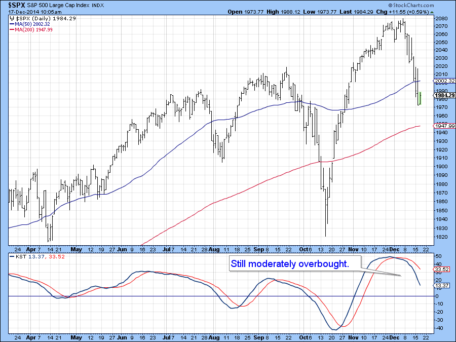
Chart 1
The same thing could be said for my Diffusion Indicator (!PRDIFDOW) monitoring a basket of Dow stocks above their 40-day MA.
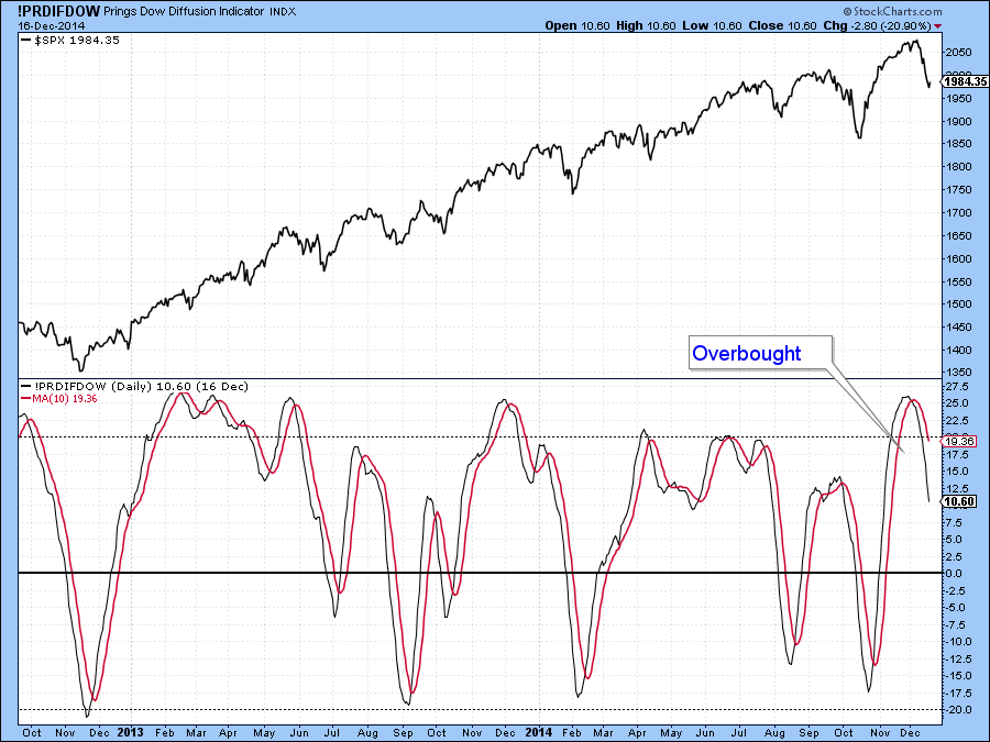
Chart 2
On the other hand, shorter-term series, such as the 15-day MA of the Arms Index ($TRIN) in Chart 3, is flashing a buy signal as it reverses from a pretty high level. There has been only one recent false signal as flagged by the dashed vertical line in January.
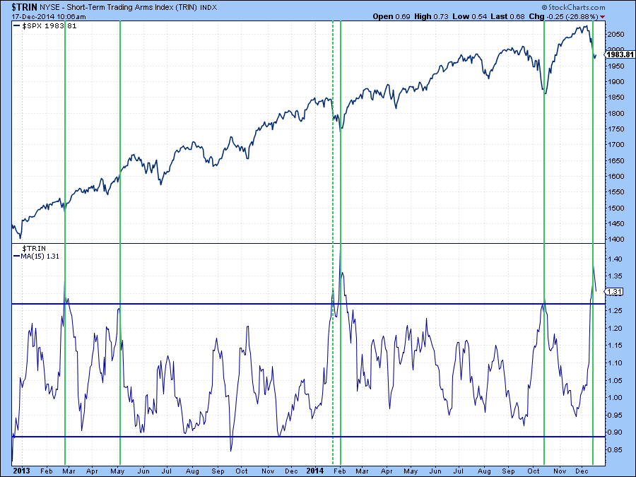
Chart 3
The 12-day rate-of-change (ROC) for the $SPX in Chart 4 offers the same sort of positive twist on the situation and it could be that a normally positive December seasonal, where tax loss selling pressure has been lifted, results in higher near-term prices.
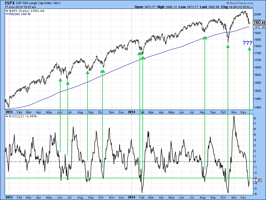
Chart 4
Finally, there are two indicators I am watching for a reliable sign of an upside reversal. The first compares two moving averages of the McClellan Volume Oscillator (!VMCOSINAS) for the NASDAQ, see Chart 5. When the 10-day EMA crosses above its 20-day counterpart a buy signal is triggered. These have been flagged by the green arrows on the chart. Right now both MAs are declining so no signal has yet been given.
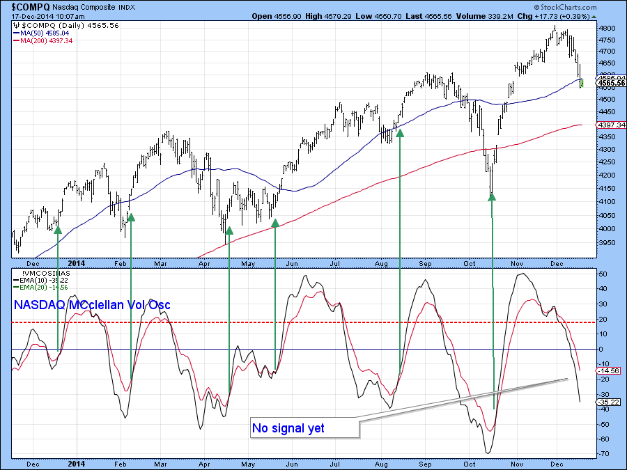
Chart 5
The second is my Bottom Fisher (!PRBFISH) featured in the lower panel of Chart 6. I last brought it out at the mid-October low, where it reversed fairly close to that turning point, at least in terms of time. At the moment the indicator is at a fairly neutral level, but needs to fall some more and then reverse to the upside in order to trigger a buy signal. You can, of course, follow both Charts 5 and Chart 6 by clicking on them and saving them into your own ChartLists.
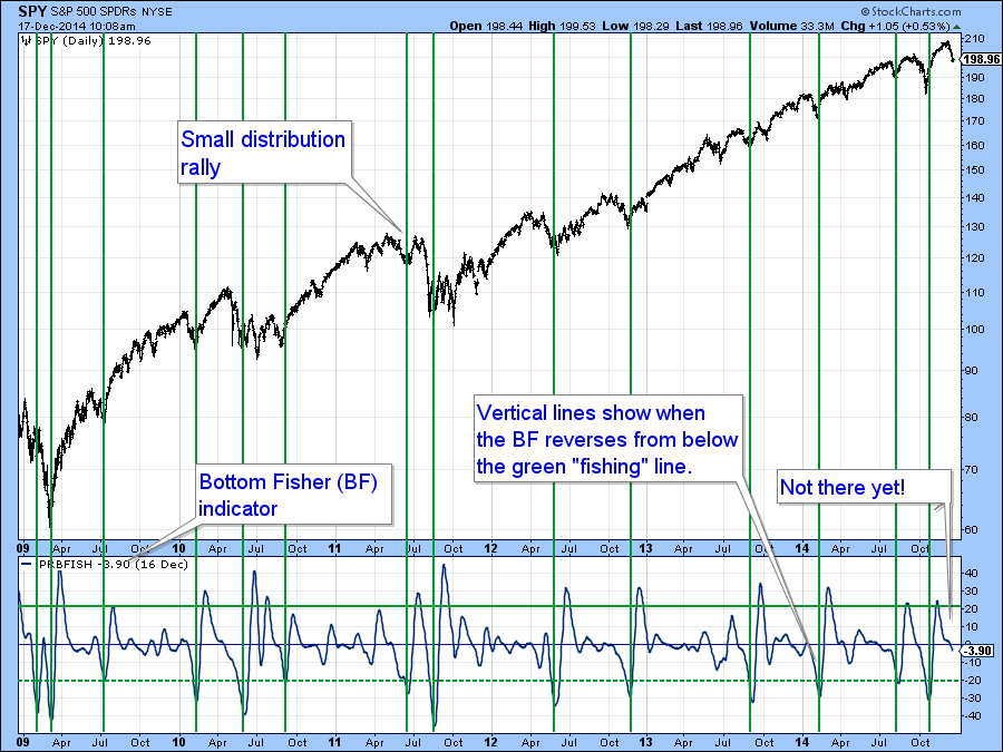
Chart 6
At this point I see the potential for a short-term bounce but am not that excited because of the ominous looking longer-term and global picture which Greg and I will get into at Thursday’s webinar.
US Credit Markets
The last few days have seen an extension of previous trends whereby shorter-term maturities have been rising in yield, presumably in anticipation of fed tightening next year. An example is shown in Chart 7 featuring the 1-year Treasury ($UST1Y).
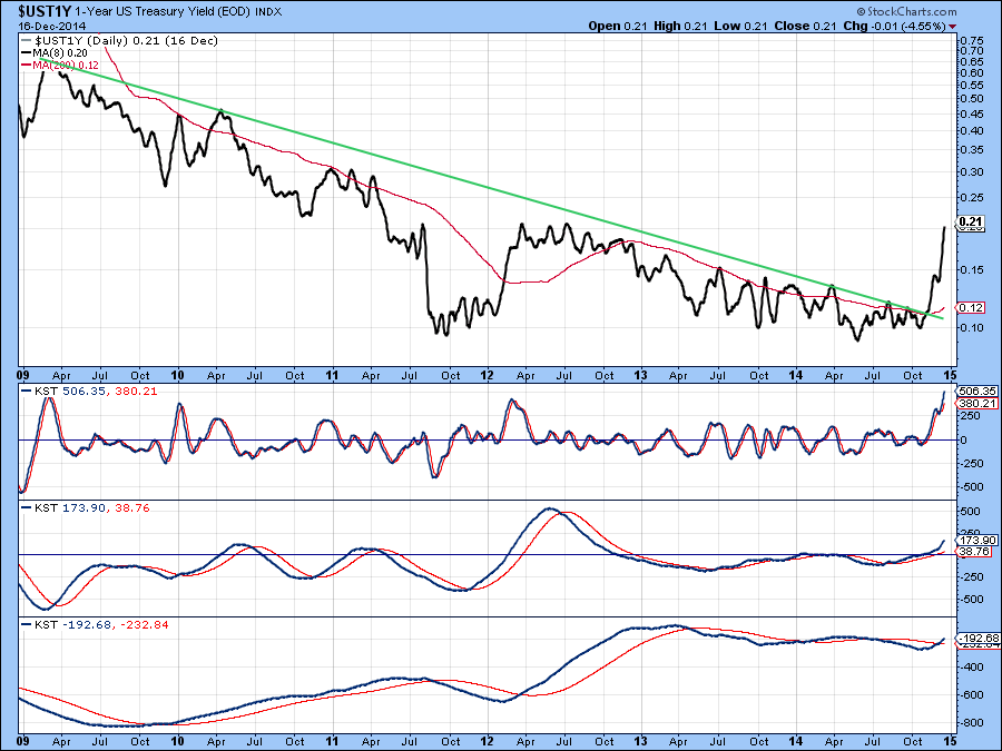
Chart 7
We also see the 3-month LIBOR ($LIBOR3) rate in Chart 8 now decisively above its 200-day MA for the first time in years. When banks charge more money to loan between themselves, that can be an indication of something changing in the credit markets.
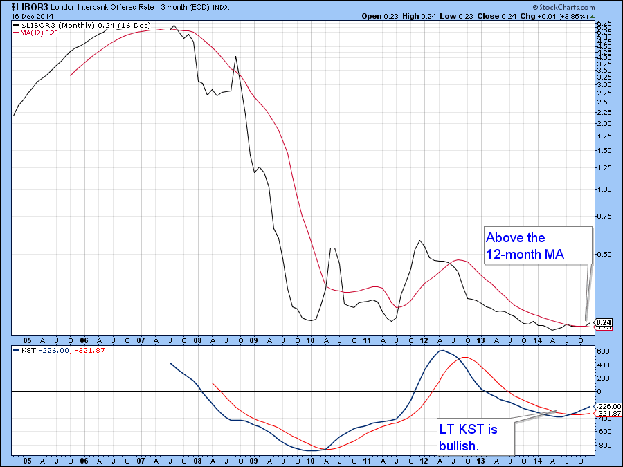
Chart 8
However, further down the yield curve the price of the 30-year T Bond ($USB) has continued to extend its advance. It has reached resistance in the form of a previous high, but with all three KSTs in a positive mode, higher prices seem likely. In the past when short rates have risen for an extended period and long rates have not, this has been fairly rare but has signaled a deflationary environment where bond prices eventually win.
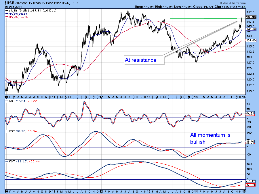
Chart 9
Chart 10 shows the Powershares Yuan Dim Sum Bond Fund (DSUM). Currently it’s edging through an important up trendline. Since the KST is bearish it seems likely that these yuan based bonds will experience a more decisive downside break. This seems surprising given the Chinese government’s recent push to lower certain yuan based interest rates.
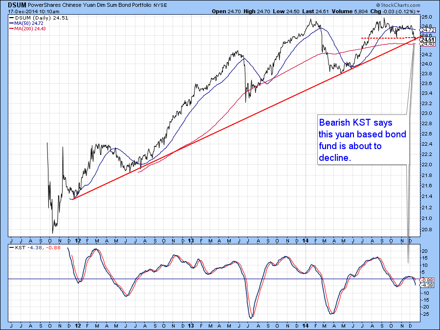
Chart 10
Precious Metals
Gold has had a chance to rally but some of the components of the gold asset markets are now starting to show some signs of fatigue. The price itself , as represented by the Gold Trust ETF, the GLD, looks as though it is trying to form an inverse head and shoulders. In order for this bullish pattern to be completed we would need to see a break above the $120. The hesitating KST in the lower panel throws some doubt on the possibility of the pattern being completed.
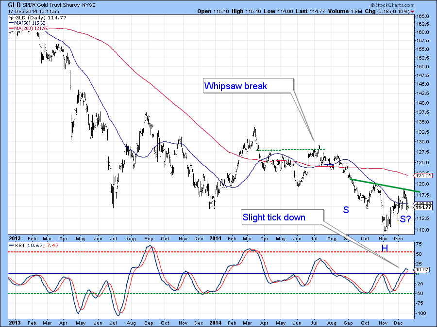
Chart 11
So too does the action on the Gold chart in Chart 12, which looks like a bearish flag. These formations develop in a counter-cyclical way as an upward sloping trading range bounded approximately by two parallel lines. It is completed when the price slips decisively below the lower line, which in this case would be $113. Note that the more sensitive MACD has already turned over, thereby indicating the likelihood of a downside break.
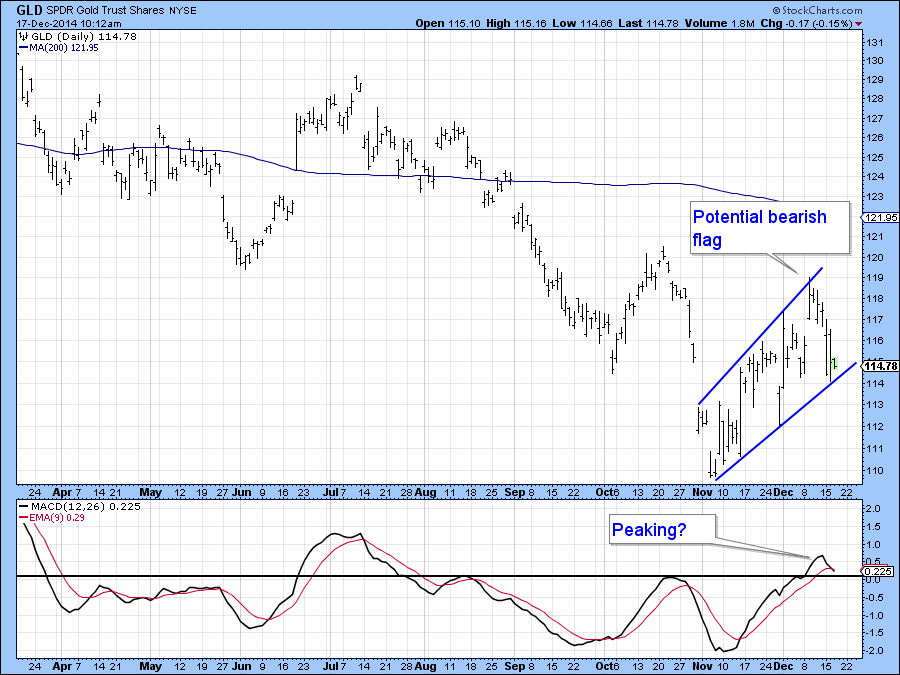
Chart 12
The ratio between the Silver Trust (SLV) and the GLD is not a perfect one in terms of forecasting gold prices. However, we do see from the red dashed arrows in Chart 13 that weakness often leads that of the gold price. Silver is recognized as being a more speculative metal than gold, which means that a rising ratio reflects growing confidence in the precious metal markets.
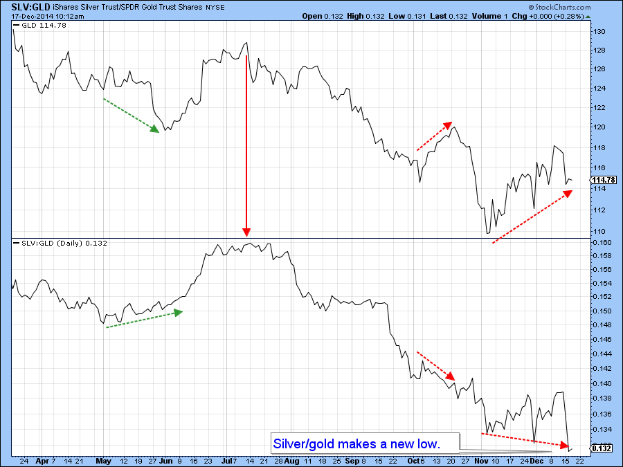
Chart 13
Chart 14 shows a cumulative line constructed from a basket of gold share equities registering net new 52-week highs. It gives buy and sell signals when it crosses above or below its MA. The red arrows indicate recent sell signals. The indicator went bearish in mid-September and continues to remain that way. Equally as important is the fact that it touched a new low this week. This indicated that any strength in the price of the ETF was not being reflected in the broad list of its components, not a good sign for the bulls!
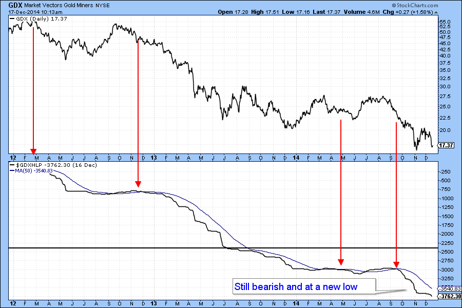
Chart 14
When measured against bonds, in the form of the Barclays 20-year Trust (TLT) compared the Gold Miners ETF, the GDX continues to weaken. That’s because this relationship has just touched new bear market low. All three KSTs are adding insult to injury because they are in a declining mode. What’s surprising is that the long-term KST has just gone bearish again. I don’t find this as a positive sign for a budding bull market in gold related assets!
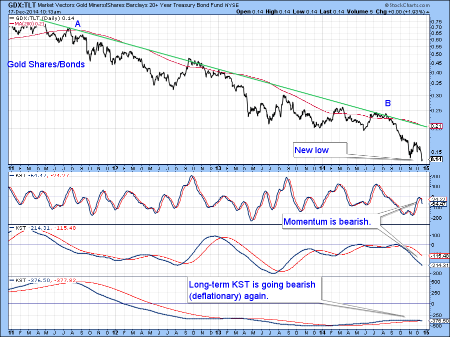
Chart 15
Good luck and good charting,
Martin Pring
The views expressed in this article are those of the author and do not necessarily reflect the position or opinion of Pring Turner Capital Group or its affiliates.


