Equity Market Breakout is Broadly Based but Short-term Indicators are Becoming Overstretched
- Emerging markets about to experience an important breakout.
- Yield curve continues to flatten.
- Confidence in the bond market faces an important technical test.
US Equities
We have seen some nice breakouts in the last few trading sessions, which have been pretty broadly based as you can see from Chart 1, comparing the S&P with its daily A/D and Upside/downside volume lines. Chart 2 pits the NYSE Composite against its A/D Line and that looks pretty solid as well.
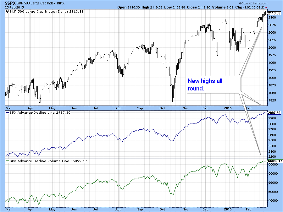
Chart 1
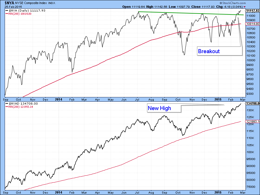
Chart 2
The key, as with most breakouts, is to make sure that they can hold, otherwise the move turns out to be a whipsaw with the accompanying negative consequences. In this respect the broadness of the advance as it embraces the NYSE and NASDAQ Composite as well as the Russell 2000 etc. gives us confidence that prices can move higher despite their overstretched long-term momentum. Rallies do not come without consequences though, and an important one is that they induce overbought conditions. I pointed one out last week in the form of a 10-day MA of the Arms Index($TRIN). This is shown in Chart 3 and the arrows demonstrate its consistency in calling short-term corrections. Its recent sell signal has so far failed to take effect and it will be interesting to see if it does. One argument against it doing so, is that starting Thursday, we begin the 5-day bullish end-of-the-month seasonal for equities.
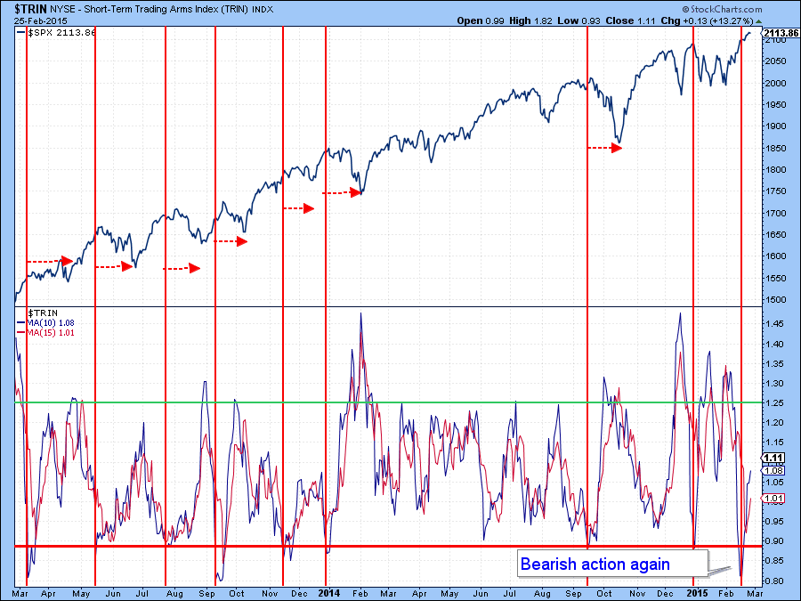
Chart 3
At the beginning of the February rally I featured the NYSE Composite ($NYA) with its PPO and used the green arrows in Chart 4 to indicate that reversals in the oscillator have usually been followed by rallies in the Index. This week I have inserted some red arrows to indicate that sell signals have also pretty consistently been followed by some form of correction, be it sideways or, more often, down. That indicator is currently in a rising and therefore in bullish mode, but there can be no mistaking the fact that it is pretty overstretched at present. We have to give the benefit of the doubt to the prevailing trend, which is up. However, in the event that the indicator reverses from current levels it will be important to see whether the breakout in the NYSE Composite, flagged in the orange ellipse, will be able to hold.
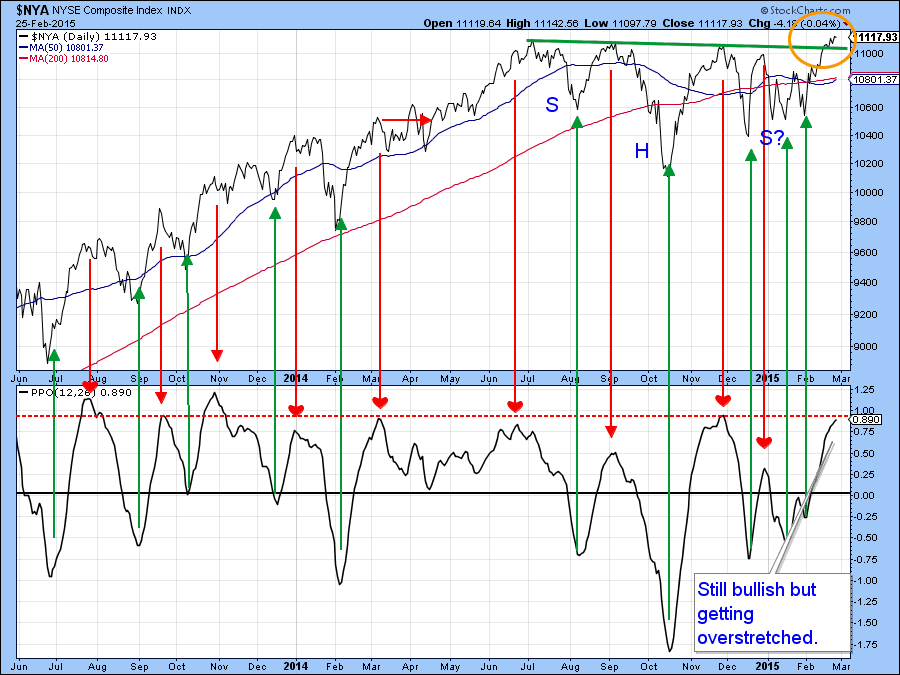
Chart 4
Finally, another favorite indicator of mine, the McClellan Volume Oscillator (!VMCOSINYC) is presented in Chart 5. The two plotted series are a 10- day (red) and 20-day (black) EMA. The arrows show that when the 10-day crosses below its 20-day counterpart some form of correction typically follows. Right now this model is bullish, for although the 10-day series is declining, it is still above the (black) 20-day series. However, it is also apparent that a signal may not be far away. If one is triggered would this guarantee a decline? No of course not, because there are no guarantees in technical analysis. However, it would increase the odds of some form of digestion of recent gains.
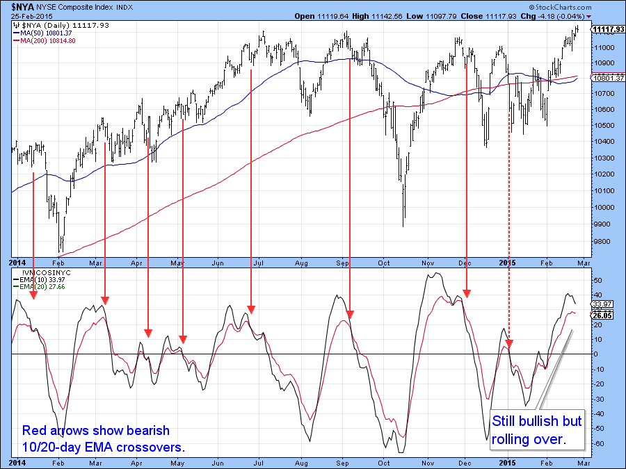
Chart 5
Stocks versus Bonds
The Stock/bond ratio ($SPX:TLT) completed a head and shoulders top some time ago and this was followed by a nice retracement rally favoring stocks. Now that advance is running into resistance in the form of the extended (red) neckline and the dashed green resistance line. Since the breakdown is still intact I am assuming that the declining trend favoring bonds is as well. After all, the long-term KST, which reflects the primary trend, is still declining. Whatever the outcome, there is no doubt that the technical picture has reached a crucial juncture. If the ratio can take advantage of the rising short-term KST and move through the resistance trendline then that would likely indicate that the breakdown was a false one. On the other hand, if the ratio stalls from here, thereby resulting in a short-term KST reversal, that would suggest new lows in the stock/bond relationship.
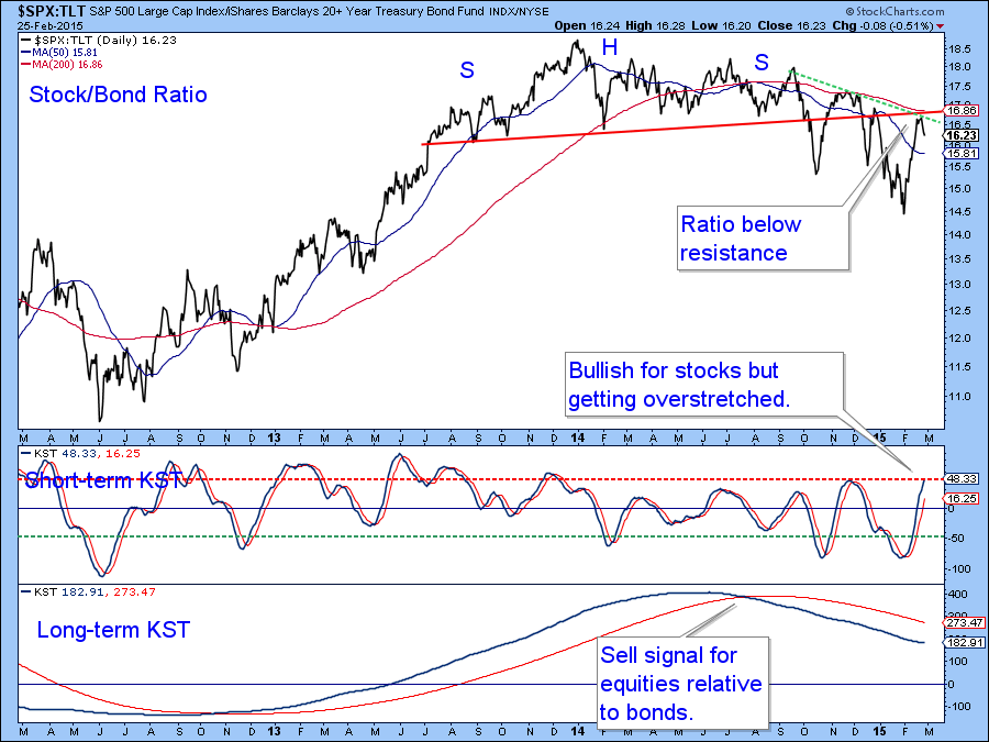
Chart 6
Emerging Markets
Chart 7 shows two possible outcomes for the Emerging Markets ETF, the EEM. On the one hand it could be argued that the price is about to complete a bullish inverse head and shoulders pattern marked by the green letters. On the other hand, the red letters and dashed red trendline could be flagging a smaller bearish consolidation head and shoulders. Since the price is very close to the green bullish neckline we could find out fairly soon. One argument against a positive breakout is the bearish trajectory of the KST, as well as the overstretched nature of the diffusion indicator. This one monitors a basket of emerging country ETF’s that are in a positive trend. However, we can see that the diffusion series has started to accelerate to the upside and is still above its MA. The two key levels to watch on the ETF itself are at $41 on the upside and $39 on the downside.
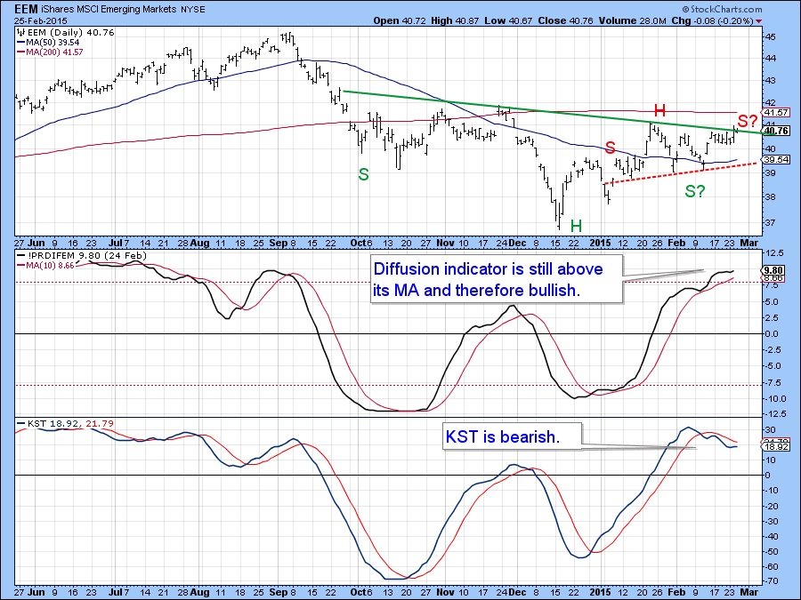
Chart 7
Interest Rates and Credit Spreads
Bond prices appear to be rallying in an initial test of their bull market highs. However, at the short-end things are unfolding in a different way as rates are firming up in anticipation of Fed actions later in the year. One key interest rate is the 3-month LIBOR ($LIBOR3), shown in Chart 8. This series experienced a long-term KST buy signal some time ago and has recently begun to re-accelerate slightly to the upside.
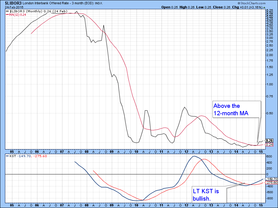
Chart 8
When the 3-month Libor ($LIBOR3) is divided by the 10-year yield ($TNX) to replicate a version of the yield curve it reveals a rising or flattening trend as short rates converge on yield from longer-term maturities. Note how this relationship broke decisively above the 2009-2015 down trendline and has subsequently pulled back to support in the form of the extended line. Since both the intermediate and long-term KSTs are in a rising mode further flattening (a rally in the ratio) appears likely. At this stage of the cycle a flattening curve is usually beneficial for both the economy and equity prices. We can also see from the red and green arrows that 200-day MA crossovers have offered reliable trend reversal signals in the last few years, so that will be something to watch in case the curve begins to steepen ( i.e. a decline in the ratio).
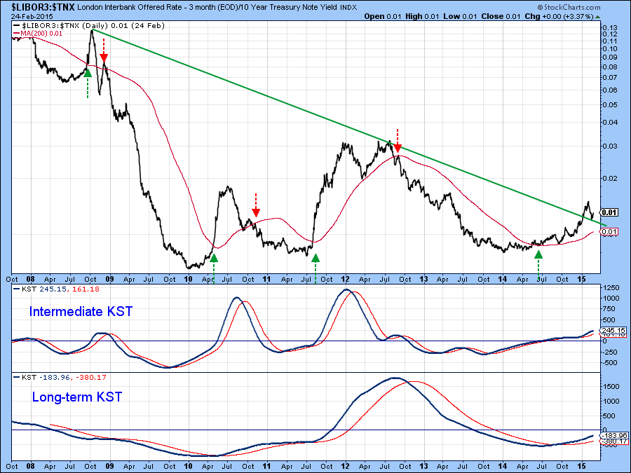
Chart 9
One of the dominant themes of 2014 was the widening of credit spreads between poorer quality and high quality bonds. An important measure of this concept is the ratio between the IBoxx High Yield (HYG) and Barclays 20-year Trust(TLT). This relationship declined for most of 2014 indicating that investors favored high quality over poorer grade credit market instruments. At the moment the primary trend of this relationship remains negative, reflecting a trend of deteriorating confidence. However, some signs of a possible reversal have started to emerge. One of them takes the form of a potential, and I emphasize the word potential inverse head and shoulders pattern. A bullish sign would occur if the ratio can recover from its most recent decline and move above the green trendline. That may be a bit of a stretch because the short-term KST in the second window of the chart is quite overextended on the upside, which implies that the next important move will be down.
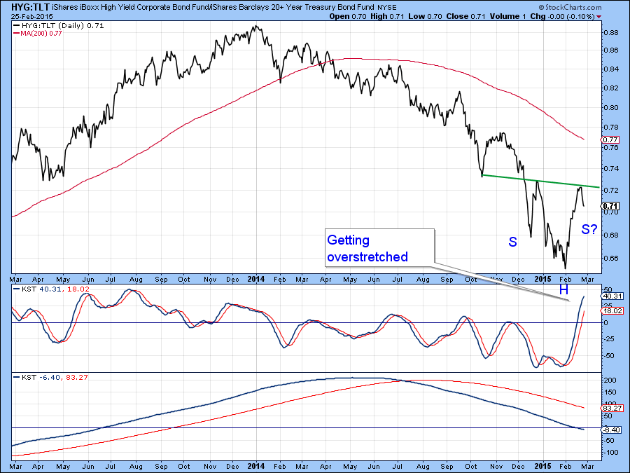
Chart 10
A similar picture is shown in Chart 11, which compares the progress of the Fidelity Capital and Income (FAGIX) with that of the Vanguard Treasury Fund(VUSTX) , another low quality/high quality spread. Note that the overall trend is one of declining confidence interrupted by temporary rallies. Since the short-term KST is at an extended position some kind of corrective activity seems likely here as well.
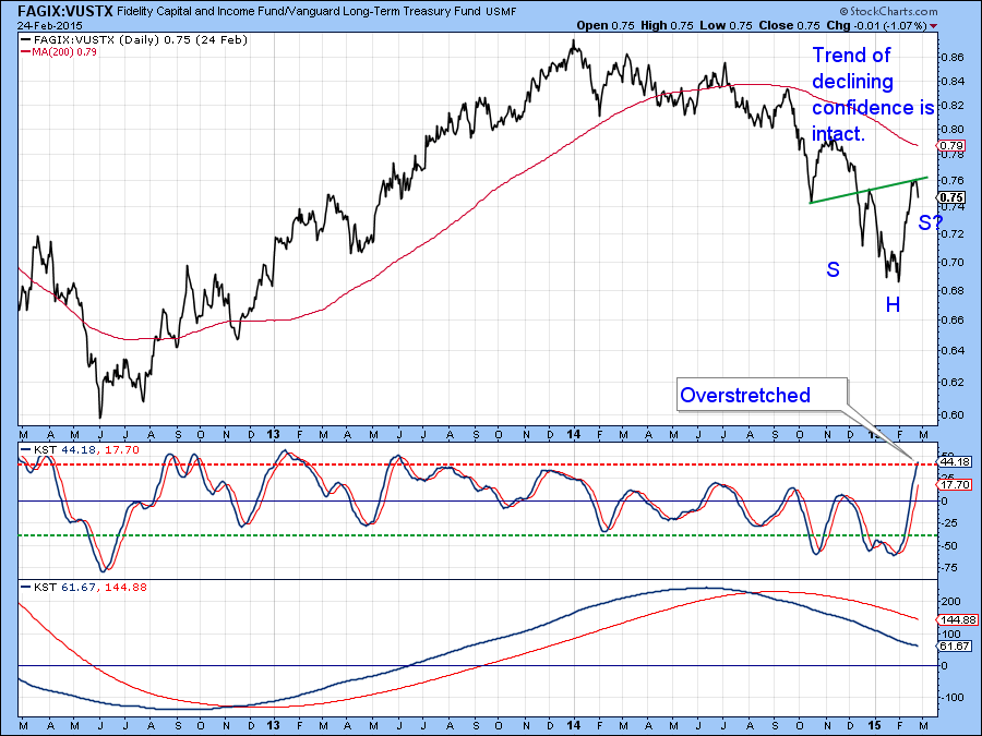
Chart 11
Good luck and good charting,
Martin Pring
The views expressed in this article are those of the author and do not necessarily reflect the position or opinion of Pring Turner Capital Group or its affiliates.


