Forthcoming Big Move in Equities is Likely. The Question is Which Way will it Be?
- The NYA starts to break down against the S&P again.
- Emerging markets ETF triggers some short-term sell signals.
- The EEM is resting above key long-term support.
US Equities
The market continues to frustrate both bull and bear alike as the major averages steadfastly refuse to break out from their recent trading ranges. Chart 1, for instance shows that the NYSE Composite ($NYA) could be forming a large inverse head and shoulders consolidation formation. That would happen with a decisive break above the 11,100 area. Were that to happen an important new up leg in the primary bull market would be signaled.
Alternatively, if we include a bit more price history going back to late 2013 the possibility of a large top formation is revealed. Of the two formations the one in the lower panel is the more significant. That’s because of its larger size. In addition pretty well all the indicators monitoring primary trend momentum are bearish and overstretched to the upside, which suggests vulnerability, but only if the pattern is completed.
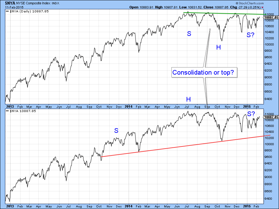
Chart 1
Chart 2 features the Coppock Indicator, a series usually reserved for identifying major lows through an upside reversal. Because markets take longer in the bullish phase of the cycle the Coppock has not been traditionally used to identify peaks. However, I have noted that secondary peaks that develop at a lower level than the first often signal bear markets. As you can see, the indicator topped out several months ago close to where the trading range for the NYSE Composite ($NYA) began.
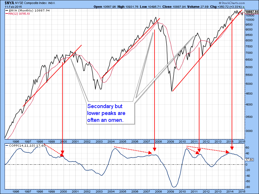
Chart 2
Right now though, near-term price action indicates that a move towards the upper end of the trading band is underway. Equally important is the fact that it is being supported by the vast majority of the short-term indicators. For example, Chart 3 features the McClellan Volume Oscillator (!VMCOSINYC) for NYSE common stocks ($NYA). The model consists of two EMA’s of the raw data itself sporting 10 and 20-day time spans. The idea is that when the (black) 10-day EMA crosses above or below its (red) 20-day counterpart, short term buy and sell signals are triggered. Right now the model is in a positive mode since the 10-day EMA is rising and above the 20-day series. As long as that condition is maintained there is a great chance that the NYSE Composite will complete the inverse head and shoulders. Right now the 10-day EMA is moderately overbought, so it’s important for the market to gain upside momentum; otherwise the ten day EMA will peak out. The red arrows show that the most likely outcome of such a reversal would be declining prices. In other words, if we are to see an upside breakout, the next few sessions would be as good a time as any to see it happen.
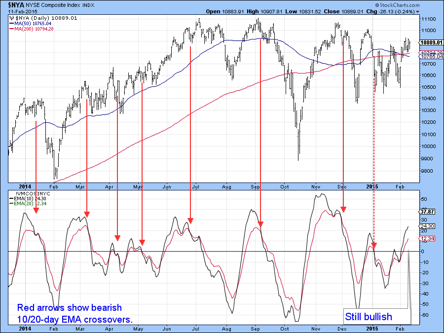
Chart 3
Chart 4 shows the same approach for the NASDAQ Composite ($COMPQ). In its case the trading range is much smaller and takes the form of a potential gently ascending right angled triangle. At present the oscillator model in the lower panel remains positive. Remember you can duplicate any of the charts in this article by clicking on them. If you like the chart arrangement you can then save it as a chart style that can be plotted with any symbol. Alternatively to save specific symbols to be plotted later, such as Chart 4 for the NASDAQ, save it in a ChartList. To save the chart with the annotations, open the annotation tool first, then save it into a ChartList from there.
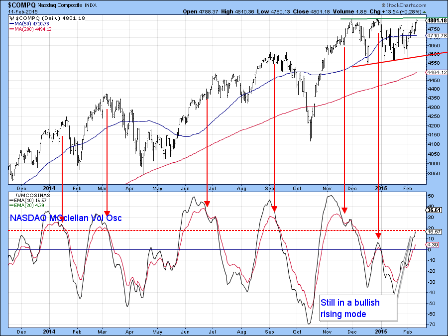
Chart 4
In addition Chart 5 indicates that the RS line ($COMPQ:SPY) may be about to break to the upside. We are likely to find out soon because the KST for relative action, in the bottom panel, has started to slowly accelerate to the upside. It seems to me that the next few sessions are going to decide whether we break to the upside or if a challenge to support in the lower area of the potential triangle develops.
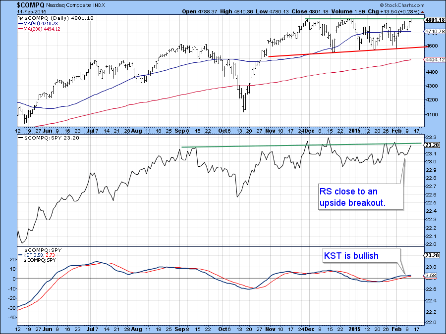
Chart 5
Finally, we see the same approach applied to the Russell 2000 ETF, the IWM. Here again the model’s current position is a bullish one. However, the price action takes a slightly different format to the NYSE Composite in that the potential consolidation formation is an upward sloping head and shoulders with a twist. The “twist” in this case is the false upside breakout that took place in December. Those kinds of whipsaws are usually followed by above average price moves in the opposite direction to the breakout. However, in this instance prices retreated, but quickly regained their composure. As a result they were able to rally back to the red breakout trendline. With the McClellan Volume Oscillator on the rise there is a good chance that it can push through. On the other hand, if the resistance proves to be too overwhelming and the price slips below the red dashed up trendline at around $116.50 that would confirm the whipsaw, thereby resulting is a nasty decline.
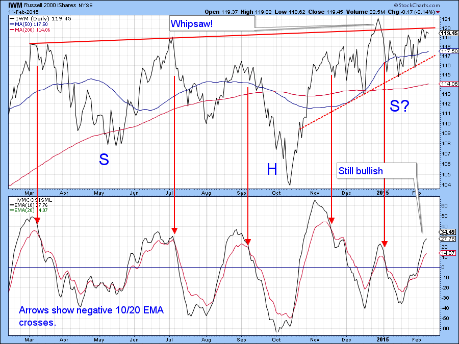
Chart 6
Last week I pointed to the upside breakout in the relative action of the NYSE Composite ($NYA:$SPX) as a bullish sign that the rally may be broadening. Now we see from Chart 7 that the small breakout failed and the RS line has now reversed to the downside. The same is true for the KST of this relationship as it has now started to move down.
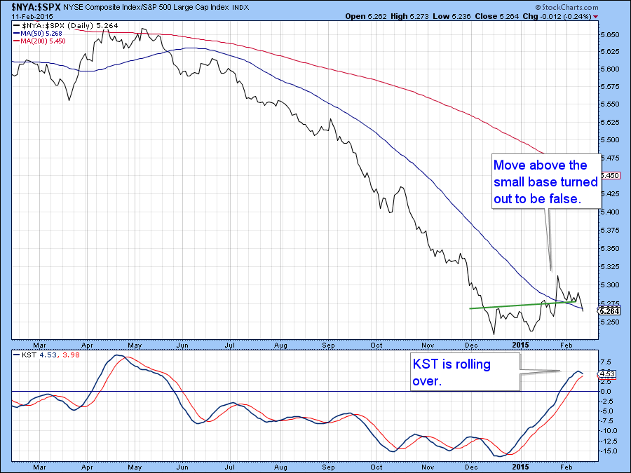
Chart 7
Emerging Markets
The MSCI Emerging Markets ETF (EEM) experienced a small upside breakout a few weeks ago but has since fallen back below the breakout point. The former strong action was supported by my Emerging Market Diffusion indicator in the lower panel. This series monitors a basket of emerging market ETF’s that are in a positive trend. Now however, the indicator has reached an overbought level and begun to decline. That, along with the bearish KST in Chart 9 indicates that emerging markets (EEM) are near-term vulnerable.
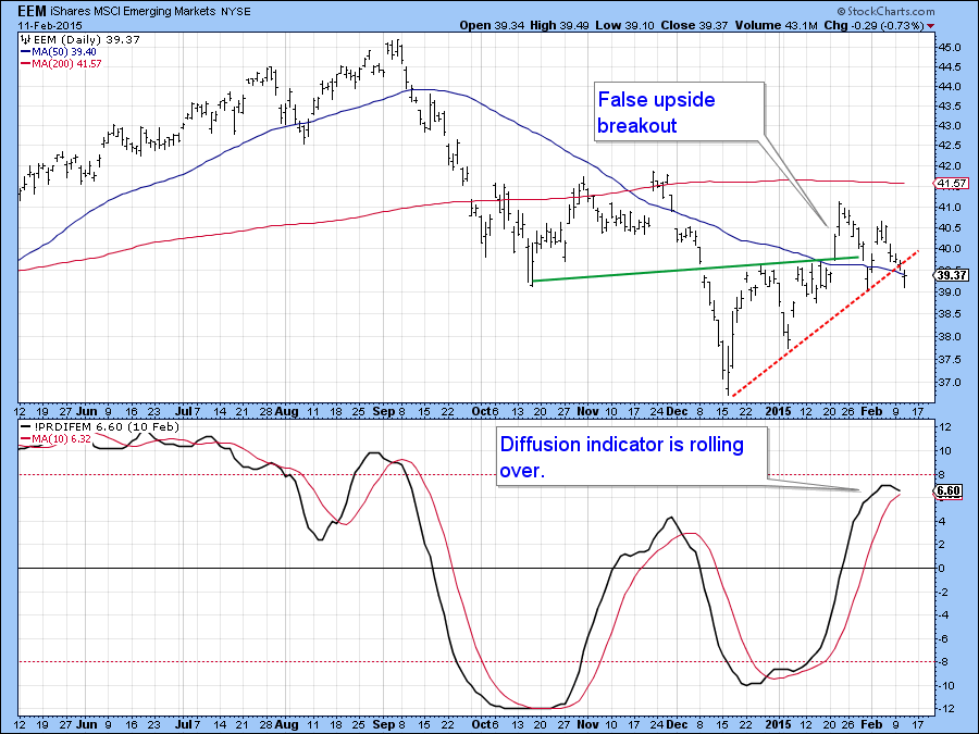
Chart 8
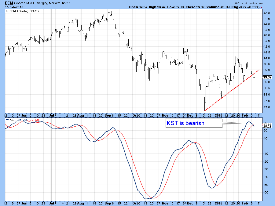
Chart 9
That could not come at a worst time for this emerging markets part of the global economy (EEM) because the price is currently just above major support in the form of the red trendline in Chart 10. The waves represent moves in excess of 7.5% and are a down and easy way of spotting a series of rising or falling peaks and troughs. To plot them use the Zig Zag Retrace tool and set 7.5 in the empty parameter box. Since the 2009 low we have seen a series of rising peaks and toughs. It’s true that the 2011 low at C was below those established in 2010 at A. However, at no point did the series of peaks and troughs reverse. Thus D was lower than B but since E remained above C the series of rising bottoms and tops remained intact. In the current situation the January peak was below last summer’s so a drop below last fall’s low at just under $38 would set up a series of declining peaks and troughs as well as completing a major top. Note also that the RS line vis a vis the S&P in the bottom panel has been in a declining trend throughout the history of the chart. I am not predicting that the top will be completed but am pointing out that with a newly minted bearish KST and diffusion indicator the odds must be considered to be well above even.
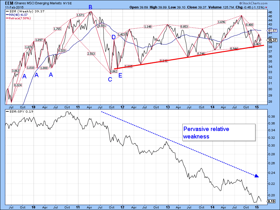
Chart 10
Good luck and good charting,
Martin Pring
The views expressed in this article are those of the author and do not necessarily reflect the position or opinion of Pring Turner Capital Group or its affiliates.


