Moment of Truth Approaching for US Equities
- Short-term oscillators turn bullish for equities
- EFA breaks above significant down trend line
- Gold short-term momentum reverses to the downside
US Equities
Last week the headline of my Market Roundup article read as follows, ”Will the end-of the month bullish seasonal for equities be enough to avoid a downside domino effect?”. Obviously that positive end-of-the-month bullish seasonal, which ended on Wednesday was enough to avoid a negative signal. However, the major averages still remain in their respective trading ranges, so the question now is whether the technical position has improved sufficiently to enable an upside breakout?.
Charts 1 and 2 set the scene in terms of the trading ranges. Chart 1 features the S&P Composite ($SPX), where we can see that the potential head and shoulders pattern experienced a whipsaw move on the downside during Monday’s session. That whipsaw action plus the upside reversal in the KST in the bottom window suggests that there is a good chance of a challenge on the old highs. That potential head and shoulder top has not gone away but its completion has become less likely. Possible distribution also shows up in Chart 2, which features a much larger potential top in the NYSE Composite ($NYA).
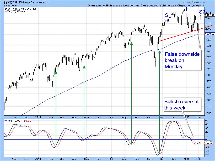
Chart 1
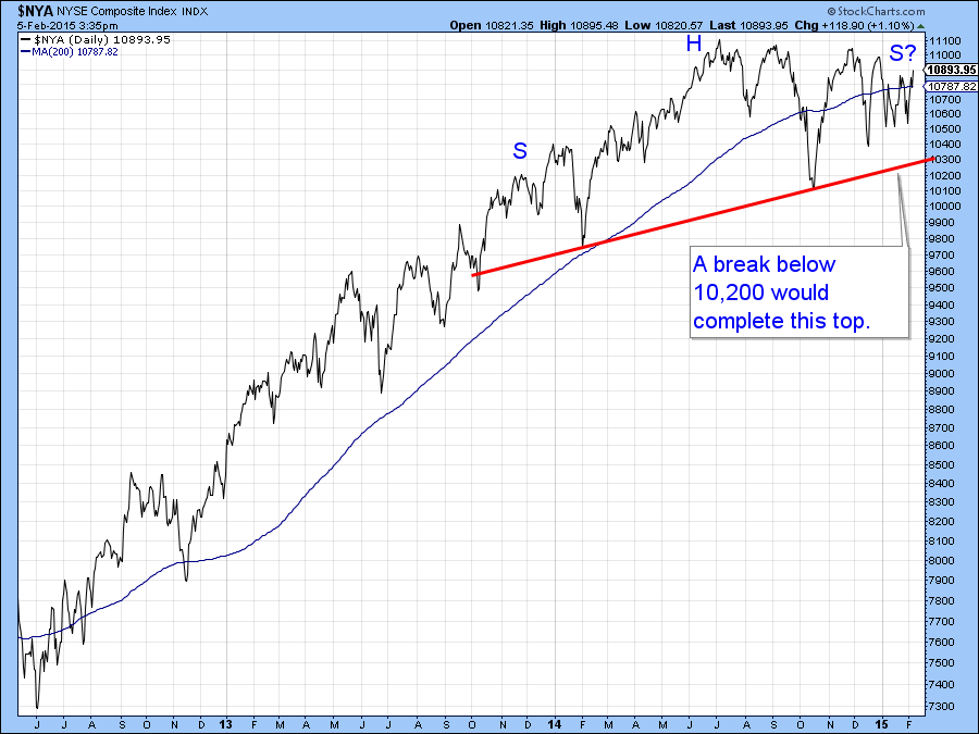
Chart 2
That possibility now has a much smaller chance of developing, not so much because the price is at the upper area of the trading range but because several short-term indicators have reversed to the upside and are not particularly over extended. Note that the Percentage Price Oscillator (PPO) has had a good record of calling rallies, as you can see from the green arrows in Chart 3. As long as this series can continue to extend its advance it’s providing great support for the Index itself.
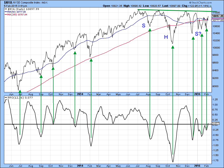
Chart 3
Chart 4 also shows a more optimistic possibility for the S&P 500 ($SPX), where a smaller potential reverse head and shoulder presents itself.
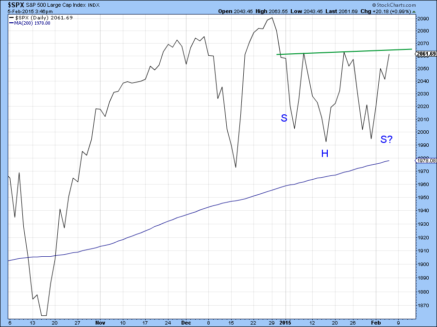
Chart 4
For the first time in a while we are also beginning to see a change in leadership. For the last few years the more broadly based NYSE Composite ($NYA) has been out-performed by the S&P Composite ($SPX). That trend is still down for the NYSE Composite, as you can see from the position of the ratio to its red 200-day MA. However, in recent weeks this relationship has broken out from a base and begun to move higher. This could well indicate that a change in the market’s internal character is just getting underway.
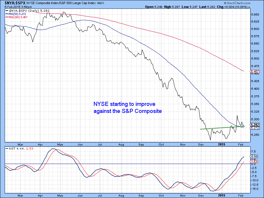
Chart 5
This is also beginning to show itself in some of the indicators monitoring the internals. For example, Chart 6 compares the bullish percent for both series, where the NYSE series ($BPNYA) has again been lagging. However, the late January move to a new low in the S&P series ($BPSPX) was not confirmed by that for the NYSE Composite. This is admittedly a small divergence but it seems to be the first positive discrepancy between the two series for quite some time. Another positive for the NYSE is that the bullish percentage this week was able to rally above the down trendline that began last August. and that suggests a trend towards more stocks signaling bullish trends.
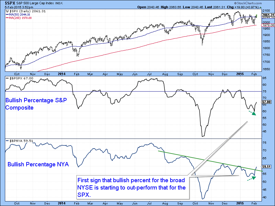
Chart 6
Finally, when we compare the A/D Line for the NYSE Composite ($NYAD) to that specifically for stocks included in the A/D for the S&P 500 ($SPXADP) we see that the NYSE series has broken to a new high. On the other hand the S&P series remains within its recent trading range.
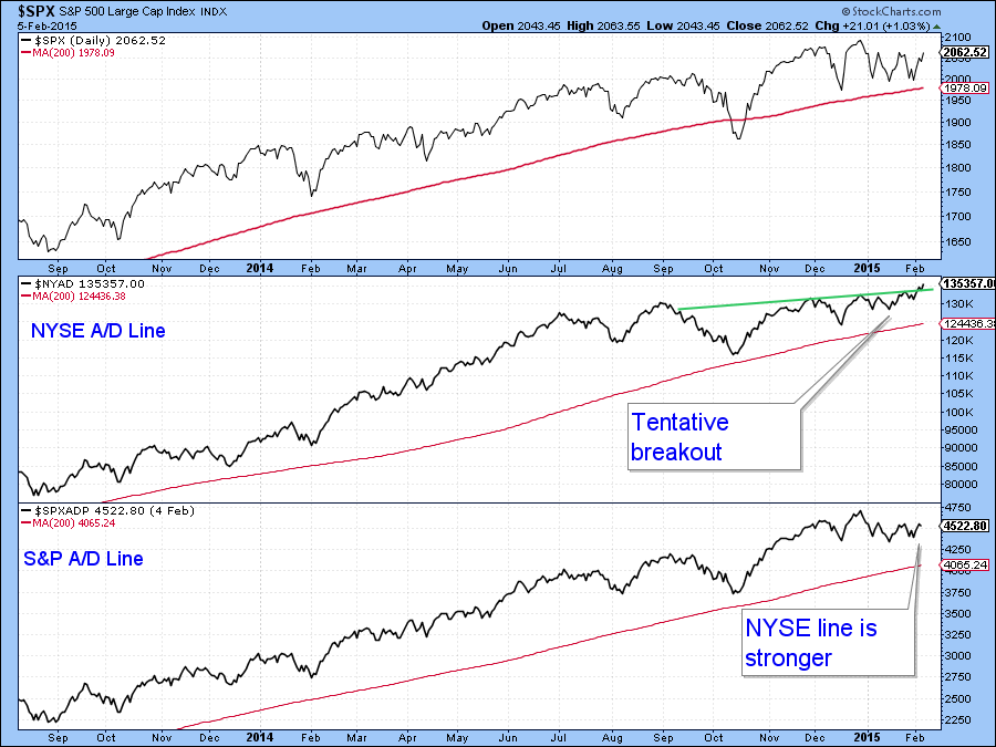
Chart 7
International
There is a strong link between the performance of US equities versus the rest of the world and the direction of the US dollar. In this respect Chart 8 compares the performance of the ratio between the US (S&P 500 - $SPX) and the rest of the world (MSCI Europe Australia Far East ETF, the EFA). The blue arrows point up those situations when this relationship has actually led the dollar. A few weeks ago the ratio violated a key up trendline and has been falling (i.e. favoring the EFA) ever since.
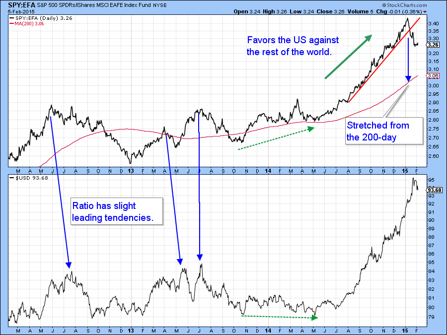
Chart 8
The basic trend continues to favor the US as we can see from the ratio of SPY:EFA, the rising long-term KST and the fact that the ratio remains well above its 200-day MA. However, the short-term momentum series is very oversold and could trigger a rally. The intermediate KST is complicating the situation because it is just about to go negative. That could imply a trading range prior to the attainment of new highs.
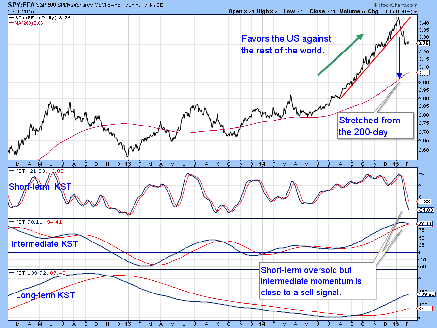
Chart 9
The EFA itself looked as if it may be in the process of tracing out an important head and shoulders top. In fact it did succeed for a brief period to penetrate the neckline. In retrospect that break turned out to be a whipsaw. Whipsaws are usually followed by above average moves in the opposite direction to the false break. That possibility now appears to have been confirmed because the price has managed to break above its 2014 down trendline. As long as it can hold above that line and the KST continues to advance higher prices should be expected, possibly challenging the old bull market high. On the other hand, we have to note that the series of declining peaks and troughs is still intact and that still holds out the possibility that the top will “work”. Assume that is not the case as long as the price remains above the green trendline. That line is currently just below $62.
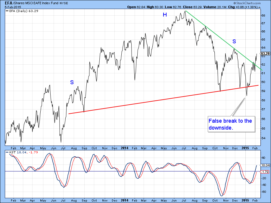
Chart 10
Gold
The Gold Trust ETF, the (GLD) recently broke out from a bullish inverse head and shoulders pattern and almost achieved its price objective of just below $127. Now the KST has started to roll over from an overbought situation and that suggests that prices will correct some more. The world “correction” can just as easily mean sideways as down. Indeed, if the price is in a bull market, a subject I will address in next week’s seminar with Greg, a brief consolidation of recent gains would be more likely. In that respect, it is possible that the price may be able to hold above the 200-day MA at $120. If it does not, then a probing of the breakout level in the $116 area would appear more likely. Of course if gold totally ignores the overbought KST and moves to a new high in the period ahead that would be a strong sign that the primary trend is a bullish one.
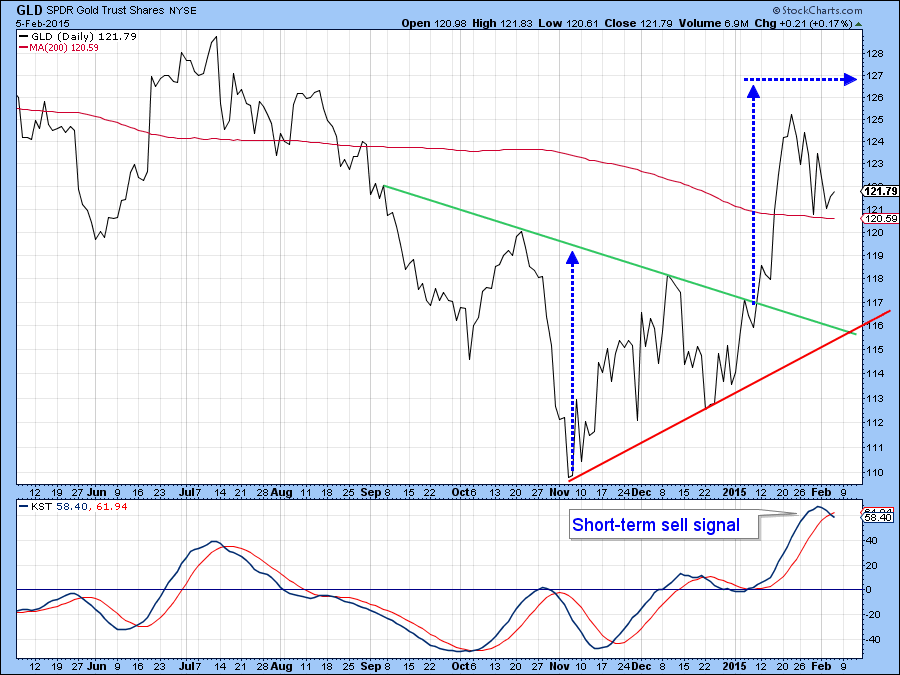
Chart 11
Good luck and good charting,
Martin Pring
The views expressed in this article are those of the author and do not necessarily reflect the position or opinion of Pring Turner Capital Group or its affiliates.


