Stock Markets around the World Continue to Look Vulnerable
- World stock ETF may have experienced a false upside breakout.
- Bonds likely to out-perform stocks in the immediate future.
- Emerging markets ETF right at critical support.
Global Equities
Global equities are starting to look sick. Chart 1, for instance shows that the MSCI World Stock ETF, the ACWI, has recently been diverging with my Global A/D Line. This series is constructed from the daily cumulative plurality of a basket of country ETF’s. Usually it moves in gear with the ACWI, as you can see from the two green dashed arrows. However, it began diverging with the price a few around the turn of the year.
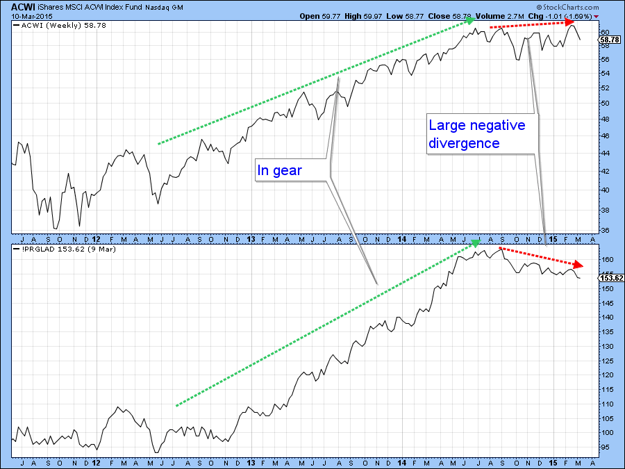
Chart 1
Chart 2 shows more recent price action in greater detail. First, it seems likely that the ACWI experienced a false upside breakout. That would be confirmed if the price slips decisively below the red up trendline . The real point for featuring this chart lies in the fact that the A/D Line has not only violated the red dashed up trendline but has sunk to a new low. In effect, it would appear that the recent bull market high in the ACWI was not being confirmed in the kind of broad way that brings a smile to a technician’s face. I should add that the countries used in this breadth indicator are all expressed in dollar terms and the dollar of late has been pretty strong. However, even when expressed in local currency terms most markets remain in a very overbought short-term condition.
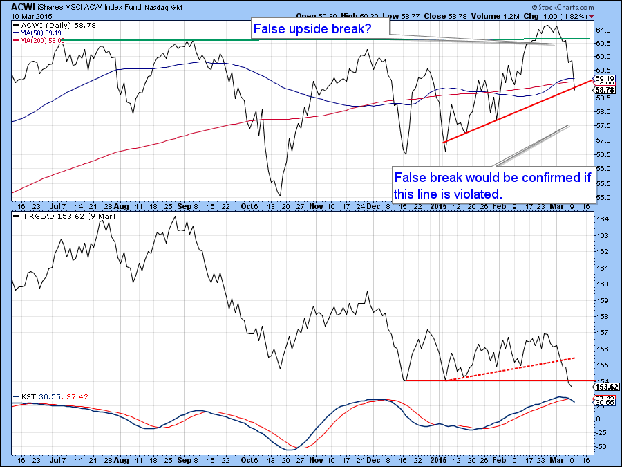
Chart 2
Further vulnerability for the ACWI seems likely because the Global Diffusion indicator, which measures the number of a basket of country ETF’s in a positive trend, is overextended and reversing to the downside. The solid red arrows show that such action has usually been followed by a price drop of some kind. The dashed arrows flag the occasional false negatives. I have also drawn the false breakout in a slightly different way in this chart. All in all, while this whipsaw move has not yet been confirmed by a break in trend, it seems likely that it will, given the weak breadth data and the diffusion indicator sell signal.
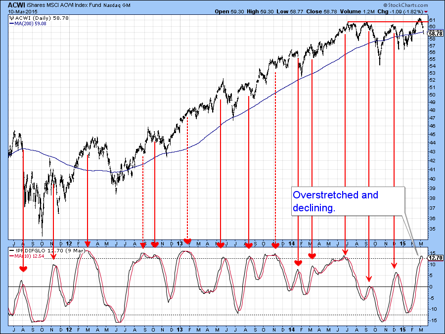
Chart 3
The bull market trendline for the ACWI was violated some time ago, as was one for the Special K momentum indicator. This means that the recent decline could well be the first domino to fall in what could turn out to be something greater than a 10% correction. Note that the Special K, which normally peaks and troughs with the price it is monitoring, has already begun a series of declining peaks and troughs. All that is required now is a violation of the more conservative up trendline on the price of the World ETF itself. That line is currently at $58. FYI amongst other things I'll be showing some longer-term charts when I join Greg at his webinar on Thursday.
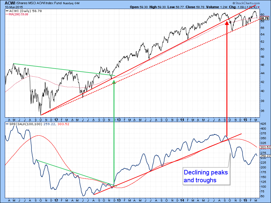
Chart 4
US Equities
Chart 5 shows that the recent break to new highs was not that well supported. The indicator in the lower panel is one that was developed by Carl Swenlin. It tracks the percentage of Price Momentum Model (PMM) buy signals for a given basket of securities. In this case the basket comprises the Dow Jones sectors. You can read more about it here. The red dashed arrows point up the fact that healthy advances are punctuated by both series rising in concert. The red arrows indicate that divergences are typically followed by corrective activity. Currently we see the largest negative divergence forming since the 2007 top. I had been hoping that the indicator would rally with the market thereby clearing up the divergences that started in the middle of last year. Instead, this series has reversed to the downside. We see the same type of action with other broad based indicators such as the percentage of NYSE stocks above their 200-day MA’s and the bullish percentage numbers. Basically what they are telling us is that fewer and fewer stocks are participating in the rally. You can see this in greater detail in Chart 6, which illustrates the fact that the indicator has recently been experiencing a series of declining peaks and troughs. If it can hold above its February low and the S&P can bounce off the red up trendline the situation might well be saved, but since the KST for the S&P in Chart 7 has only just gone bearish the odds of this happening are not high.
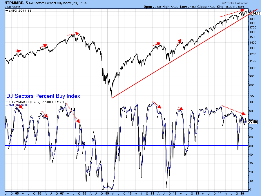
Chart 5
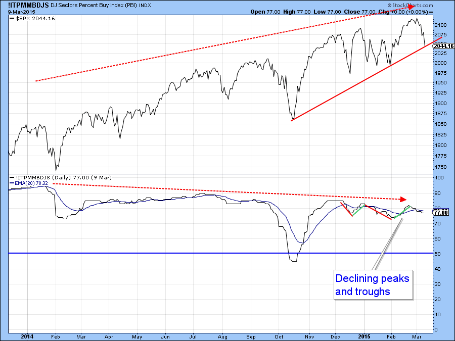
Chart 6
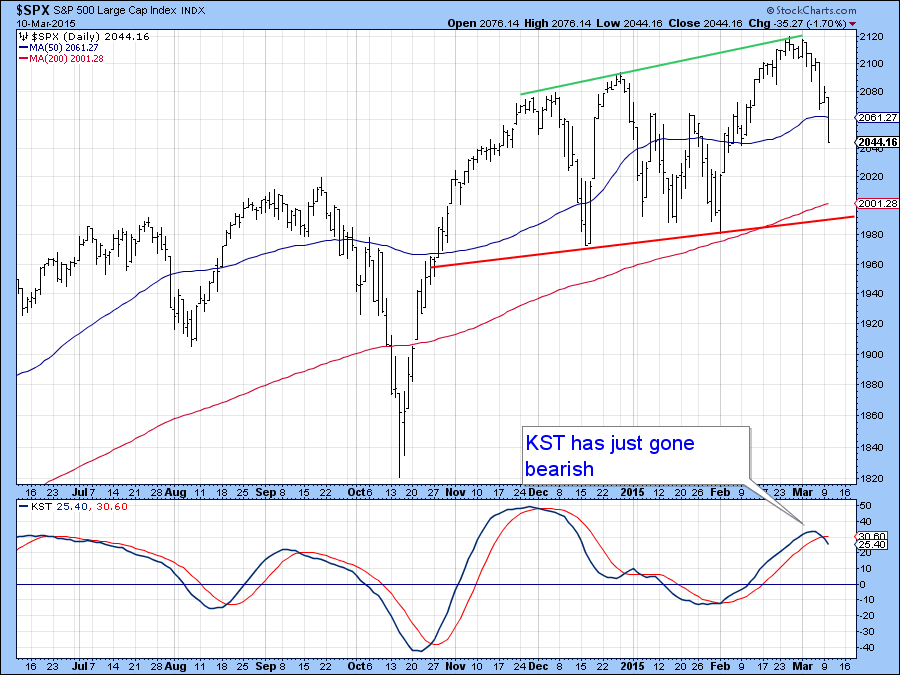
Chart 7
Stocks versus Other Asset Classes
Last week I focused on the technical position of the Stock/Bond ratio (SPY/TLT) as it had reached a crucial juncture point. Now it looks as if the rally is over and the ratio is now about to decline again. The implication is that stocks are likely to under-perform bonds. See how the ratio got turned back at the extended head and shoulders neckline. Also, it experienced a quick false break above the dashed green trendline joining two previous peaks. Since the long-term KST in the bottom window is still bearish it seems likely that the ratio could well register a new bear market low in the weeks ahead. This would say nothing about the trend of the absolute prices of bonds or stocks, merely their relationship. However, bearing in mind the fact that equities remain overbought and bonds short-term oversold I would expect to see falling stocks and rising bond prices going into the late spring.
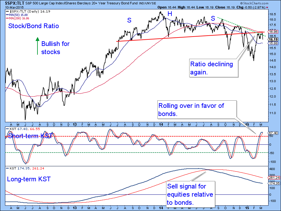
Chart 8
Stocks remain in an uptrend when compared to the CRB Composite (SPY:$CRB). Currently the price action looks to be forming a bullish right angled triangle. Confirmation would come with a breakout above the green trendline. The KST in the bottom panel has gone flat at a fairly low level, which means that is in a position to support a rally favoring stocks. On the other hand, violations of the trendline forming the ascending part of the pattern often results in above average declines. That would also be supported by the fact that such a penetration would cause the KST to roll over from a low level. Low level momentum reversals as a price is close to or at a new high for the move are often followed by above average declines. To update the chart and find out what happens just click on it at a future date.
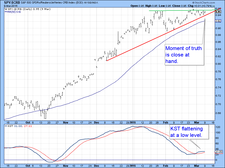
Chart 9
Emerging Markets
I’ve been stalking the Emerging Markets ETF (EEM) for a possible downside break for the last few weeks and pricewise we are getting pretty close as you can see from Chart 10. The red lines represent price moves of 7.5%. The event that I am looking out for is a possible break of the thick red up trendline at Y, since a move below it would signify that the EEM had begun a series of declining peaks and troughs, thereby triggering a double negative signal. The other would, of course, be the violation of that three year up trendline itself. Note that the relative strength has already fallen to a new multi-year low, hardly an encouraging sign for a potential turnaround. That’s also the picture we get from Chart 11, which shows that the price has just completed a small head and shoulders top. The situation could be saved with a weekly close above point Z in the Chart 10, but with both momentum indicators in Chart 11 in a bearish mode that does not seem likely.
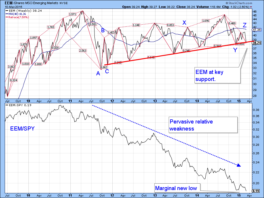
Chart 10
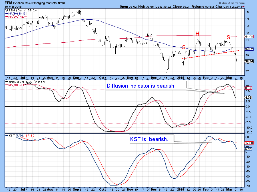
Chart 11
Good luck and good charting,
Martin Pring
The views expressed in this article are those of the author and do not necessarily reflect the position or opinion of Pring Turner Capital Group or its affiliates.


