Global A/D Line Breaks above Key Resistance
- - Confidence trying to improve in the bond market so that it can support higher equities.
- - Oil trying to form a base.
- - Declining peaks and troughs still in force for the Bloomberg Commodity ETN.
Global Equities
Throughout most of the bull market my Global A/D Line, comprising the cumulative daily plurality of a basket of country ETF’s, was in gear with the MSCI World Stock ETF, the ACWI. You can see this from Chart 1, where, until last September the line confirmed and sometimes led new highs in the ACWI. The negative divergence that began last September is still intact and is a longer-term worry.
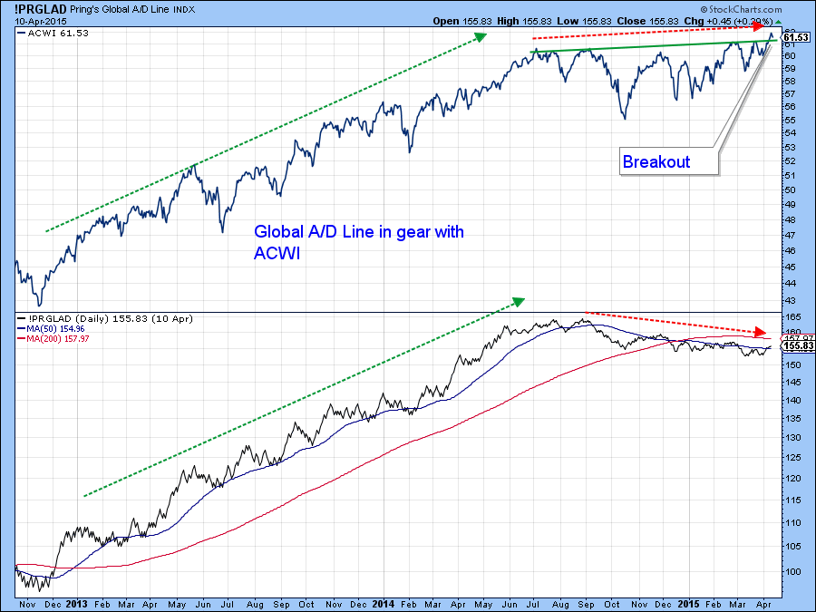
Chart 1
However, Chart 2 shows that the A/D Line has just broken above key resistance in the form of the two converging trendlines. The KST, calculated from this breadth indicator, has also turned up. The importance of these events is that they are occurring simultaneously with a breakout in the ACWI itself and therefore add strong support to the idea that the price is headed higher.
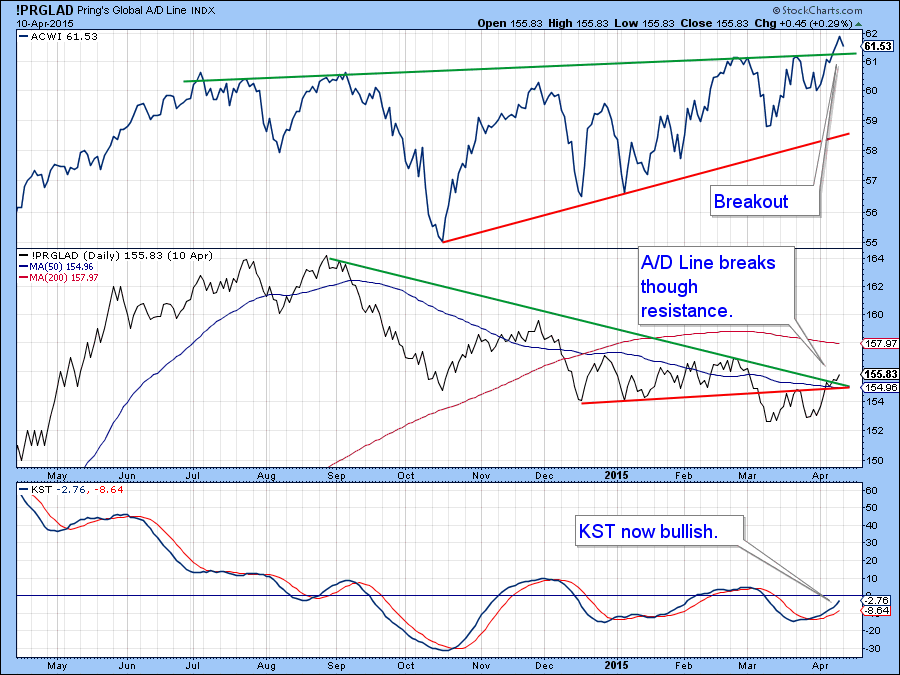
Chart 2
Chart 3 features an indicator that measures a basket of country funds in positive trends. The red and green solid arrows show that when this indicator crosses its MA in either direction, a worthwhile move of at least short-term duration follows. The dashed arrows indicate the disappointing signals. Last week this diffusion series triggered another buy signal. As long as it can continue to rise, thereby indicating an expanding number of country ETF’s experiencing a positive trend, the odds of a valid ACWI breakout will remain high. Hesitation and a drop below the green breakout trendline would be a cause for concern. So too would be a sell-off by the A/D Line below the two converging trendlines in Chart 2. The way it looks right now is all systems go! Don't forget you can follow these charts by just clicking on them and saving them in a ChartList.
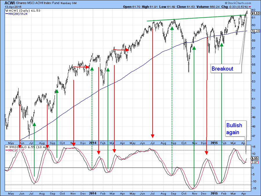
Chart 3
US Equities
Charts 4 and 5 feature the McClellan volume oscillator model for both the NYSE and NASDAQ markets. That for the NYSE has been bullish for a while. Since the 10-day EMA of the raw data (the black line) remains above its 20-day counterpart (the red line) the model remains in a positive mode. As long as this remains so and the KST in the bottom panel also maintains its upward trajectory a decisive upside breakout is likely. We have to be careful though as the intraday charts show the indicator struggling to maintain its breakout. The close only chart does not, at the moment, share this potential weakness, as it is right at its breakout point (Chart 6). However, a drop below the red up trendline and 200-day MA at around 10,800 would be needed to confirm the likelihood of a failed breakout.
Last week I pointed out that this same model for the NASDAQ was close to a buy signal. Now that signal has been triggered which means that the NASADAQ is likely to see higher prices as well. It looks to me as if this Index was in the process of forming a head and shoulders top. The sharp rally away from the potential neckline indicates that the top will not “work”. Typically head and shoulders that fail to materialize are followed by above average upside moves as bearish market participants and bullish new longs both compete for a limited amount of stock.
Chart 4
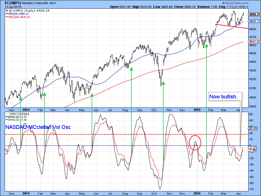
Chart 5
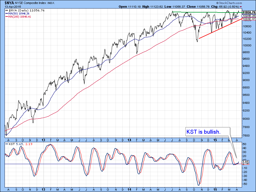
Chart 6
Confidence and the Market
Chart 7 shows the ratio between the iBoxx High Yield and Barclays 20-year Trust ETF’s (HYG/TLT). A rising ratio implies investors in the bond market are gaining in confidence as it means that the risky high yield series is out performing the conservative government fund. This relationship usually moves in the same direction as the market, as bond investors gain and lose confidence in sympathy with mood swings by equity traders. In gear activity such as this tells us little. However, this interaction begins to speak to us when it diverges in either direction with the equity average and this is confirmed by a trend break in both the ratio and the S&P. In January 2014 the ratio started to diverge negatively with the equity market big time. That divergence is likely to stand for some time and is a major long-term worry. In the meantime though, it looks as if both series have started to move in gear again on the upside. In addition the KST for the ratio has just gone bullish, suggesting that it will continue to extend its recent advance. My expectation is that confidence is likely to improve over the short-term, taking equity prices in the same direction. As long as that proves to be the case I am willing to temporarily put the long-term negative divergence to one side until the ratio again shows signs of vulnerability.
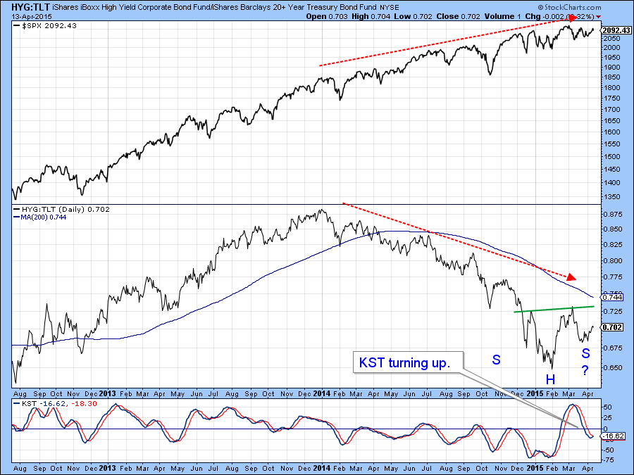
Chart 7
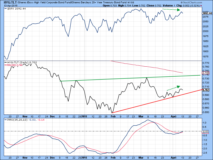
Chart 8
Another way of assessing changes in confidence as they relate to equity prices is to compare the Fidelity Capital and Income Fund with that of the Vanguard Long-term Treasury fund (FAGIX/VUSTX). Once again a rising line implies growing confidence. In this instance we see a more fully formed potential inverse head and shoulders. The intermediate KST of this relationship is already bullish and its short-term counterpart seems to be hinting at a trend towards growing confidence that will be bullish for both this quality spread and equities in general.
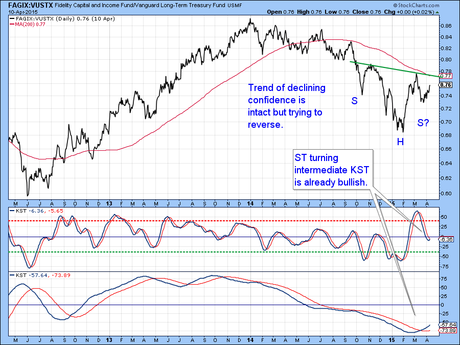
Chart 9
Oil and Commodities in General
Last week at the Thursday webinar I was asked about the oil price. My response was that the longer-term evidence points to a primary bear market but we might well see a counter-cyclical move develop in the interim. For instance, the price remains below its 12-month MA and the long-term KST, in the bottom of Chart 9. The blue arrow shows that it would take an approximate 50% rally from current levels just to get back to the 12-month MA for West Texas Crude. That means we could see quite a rally develop before this MA relationship could go bullish.
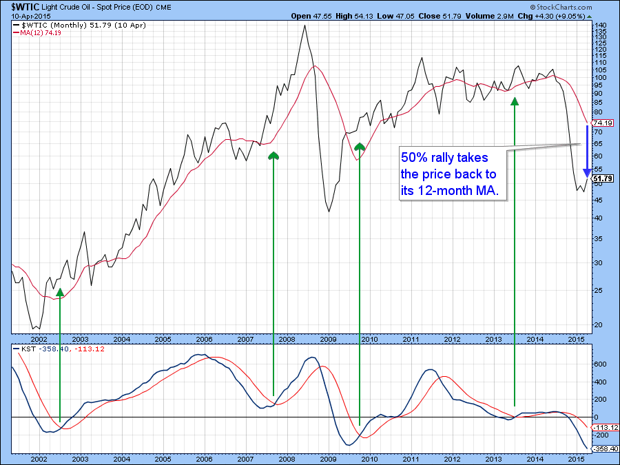
Chart 10
Chart 11 tells us that the oil price may well be in the process of forming a base as only a small amount of additional strength is required for a breakout. Note that the (red) 200-day MA is some distance from current levels at slightly north of $70, so it’s quite possible that a spirited contra-trend rally could develop at any time. There is certainly no shortage of potential geo-political events that could trigger such an event.
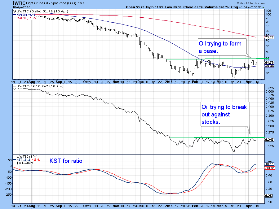
Chart 11
The Bloomberg Commodity ETF (DJP) is in a similar technical position to the oil price in that it has recently been consolidating following some serious losses that began in mid- 2014. The green and red lines represent waves as defined by the StockCharts retracement tool using a 5% filter. They show that the series of declining peaks and troughs is still intact.
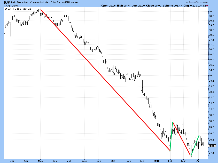
Chart 12
Moreover, Chart 13 tells us that the price is still a long way from its (red) 200-day MA. Quite often during a primary bear market a momentum indicator will remain below its equilibrium level for an extended period of time, say for 6 months or longer. When it finally emerges into positive territory such action indicates a change of character, which is often associated with a reversal from a primary trend bear to bull. Chart 12 tells us that the net new commodity high indicator has been in such a position since last summer. It recently tried to move above that zero level and failed, thus re-enforcing the primary bear market signals being seen elsewhere. As well as the usual market analysis I will be covering some technical setups that are often followed by above average price moves in the webinar this Thursday.
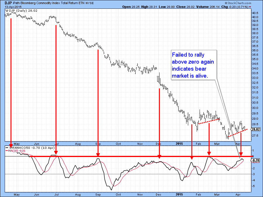
Chart 13
Good luck and good charting
- Martin
The views expressed in this article are those of the author and do not necessarily reflect the position or opinion of Pring Turner Capital Group or its affiliates.


