Will Chinese Equities Drag up their US Counterparts?
- Dow Jones Transports flirting with key support.
- Chinese ETF (FXI) experiences a long and short-term breakout.
- Emerging markets on the edge of a breakout.
US Equities
Since the middle of last year we have seen two different market characteristics develop. The first, as epitomized by the S&P 500 ($SPX) and NASDAQ Composite ($COMPQ), reflects a steady upside zig zag as both series gradually worked their way higher. The second has been a trading range environment as seen in the price action of the NYSE Composite ($NYA) and the Russell 2,000 ETF (IWM). The MSCI World Stock ETF, the ACWI, has also experienced this ranging action. Chart 1 shows that the IWM has already broken out from its trading range but Chart 2 indicates that the NYSE Composite has not. Note how its short-term KST has now edged marginally above its MA suggesting that it may be in the process of starting another breakout attempt.
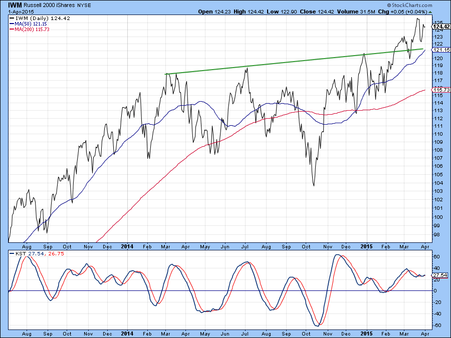
Chart 1
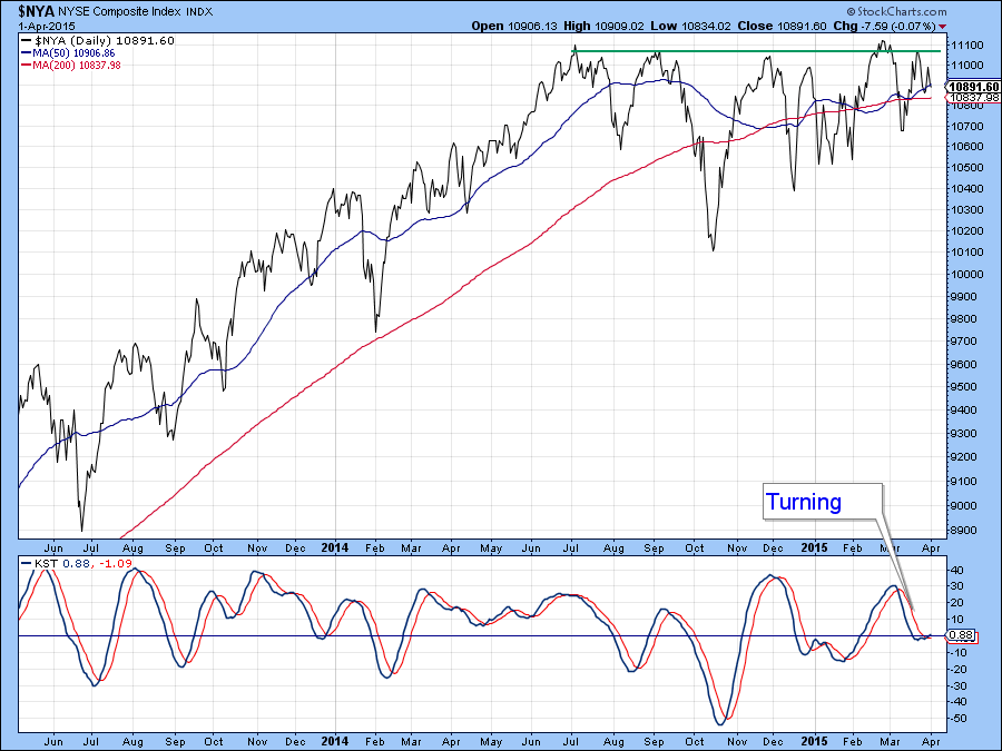
Chart 2
We see another short-term momentum indicator in Chart 3 and it too is in a tentatively bullish mode. This indicator (!VMCOSINYC) monitors the relationship between the 10- and 20-day EMA of the McClellan Volume Oscillator. It goes bullish when the (black) 10-day series crosses above its (red) 20-day EMA counterpart. As you can see, it recently experienced a tentative crossover, fell back slightly but still remains in a positive mode. The reason I am showing this lies in the fact that the NYSE Composite is within striking distance of a solid upside breakout and this revived short-term momentum could give it the power to break out of the trading range. Should that develop we would likely see a serious extension to the bull market.
In this respect it’s important to note that the market is currently in the bullish end of the month seasonal which extends into the third trading day of the new month i.e. next Monday. That means if a breakout is to materialize, now would be the ideal time as it would be backed by positive short-term momentum and bullish seasonals.
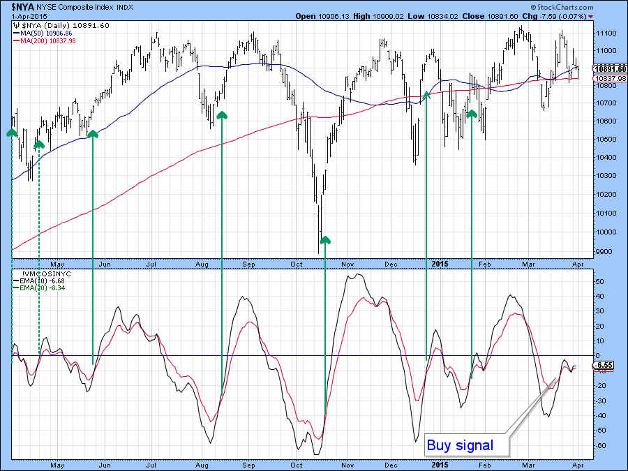
Chart 3
Chart 4 shows the relative action between the NYSE and the S&P. The declining line means that the NYSE has been under-performing the S&P 500 since the summer of last year. Now the RS line is in the process of challenging the solid green down trendline. It will probably succeed because the KST is in a bullish but not overextended mode. That’s another reason for focusing on the NYSE, for if the line is penetrated it will indicate a new trend of superior performance by this more broadly based market average.
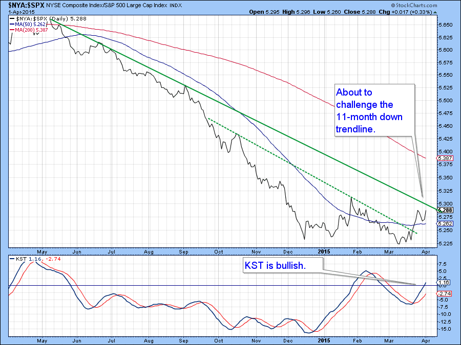
Chart 4
The Transports and the Industrials
Another area I am watching is the relationship between the Dow Jones Transports and Industrials as shown in Chart 5. As you can see, the Transports have been pretty weak recently as the oil price has stopped dropping. Right now the price is resting on a key support trendline and the 200-day MA. A drop below current levels would obviously put the Transports in a bearish mode. For their part the Industrials are still comfortably above their equivalent breakdown point, but nonetheless should be watched closely. I estimate a decisive downside break would occur for the Transports with a daily close below 8,600 and 17,300 for the Industrials. If that happens we would not get a Dow Theory sell signal since that requires a series of declining intermediate peaks and troughs for both series, but it would suggest that further downside lay ahead.
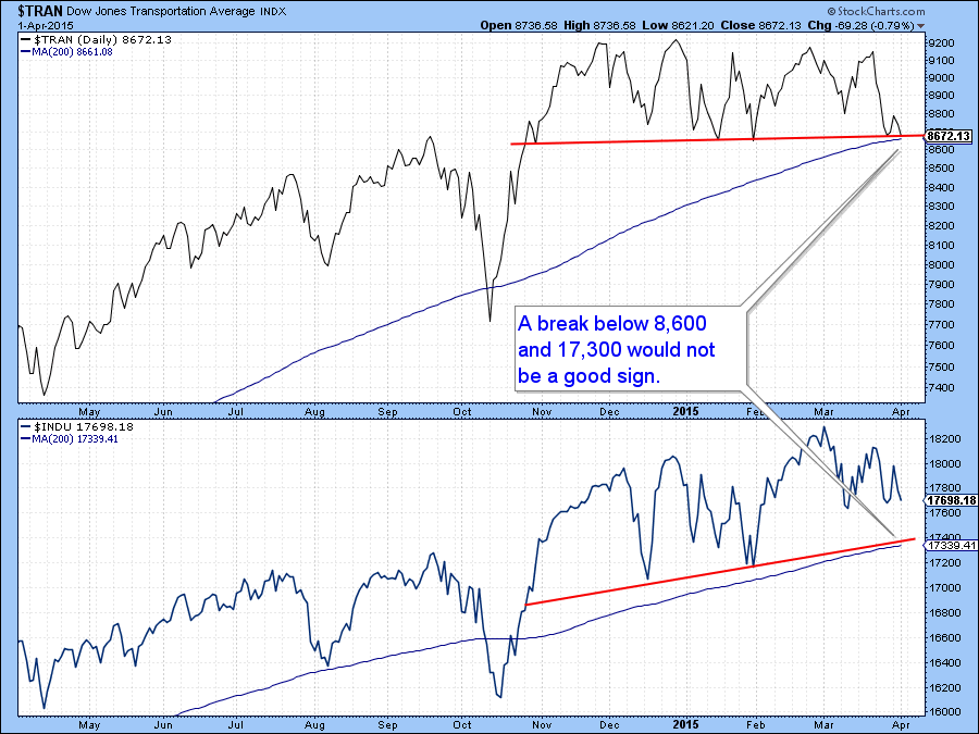
Chart 5
Sectors
Charts 6, 7 and 8 feature the daily KSTs for the major sectors and some ancillary industry groups. They are listed in arough approximation to their chronological sequence, starting with the bullish ones and ending with sectors whose KSTs are in a bearish mode. Note that the KST for the S&P is at a neutral reading and has been quite flat in its recent trajectory. That to me, indicates a very finely balanced technical structure that could easily be pushed in either direction without much force.
The various short-term KSTs are being presented from three points of view. First, what does the balance of evidence between bullish and bearish KSTs suggest for the overall market? Second, where is the leadership coming from? Finally, what should we look for from the point of view of signaling the direction of the next market move?
The answer to the first question is that the bullish charts currently offset the bearish ones. It’s actually worse than that because normally we could point to the early leaders like bonds, utilities and REITS and say they are providing the leadership with their respective KSTs in an early bull phase. However, we can say the same thing for Energy and Gold shares, and they typically lag. So the answer to the second question regarding leadership is, all over the place. Finally, if we are looking for some direction perhaps the best place is Technology as that indicator is close to neutral and would not take much to reverse to the upside. Technology also represents hot money which is often a short-term driving force for the overall market. Conversely, if technology slips from here it could well take other sectors with it, thereby resulting in a wider market correction.
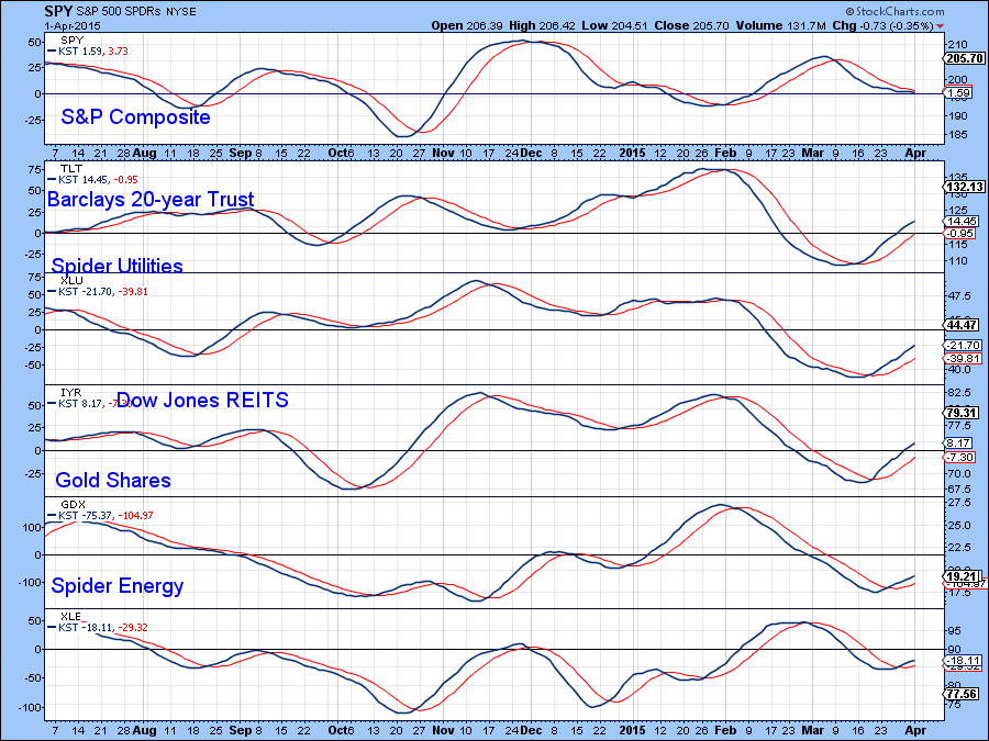
Chart 6
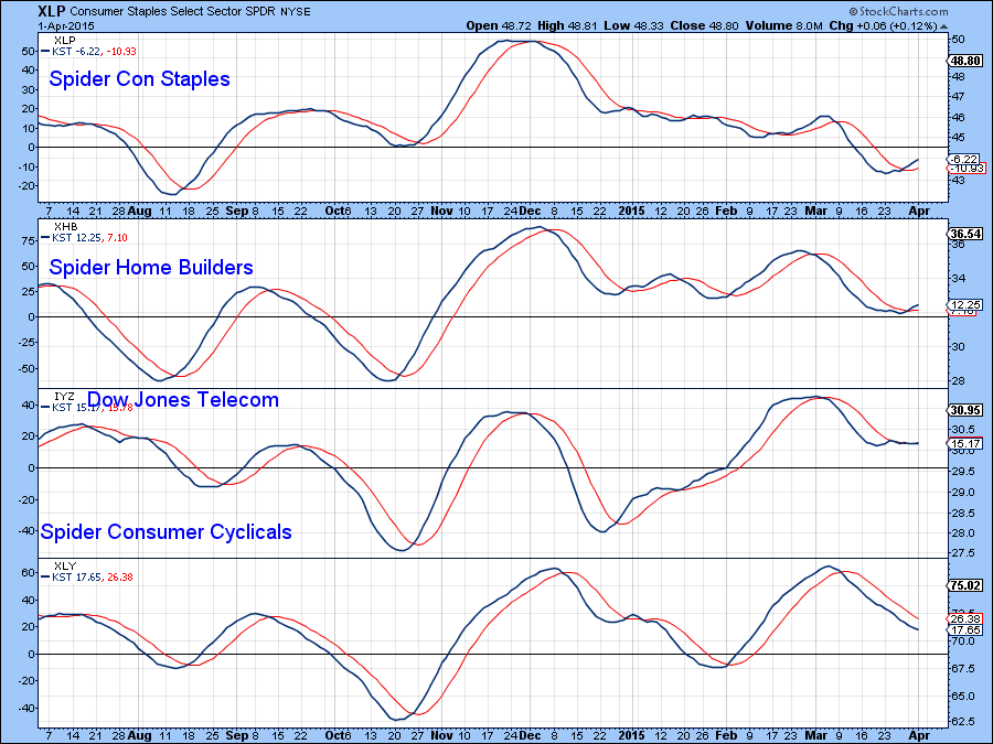
Chart 7
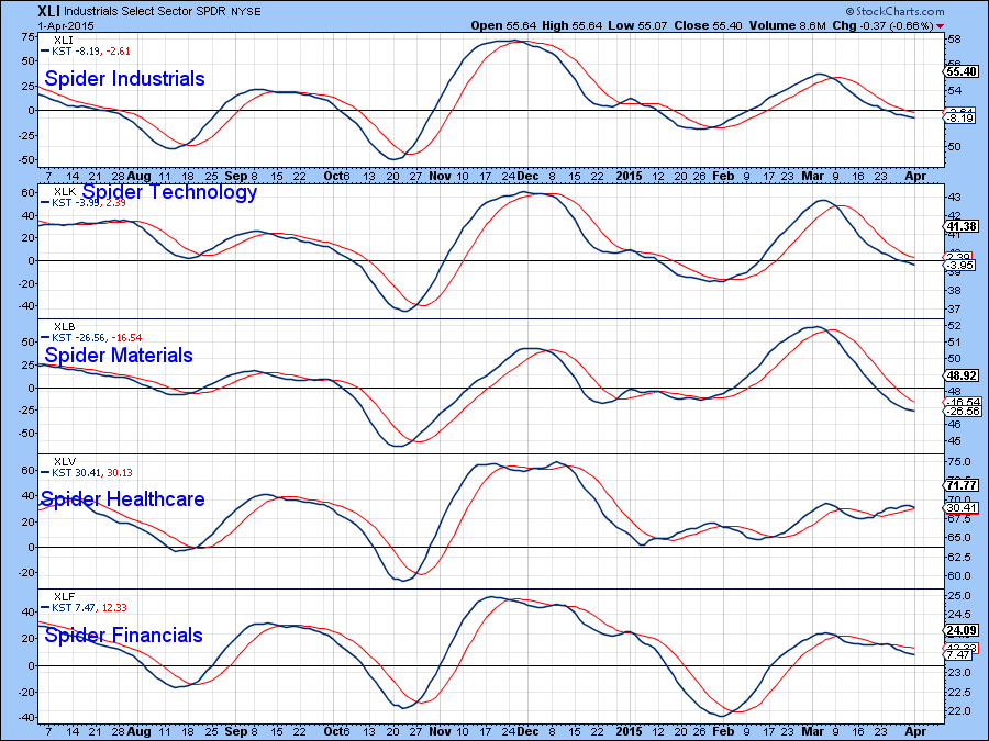
Chart 8
Emerging Markets
The FTSE 25 Chinese ETF, the FXI, broke out from a major base a while back. Note also that the long-term KST is still at a pretty subdued level and the price appears to be in the early stages of a parabolic move.
Chart 10 shows that it has also just broken out from a large consolidation inverse head and shoulders pattern. Its KST is also at a relatively subdued position, which leaves plenty of upside potential.
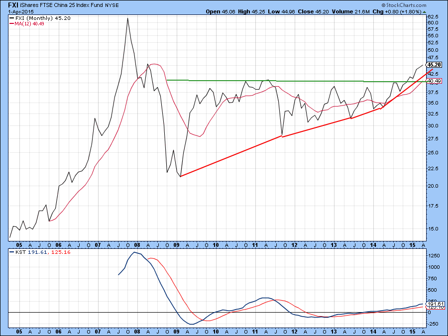
Chart 9
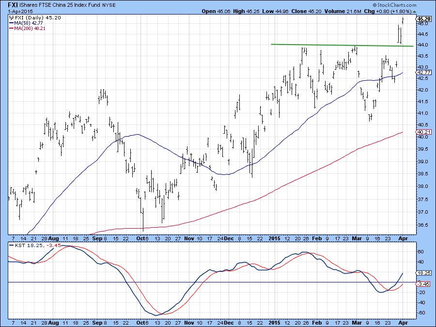
Chart 10
Chart 11 shows that the Emerging Market ETF, the EEM, is also being supported by a positive KST and is right at its breakout point. A positive resolution seems likely.
This view is also supported by Chart 12, where we see my Emerging Market Diffusion indicator (!PRDIFEM). It triggers buy signals (green arrows) when it reverses to the upside from below the -8 level (green dashed horizontal trendline). It is currently in the all-clear mode.
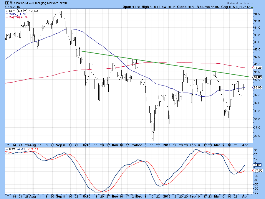
Chart 11
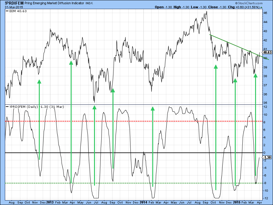
Chart 12
Good luck and good charting,
Martin Pring
The views expressed in this article are those of the author and do not necessarily reflect the position or opinion of Pring Turner Capital Group or its affiliates.


