Investors no Longer Hunting for Yield as Junk Bonds Break Down
- Leading sectors experience false breaks to the upside.
- NYSE A/D Line completes a head and shoulders top.
- Dollar Index may be about to resume its bull market.
US Equities
Last week there appeared to be a sporting chance that the market was headed higher as several short-term indicators were showing signs of being oversold and a couple of sectors had begun to break out on the upside. What a difference a Greek referendum can make! Chart 1 shows several of those sectors did break out, but these moves have been cancelled this week as the Brokers, Financial and Insurance ETFs all moved back into their previous trading ranges. The Brokers and Financials have also violated a key up trend line. Chart 2 indicates that Healthcare and Consumer Cyclicals have also experienced false breakouts. With the strongest sectors failing, there is very little left in the way of upside leadership. Unfortunately, there is plenty on the downside.
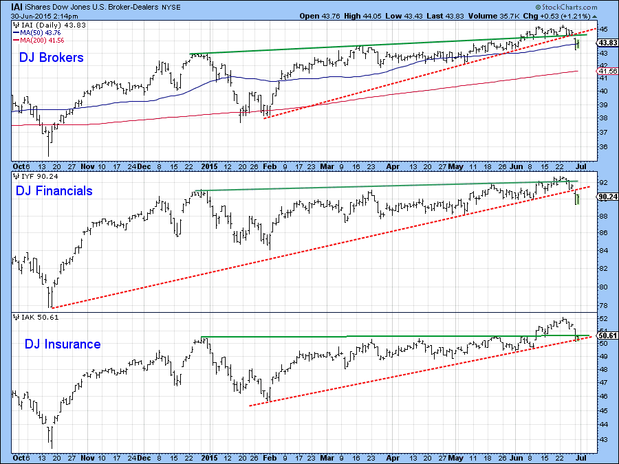
Chart 1
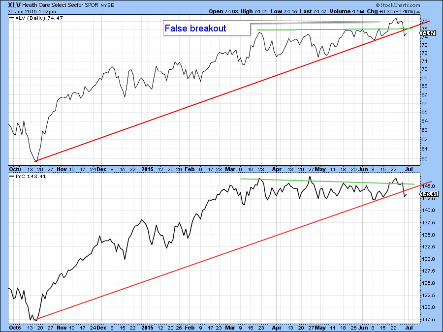
Chart 2
This weakness has also spread to more widely based indexes such as the NYSE Composite ($NYA)(Chart 3), which has now cracked through its 200-day MA and completed a small head and shoulders top in the process. Note that both the NYA and the NYSE A/D Line experienced false breaks to the upside, which have now been confirmed with the head and shoulders breakdowns. False breakouts are often followed by above average price moves. That may well take place in the current situation because there are so many of them.
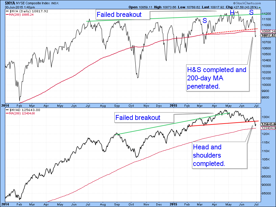
Chart 3
Chart 4, shows the disappointing turn in the McClellan Volume Oscillator(!VMCOSINYC) for the NYSE. Last week it looked to be in the early phase of a rally as both the 10-and 20-day EMA’s were headed higher. Now however, they are both heading south, as Monday saw a new sell signal. That was given when the black 10-day series crossed below its red 20-day counterpart.
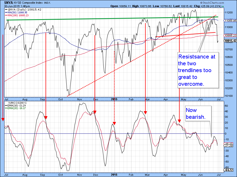
Chart 4
Last week my Dow Diffusion indicator (!PRDIFDOW) turned up and looked as if it was headed higher. Now the indicator has reversed to the downside and the Dow has broken down from a top. It has yet to violate the major up trend line on which it is currently resting, but that seems a likely bet given what is going on elsewhere.
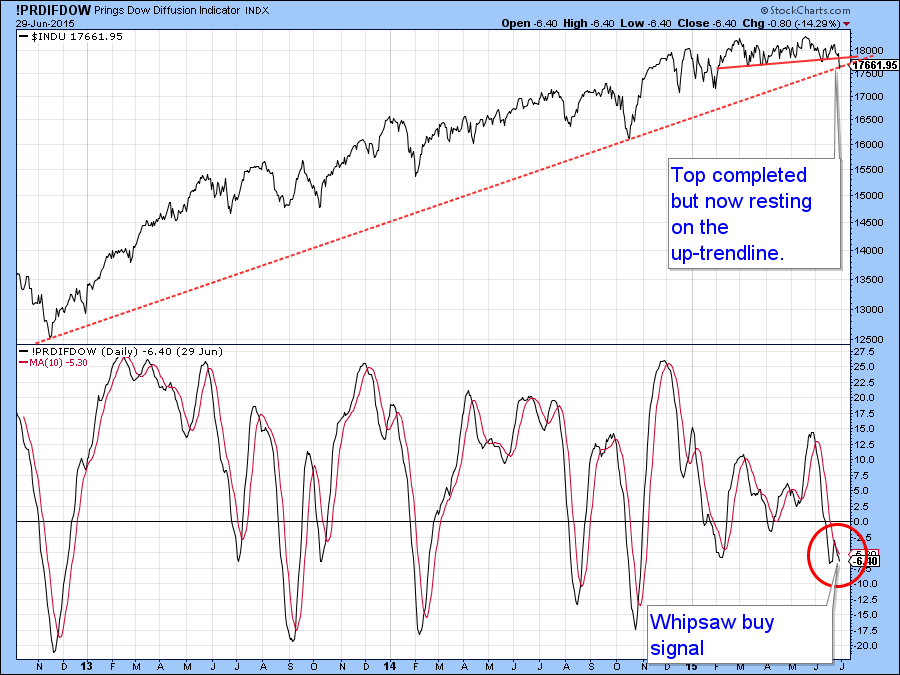
Chart 5
The New York Composite ($NYA) also looks vulnerable from a long term perspective . That’s because its Special K (SPK) in the lower panel of Chart 5 has now decisively broken down from a head and shoulders top. This confirms the (brown) bull market trend line break that has already taken place. Confirmation of the momentum break also comes from the red dashed line dating from early 2012. It should be remembered that these are major signals that suggest an important downside move has only just begun.
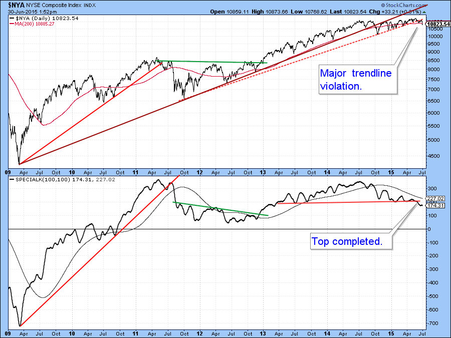
Chart 6
The MSCI World Stock ETF, the ACWI, experienced a double trend line break on Monday thereby confirming what had happened to the SPK earlier. One benchmark that has not yet given way is the 200-day MA. It is currently at $59.12 compared to Monday'sthe closing price of $59.49.
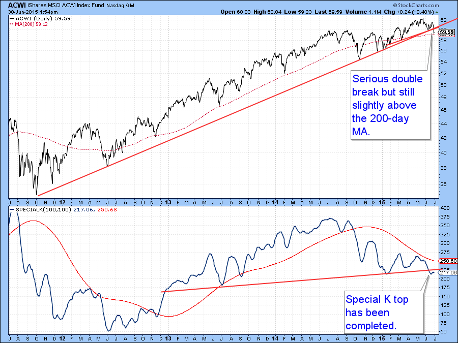
Chart 7
Junk Bonds
The iBoxx High Yield Corporate Bond ETF, the HYG has completed a head and shoulders top. Currently the KST is flat but weakness from the breakdown is likely to push it lower. High yield bonds, being speculative in nature, usually move up and down with the stock market. That means that this week’s action is a definite negative for equities.
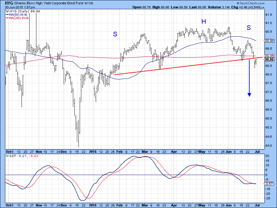
Chart 8
The Wells Fargo Income Advantaged ETF (EAD) is another high yield fund that has completed a head and shoulders top, but this time of the downward sloping variety. Note that all three KSTs are in one way or another in the bearish camp.
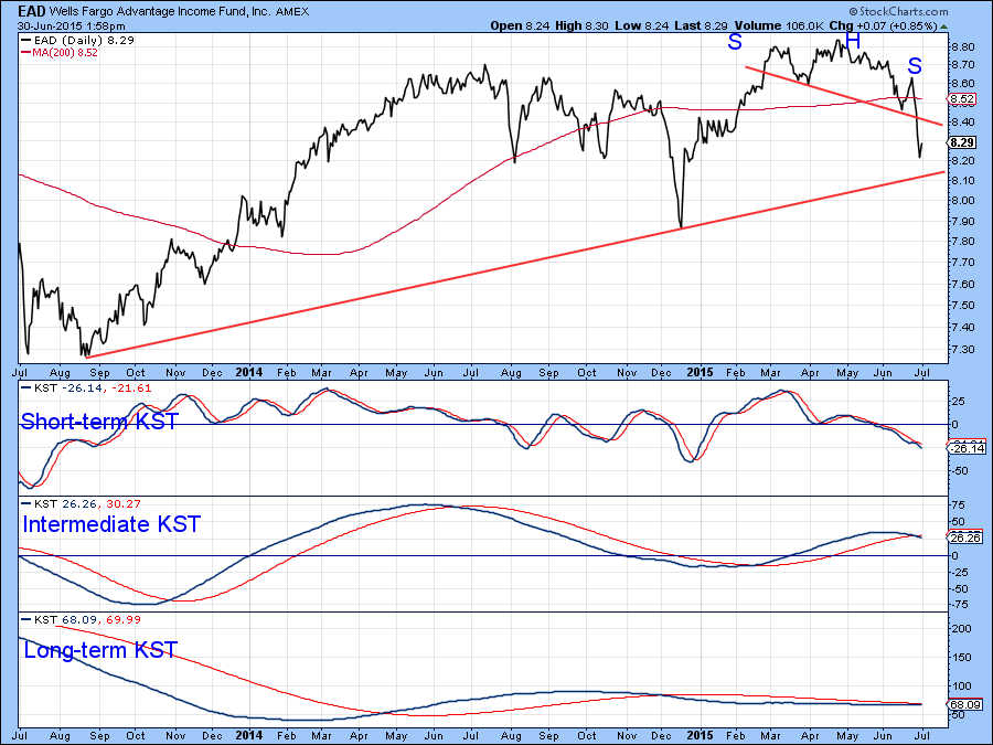
Chart 9
Government Bonds
Junk bonds may be selling off, but it looks like the correction in governments is over, at least for the time being. In this respect Chart 10 shows that the Barclays 20-year Trust, the TLT has confirmed positive KST action by breaking above the green down trend line. Stronger confirmation would come in the event that the price is able to rally above its previous minor high at $119. In that event it would have completed a small bullish double bottom.
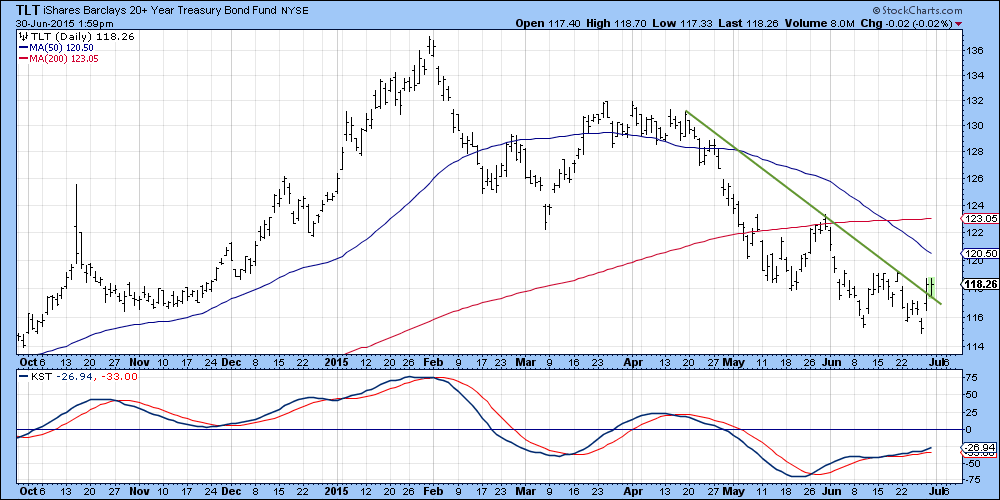
Chart 10
The Dollar
The Dollar Index may be getting ready to rally again. For instance Chart 11 shows that my currency diffusion indicator, that monitors a basket of cross currency relationships in a bullish trend, has started to hook up again. Normally this series reverses in a pretty deliberate fashion but has recently been experiencing some whipsaw action, not dissimilar from its late 2012 performance.
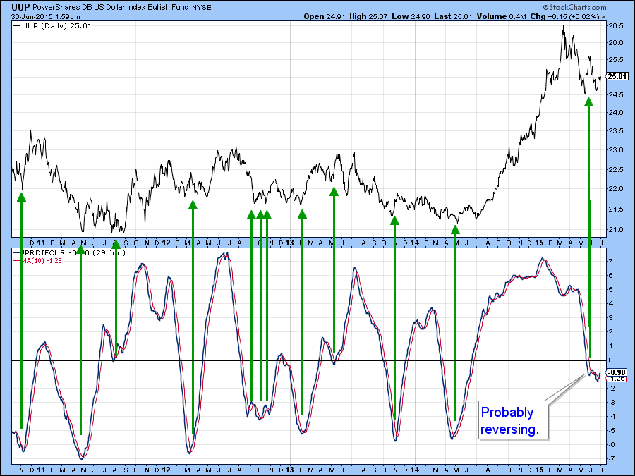
Chart 11
The KST, in Chart 12, has just tentatively crossed above its MA and that smells of a rally to me. In this instance there is some key resistance at the green dashed trend line and the 50-day MA. However, the signal I am looking for to signal the end of the correction is an upside penetration of the solid green down trend line just under $25.25.
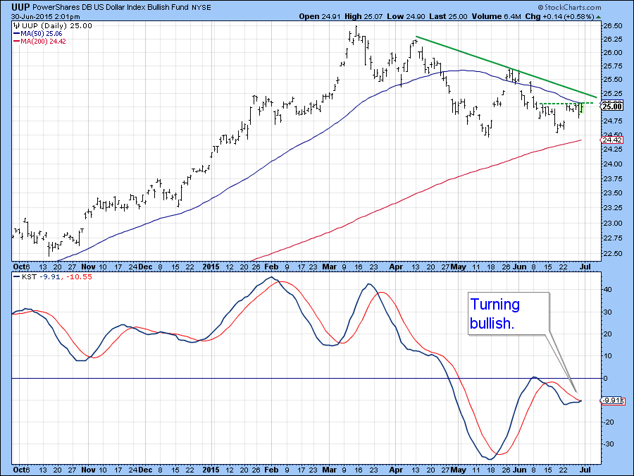
Chart 12
Chart 13 presents the Dollar ETF (UUP) together with some key relationships that are influenced by dollar movements. All are currently above their extended trend lines as flagged with the dashed red format. If the dollar itself is to move higher I would expect to see these series start to support dollar strength with breakouts of their own. By the same token, if this is a top, on which I place lower odds, then we would expect to see these dashed red lines violated on the down side. You can always click on this chart in future to follow the action.
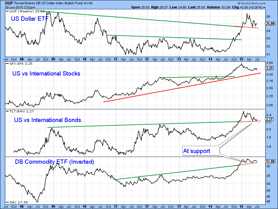
Chart 13
Good luck and good charting,
Martin J. Pring
The views expressed in this article are those of the author and do not necessarily reflect the position or opinion of Pring Turner Capital Group or its affiliates.


