Longer-term Equity Charts Offering An Ominous Warning
- Emerging markets are on the brink.
- The European IEV tentatively breaks its bull market trend line.
- Copper being driven down by weakness in China.
Equities
“Price action on Tuesday was quite remarkable since it seemed at the opening that the equity market was about to fall off a cliff but by the end of the session many issues had turned potential disaster into small gains. One day’s action does not change a trend of course, so the deterioration in the longer-term indicators that I have been talking about recently still stands”. That’s what I wrote on Tuesday night because that intraday reversal had resulted in many markets and averages experiencing bullish exhaustion days. Given today’s weak closing action I am glad I postponed publishing until tonight’s close because many of these bullish patterns have either been cancelled or look as if they are about to be.
In this unstable environment, where prices can fluctuate significantly on an intraday basis on the whim of a Greek finance minister, glitches on the NYSE to changes in margin levels in China etc. It is probably wiser to turn to the perspective of the longer-term indicators.
In that respect, Chart 1 shows the monthly action of the NYSE Composite ($NYA). Note that the two previous bull market peaks consisted of some ranging action (more limited in the 2007 experience) prior to the start of the bear market. Each peak was preceded by a bearish KST indicator and was confirmed, not only by a trend line violation but a negative 12-month MA crossover. We see exactly the same configuration today with the 12-month MA cross and trend line violation acting as conformation to the bearish KST. A break below the October low and horizontal red trend line at around 10,500 would place the issue beyond any reasonable doubt. For this please see Chart 2.
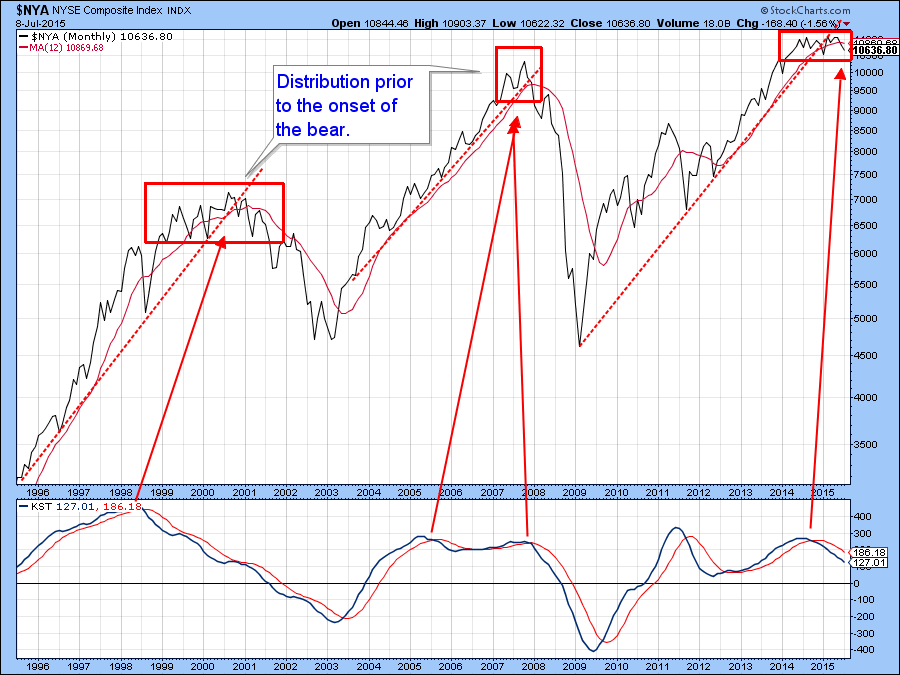
Chart 1
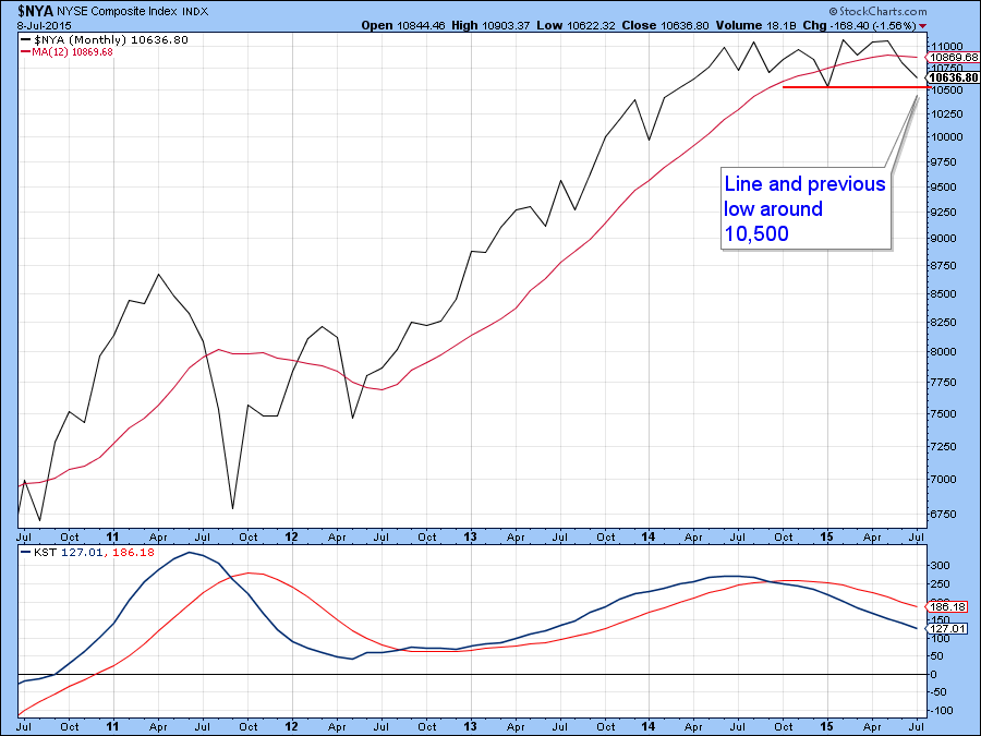
Chart 2
Chart 3 features the MSCI World Stock ETF, the ACWI together with its Special K. The last time we looked, it was possible to observe a marginal break of that head and shoulders neckline. Now the break is more decisive and should definitely be taken more seriously. Note that it has now been confirmed by a trend line break in the price as well as a negative 200-day MA crossover.
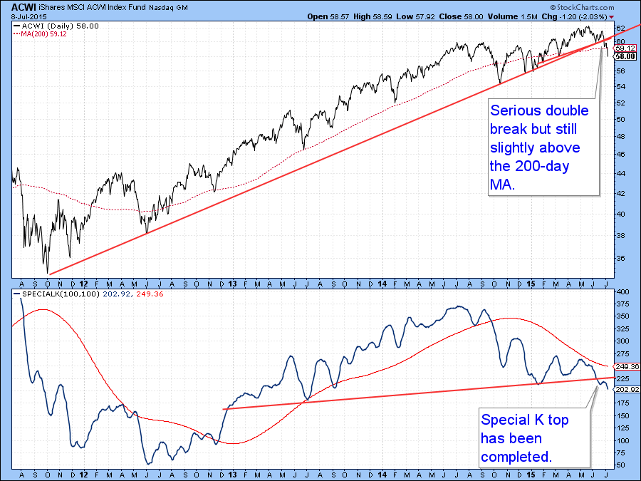
Chart 3
Chart 4 plots the weekly progress of the Dow Industrials ETF (DIA). Here you can see that the KST experienced its momentum peak way back in 2009 and has gradually been topping out at a lower and lower level. This is the largest and longest negative divergence I can recall ever seeing. Now the uptrend in momentum has been ruptured by the red trend line and this has been confirmed by the Dow itself. Quite often linear uptrends such as this are followed by unexpected sharp declines. We never know for sure but this combination of negative long-term indicators suggests that hard times for equity investors are upon us. One caveat; this is a weekly chart, so if the Index experiences a sharp rally in the final days of the week the break may not take place. However, as it stands right now the trend line has been unofficially violated.
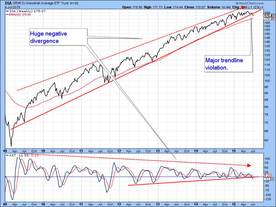
Chart 4
International ETF’s
This weakness is not just confined to the US of course. Indeed the US has been one of the global pillars of strength. Take the Emerging market sector for instance. It’s currently resting on a key horizontal trend line. Bearish long-term momentum in the second panel combined with a new low in relative action against the S&P suggests that the price will fall below that horizontal cliff.
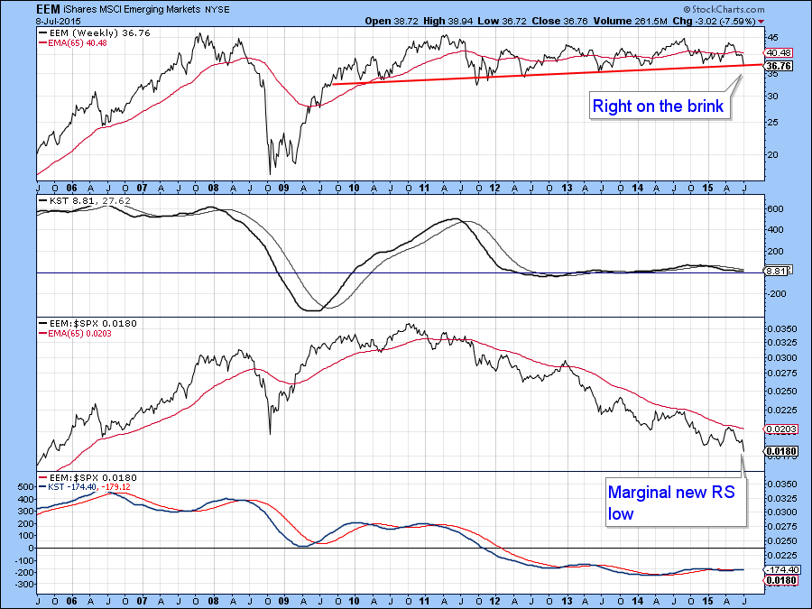
Chart 5
This week has seen the S&P Euro 350 ETF, the IEV, break below its bull market trend line. This is a weekly chart, so we cannot call the break until Friday’s NY close but as things stand right now the picture looks somewhat bearish.
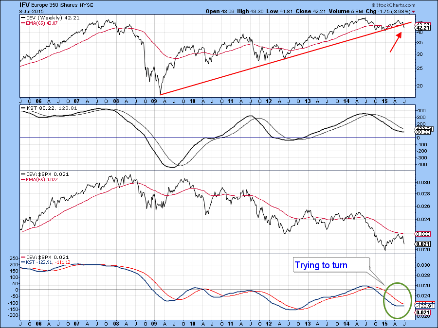
Chart 6
Chart 7 shows the Chinese ETF, the FXI. This one has experienced the biggest turnaround of them all and is now below both its breakout and the 2014-15 trend lines. Relative action has also violated an important up trend line. Momentum is still positive but that’s not surprising since it is supposed to signal long-term changes in trend that develop over an extended period, not the kind of 25% decline that has taken place over literally the last 30-days.
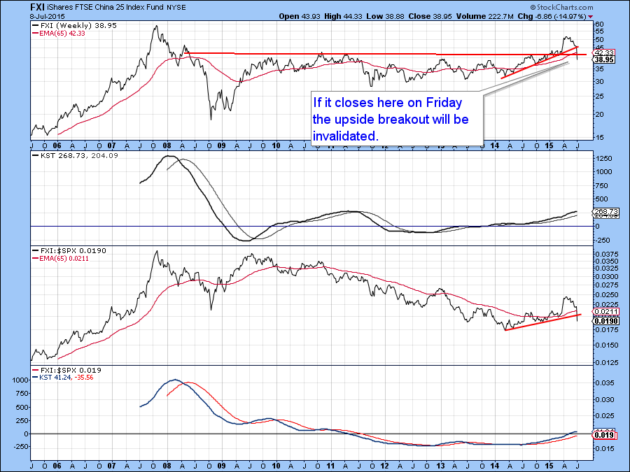
Chart 7
Commodities
Commodity prices have fallen to very important support. Chart 8, for instance shows the DB Commodity ETN (DBC). The price has been consolidating earlier losses in the form of a trading range. It has now fallen to the lower end of that range. Unfortunately the KST has started to edge down again, which suggests that the price of this ETF will drop to a new low. In the meantime it will be nail biting time in the commodity pits.
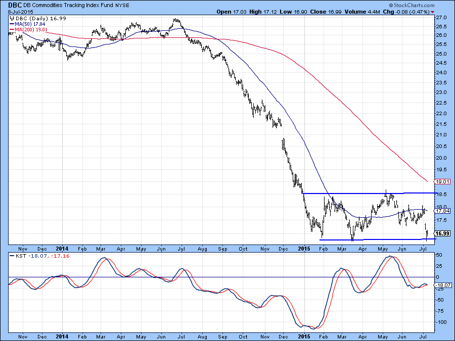
Chart 8
Copper is a commodity that has been falling precipitously in the last few weeks. On Tuesday it looked as if sellers were exhausted and the price action formed a bullish hammer that found support at the previous low. On Wednesday it took out that “hammer” low and now stands right at its January low. The next couple of sessions or so will prove critical. That’s because a break to new lows will invalidate the hammer thereby indicating a very weak technical picture. On the other hand, a bounce, from what is a very oversold short-term condition, would likely result in a retracement rally of some sort.
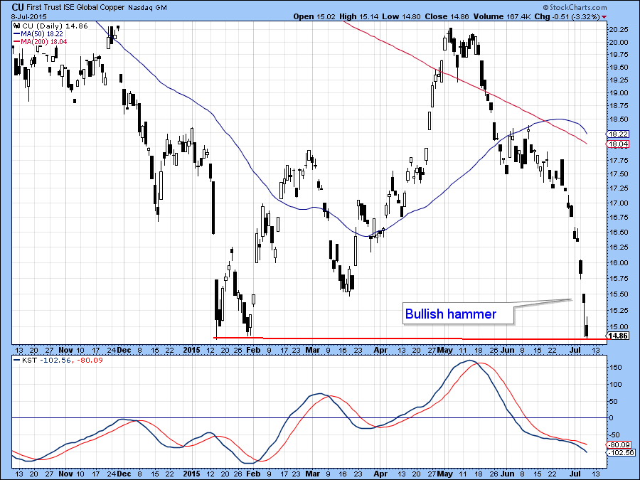
Chart 9
Silver is the commodity I am really interested in because it traced out a bullish hammer pattern on Tuesday but has so far held close to that closing price. Also, the volume on the hammer day was huge, indicating a substantial amount of liquidation took place. The problem is that the price fell down from a large head and shoulders consolidation formation, and that’s a big obstacle to overcome. If it now breaks below the hammer low, that will confirm the head and shoulders and suggest substantially lower prices. On the other hand, if it can quickly regain some composure and decisively rally above the red neckline, say to $15, that would be quite a bullish achievement. Remember silver and gold are closely tied and an invalidation of the head and shoulders would be a bullish factor for the yellow metal. In the meantime the break is intact and so is my bearish stance on the gray metal.
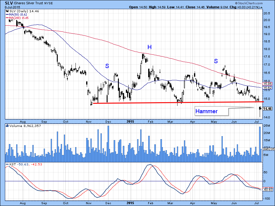
Chart 10
Good luck and good charting,
Martin J. Pring
The views expressed in this article are those of the author and do not necessarily reflect the position or opinion of Pring Turner Capital Group or its affiliates.


