Recent Quiet Market Action Continues To Mask Deteriorating Breadth
- Special K continues to point to lower stock prices.
- Dollar looks set to break out on the upside.
- Euro and yen denominated commodities at new lows.
The market continues to move sideways, but under the surface things continue to deteriorate. For example, Chart 1 features a cumulative line derived from daily net new high data. The line rises when more issues register new highs than new lows and declines when the lows dominate. Useful market signals are triggered when this series crosses above or below its 50-day MA. The indicator went bearish for the first time in many months during July and has been declining ever since. Note that the KST for the cumulative line has also started to roll over again and is now bearish. The S&P itself remains above the red horizontal line at 2050, which now becomes a critical level from a short-term point of view.
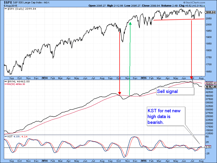
Chart 1
Chart 2 shows the actual raw data, where it is apparent that the number of net new highs has been shrinking since the middle of last year. Also, in late July, the number of stocks touching net new lows was below the number in late June. The S&P 500 made a higher low though. This discrepancy has been flagged by the two dashed red arrows.
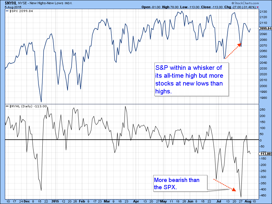
Chart 2
Further loss of upside participation can be seen from Chart 3, which features two important indicators. The first is the number of sectors that are on a short-term buy signal and the second is the Bullish Percent Indicator. These indicators continue to work their way lower as the market moves sideways. Their deterioration reflects the fact that fewer and fewer stocks are in uptrends as the market becomes progressively selective. You may think these series look oversold, and they are based on recent action. However, at around a 50% level these are really neutral readings, being half way between the extremes of zero and 100.
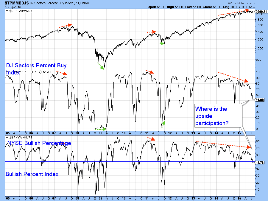
Chart 3
The NYSE A/D Line also looks weak. In this respect the two dashed red arrows show that the NYSE Composite did not register a new low last week but the A/D Line and the Upside/downside volume lines both did. The key level of support for this average lies at the red solid horizontal line at 10,600.
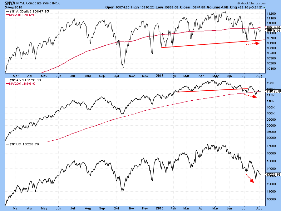
Chart 4
These breadth divergences could easily be cleared up with a good rally but Chart 5 shows that the longer-term picture continues to deteriorate as the Special K for the NYSE Composite has completed a top and reversed again to the downside. This action has also been confirmed by the Index itself, which has now violated two important up trendlines.
The market has just experienced the bullish end of the month effect, which terminated Wednesday and begins on a seasonally weak period for the next three months. It’s certainly going to be interesting to see if all of these negative divergences and narrowing participation will turn into something more significant on the downside. In that respect the 2050 and 10,600 levels on the S&P and NYSE Composite respectively will be worth monitoring. If support at those levels gives way it could open the flood gates to lower prices.
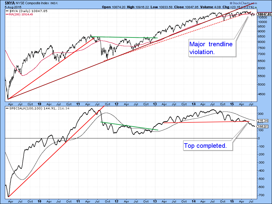
Chart 5
The Dollar Index
Chart 6 shows that the Dollar Index is still struggling to rally above resistance in the 99 area. The KST has gone absolutely flat and is not therefore supporting an upside breakout at this point. However, this horizontal trajectory tells us that it is in a very fine state of technical balance. Obviously a move above the green resistance trendline would do the bullish trick and that could happen with a positive employment report on Friday (not predicting, just saying!). Nevertheless, there are several grounds for suspecting that the dollar will move higher. First, it is in a confirmed primary bull market and we need to give the benefit of the doubt to that trend. Second, my currency diffusion indicator in Chart 7 is still in a rising mode and is therefore signaling the all-clear.
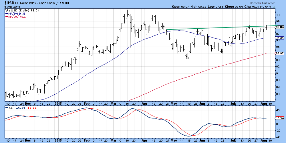
Chart 6
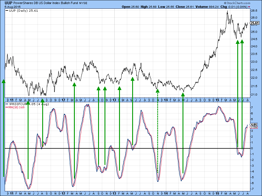
Chart 7
Finally, Chart 8 compares the Dollar Index to several relationships that typically move in the same direction of the currency. If the dollar was not going to break to the upside I would expect to see at least one of these indicators beginning to break below their red trendlines. As it happens the exact opposite appears to be taking place.That’s because the inverted DB Commodity ETF in the bottom window has touched a new (inverted) high and the US versus international bond ratio has violated a small down trendline.
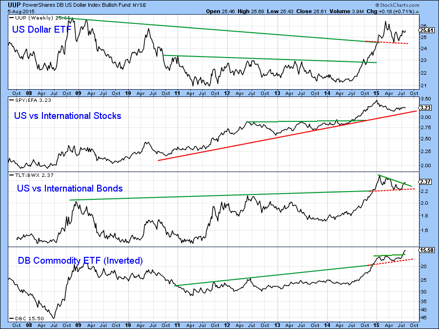
Chart 8
German and Japanese reflation; how’s that working out for ya?
The German and Japanese central banks have been on a tear to inject liquidity into their economies and promote inflation. Charts 9 and 10 indicate that they have been unsuccessful so far, as commodities denominated in euro and yen have both sunk to new bear market lows. Both KSTs are in a declining mode which argues for even lower prices.
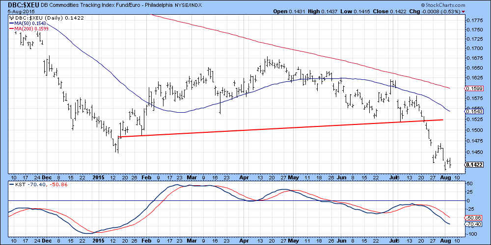
Chart 9
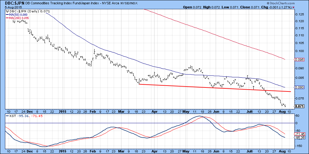
Chart 10
Gold has a strong tendency to discount inflation and Charts 11 and 12 feature the price of the yellow metal denominated in yen and euro. The yen series completed a head and shoulders top a few weeks ago and has and violated its bull market trendline. An oversold KST argues for a rally, but given the negative longer-term technical picture, this is likely to be more of the retracement type than the start of a new primary trend.
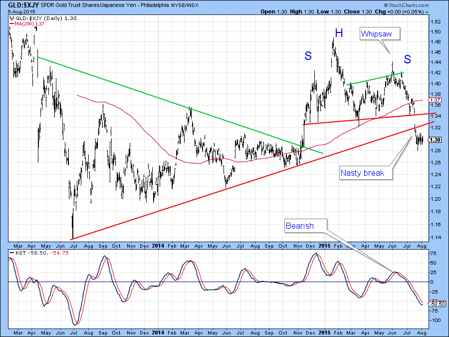
Chart 11
Euro denominated gold has also completed a top but is now resting on important support in the area of the two converging trendlines. The KST is getting a bit oversold but is still declining. The price is clearly facing an important technical test because a break below the two trendlines would indicate a resumption of the bear market.
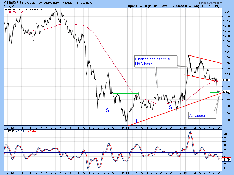
Chart 11
Good luck and good charting,
Martin J. Pring
The views expressed in this article are those of the author and do not necessarily reflect the position or opinion of Pring Turner Capital Group or its affiliates.


