Whipsaw Decline Or The Start Of The Right Shoulder?
- Monday’s action suggests a short-term rally is in the cards.
- Action by the S&P 48-month ROC argues for a bear market.
Catching a falling knife with your bear hands is never fun. Sorry, Freudian slip. Should be bare hands! I am not going to try to call a bottom, merely lay out a possible scenario. Sentiment on a short-term basis, has clearly moved to an extreme. Try watching TV or listening to radio and getting away from market news. It’s not possible right now. The whole world knows that the “Chinese slowdown is spooking US investors,” or that traders are worried because the Fed is about to raise rates. Well guess what? The market, at least at the short end, has already done most of the heavy lifting as the yield on say, 3-month commercial paper, was at a 3-year high last week. Perhaps it’s time to look north again? This does not change my view that there is a very high probability that we are in a bear market, but I think there are some grounds for expecting some form of a rally to develop.
First, many of the averages showed signs of what I call an “exhaustion” day on Monday. These one day patterns develop when, after a sharp decline, the price experiences a very wide trading range that opens sharply lower but closes above the opening. In the process a gap is left between that and the previous day’s trading session. High volume is another exhaustion characteristic. These one day price patterns develop when bearish emotions are running extremely high. There are two other points. First, like any other technical phenomenon, they can and do fail. Second, their positive effect on the market is expected to last between five to ten days but, because they often appear at major bottoms, it is not unusual for prices to rise for much longer.
Chart 1 shows an exhaustion day for the Dow ($INDU). It’s far from a perfect specimen because the gap to the left is relatively small and some other averages like the NYSE Composite ended lower on the day. However, it does offer the idea that sellers come into the day well in control. However, by the end of the session the ability of the price to close above its opening levels indicates that buyers have gained the upper hand. It may not feel like that at the time but the fact that prices close above the panic opening as they did on Monday, is a definite plus. Another positive characteristic lies in the fact that volume for Monday was exceptionally heavy.
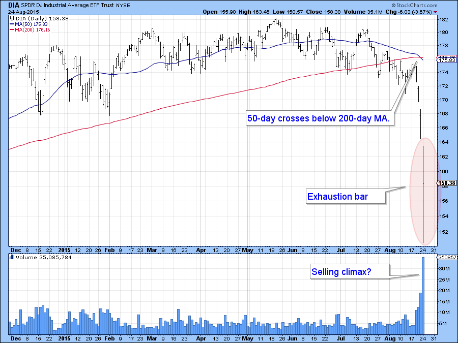
Chart 1
Chart 2 shows the hourly action for the Dow ETF, the DIA. Here again you can see how the opening hour (it’s really half an hour between 9-30 and 10 am) formed an exhaustion bar of its own. The overall action suggests that the price may be in the process of tracing out a double bottom, but that would require a break that can hold above the intraday high and violate the green down trendline. All of this is pure speculation at this point, but the rising but still oversold nature of the two oscillators suggests that this idea might have some merit.
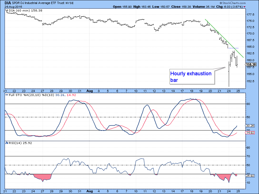
Chart 2
The very high reading in the $VIX in Chart 3, suggests that a bottom may be at hand because it is now close to the levels reached during the 2010 and 2011 declines. As long as this indicator continues to rise I interpret its action as bearish. It is now at the kind of level that requires even larger doses of declining days to keep going on the upside. Enough may be enough on this one.
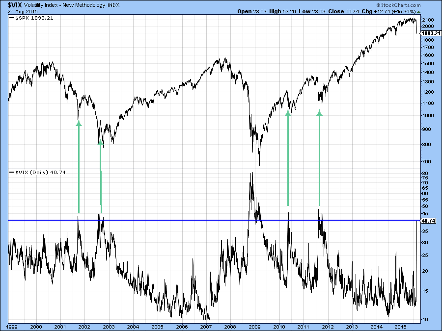
Chart 3
If the recent sell-off proves to be a whipsaw then I would expect prices to make significant new highs and quickly. Looking at Chart 4, that sharp decisive breakdown from the top flagged by the dashed line just does not have the feeling of a false move to the downside.
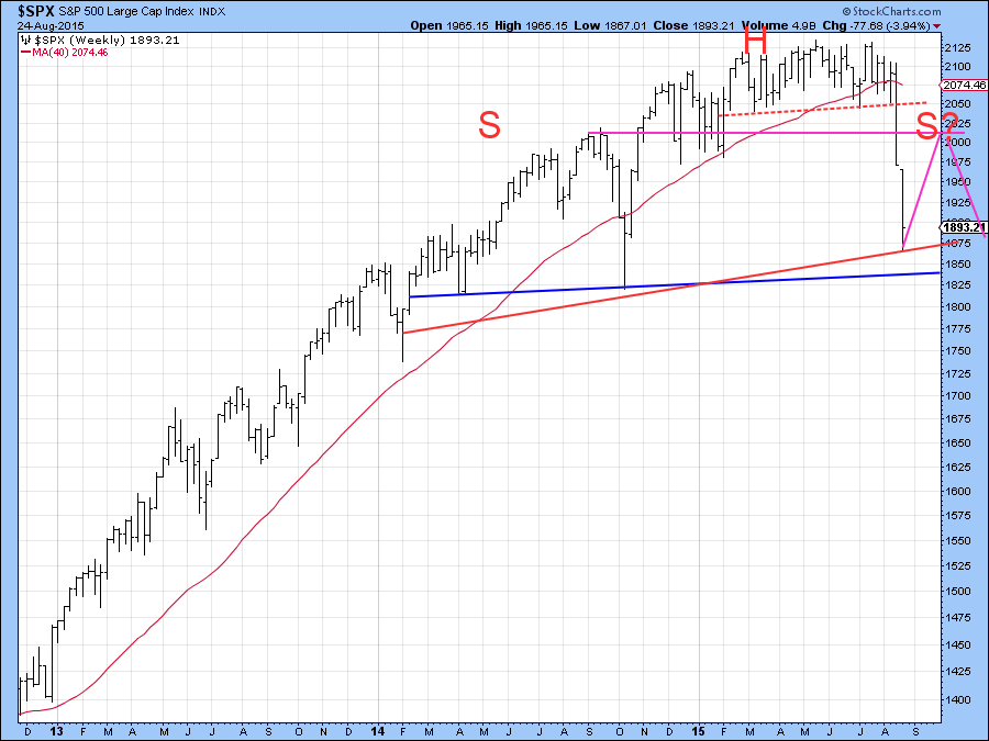
Chart 4
A more likely scenario is that the S&P 500 ($SPX) is forming a large head and shoulders top. Why do I feel this way? Well I have just started writing my monthly Intermarket Review where the US stock section contains several reliable long–term indicators all of which have gone bearish. We have to be a bit careful there because to actually go bearish the S&P would have to end the month not far from Friday’s close. Chart 5 sets the background for the kind of indicator I am talking about. That is a 48-month ROC of the S&P, or more precisely its (red) 12-month MA. The arrows show that when the MA peaks from a level in excess of the horizontal red line it confirms that some kind of equity decline is underway. Sometimes the MA does not even have to rise to the line in order to create havoc. Look at the 2007 experience as an example. Only one signal failed and that was in 2013, as flagged by the dashed arrow. It seems unlikely to me that we will see two consecutive false negatives.
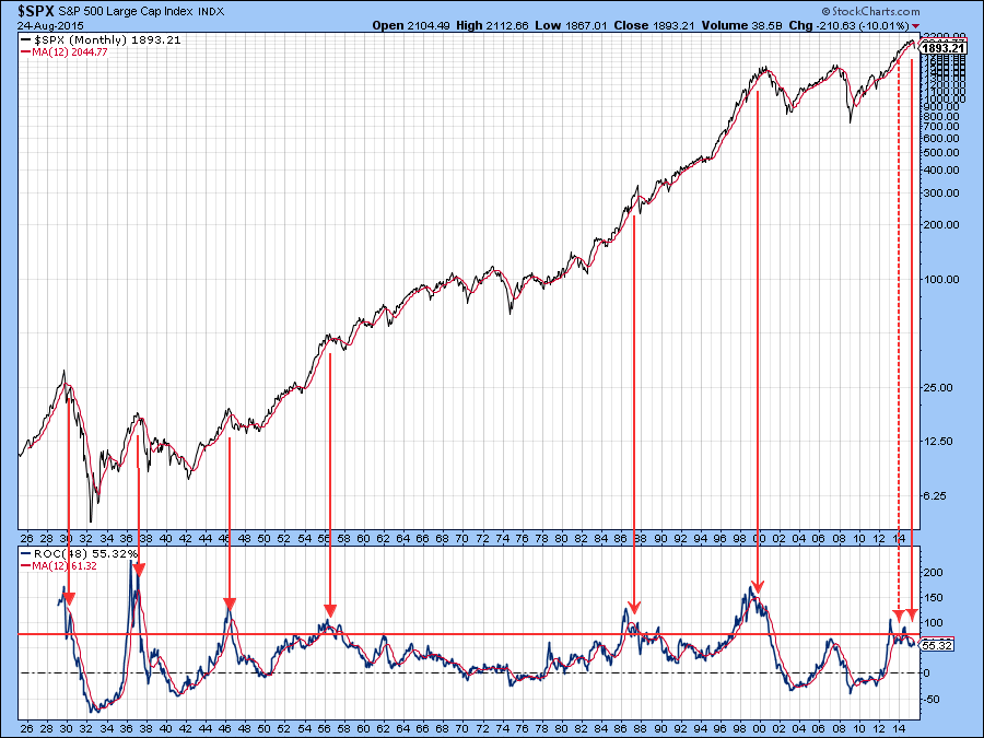
Chart 5
Working on the (unproved) assumption that Monday was the low for the recent decline, where might the ensuing rally end up? In many instances of initial bear market rallies, i.e. our possible right shoulder, prices retrace 50% of the initial lost ground. This developed after the 1929 crash between October of 1929 and March 1930. It also happened in the US after the October 2007 peak and in Shanghai during a similar period. There are certainly no guarantees, as the recent sub 50% retracement rally in Shanghai testifies. However, it is a starting point, and we find quite a bit of resistance in the S&P500 ($SPX) at 2000. Such an advance would also mean that this average would remain below its 12-month MA at around 2050.
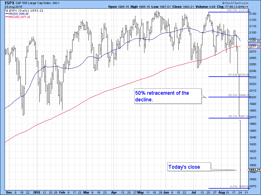
Chart 6
Would I bet the mortgage on such a scenario? Certainly not! Neither would I try and play it, because everything right now is so fluid. I am just going to use it as a working scenario that may or may not transpire. If the rally does develop under weakening breadth and falling volume those will be clues as to its spurious nature. In the meantime I am going to watch and keep my powder dry. Prices do strange things in bear markets!
Good luck and good charting,
Martin J. Pring
The views expressed in this article are those of the author and do not necessarily reflect the position or opinion of Pring Turner Capital Group or its affiliates.


