Bond Market Quality Spreads Are Signaling More Trouble Ahead
- Test of the August 24 intraday lows is at hand
- Junk bonds complete 3-year top
- Credit spread may be leading the Dollar Index higher
- The yields on short-term treasury maturities may be peaking
Testing the lows
Normally I like to use the KST to determine when momentum has reversed direction. It is clear from Chart 1 that the recent market cycles have been too brief for the KST to pick these turning points with any degree of accuracy. That’s not to say that the KST has lost its ability to call a reversal in a timely fashion, merely that recent market activity has been far more sensitive to gyrations than is normally the case.
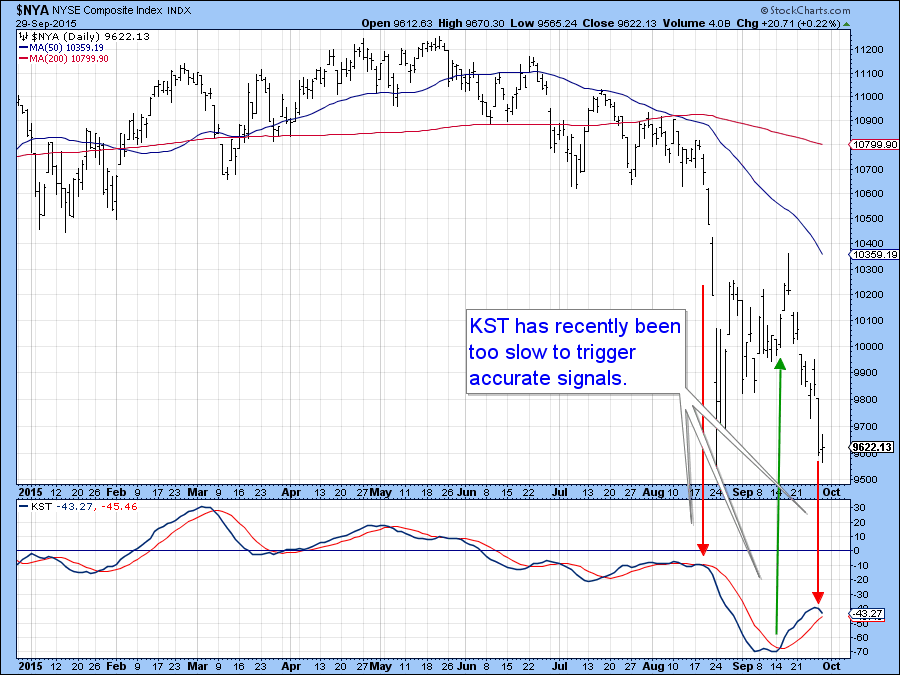
Chart 1
In this respect, Chart 2 features the PPO for the SPY ETF set with a more sensitive parameter (8/16) than the 12/26 default. As you can see, it is far from perfect but has definitely been more reflective of recent action than the slower moving KST. I bring it up because there is a possibility that the test of the August 24 intraday low that I have been looking for may be a successful one. That’s not a prediction, but since prices are close to that point the PPO, if it reverses, might give us a timely signal. After all, we are into day one of the end of the month bullish seasonal which is in effect until Monday, October 5.
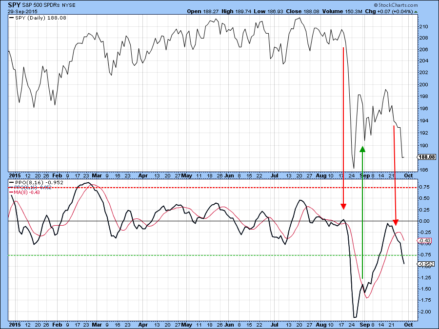
Chart 2
Chart 3 shows another sensitive momentum series, this time for the NASDAQ Composite ($COMPQ). The indicator compares a 10-day EMA (black) to a 20-day EMA (red) for the McClellan Volume Oscillator. Short-term buy and sell signals are triggered when the 10-day series crosses above or below its 20-day counterpart. As you can see, the indicator has been timely over the last couple of months. Its latest sell signal was also reasonably close to the mark. Both MA’s are currently registering neutral readings, but when it becomes oversold and starts to reverse to the upside a rally would be signaled. If the price touched a new closing low and the indicator remained above its August low, so much the better because that would represent a positive divergence.
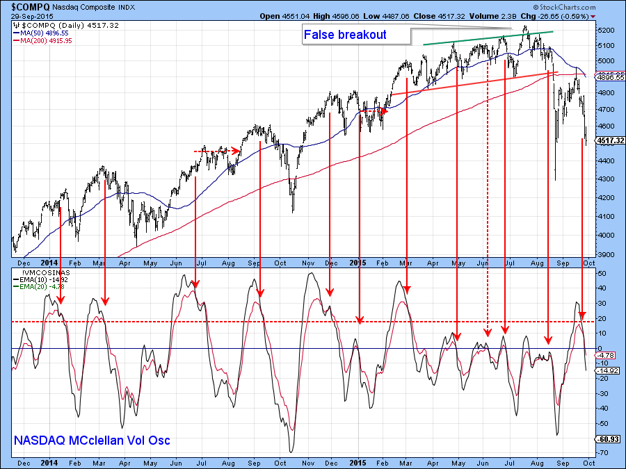
Chart 3
Chart 4 offers a longer perspective where you can see that the PPO indicator from Chart 2 has successfully called many turns in the last five years or so. The qualification for a buy signal is that the indicator must reverse from a position below the oversold green dashed horizontal line. At Tuesday's close it had reached the buying zone but was still in a free-fall to fall. When it finally reverses there is a high probability that a rally of some kind will be generated. Even so, it’s important to remember that the longer-term indicators are signaling a bear market and rallies in bear markets are usually sub-par and extremely deceptive.
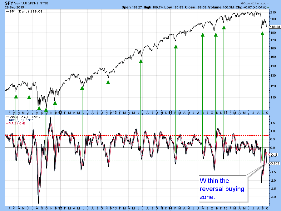
Chart 4
Credit spreads are warning of more trouble ahead
There are two reasons why I can’t get very excited about this market, even if we do get a rally. First, we are entering the crisis-prone month of October. That happens every year, of course, but what makes this one special is that the long-term indicators are signaling a bear market. Arguably far more important is that bond market credit spreads are hinting at some underlying financial problems. Consider Chart 5, which compares the S&P to the ratio between the Barclays 7-10-year Trust, the IEF to the iBoxx High Yield ETF, the HYG. A rising ratio indicates a preference by bond investors for higher yield higher risk assets and is a favorable factor for equities. On the other hand, a declining relationship indicates a rush to quality as the higher yields are not considered to be worth the extra risk. In the last week, this ratio has dropped decisively below the major support trendline. That suggests that this bond market spread will continue to widen. Since the October crisis-prone month is upon us you can see why a break in this spread could result in serious damage to equities, not to mention Junk bonds themselves.
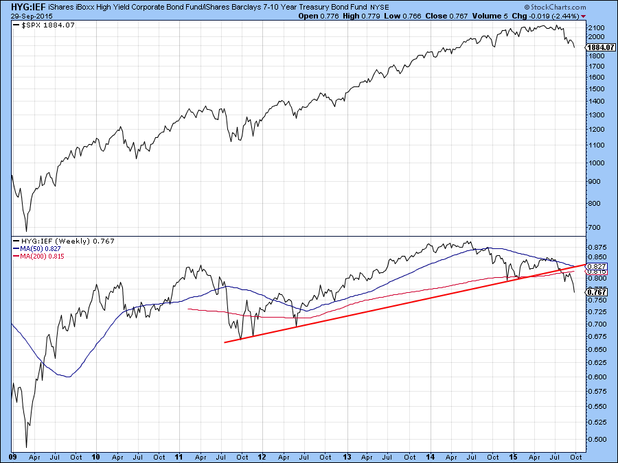
Chart 5
In that respect, Chart 6 shows that the HYG and its colleague the Barclays High Yield ETF (JNK) have both completed 3-year tops. The bear market for junk bonds has only just begun it seems!
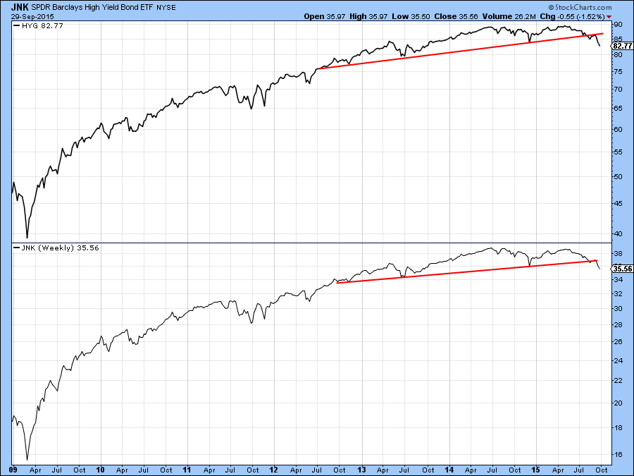
Chart 6
The Dollar Index and junk bonds
Many observers are focused on the relationship between the US and non-US bond yields and the game of forecasting when the Fed will trigger a so-called “lift-off” by way of forecasting moves in the dollar. I am using the bond spread as shown in Chart 7 that demonstrates price movements in the Dollar Index may be determined by changes in confidence more than any other measure. This compares the dollar’s performance to a different bond market spread than the one shown in Chart 5 that we were previously considering. This one is calculated from the ratio between the Barclays 20-year Trust and the iBoxx High Yield (TLT/HYG). In this respect, the arrows reflect similar waves in both series. Moreover, Chart 8 points out that reversals in this bond spread typically lead reversals in the Dollar Index. Its move to a new high and the tentative completion of the inverse head and shoulders pattern suggest that confidence is going to extend its trend of deterioration. If so, that should be bullish for the dollar. The Dollar Index is also related to the IEF/HYG relationship and as we have already seen that one has experienced a really negative (for confidence) breakout.
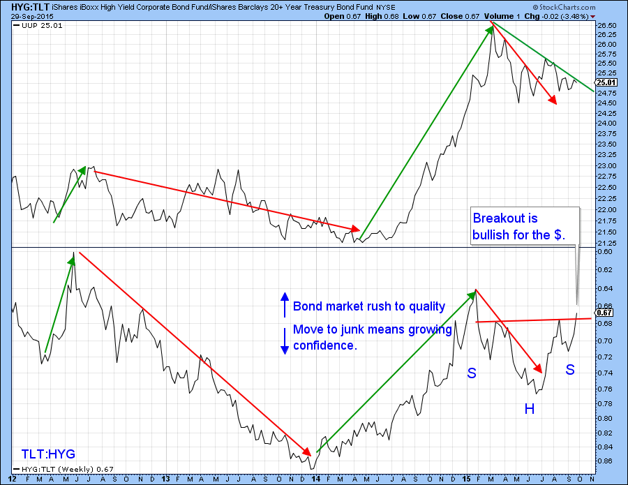
Chart 7
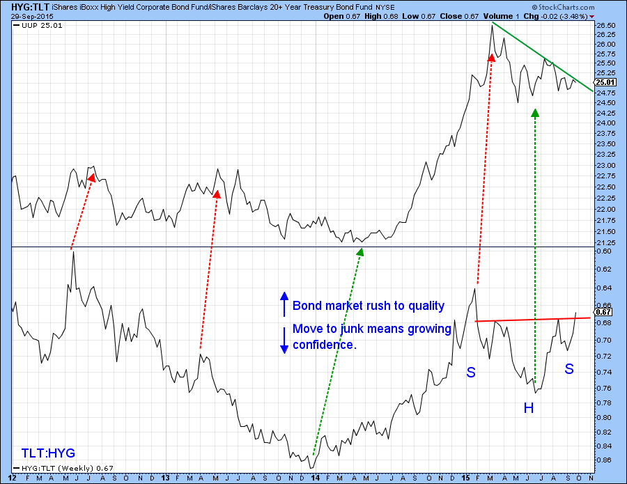
Chart 8
The 5-year Yield
The 5-year yield has been range-bound for the last 3 years but has started to show signs of topping out. Note that it is currently resting on the rising dashed trendline. A bearish short and intermediate KST suggest that the line will not hold and that lower yields lie ahead. If so, we could then expect a challenge of the all-important red line at 1.3%.
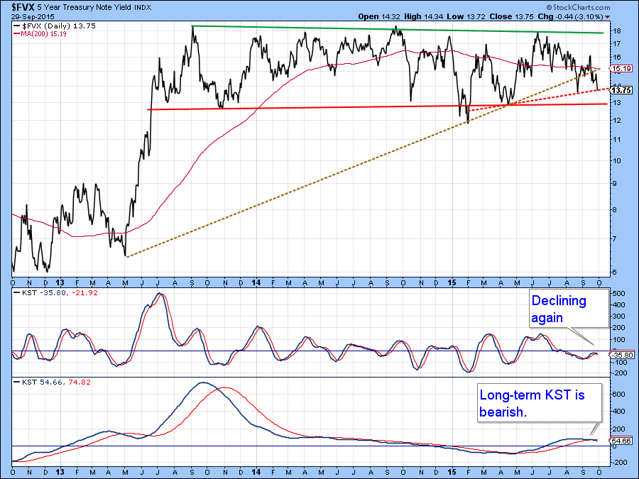
Chart 9
It already looks as if the spread between the 5-year and the 30-year yield series has begun to break to the downside as this relationship has completed a top and all three KSTs are bearish. This is known as a steepening yield curve and usually denotes a weakening economy. Consistent failure by the Fed to raise rates underscores this point.
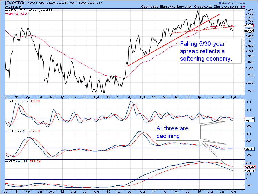
Chart 10
The maturity I am watching very closely is the 2-year. In this respect, Chart 11 shows that it recently experienced a false upside break. Such action is often followed by an above average move in the opposite direction to the breakout. So far that has not happened. However, if we see a break below the red trend line to about the 60 basis point level that would confirm the false break and I would expect to see short-term Treasury maturities fall quite sharply. Note that the intermediate and long-term KSTs are still bullish but, given the weakness in their short-term counterpart, could easily tip to the bearish side.
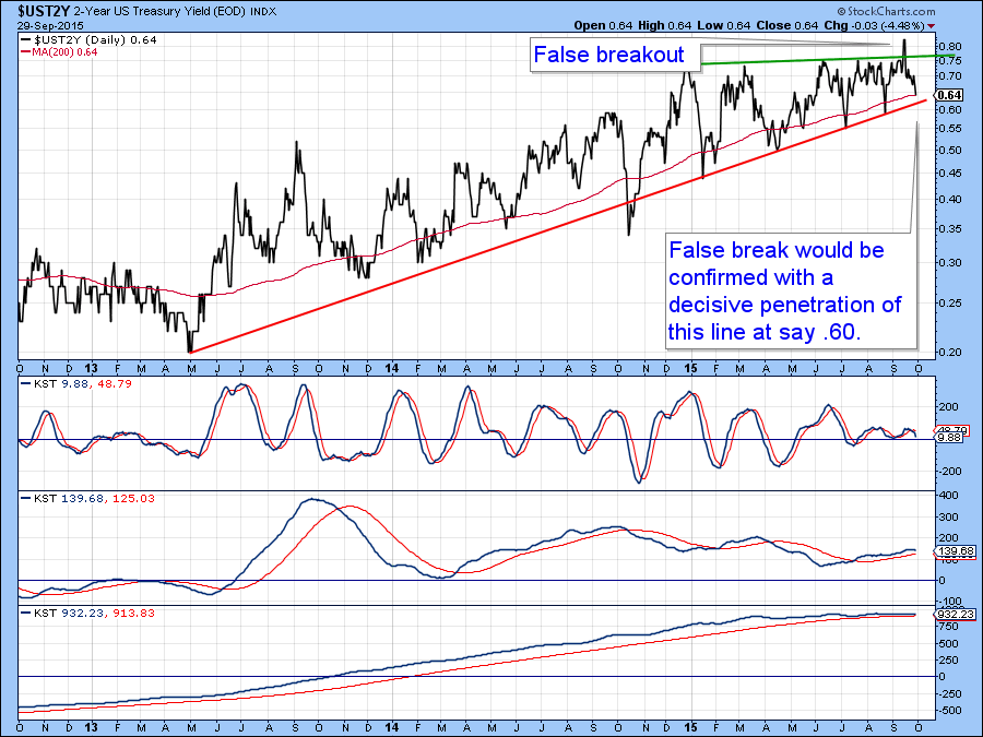
Chart 11
Good luck and good charting,
Martin J. Pring
The views expressed in this article are those of the author and do not necessarily reflect the position or opinion of Pring Turner Capital Group or its affiliates.


