Onward And Downward, The Correction Is Likely To Continue
- KST for the VIX triggers a sell signal for equities in general
- Junk Bonds have reversed to the downside
- Dollar breaks to the upside on a broad basis
- Some commodities break to new lows
The corrective process we talked about last week is still underway. Sometimes the technical position improves as prices decline but in the current situation things have worsened a bit. Chart 1 compares the S&P to the VIX. I have inverted the $VIX along with its MACD. In this display, the movements correspond with those of the S&P. Reversals in the trend of the VIX often give us advanced warnings of similar reversals in the S&P. At other times, the VIX does not lead but acts as confirmation. However, I find momentum reversals of the VIX to be more helpful than the raw numbers because it can tell us when volatility is overstretched in one direction or another. My instrument of choice in this regard is the MACD. This indicator is particularly advantageous because it helps to smooth out some of the volatility of the raw numbers and offers clear cut signals as it crosses above and below its signal line. The red arrows in Chart 1 for instance, point up to the principle sell signals that have developed in the last year. When signals are generated from a relatively low level not much damage seems to be done as the S&P experiences some ranging action. However, signals that develop from a higher level, as was the case in December of last year and March and August of 2015, were all followed by more protracted corrections. The current one comes from an even more elevated level. Its eventual effect remains to be seen, but it certainly has the power to do some harm, especially if trading action during the last 12-months turns out to be one giant topping out process. On the other hand, if we are in a bull market and the recent rally turns out to be the initial lift off from an intermediate low, the sell signal from a high reading will have little effect.
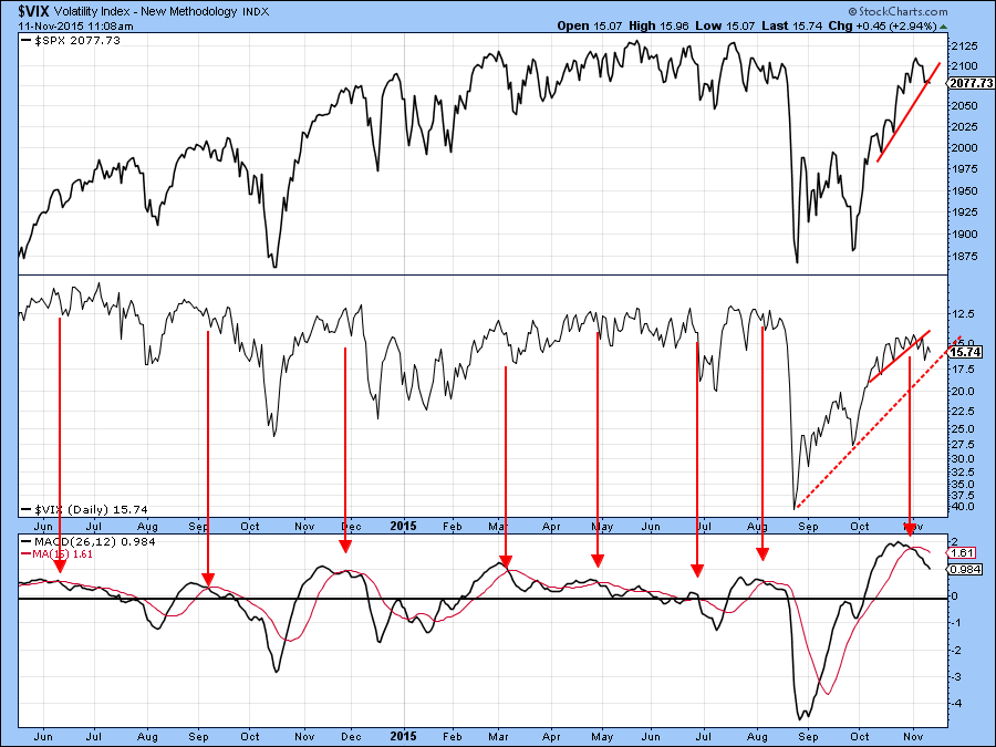
Chart 1
Chart 2 shows that both the NYSE A/D ($NYAD) and Upside/downside volume ($NYUD) lines experienced false breakouts above the green trendlines last week. The violations of the two red up trendlines indicate confirmations of these whipsaw moves. Since false moves are usually followed by above average price moves, I am expecting some more vulnerability as time progresses, say early next week.
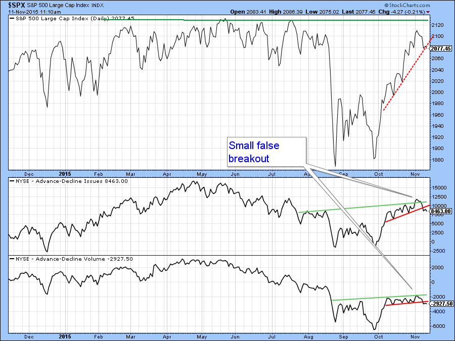
Chart 2
The S&P 500 ($SPX) has been one of the strongest areas on the board, but its A/D line (!ADLINESPX) was recently even stronger. Chart 3 shows that this indicator broke to a new 2015 high earlier in the month. However, it has since backed off, and that breakout will likely turn out to be a whipsaw. Confirmation of this false move comes from the fact that the line has subsequently violated the small red up trendline. The Upside/downside volume line (!CUMVOLSPX), constructed from S&P issues also experienced a false upside breakout as it tried to hold above the red breakdown trendline. The violation of the small red up trendline again confirms this whipsaw action.
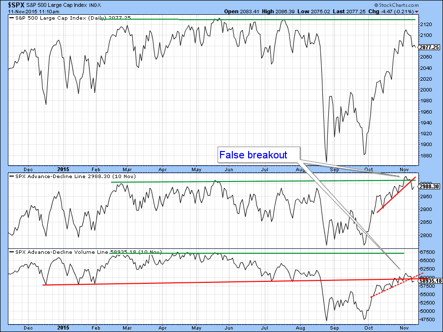
Chart 3
One of the key relationships that I am watching carefully is between the S&P 500 and high yield bonds, specifically the iBoxx High Yield Bond ETF, the HYG. Chart 4 shows that most of the time the two series move in tandem. However, it is when the HYG fails to confirm an upward or downward move in the S&P that a warning of a change in trend is given. For example, the two red arrows show that the HYG failed to confirm the second post-August rally high in the S&P. That’s a pretty big discrepancy and shows that bond investors do not share the same enthusiasm as their equity market colleagues. Even worse, the PPO for the HYG is in a bearish mode and the price itself clearly experienced a false break above the green down trendline. That, along with the two gaps, suggests that the HYG is in the process of leading the S&P lower.
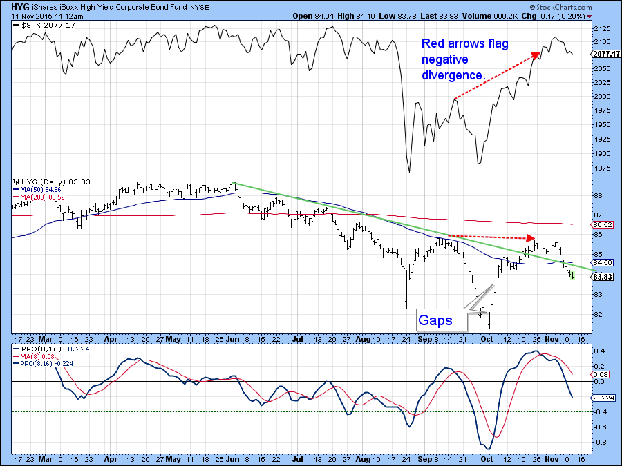
Chart 4
The two small red dashed arrows in Chart 5 show that volume for the NASDAQ 100 ETF, the QQQ, has started to pick up as the price has begun to retreat. This is normally a negative characteristic, which is also apparent from the price action of the PVO in the lower panel. After indicating weak volume during the rally, this indicator has recently been in a trading range. If it can push above the green down trendline it will confirm that a phase of expanding activity. Expanding volume with rising prices is bullish. However, since the price itself has just violated the red up trendline any expansion in activity will most likely accompany lower prices, and that’s bearish.
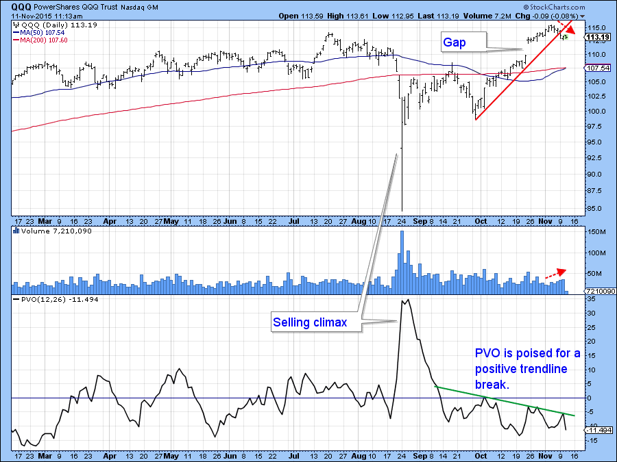
Chart 5
Chart 6 looks at the recent rally from the point of view of retracement moves. Interestingly, the 50% retracement would take the S&P 500 ($SPX) back to support at the upper end of its double bottom rally.
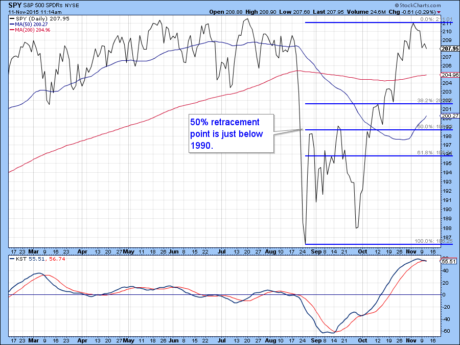
Chart 6
The Dollar
Last week we looked at the possibility of the dollar breaking to the upside. Accepted wisdom has placed the strong employment report and the resultant rise in US interest rates as the driving force of the breakout. However, Chart 7 shows that swings in confidence probably offers a more historical relationship with dollar movements. In this respect, confidence is reflected in bond investors’ preference for junk bonds or treasuries in the form of the ratio between the Barclays 7-10-year Trust and the iBoxx High Yield ETF’s (IEF/HYG). Note that the ratio has been plotted inversely to correspond with movements in the Dollar Index. Recently it broke to the upside as it led the dollar higher. Since then, it has fallen back below the breakout point throwing up the possibility of a false breakout.
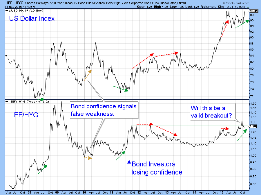
Chart 7
Chart 8 shows that the ratio has just broken above a small down trendline and the PPO has triggered a buy signal by moving above its MA. The arrows show this is usually a good sign of an impending rally. Therefore, I am expecting this key relationship to move higher.
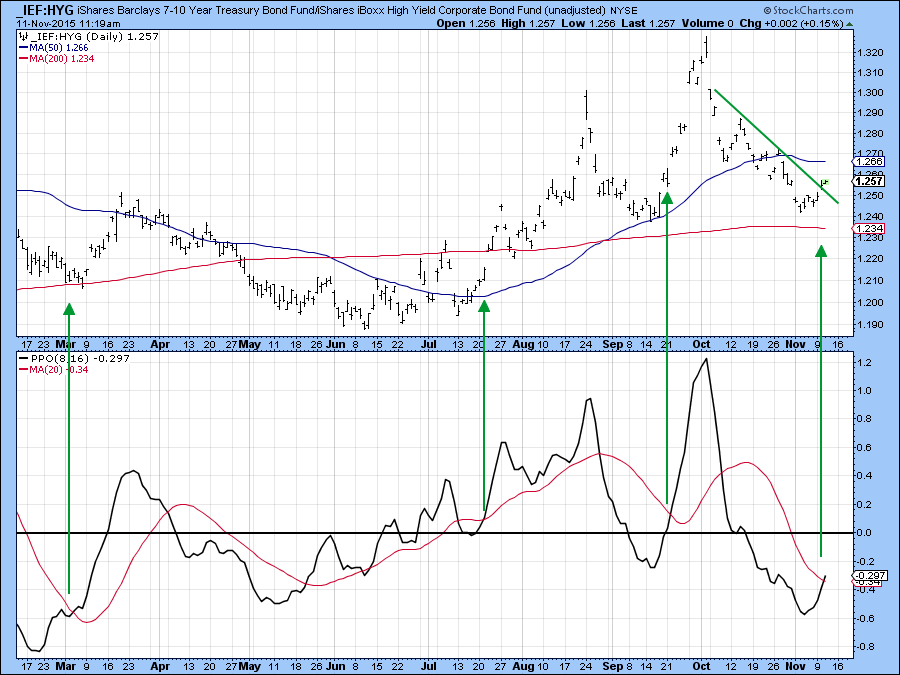
Chart 8
Regardless, we now see a decisive breakout for both the Dollar Index ETF, the UUP and its more broadly based (less euro influenced) Wisdom Tree counterpart, the USDU. Onward and upward!
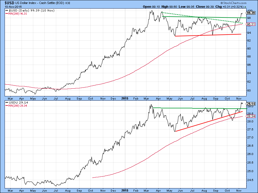
Chart 9
Some commodity ETF’s hit new lows
A higher dollar is generally accompanied by lower commodity prices and last week we saw that the Bloomberg Commodity ETN (DJP) had tentatively broken down from the head and shoulders consolidation pattern featured in Chart 9. This week prices have slipped to new lows and are showing few signs of a reversal.
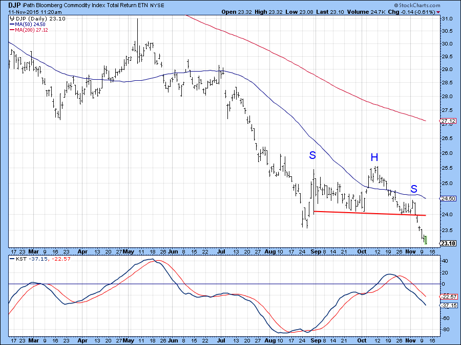
Chart 10
I also pointed out that the Goldman Sachs Natural Resource ETF, the IGE had tentatively failed in its attempt to break out from a reverse head and shoulders pattern. That failure has now been confirmed with a decisive break below the red up trendline. Since the KST is bearish and moderately overbought I am expecting to see the price of this ETF go lower as well.
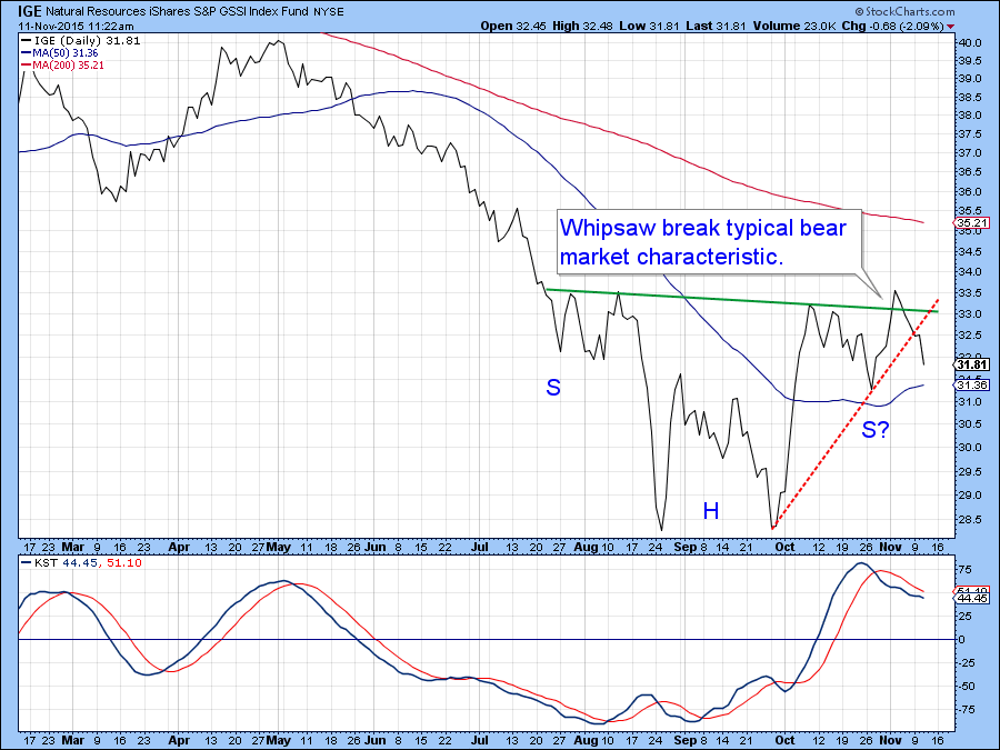
Chart 11
Good luck and good charting,
Martin J. Pring
The views expressed in this article are those of the author and do not necessarily reflect the position or opinion of Pring Turner Capital Group or its affiliates.


