Volume Is About To Expand, But Which Way Will It Send Prices?
- Two bar reversal for the S&P says the rally is over
- Volume is oversold. That means volume is likely to expand on the downside.
- Credit spreads challenging their bear market lows
- Commodities breaking down in a very big way
- This week's two-bar reversal says the market breaks down!
That last time I wrote about US equities in mid-November, I pointed out that the S&P 500 ($SPX) had formed a bullish two-bar reversal and had bounced from the support level indicated by the red trendline in Chart 1. These patterns are supposed to have an effect from between 5-10-days. Yesterday was the tenth day and today saw the second bar of a bearish two-bar reversal. Not only that, but this pattern took the price temporarily above resistance in the form of the dashed green resistance trendline. That counts as a form of whipsaw and suggests that the rally is over and at least a test of the mid-November lows is underway. Chart 1 also shows that the SPY is running up against resistance in the form of the green trendline. The big question is can it break this resistance in a convincing manner? Two other characteristics in the chart suggest not. The first is the bearish and declining KST. The second lies in the fact that gaps, which are emotional points on a chart, are almost always closed or at least an attempt is made to fill them. The problem is that there are no rules that determine when this will happen. Usually, gap closings develop within 3-4-months, often less. There just happens to be a gap that was formed in early October.
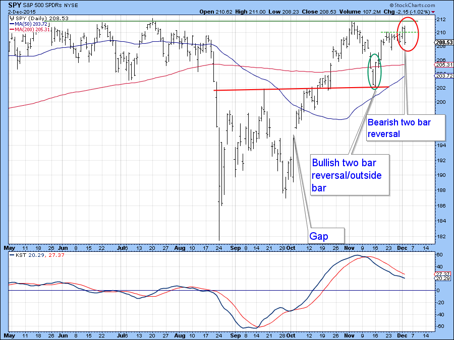
Chart 1
On the other hand, Chart 2 shows that the McClellan Volume Oscillator (!VMCOSINYA) for the NYSE has just triggered a buy signal as the (black) 10-day EMA has crossed above its (red) 20-day counterpart. As long as that condition holds we are unlikely to see a serious decline.
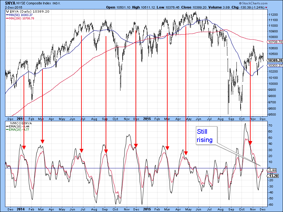
Chart 2
Chart 3 also shows that the very sensitive 8/16 PPO has started to roll over again. The overhead resistance, flagged by the horizontal green trendline, is also evident from the chart.
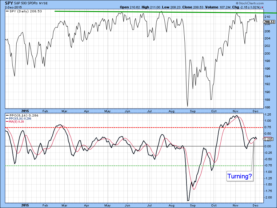
Chart 3
One of the things that the post-August 24 rally has been missing is support from the volume indicators. I think there is a pretty good chance that that characteristic is about to change as many of the volume oscillators are oversold. That only means one thing—the probabilities favor volume expanding. The $64,000 question is which way will the prices go?
Chart 4 indicates that the 18/46 Percent Volume Oscillator (PVO) has fallen back to its blue oversold zone. The green and red arrows show what has happened recently when this indicator has reversed to the upside. Sometimes the market rallies, as shown by the green arrows. At other times, the expanding volume has exacerbated the decline. It very much depends on where the MACD stands. If it’s overbought, the rising volume triggers a decline and if it’s oversold an advance is more likely. Right now the MACD is in a rising mode but the bearish KST action in Chart 1 combined with the rolling over characteristics of the PPO in the previous chart suggest that the MACD will soon succumb to the downside. If the $NYA fails to rally above the resistance flagged by the green trend line, and violates the October/December red uptrend line, a test of the August 24 lows would likely take place. Remember, on Thursday we end the bullish end-of-the-month seasonal. For the record, that’s the last two days and initial three trading days of the new month.
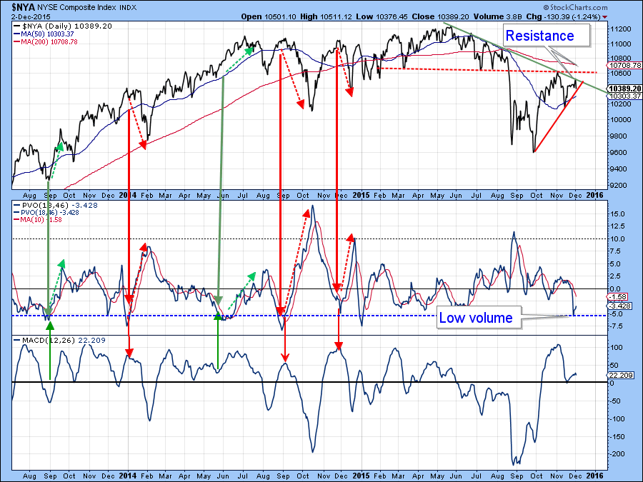
Chart 4
Chart 5 compares a 12/26 PVO for the NASDAQ to the NASDAQ 100 ETF, the QQQ. Here again, we see an oversold volume indicator, but this time with a declining KST. That suggests lower prices being accompanied by rising volume. Wednesdays’ action had the smell of exhaustion about it, with prices failing to hold their earlier gains. That indicates the likelihood of the up trendline, which is just above $113, being threatened.
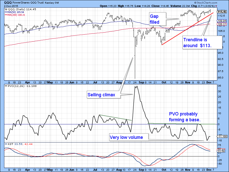
Chart 5
Finally, note that while the A/D Line for the S&P Composite in Chart 6 recently touched a marginal new high, its volume counterpart did not. Indeed, this series is well below its summer highs unlike the S&P itself.
Again this weak volume underscores current vulnerability.
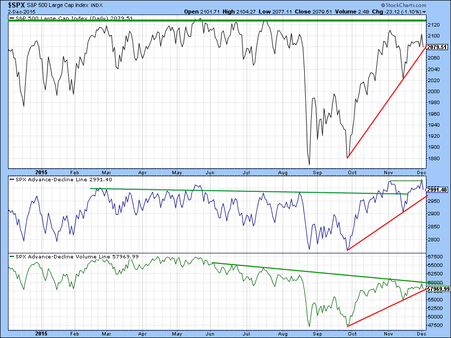
Chart 6
Credit Spreads
Chart 7 compares the S&P 500 ($SPX) to a bond market credit spread in the form of the ratio between the iBoxx High Yield and Barclays 7-10-year Trust ETF’s, the IEF to the HYG. This spread has been plotted inversely to correspond to price movements in the S& P Composite. Note that the spread recently broke below the red support trendline, pulled back above it and has now fallen below the line again. If it drops below its previous low that would suggest a new leg down in bond confidence, a weaker economy, lower stock prices, and lower commodities.
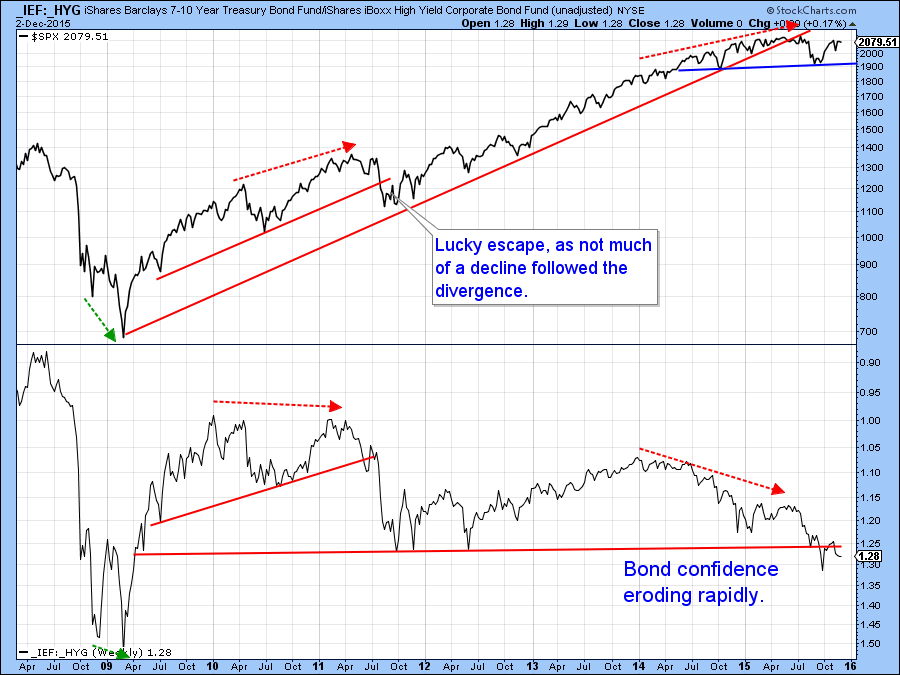
Chart 7
Commodities
Chart 8 shows that the CRB Composite ($CRB) and the oil price have both fallen to mega support levels. The $CRB support level was slightly penetrated in November and now it looks as though there may be some December follow through. It may be true that downside pressure is being caused by year-end tax-loss selling, which should abate in the next few days. If so, any downside move would turn out to be a whipsaw. However, if that does not prove to be the case and the $CRB and oil support trendlines are violated, these signals would have very long-term negative consequences. Note, for example, that there is no support on the $CRB until prices reach the 100-110 level.
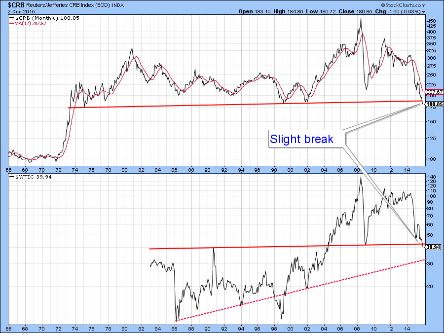
Chart 8
In the short-term, both oil and the Spider energy ETF (XLE), are suggesting lower prices.
The oil price itself in the form of the oil ETF (OIL), has just completed a bearish consolidation head and shoulders and its KST supports this break with some negative action of its own.
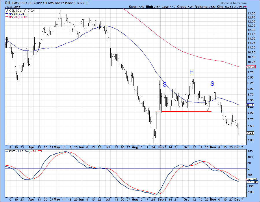
Chart 9
Chart 10 shows that the Spider Energy ETF, the XLE may be about to break down. The price itself is right at its October/December uptrend line, whereas the RS line is right at a potential head and shoulders neckline. Since both KSTs are in a bearish trend, a full-fledged downside breakout looks to be a strong possibility.
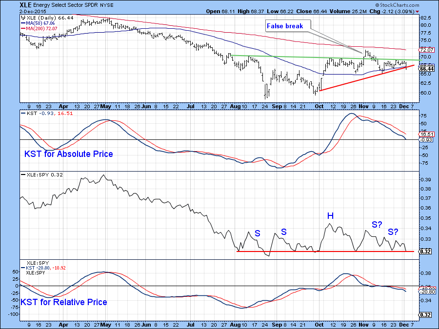
Chart 10
Good luck and good charting,
Martin J. Pring
The views expressed in this article are those of the author and do not necessarily reflect the position or opinion of Pring Turner Capital Group or its affiliates.


