Please Show Me A Bullish Long-Term Equity Chart
- Europe, Asia and Latin America all look bearish
I am not kidding. Today I went through pretty well all of the country ETF charts looking back a few years with the long-term KST. I could find only one bullish chart as displayed here as Chart 1. As you can see it has violated its 2012-2015 down trendline, completed a small base and, as of last week, had crossed above its 65-week MA. Because of its lengthy bear market the long-term KST in the bottom window is still below zero, so it’s hardly overbought. If you think that’s a bullish chart, I’ll tell you what it is at the end of the article but for now let’s focus on the negative ones.
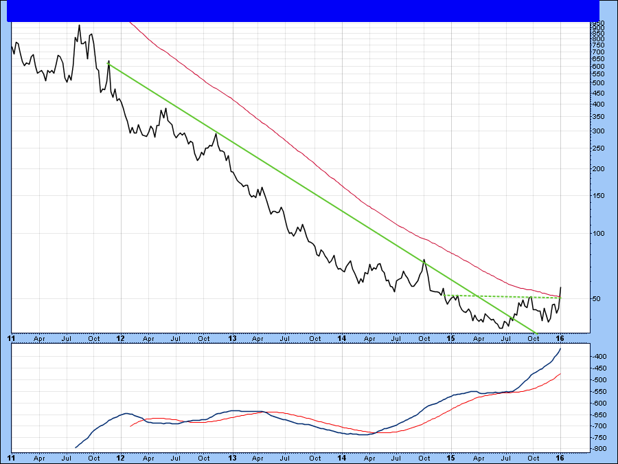
Chart 1
The World
I’ll start with the more encompassing ETF’s gradually working down to some larger individual countries. First up is the MSCI World Stock ETF, the ACWI. It’s already well below its 65-week EMA and the long-term KST is declining. However, on Friday it completed a head and shoulders top. The ultimate downside objective calls for this dollar denominated Index to fall to the $46 area.
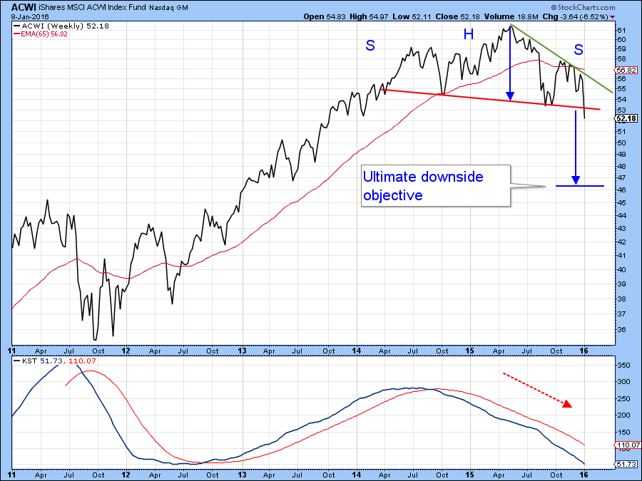
Chart 2
Chart 3 strips out the US and looks at the rest of the world in the form of the MSCI Europe Australia Far East ETF, the EFA. I have flagged this as a double top, but would not have a problem with anyone calling it a head and shoulders. The label is unimportant. What really counts is that it represents a battle between buyers and sellers and when the price broke below the trendline the sellers won out. Note that both Charts 2 and 3 also have green down trendlines. As long as those down-sloping trendlines remain intact, the bearish message being transmitted is also.
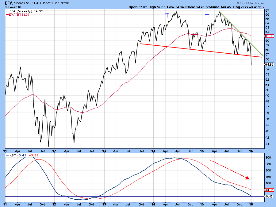
Chart 3
Europe
The Eurozone ETF, the EZU, has also completed a large head and shoulders top and has a downside objective of just above $25 from its current $32.84. Note that the bearish KST is only slightly below equilibrium and is therefore not even close to an oversold reading from which one could extrapolate a possible upside reversal.
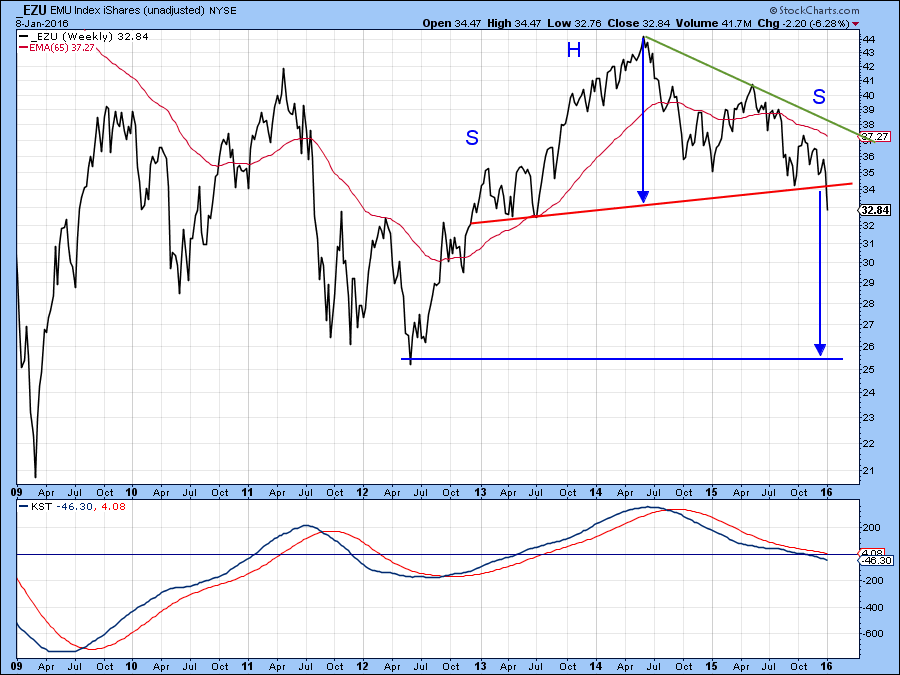
Chart 4
Outside the European Monetary Union lies the United Kingdom in the form of the EWU. The price of this ETF has also completed a head and shoulders top, though the declining peaks and troughs are more advanced.
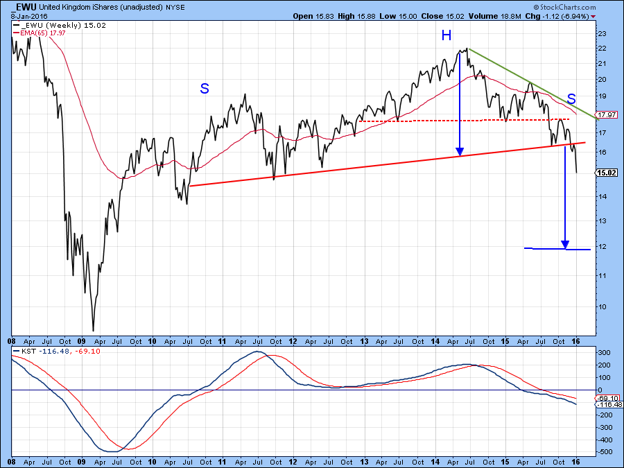
Chart 5
Asia
Moving over to Asia, Chart 6 features the MSCI Asia Ex Japan ETF, the AAXJ. It has also broken down from a top, though I am not sure what to call it as the ultimate 2015 peak is somewhat higher than its 2010 top, so I am not sure if it qualifies as a double top. Once again it does not matter, because the declining peak and trough action and the support line violation are both bearish, and so is the KST.
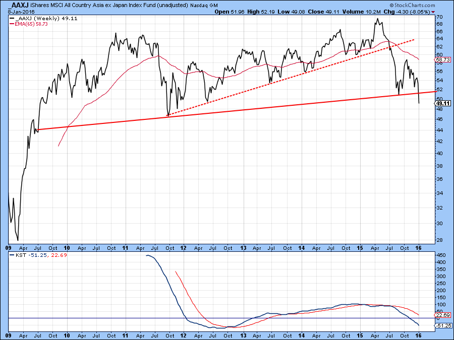
Chart 6
The FTSE China ETF, the FXI, has also completed a major top and only just broken down. Even the long-term KST is above zero, hinting of much lower prices to come.
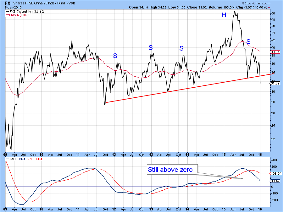
Chart 7
The Japanese ETF, the EWJ, is one of the few major country ETF’s that has not yet broken down, though Friday’s close took the price right back to the neckline of a possible upward sloping head and shoulders pattern.
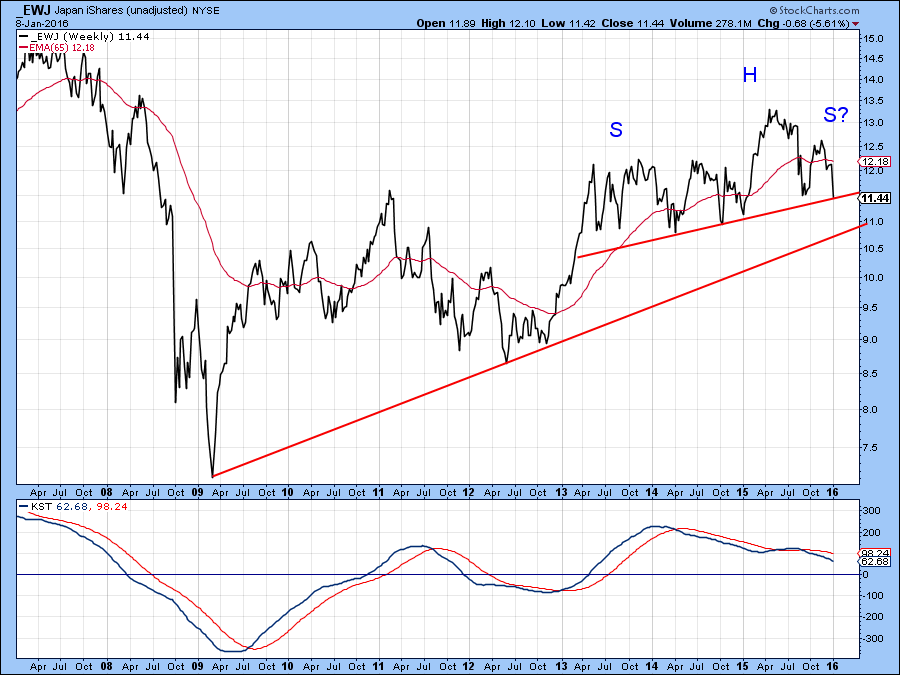
Chart 8
When expressed in Yen, Japanese equities in the form of the Nikkei ($NIKK) have been on a tear. However, even this series has just completed a head and shoulders top and violated its 2012-2016 up trendline. Since the KST is now bearish, caution remains the order of the day.
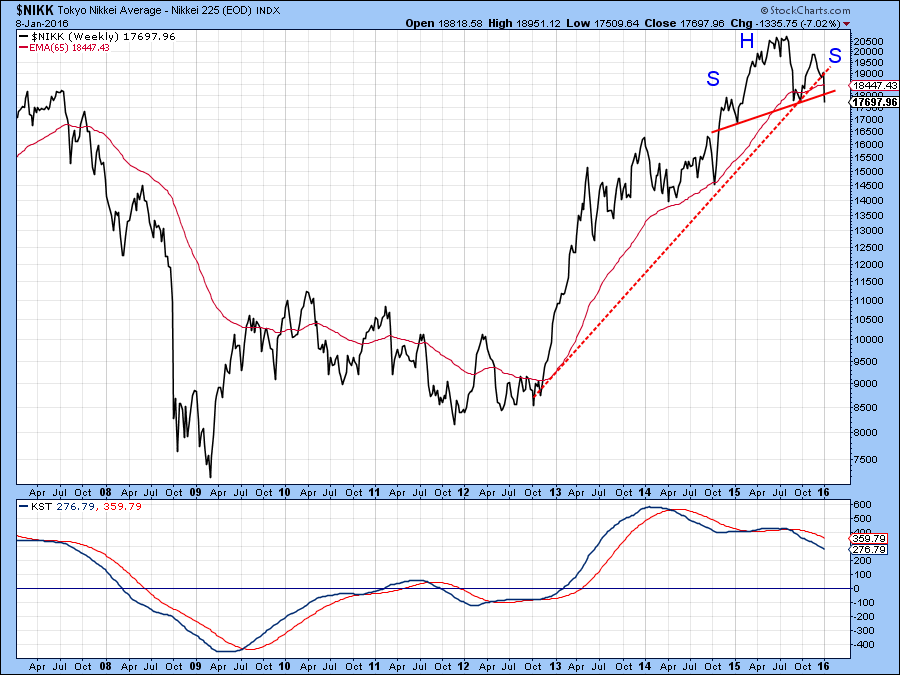
Chart 9
Finally, in Asia, Chart 10 shows the MSCI Indian ETF, the INP. Its price has completed a head and shoulders to and violated a major up trendline. The bearish patterns for this ETF do not look to be as big and as serious as for other countries, but the technical danger is nevertheless still apparent.
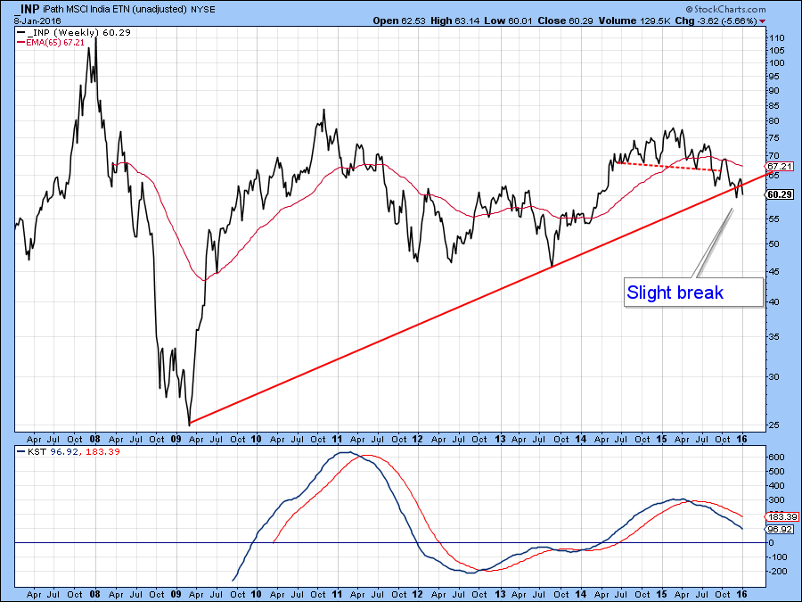
Chart 10
Chart 11 does not exactly represent a region, rather a class of countries included in the MSCI Emerging Markets Index, the EEM. Here we see a more developed bear market with a downside objective in the $22 area. Note that the two blue lines, used to calculate the objective, are of the same height, which gives greater credibility to this objective.
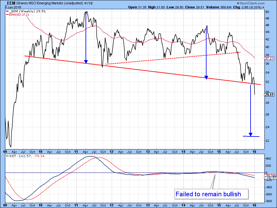
Chart 11
Chart 12 shows what’s been going on South of the border and it’s not a pretty picture. The Latin America 40-ETF, the ILF, has been one of the worst performers in the world in the last couple of years. Clearly it’s oversold but showing absolutely no sign of a reversal at this point.
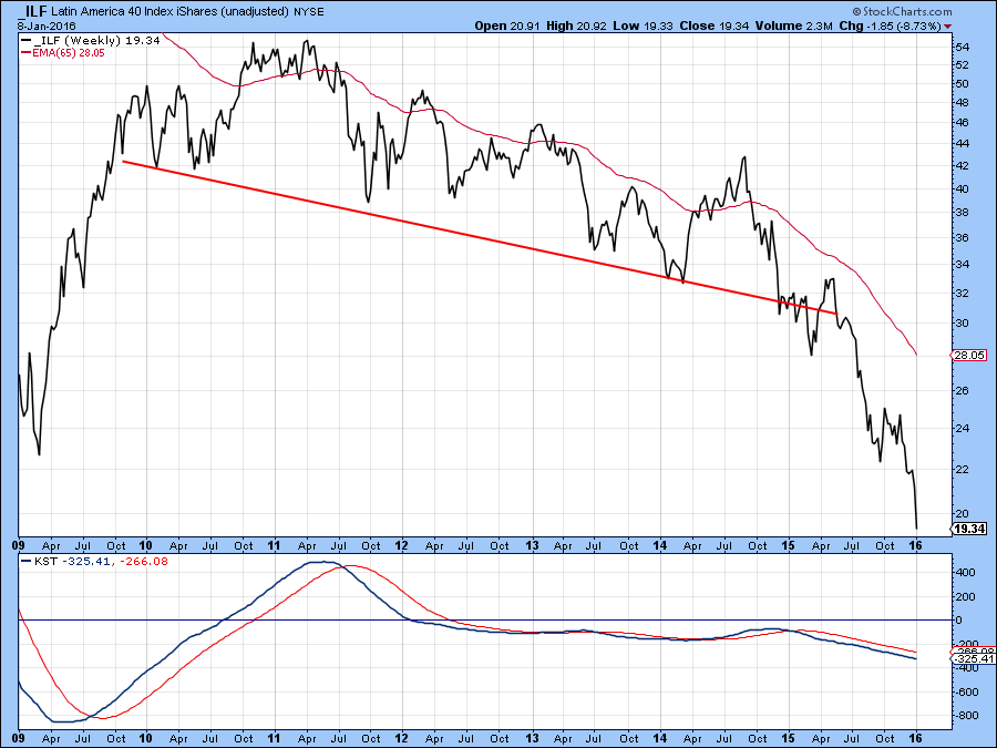
Chart 12
In conclusion, just about every major country or region has completed some form of top. Now there is the possibility that these breaks represent whipsaws, after all the opening week equity price collapse has been widely disseminated by the general purpose news media. That means that from a contrarian point of view, everyone is aware of the bad news, so last week's sell-off could turn out to be one giant whipsaw. However, it is generally dangerous to bet on false signals before they are confirmed. That means that we should only go with what the charts tell us right now and that’s a universally bearish message. There will be a time to be bullish, but we have to wait for those same charts to give us that message. Right now they are pointing south and caution is the order of the day.
So, what’s the bullish price configuration in Chart 1? Well, actually I cheated in two respects. First, it’s not exactly a country but the Direxion Daily Small Cap ETF. Second it’s the Small Cap Bear, the TZA, which, of course makes it an inverse fund. That means that if you agreed with me that it looked like a bullish chart by rights you should now be bearish!
Good luck and good charting,
Martin J. Pring
The views expressed in this article are those of the author and do not necessarily reflect the position or opinion of Pring Turner Capital Group or its affiliates.


