Is This The Top Of The Rally Or A New Bull Market?
- World indexes not yet above their 200-day MA’s
- USA indexes very overstretched short-term
- Two reliable primary trend indexes at make or break points
Three world equity indexes
StockCharts carries three stock market indexes measuring “The World”. All of them are overbought on a short-term basis, two are below their 200-day MA’s and one is literally right at it. Chart 1 features The FTSE All-World Index ($FAW). This one, after a very spirited rally, is still below its 200-day MA but has managed to cross above its green down trendline. However, the long-term KST remains in a bearish trend below its EMA. If the Index can remain above the green line that will be a positive factor but failure to do so would hint at exhaustion, which would be followed by some corrective activity.
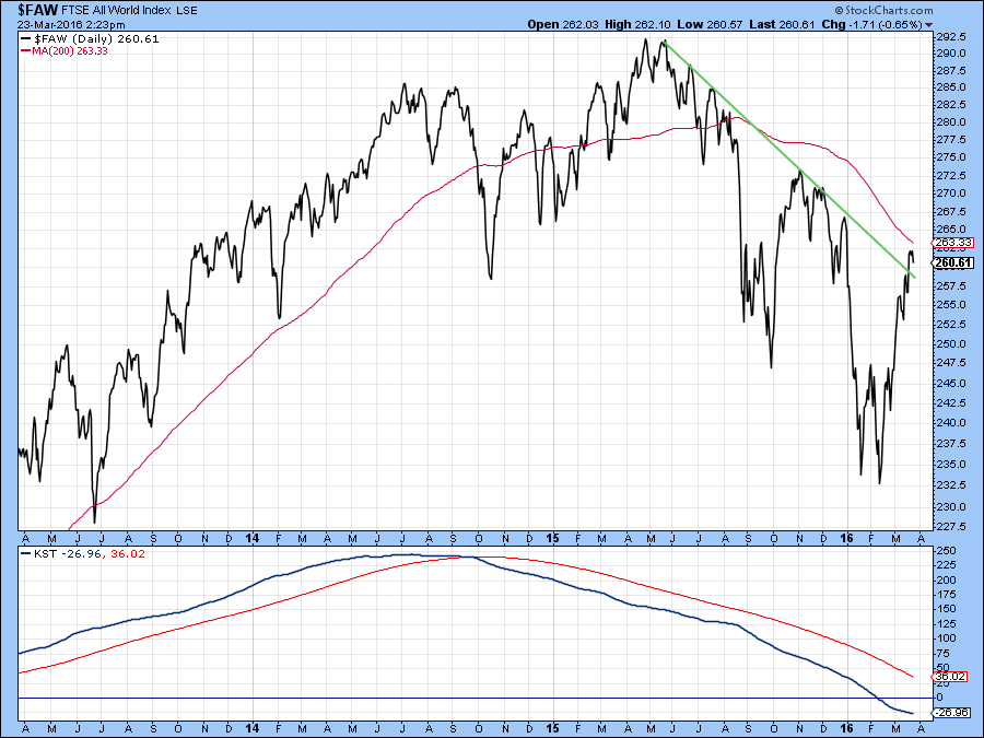
Chart 1
Chart 2 shows another world series, the Global Dow Index ($GDOW). This series is right at its green down trendline and further away from its 200-day MA. The KST is still bullish but is clearly overextended. That makes a successful assault on the MA somewhat problematic but by no means impossible. Let’s say 40/60 odds.
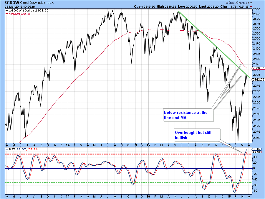
Chart 2
Our third index, the MSCI World Stock ETF, the ACWI, is right at its 200-day average and down trendline, clearly a critical position. Note that the Global A/D Line (!PRGLAD) in the lower panel is also trying to mount a rally on its bear market trendline, but so far has not been successful. Since the green line for the price is in the same vicinity as the MA, they reinforce each other as resistance levels. In other words, a rally above them would indeed be a big deal. Bottom line, given this resistance and the overextended nature of the KST this is probably as good a place as any for anticipating some form of corrective activity.
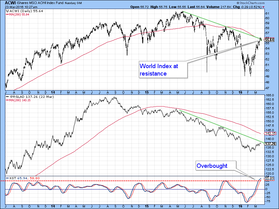
Chart 3
Finally, on the world scene, Chart 4 compares the Dow Global ($GDOW) to my Global Diffusion Indicator (!PRDIFGLO). This one monitors a basket of individual country ETF’s that are in positive trends. The red arrows show that when this series reaches a peak and then reverses it’s normal, but not guaranteed, for some kind of a correction to develop. The indicator is not yet at that overstretched extreme and is still rising, so a sell signal has certainly not been triggered. That leaves some room for upside action but not much, especially if global stocks are still in a primary bear market, which their position below their respective declining 200-day MA’s suggests.
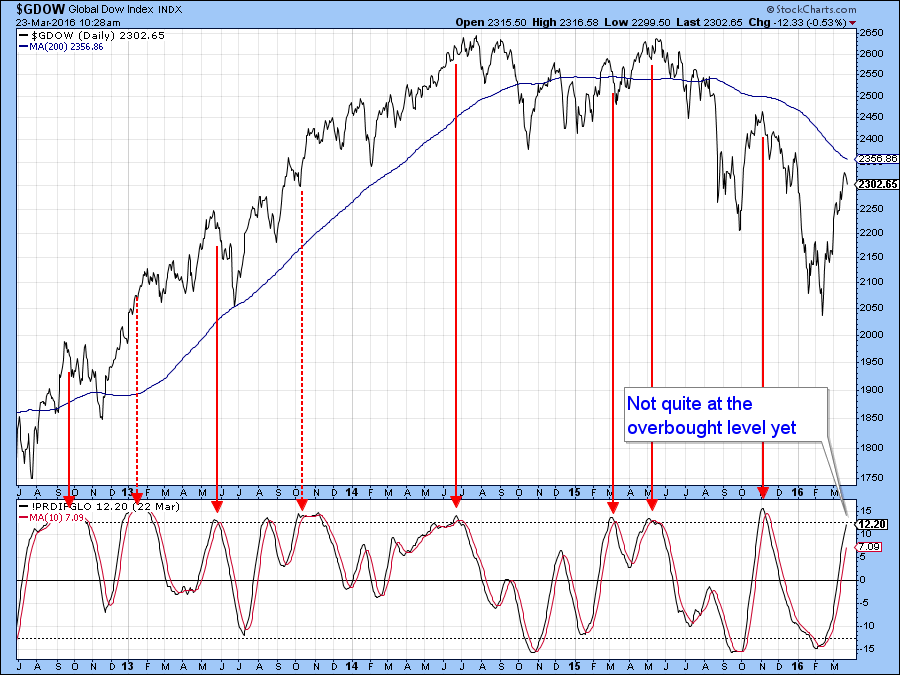
Chart 4
US short-term Indicators
Back in the US, it is no secret that prices are very overbought on a short-term basis. Since oscillator rallies in bear markets are typically more limited than bull market advances, the current overbought condition represents a great test of the bear market narrative. In other words, if the bear trend is still intact this should mark the top of the rally, if not prices may have further to run prior to digesting recent gains. In recent days, things have become much more interesting because some of the watch list of indicators I cited in a previous article, are bordering on a primary bull market signal. First though, let’s consider the shorter-term picture.
Chart 5 shows the PPO using the more sensitive 8/16 parameters than the default 12/26. As you can see, it is currently waffling around at an extreme level which, in combination with resistance at the green down trendline, suggests that some form of correction is likely to materialize.
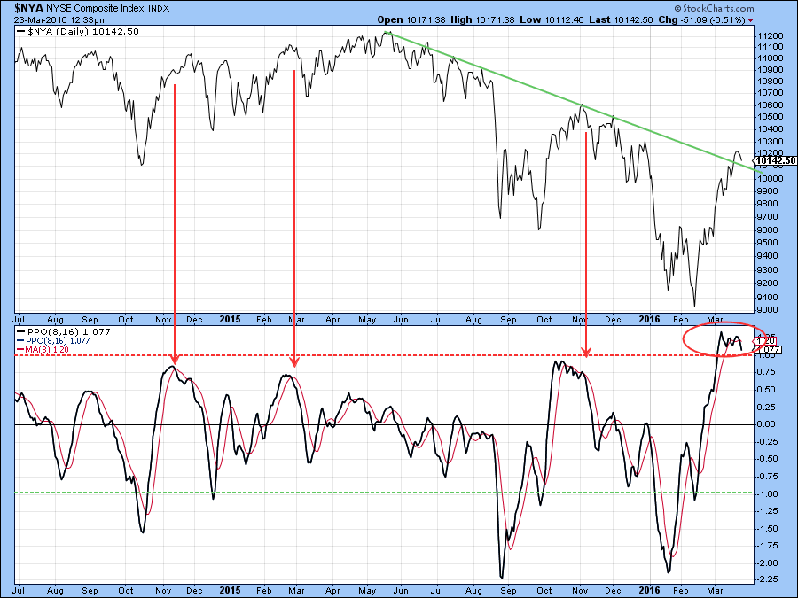
Chart 5
Chart 6 compares the $NYA to a 10-day to a 20-day EMA of the NYSE McClellan Volume Oscillator (!VMCOSINYC). The arrows flag when the black 10-day series crosses below its 20-day counterpart after a move to the red overbought zone. Usually, that kind of action is followed by some kind of decline. So this week’s sell signal is, on the one hand, a worry, especially as the $NYA itself is right at its 200-day MA. On the other hand, you can see that the recent high for the indicator surpassed all other peaks on the chart. That kind of action is not what we expect to see in a bear market and should be regarded as one piece of evidence favoring the bull market case.
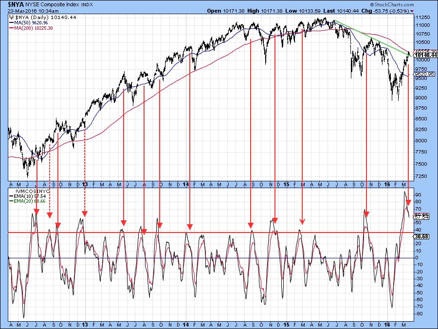
Chart 6
Chart 7, on the other hand, shows that volume, in the form of the PVO was declining during the course of the recent rally, which is not an encouraging sign. Note also that the price is edging through the red up trendline, which suggests a drop in upside momentum. We have to be a bit careful on this one because the latest plot is intraday in nature and does not indicate a closing price. However, a more decisive break, if one develops would likely result in a reversal in the price oscillators and lead to a near-term correction.
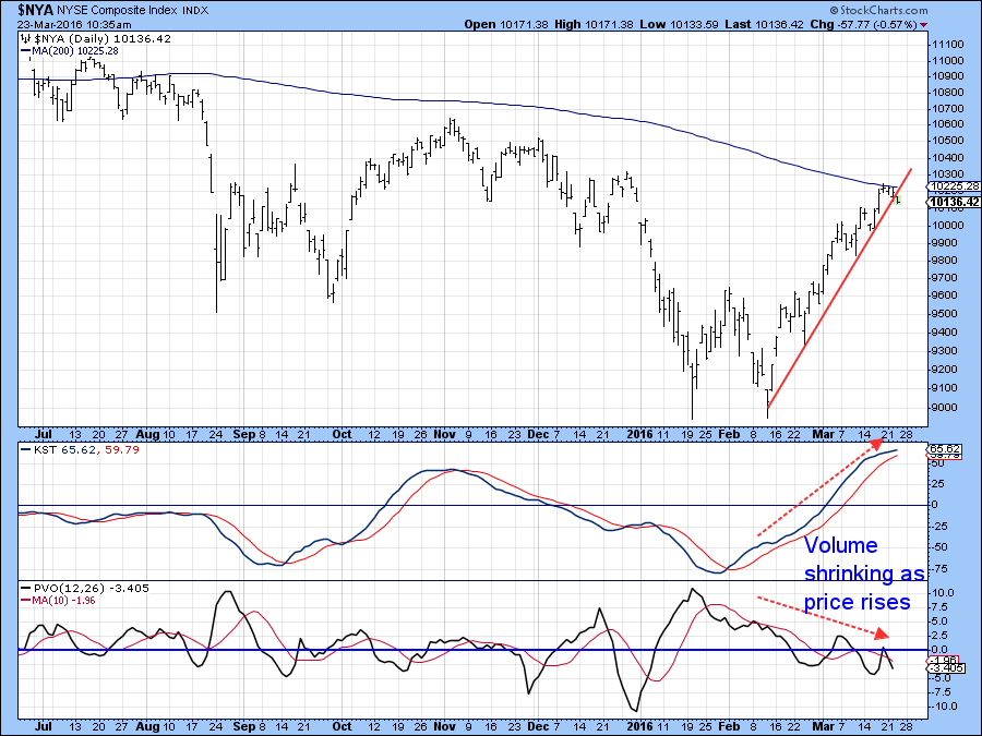
Chart 7
It’s of really critical importance because two primary trend indicators are on the cusp of triggering bull market signals.
Are two primary trend indicators about to confirm a new bull market?
The first of these is shown in Charts 8 and 9. The former offers perspective and the latter a chance to follow the indicator in a more detailed fashion. It’s a PPO based on the weekly parameters of 6 (a month-and-a-half) and 180 (approximately 3-years). The idea is that when the oscillator falls below zero it signals a primary bear market. Zero in this instance tells us when the 6-week MA is below its 180-week counterpart. Bull markets are signaled when it crosses back above zero again. These periods have been flagged by the vertical green lines and are shown to be pretty reliable. Chart 8 shows that the indicator is right at the zero level, which means that any additional market strength in the period directly ahead would, from this indicator’s point of view, signal a primary bull trend.
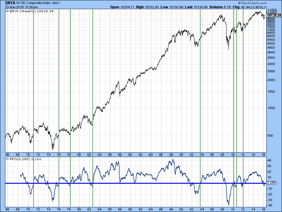
Chart 8
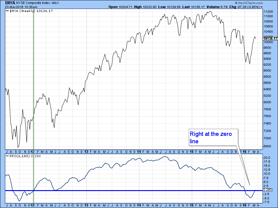
Chart 9
Charts 10 and 11 feature another primary trend benchmark indicator. This is a 10-day MA of the Record High indicator for the NYSE Composite ($RHNYA). Read about it here. The formula is calculated from new 52-week highs divided by highs and lows, the whole thing being multiplied by 100 in order to allow the indicator to fluctuate between 0 and 100. My interpretation is that sell signals are triggered when it falls below 20% and buy signals when it crosses back above the 60-area. Such signals have again been flagged by the vertical green lines. Only one failed, during the 1973-4 bear market. StockCharts history for the NYSE only goes back to the 1960’s, but we can apply the same indicator to the DJIA and see its successful buy signal record going back to the 1920’s. Chart 10 shows more recent activity in greater detail, where you can see that the latest sell signal has been followed by a rebound to the 61 level, a technical but not yet decisive buy signal.
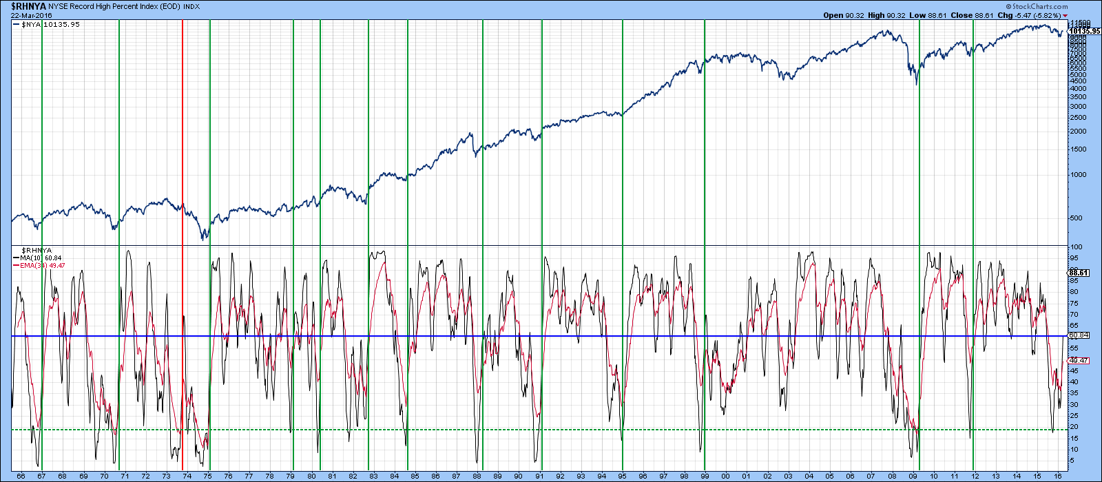
Chart 10
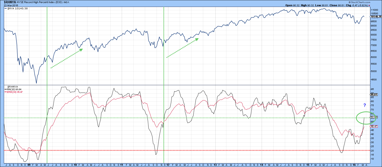
Chart 11
Good luck and good charting,
Martin J. Pring
The views expressed in this article are those of the author and do not necessarily reflect the position or opinion of Pring Turner Capital Group or its affiliates.


