US Equities Remain At A Bull/Bear Crossroad
- Consistently reliable primary trend indicator on the fence
- Strong breadth
- Equities overbought and lacking in volume
- Rates headed lower?
Consistently reliable primary trend indicator right on the fence
The US equity market continues to bump up against resistance at a time when most short-term oscillators are overstretched. Since volume has been shrinking during the course of the rally, prices are near-term vulnerable. Some of the longer-term indicators have gone slightly bullish, which holds out the possibility that this is a rally in a new bull market. If that proves to be the case then any correction is likely to be brief in terms of time, possibly even taking the form of some ranging action. On the other hand, if the bear market is still alive then any correction will most likely take the form of an unpleasant decline. The good news is that trading is in the middle of the end-of-the-month bullish seasonal, that will run into Tuesday of next week. The bad news is that the seasonally weak May/November period begin in just over 20 trading days.
Chart 1 shows how finely balanced the current technical picture has become. The series in the lower panel is the Coppock Curve, a long-term smoothed momentum indicator that for the last 100-years or so, has consistently signaled primary bull markets by reversing to the upside from a below zero position. The chart shows that a false buy signal was triggered in 2001 but this is the only time we have seen a whipsaw since the great depression. The indicator recently fell below zero and right now is essentially flat. Ergo an extension to the current rally could push it into a bullish mode. Alternatively, a sharp correction would cause it to accelerate to the downside, thereby delaying any positive signal. Clearly, the stakes are pretty high right now. One bullish aspect lies in the fact that the S&P is now above its 12-month MA. MA crossovers of this nature have not been perfect and are certainly subject to false moves, but it is one of the best testing MA’s around. However, it is fairly evident from the chart that the S&P has been in a trading range for some time, which means that a more reliable signal would come from a resolution of that range, from whichever direction it might come.
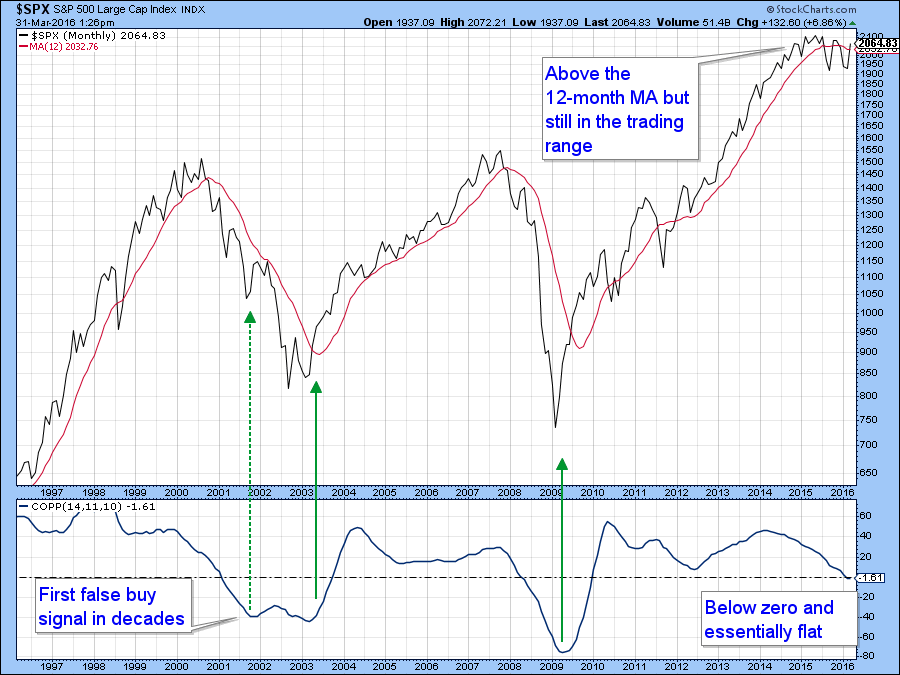
Chart 1
Chart 2 features the S&P compared to a cumulative plurality of NYSE highs over lows. Buy and sell signals are triggered as it crosses above and below its 50-day MA, as flagged by the arrows. Occasionally a whipsaw takes place as highlighted in the red ellipse, but by-and-large, crossovers have a habit of remaining in force once triggered.
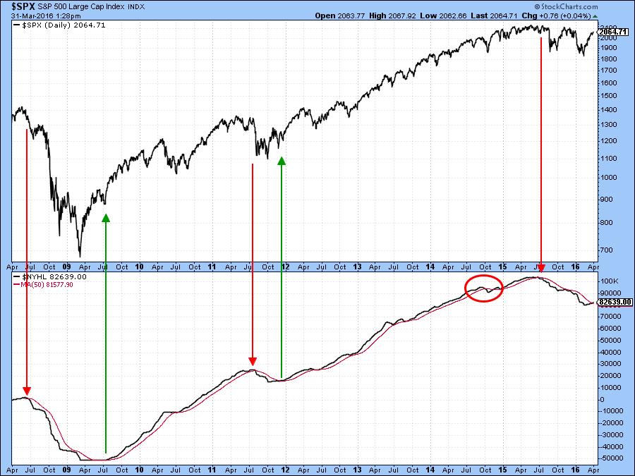
Chart 2
Chart 3 shows recent price action in greater detail. This week the indicator went bullish again. We have to take the crossover at face value but it is interesting to note that the KST in the bottom panel is very overextended and has begun to turn down. If the cumulative new high indicator can remain unscathed during any impending correction that would be a very positive sign.
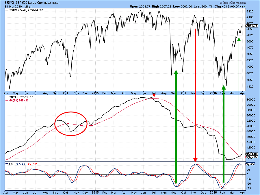
Chart 3
Strong breadth
The NYSE A/D Line has also been making progress and has been outperforming the NYSE Composite itself. This is shown in Chart 4. Note that the A/D Line is now right back to its bull market high indicating that the broad market has greater underlying strength than the averages themselves. The upside/downside volume line has violated an important down trendline. It is also above its early December high, unlike the $NYA itself, which is slightly below it.
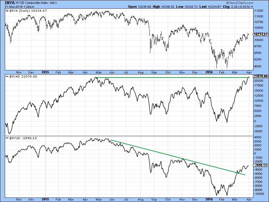
Chart 4
Strongest of all, though, is the A/D Line for the stocks comprising the S&P 500 itself, as this series has just registered a new bull market high.
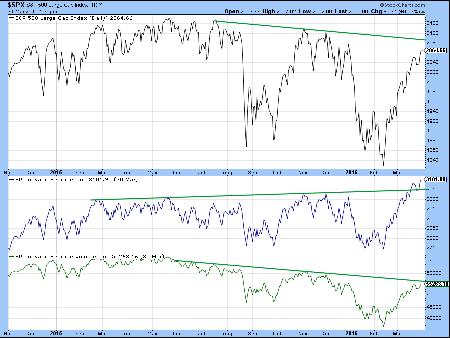
Chart 5
Equities overbought and lacking in volume
Chart 6 shows that volume has been weak during the course of the rally. This is reflected in the downward trend in the PVO since January. A short PVO decline from the January selling climax is to be expected and would be normal. However, the indicator has declined for a long period of time and is now oversold. That means that volume is now likely to expand. The green and red arrows show that this can be a bullish or bearish depending on what precedes an oversold PVO reading. If it comes because prices have been falling or consolidating this is usually bullish. However, if it comes after a rally then this tends to be bearish.
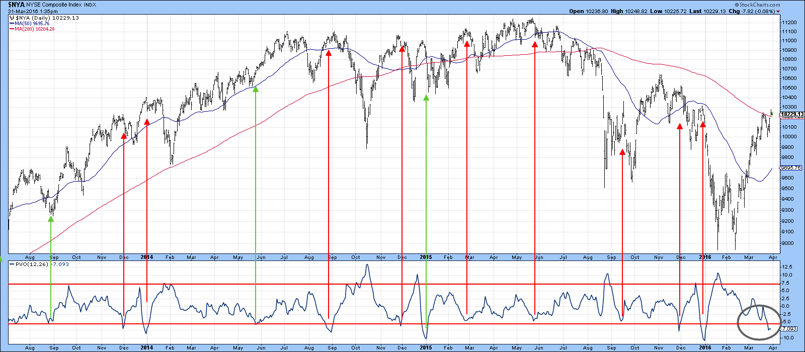
Chart 6
Chart 7 suggests that the next move will be down because the 10-day EMA (black) of the McClellan volume oscillator has crossed below its 20-day (red) counterpart. The solid arrows show that such crossovers from an overbought reading have consistently signals corrections of some kind. The dashed arrows point out that it is not a perfect indicator. The current technical position is particularly important because the NYA has just crossed above the green resistance trendline and 200-day MA. Failure to remain above these levels will indicate exhaustion and be a short-term negative factor.
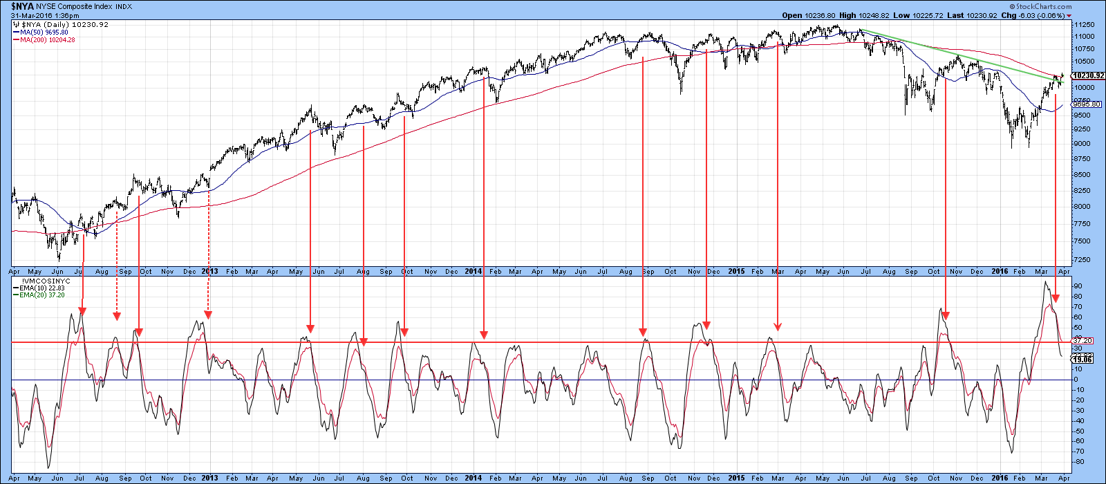
Chart 7
Finally in the equity area, Chart 8 shows that the world is also very overextended as the Global Diffusion indicator has reached a very high reading. The solid arrows show that even in a bull market, reversals from above the overbought zone have been followed by a correction of some kind. The dashed arrows indicate false signals. Right now the indicator is still rising, so a sell signal has not been given. However, it seems likely that it soon will as this breadth series rarely spends much time north of its overbought line.
There are obviously a lot of positive points concerning this rally and the possibilities for it becoming a transitional one to a bull market is increasing. However, putting it all together, it seems likely that either during or directly after the end-of-the-month bullish seasonal, some form of a correction will develop. The nature of that correction and subsequent price action may well put the primary bull/bear discussion to rest.
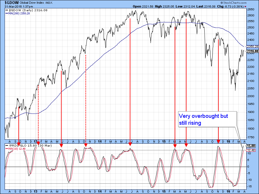
Chart 8
Rates headed lower?
The 2-year yield is considered to be fed sensitive and has been in an uptrend for the last 5-years or so. It’s still within its 2013-16 trend channel, but is starting to look vulnerable. First, it has experienced two false signals to the upside, which hints at exhaustion. Second, and more importantly, all three KSTs are in the early stages of a decline, which suggests that our benchmark of .65% will be penetrated in the not-to-distant future.
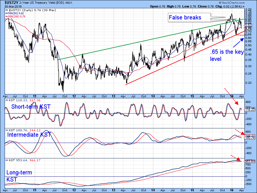
Chart 9
Finally, Chart 10 hints that the 30-year yield may well be in the terminal phase of completing a head and shoulders pattern. That would require a daily close below 2.5%. That seems to be a likely possibility because all three KSTs are once again in a negative mode.
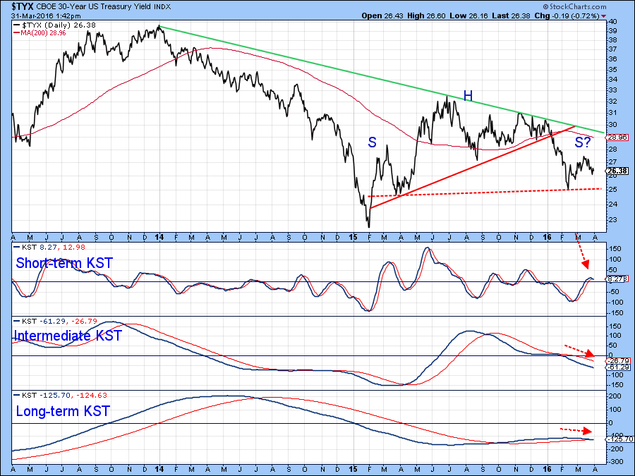
Chart 10
Good luck and good charting,
Martin J. Pring
The views expressed in this article are those of the author and do not necessarily reflect the position or opinion of Pring Turner Capital Group or its affiliates.


